TrueViews are disappointing at times
 BIGAL2749
Posts: 742 ✭✭✭✭
BIGAL2749
Posts: 742 ✭✭✭✭
Edited since first posting was somewhat confusing. The 2 images are of the same coin.
In '97 Gary Adkins sent me two heraldic dollars, one white and the other toned. Both were in MS 62 holders but the luster was so strong on the darkly toned coin vs the white coin (also had been dipped in its past) that the decision was easy. Even felt the toned coin might also end up in a 63 holder someday.
Twenty years later I sent in to Pcgs for reconsideration, variety, and Trueview.
Coin upgraded to 62+ and variety B-165 (common and known to be weakly struckly with stars missing on the reverse) was added on the new holder.
The TrueView was very disappointing in that no luster shows up and even though the details are there the flash is missing that gives the coin so much appeal.
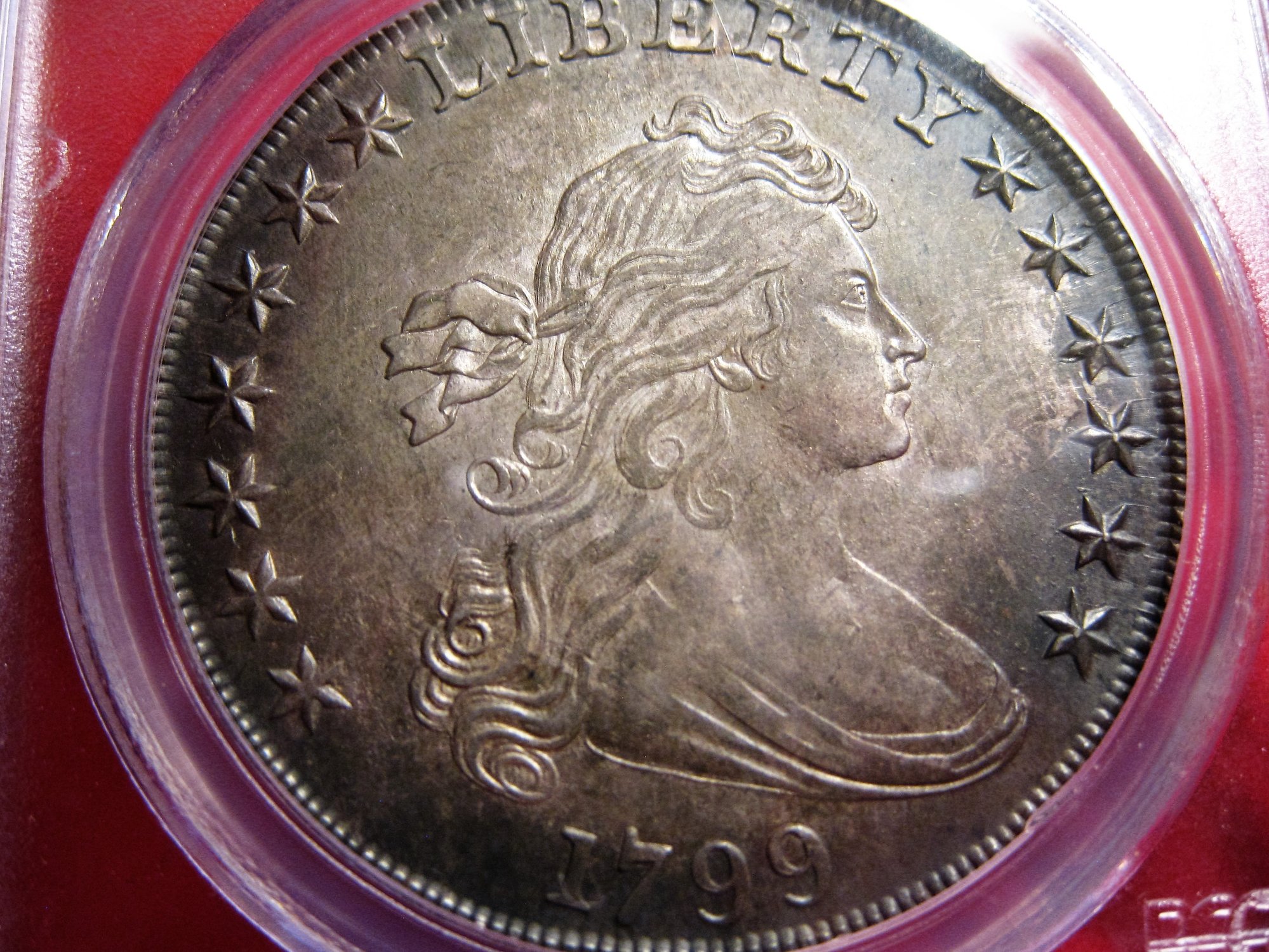
My pics are typically poor but I did take one (2nd pic with red background) that gives a hint of what is under the color
Same coin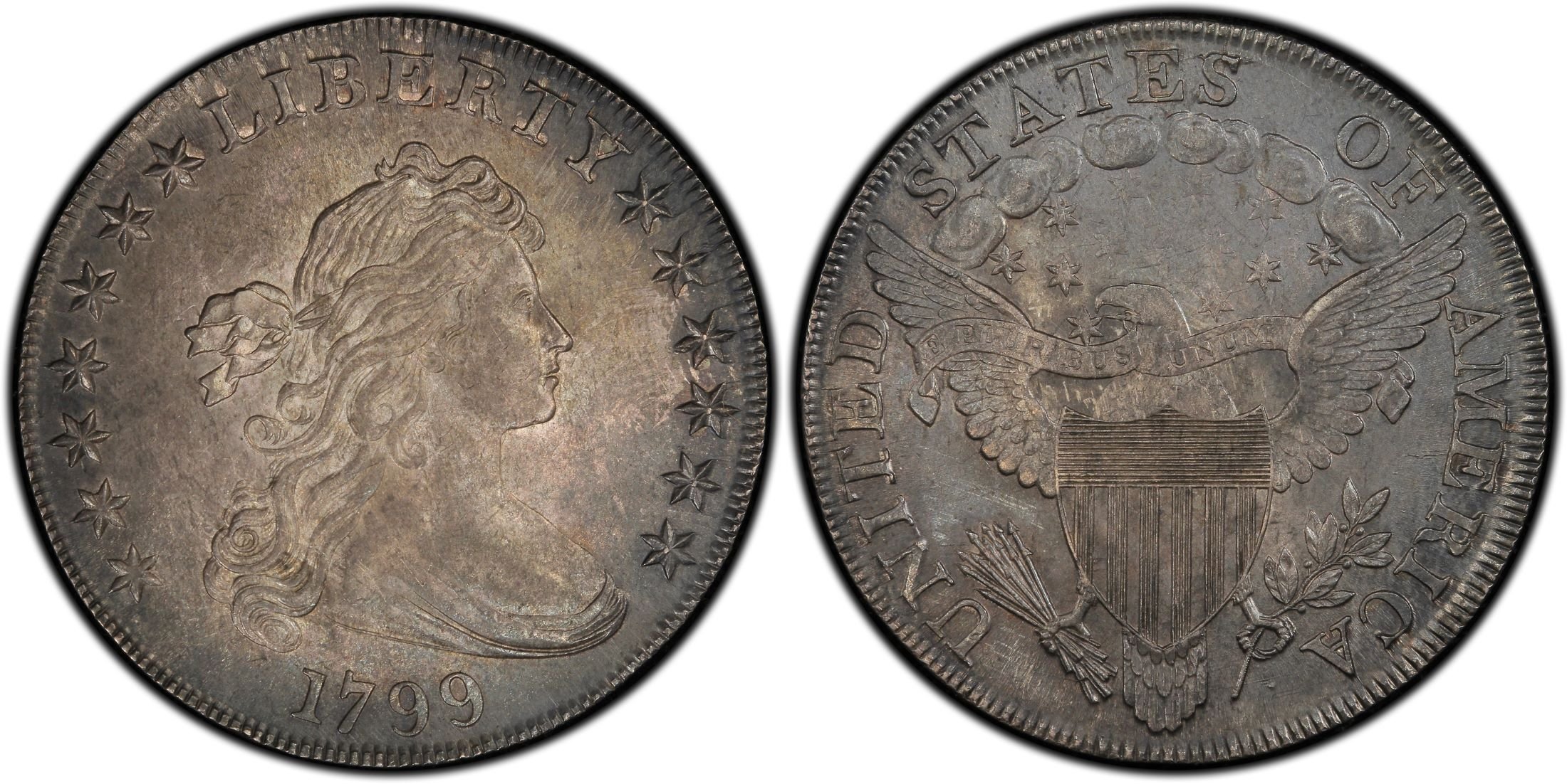
Comments
Yours looks like a nice coin. I wonder if you actually harmed the value of the coin since it was definitely in a PCGS OGH if you purchased it in 1997 and now it's in a new blue holder. The + designation may or may not give it much more value and there is a large spread between MS62 and MS63, but I would suspect that the premium look of the coin in combination with the OGH would have made it much more desirable to a large pool of folks and might have also made it more liquid and more valuable, as well.
In honor of the memory of Cpl. Michael E. Thompson
Agree with TomB on the OGH and agree the pic looks very dull in the TV shown
Latin American Collection
Yeah, not the picture I would have taken of that coin, given the luster you're showing in the 2nd picture. I can go either way with the old holder. There's a bump in the price guide from 62 to 62+, and people that see the coin in the current holder looking for an upgrade will jump on it thinking it should upgrade in a few tries. Keep it in the old holder and they'll think the same thing, but be less likely to pull the trigger because of the holder, and they'll have to be more convincing to get buyers to look past the grade and get premium money. Of course, a pristine old holder sort of does that for you.
Bottom line: Very nice coin!
Keeper of the VAM Catalog • Professional Coin Imaging • Prime Number Set • World Coins in Early America • British Trade Dollars • Variety Attribution
Grey TruView vs. that?
C'mon, you are pulling my lariat. The difference is significant.. TV, thumbs down. Nope.
Those are two different coins @epcjimi1
Latin American Collection
the top two pics are the same coin and the third is the second MS62+ on CoinFacts
No Kidding, TrueViews are disappointing at times. I thought that the point, but whatever. Two of the pics are the same coin, there is a second. My head hurts.
I've noticed they have a hard time with nickels that have hazy surfaces
@basetsb_coins on Instagram
So, which images look more like the coin in-hand most of the time? The PCGS images appear to show the coin laying flat, but your image makes it appear that you had to tilt the coin to bring out the luster. If the coin generally appears like the PCGS images then that may very well be more accurate and perhaps your shot might be considered more in line with a "glamour" shot. I have no idea either way.
In honor of the memory of Cpl. Michael E. Thompson
The pic I took is closer to the real thing. With my point and shoot I most likely had the holder at a tilt as I have trouble with light reflecting off the slab and that has changed the appearance but the real thing is closer to my image than the Trueview.
When I'm at the bank I'll attempt getting a few pics.
I had the impression when I first saw the TrueView that the image was not compared to the real thing
What did the guys at PCGS say when you asked about having it re-photographed?
They're usually pretty good when you give them a chance.
I have found that true view's either glorify a coin or slam it! I will take my pictures all day long over a true view!
Yeah, the TrueView image looks too juiced and surrealistic. It does bring out the weak stars though.
- Jim
not a fan of trueviews. Feels like the coin is juiced and then get disappointed when you see it IN HAND
Many members on this forum that now it cannot fit in my signature. Please ask for entire list.
To the OP:
Everyone is confused by the different photos you've posted. I had to read your post two or three times to sort it out (I think). Maybe you should clarify which photos are of your coin and which are of an entirely different coin.
This thread is interesting because, in this case, it seems like the TrueView is more subdued than the coin in hand.
Hmm...seemed straightforward to me. Top pic in OP is the (disappointing) TV. Next pic is OP's point-and-shoot of the same coin to show luster. 3rd pic is a different 62+ on Coinfacts (not sure why it's there and should probably be deleted for clarity).
Lance.
The 3rd pic is there for comparison. I think the point is that the first TV in the OP isn't very flattering while the second TV is.
Very nice coin in any holder. Your photo, definitely shows it off better, though.

Donato
Donato's Complete US Type Set ---- Donato's Dansco 7070 Modified Type Set ---- Donato's Basic U.S. Coin Design Set
Successful transactions: Shrub68 (Jim), MWallace (Mike)
Seems clear to me... unflattering TV, coin has attractive surfaces in owner's picture.... The third coin was put in for comparison.... Back to the point....Nice coin, have the TV redone...Cheers, RickO
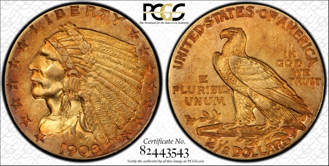
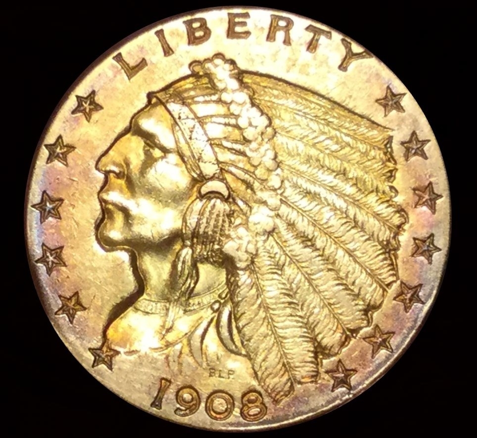
I've had a few trueviews that I was a little disappointed with. I like gold toners, and they seem to not show the color as well as silver toners do. Here is a 1908 $2 1/2 I shot with an ipod, vs the trueview. Their pictures shows the detail a lot better, but not the purple toning as well.
Yep. Confused me. I thought the 3rd pic. was the TV too, because I've seen a lot of TV's that have that over-saturated look to them.
- Jim
I'm surprised people don't take videos of their coins to show how color changes with movement.
My currency "Box of Ten" Thread: https://forums.collectors.com/discussion/1045579/my-likely-slow-to-develop-box-of-ten#latest
I much prefer the truview to your pic.
To be fair, when a coin gets imaged, the photographer might need to make some creative decisions. Do I "light it up", do I go "subtle," do I bring out PL qualities, do I show frost, color, etc., etc. I do this all the time. All of these options are not always mutually inclusive, however. One person might feel like the image of the coin should look like XX, while another one feels like it should look like YY. It's the same coin, but which aspects of the coin are brought forth will differ. I don't know that to be the case here, but I will say that I think about it all the time, as I'm sure the PCGS photographers do as well.
It is true that we do have to make some creative decisions in the taking of the photo or choosing of the image of what appears online.
We do keep some alternate shots on record from 2012 onward. You can ask us to see of we have a more suitable shot on file. Just email us at photography@pcgs.com. The photo in question was taken at the end of 2013.
We're always willing to make things right if there is a shot that a customer feels is unsatisfactory.
Just as some of you may submit coins for grading and are occasionally disappointed with the result, so too can you submit a coin for imaging and likewise be disappointed. We're only human, but as I said willing to make it right.
Constructive criticism is important for things as subjective as photography, and it keeps me on my toes, and thinking of ways we can improve.
Phil
Radiant Collection: Numismatics and Exonumia of the Atomic Age.
https://www.pcgs.com/setregistry/showcase/3232
Well, obviously their picture is better, but I wish it showed the purple toning like mine does.
@BIGAL2749 looks like I do have an alternate image in our archives that more closely resembles your photo. Would you like me to update it online?
Thanks
Radiant Collection: Numismatics and Exonumia of the Atomic Age.
https://www.pcgs.com/setregistry/showcase/3232
I like that alt image a LOT better. I vote for updating it online!!!")
ANA LM
USAF Retired — 34 years of active military service! 🇺🇸
Taking photos is not straightforward. You have to consider the lighting. On a toned coin, you have darker and lighter colors on the same image. You have to consider the ASA and white balance of the shot. Then there's the issue of filters and the degree of how vivid you want the color to be without juicing the image. I have enough trouble getting it right with pics of wildlife. I wouldn't want to have to deal with all of this taking photos of coins.
"Seu cabra da peste,
"Sou Mangueira......."
@PCGSPhoto said:
Yes I would like it posted online
I have to say I received a PM from a member who gave me a lot of information and suggestion that I contact you. He's aware that alternate images are kept many times.
Just being aware of someone not totally happy with an image and going out of your to research an alternative is certainly some great customer service.
BTW the last 2 TrueViews on my last submission were great.
Care to elaborate on what you are hinting at about the new holders?
OK, the image is now updated. Here is a link to the TrueView:
http://images.pcgs.com/trueview/28572794
Radiant Collection: Numismatics and Exonumia of the Atomic Age.
https://www.pcgs.com/setregistry/showcase/3232