Most beautiful US regular issue coin
 moursund
Posts: 3,207 ✭✭✭✭✭
moursund
Posts: 3,207 ✭✭✭✭✭
I've long thought that the walking liberty half has THE greatest US coin design.
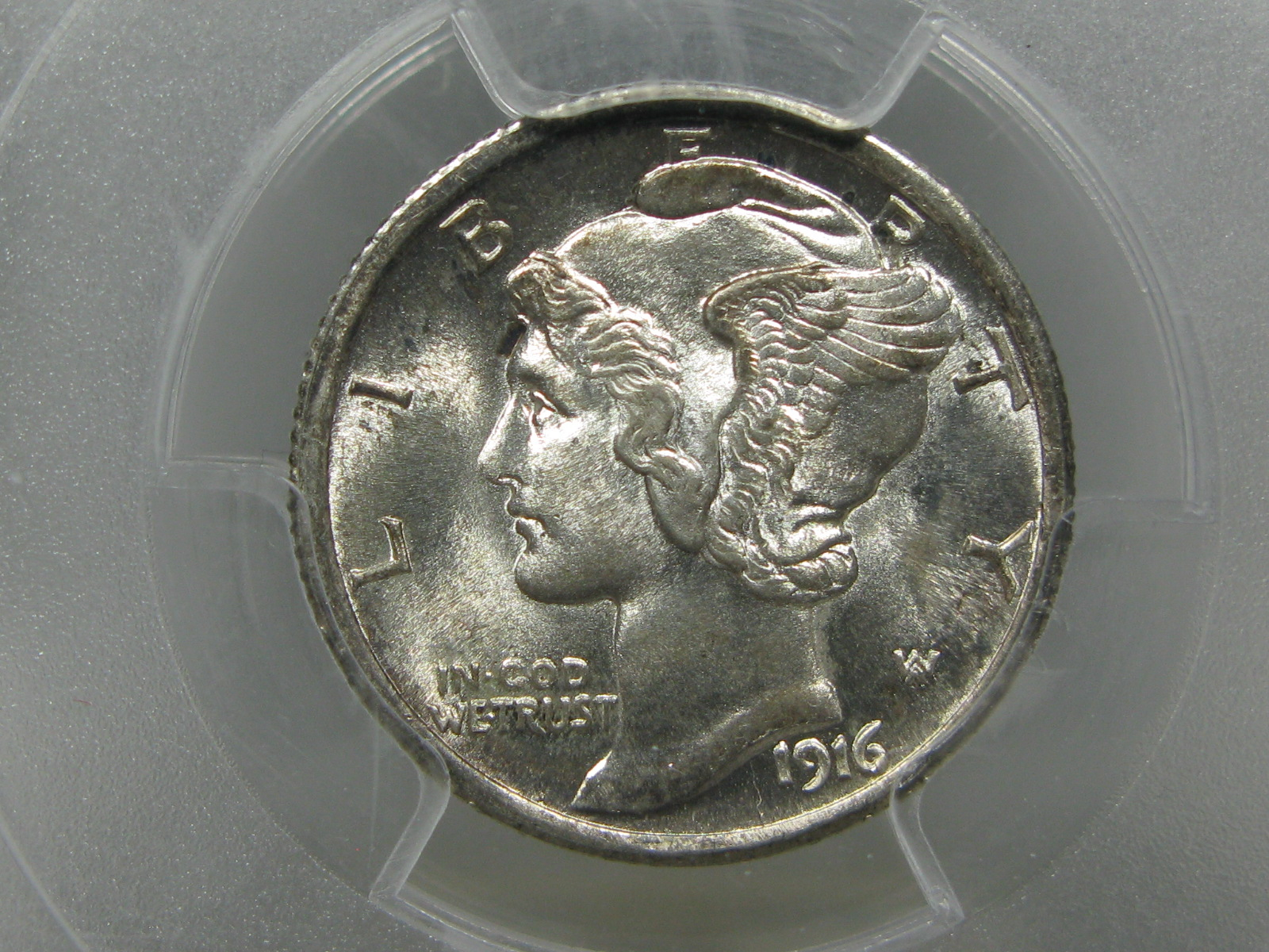
The mercury dime is right up there as well.
If the mercury dime were instead the mercury half, would it be as impressive as the walker?
am
100th pint of blood donated 7/19/2022 ") . Transactions with WilliamF, Relaxn, LukeMarshal, jclovescoins, braddick, JWP, Weather11am, Fairlaneman, Dscoins, lordmarcovan, Collectorcoins, SurfinxHI, JimW. God so loved the world that he gave his only begotten son, that who so believeth in him should not perish but have everlasting life.
. Transactions with WilliamF, Relaxn, LukeMarshal, jclovescoins, braddick, JWP, Weather11am, Fairlaneman, Dscoins, lordmarcovan, Collectorcoins, SurfinxHI, JimW. God so loved the world that he gave his only begotten son, that who so believeth in him should not perish but have everlasting life.
0
Comments
No
My collecting “Pride & Joy” is my PCGS Registry Dansco 7070 Set:
https://www.pcgs.com/setregistry/type-sets/design-type-sets/complete-dansco-7070-modified-type-set-1796-date/publishedset/213996
I think the reverse could be very interesting vs the walking liberty half but overall, no, the walking liberty would still be a more overall aesthetic choice. It’s not a fair comparison, though, as both had very different canvas sizes to work with for a design.
Ok, would it run a close second?
I really like mercs, but my eyes are getting old, so I find I don't like them quite as much as I used to. Too small.
I suppose a similar point could be made for the ugliest US circulation strike... The Ike dollar might out-ugly even the SBA, because it has more ugly canvas with which to work...
I think the Standing Lib Quarter obverse can give the Walker a run for the money on a Half Dollar size planchet.
Steve
My collecting “Pride & Joy” is my PCGS Registry Dansco 7070 Set:
https://www.pcgs.com/setregistry/type-sets/design-type-sets/complete-dansco-7070-modified-type-set-1796-date/publishedset/213996
I think the Ike design is somewhat proportional. The reverse I never really liked. The whole design is a bit too utilitarian for my taste. Still the large size rescues it from being as bad as the SBA with the retread reverse and unfortunate obverse.
The one and only. I am very bias though.
.
Ken
The mercury obverse is on the palladium eagle
You can get an idea from that
Around here this one gets talked about a lot
The $10 Indian head design is already close to a half in size. That would make a great half dollar look in silver, IMO.
Liberty Seated Dollars are hands down the most beautiful design IMHO.
Draped bust large eagle reverse
Not the most beautiful design but the BEST design is, in my opinion, the Buffalo nickel. I will agree that the most beautiful design is, indeed, the Walking Liberty half, especially the reverse.
Call me crazy, but the Barber half has a great design on both obverse and reverse. Much better size than the quarter and dime to really get the details out.
You must be crazy. Barber design is boring and it looks like a man.
Successful BST with ad4400, Kccoin, lablover, pointfivezero, koynekwest, jwitten, coin22lover, HalfDimeDude, erwindoc, jyzskowsi, COINS MAKE CENTS, AlanSki, BryceM
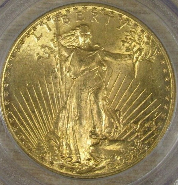
The 1907 High Relief $20 gold was technically a regular issue and still the best. The Walker is next in Proof.
Flowing hair cent wreath reverse.
Paper money eventually returns to its intrinsic value. Zero. Voltaire. Ebay coinbowlllc
Buffalo nickel was IMO the best (and nicely done on the 2008 1/4 oz buff esp. in unc).
Well, just Love coins, period.
Walking Liberty half dollars are the most beautiful regular issue. The Buffalo nickel and Mercury dime are the best executed designs for the size. Worst executed coin has to be the Franklin half dollar, especially the puny second-thought eagle on the reverse.
"Bongo hurtles along the rain soaked highway of life on underinflated bald retread tires."
~Wayne
Weinman explained that he used a bust for his dime design due to the limited size of the coin:
.
So were the design to be on a coin the size of the half dollar, Weinman would not have submitted a bust design. It is likely that Weinman would not have been satisfied with his Winged Liberty design to be used on a half-dollar sized coin.
My strategy is about collecting what I intend to keep, not investing in what I plan to sell.
Well, there are different considerations. If you're looking for a well-balanced design that strikes up well, promotes long die life, and provides uniform wear throughout the life of the coin, the Barber quarter and half dollar probably win the prize. Barber might have sculpted a somewhat handsome woman, but he knew how to make a coiner's coin.
If you're looking for aesthetics, the Walker and Merc have their proponents. The motif of the Walker obverse drew heavily from a French design, La Semeuse.
I favor the Peace dollar, which was fantastic in concept, but was ultimately plagued by striking difficulties. Sadly, the HR Saint had some of the same issues.
If you're looking for a purely American design, devoid of themes and elements originating in Western Antiquity (wreaths, fasces, phyrigian caps, etc,) it's pretty hard to beat the Buffalo nickel. It has a really gorgeous design and the rugged fields and motifs are uniquely our own.
Peace dollar obverse, A+. Reverse, A-. The peaceful eagle just isn't striking enough. Are those the striking difficulties of which you speak?
No, the original 1921 design was executed in a much higher relief than the 1922-64 coins. The 1921 was only struck for 4 days between Christmas and New Year's Day and die life was a real problem. They modified the design and lowered the relief for the rest of the series.
More or less it's the same problem that plagued the Saint.
One other issue with the Peace dollar is that it just isn't that pretty when weakly struck or in grades much less than MS65 or MS66. The size of the coin and large fields and large, flat devices tend to attract hits. In high grades, it's stellar:
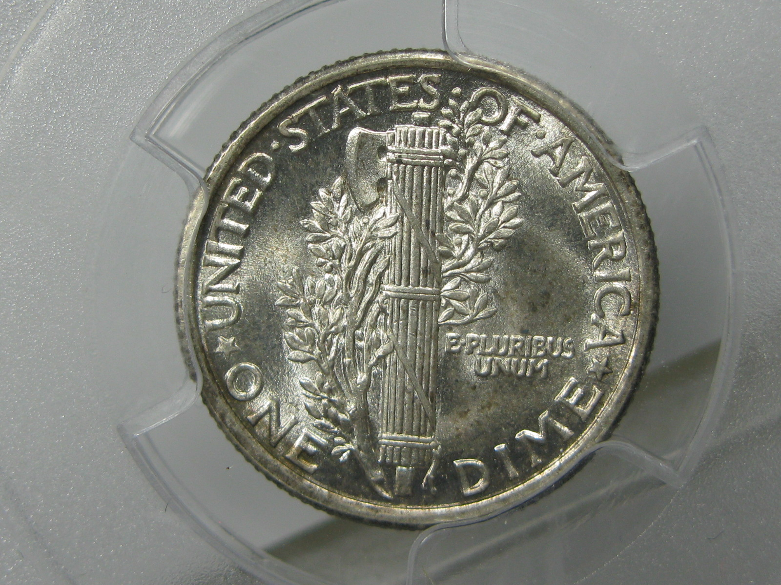
The reverse on the Mercury does not have an eagle, so wouldn't qualify.
I agree with you on the WLH - beautiful, best US design. Especially the reverse.
Obv from Mercury and rev from WLH would be an appealing coin IMHO.
St Gaudens Double Eagle Has been and will be the top design for a long time.")
I certainly like the Peace dollar better than the Morgan but I have never been able to get around Liberty's lower hypognathic (underdeveloped) jaw that spoils her overall looks....
Well, just Love coins, period.
You guys are nuts. It the Roosevelt dime hands down
Martin
I know this isn't an American coin but as far as a beautiful foreign coin goes this one is at or near the top IMO-
But, as I stated above, here's the most beautiful US coin. Just my opinion, of course. I thought I'd do it with images instead of just text-
And, of course, my favorite-
Beauty is always a contentious issue when it comes to specifics. We can always get a consensus, and some will agree on one, while others insist on another. That applies in art and beauty contests as well. For me, it certainly is the WLH. I will say, that coins from the past certainly were more artistic in design, for the most part. Cheers, RickO
The Barber coins and the Standing Liberty Quarter, especially the Type 1, look good in Mint State, but once they get some wear on them, the beauty disappears in my opinion.
The Saint Gaudens double eagle (especially the high relief) is by far the most beautiful regular issue US coin. Honorable mention goes to the buffalo nickel, the peace dollar, the WLH, the SLQ, and the Indian $10 and $5. As far as the classic commemoratives, the obverse of the Panama Pacific Exposition gold $2.5 is the most beautiful with the Oregon Trail half dollar coming in second place. Of course, beauty is in the eyes of the beholder and your list may be different from mine.
Worry is the interest you pay on a debt you may not owe.
"Paper money eventually returns to its intrinsic value---zero."----Voltaire
"Everything you say should be true, but not everything true should be said."----Voltaire
My favorite coin with just a portrait on it, is the early Draped Bust design.
My favorite full figure coin, is the Walker.
The peace dollar is probably the most overrated US design ever.
Proportionally it is a complete failure, both obverse and reverse.
1907 $10 no motto is one of my favorites.
That's exactly why I'm looking forward to the 2021 Peace Dollars. I think that these will be a better rendition than the original series for that reason.
It's a clean design. Only thing is TR forced Saint Gaudens to put that Indian Headdress on Liberty. It would be nicer with no headdress.
CAPPED BUST HALF DOLLARS (1807-1839)
Wayne
Kennedys are my quest...
This is not quite a regular issue, but it's the design I would most like to see on a half-dollar sized coin
Or this, second choice:
Commems and Early Type
Problem with proof walkers is that they're a pain to find fully struck. The 2016 gold Walker is the most fully struck walker you'll find.
The 1907 High Relief Double Eagle is an amazing coin. It gets my vote for the best.
Proof Walkers are wonderful coins, but can proofs be considered "regular issue"? Here's one of mine:
That’s a great design but why half dollar size, why not on a dollar sized coin?
If it’s not going to be quarter size, my preference would be for dollar size. Half dollars still seem small to me next to a dollar.
Here’s a couple of my picks:
My YouTube Channel
Draped bust large eagle reverse> @Martin said:
This is one of the worst designs but I'll admit, it's better than the SBA dollar and some of the Chuck-E-Cheese look-a-likes starting with the SQ program.
Chuck-E-Cheese tokens have a pretty decent collector following too!
That design would make for an outstanding coin on anything from a quarter on up.
The 1936 Proof half dollars are pretty sharp because the mintage was low. This piece looks better in person because the haze is much less pronounced when you see it in person.
This 1942 Proof Half Dollar is graded PR-67 and is very pretty. It's bear to photograph, however.
But it's hard to beat this.
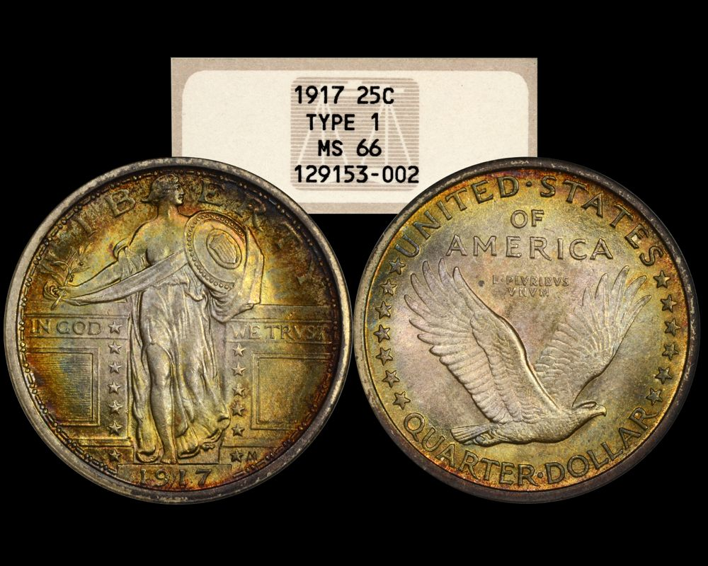
I’d have to go Standing Liberty Quarter, Type 1
Dave
From CoinFacts:
"She comes out of the sun in a silk dress,
running like a water color in the rain...."
That's a really purdy coin there, but I wouldn't say the design is in the top tier...
The Waking Liberty half gets my vote.
As those others mentioned so far, I have never heard the Roosevelt dime design described as “beautiful” before that earlier post.
Perhaps that was tongue in cheek? LOL.
I do like the Oregon Trail commem. if that can count. My favorite coin, or one of my favorites is the Dan Carr matte proof 1927 Oregon Trail. Will try to put a picture of it on here in a couple of hours...
Well, just Love coins, period.