Stay away from "alternate weird colors" like blue, red, purple, orange, green. They can clash, esp if a coin has toning.
The only two background choices on the table should be white (with an option for black)
I would do this
Keep the standard TrueView (the one displayed in the Registries, the Showcase, in CoinFacts, and on the Cert Verification page) with a white background with black letters (for consistency with the millions of existing Trueviews)
Then on the TrueView download page, have the standard ones be white ... but one of the options can be a Large Black background so people could download those and display in the forums should they choose.
Before you get too deep into this, the question should be asked:
What problem do you have with the current design that you are trying to fix in the redesign?
Don't fall into the trap of "changing just to change" -- that's the trap that many application builders fall into. They need to justify their jobs, so they change stuff for no good reason and the change is typically for the worse (See Microsoft Office, etc.)
If your hand is being forced from above to change just to change -- and if there is no actual value added with the new design -- make sure (if nothing else) the new design is more beautiful, more artistic, more elegant.
Is that the SAME photo placed on black & white backgrounds?
I ask because if so, the color background changes the appearance of the coin. The Peace dollar on the white has what appears to be a lighter contrast than the Peace dollar shot on the black background. To my eye, it looks like two seperate photo's on two seperate backgrounds. I can see that it is the same coin on both.
Also, I would like to see the grade posted on the tru-view.
I think having the option for either a black or white background would be best. I'd love to see the grade on the TrueViews as well as many others have already mentioned.
Putting the grade in the gold shield would get the grade onto the TrueView without cluttering up the image too much, which could be a problem. Here's a mock-up, of something that could work. The only thing that would likely need to change is the size of the PCGS (and shield) to allow the space for designations and plus grades.
I think it really depends on the color of the coin as far as the background color is concerned. Black looks great with the gold coins, and white with darker toned coins. But please put the grade on the TV's.
If you are going to put grades on, you need room for all the qualifiers: MS66 FS DMPL. Im not sure what the longest possible string is. Also arent TV’s shot before the grades are posted? Adds a bit of a timing issue
@shish said:
Both, add a column on the submission form to select the color.
Add the grade to the TV.
Not on the submission form- when the order is complete you get a link to download the photos. Just add check-boxes on that page and download it any way you want!
Putting the grade on a Trueview will add to turnaround times. The coins are imaged Raw. They would have to wait for the graders to finish before they could send out the images.
@BG said:
Putting the grade on a Trueview will add to turnaround times. The coins are imaged Raw. They would have to wait for the graders to finish before they could send out the images.
Presumably the grade would automatically populate on the TrueView template after the grade is posted, and wouldn't be manually added. Also, images currently are only sent out after the grades are posted.
will there be an option if possible to transfer current images from Gen. 1-2 TV's into this new Gen. 3 template??
Putting the grade on a Trueview will add to turnaround times. The coins are imaged Raw. They would have to wait for the graders to finish before they could send out the images
I always thought that imaging was done after grading and prior to encapsulation.
This is an unrelated question, but I am curious what the grading / photo flow is. The reason I ask is I like to view the 'most recent changes' on CoinFacts to see beautiful coins I will probably never have or afford. Sometimes there are mechanical errors, and I would think another set of eyes could help stop this. Such as this coin, where the mintmark was missed posted on 12/20.
'#1 is better on the whole for more coins than #2.
-- Maybe the PCGS could be a little larger ?
-- More importantly, would you want to say Certification instead of Certificate? It's not a Certificate. I've wondered this before. The coin is certified. I know it has been on there a long time, but maybe now is a good time to change?
@PCGSPhoto Are there any considerations to better support varieties and edge views like the following? The following are great, but obscure the PCGS logo.
I like the shield on the slab insert where there is a gradient on the gold better than the flat yellow on the TrueView which seems like a lot of empty yellow space.
The PCGS TrueView logo on top looks small compared to the certification number on the bottom making the image look a bit unbalanced. The logo looks like it's just floating around in a large area of white.
It seems a bit odd for the white background to be more obscured on the top center than all of the center currently. It also seems unbalanced lower it seems more whiteish near 8 o'clock on the reverse than 4 o'clock on the obverse. Now I see the gray background on the white transitions to a white background on the right. I like a bit more symmetry and balance.
Not too crazy about the words or the font for "TRUE VIEW". The previous subtitle seems more classy.
As many of you have observed, our new template has been deployed. Hopefully you're all used to it now. In fact I prefer it to the old templates. The logo and background are far less intrusive in the new version I find.
Are the old images going to be reformatted to the new template? One of the great thing about the PCGS images is consistency. Without changing to format on the old images, sets will show a mixture of templates... not as attractive.
As many other contributors have stated, I would love to see the grades added to the image.
@LincolnCentMan said:
Are the old images going to be reformatted to the new template? One of the great thing about the PCGS images is consistency. Without changing to format on the old images, sets will show a mixture of templates... not as attractive.
As many other contributors have stated, I would love to see the grades added to the image.
….I'm good with either background color.
David
Let us know your certs at photography@collectors.com and we can reprocess your older images so they have the new template to keep your TrueViews consistent.
@LincolnCentMan said:
Are the old images going to be reformatted to the new template? One of the great thing about the PCGS images is consistency. Without changing to format on the old images, sets will show a mixture of templates... not as attractive.
As many other contributors have stated, I would love to see the grades added to the image.
….I'm good with either background color.
David
Let us know your certs at photography@collectors.com and we can reprocess your older images so they have the new template to keep your TrueViews consistent.
everyone has their personal preferences and it can hard to make a decision on what will please everyone. to me, the TrueView images have one similarity to slab inserts --- there is a fine line between too little information and not enough information present. there's a tipping point where things look cluttered or empty.
my opinion is that we have reached that point, probably a little over it.
@PCGSPhoto said:
As many of you have observed, our new template has been deployed. Hopefully you're all used to it now. In fact I prefer it to the old templates. The logo and background are far less intrusive in the new version I find.
Thanks for the update Phil. It's good to see progress but it can take a bit to get used to it.
It's still growing on me. Some of my thoughts posted above still hold regarding symmetry:
Left and Right Symmetry: The background seems darker on the left and the right due to the gray being on the background on the left and the logo on the right. I prefer more symmetry between left and right.
Top and Bottom Symmetry: The PCGS logo on top looks small relative to the cert number on the bottom. It would be nicer if they were more proportional to each other for balance. This is particularly noticeable to me around the margins between the logo / text and the coin photos.
Still looking forward to the black version which seems more symmetric from left to right.
1) The asymmetric fade seems a bit too pronounced for my taste, but this is likely simply due to it being new.
2) The "PCGS TRUEVIEW" at the top clashes with the more elegant typeface used at the bottom of the image for the cert number and additional information. Indeed, the typeface used at the top looks cartoonish when compared to the rest of the product.
3) Additionally, the "PCGS TRUEVIEW" text at the top really does appear to be too small given its blocky nature and the fact that it is plopped down in the middle of an otherwise white area of the fade.
4) It may be possible to minimize some of points two and three if "TRUEVIEW" were to appear in the same typeface as the bottom text.
5) I have no doubt we will all get used to this and embrace it, but I am not loving it.
Comments
Stay away from "alternate weird colors" like blue, red, purple, orange, green. They can clash, esp if a coin has toning.
The only two background choices on the table should be white (with an option for black)
I would do this
Keep the standard TrueView (the one displayed in the Registries, the Showcase, in CoinFacts, and on the Cert Verification page) with a white background with black letters (for consistency with the millions of existing Trueviews)
Then on the TrueView download page, have the standard ones be white ... but one of the options can be a Large Black background so people could download those and display in the forums should they choose.
My Coin Blog
My Toned Lincoln Registry Set
Before you get too deep into this, the question should be asked:
What problem do you have with the current design that you are trying to fix in the redesign?
Don't fall into the trap of "changing just to change" -- that's the trap that many application builders fall into. They need to justify their jobs, so they change stuff for no good reason and the change is typically for the worse (See Microsoft Office, etc.)
If your hand is being forced from above to change just to change -- and if there is no actual value added with the new design -- make sure (if nothing else) the new design is more beautiful, more artistic, more elegant.
Yes, it's different, but is it better?
My Coin Blog
My Toned Lincoln Registry Set
I like the new background but I also like the old font.
An option on the TrueView download page for black would be great! Maybe a poll is warranted for adding the grade or not.
Check out my iPhone app SlabReader!
I like the old font more. I like the addition of the gold shield, but not the addition of TrueView to the template.
- Bob -

MPL's - Lincolns of Color
Central Valley Roosevelts
Is that the SAME photo placed on black & white backgrounds?
I ask because if so, the color background changes the appearance of the coin. The Peace dollar on the white has what appears to be a lighter contrast than the Peace dollar shot on the black background. To my eye, it looks like two seperate photo's on two seperate backgrounds. I can see that it is the same coin on both.
Also, I would like to see the grade posted on the tru-view.
I can't tell the difference. The coin looks the same
Practice makes perfect & nobody is perfect. So, practice being nobody.
I think having the option for either a black or white background would be best. I'd love to see the grade on the TrueViews as well as many others have already mentioned.
Putting the grade in the gold shield would get the grade onto the TrueView without cluttering up the image too much, which could be a problem. Here's a mock-up, of something that could work. The only thing that would likely need to change is the size of the PCGS (and shield) to allow the space for designations and plus grades.
I prefer no grade on the holder. We collect coins, not grades.
I like the option of choosing the background (white vs. black) or having both available. Gold coins look smashing with a black background.
On the holder or the image?
I meant image...but now that you mention it... 😉
I think it really depends on the color of the coin as far as the background color is concerned. Black looks great with the gold coins, and white with darker toned coins. But please put the grade on the TV's.
Later, Paul.
If you are going to put grades on, you need room for all the qualifiers: MS66 FS DMPL. Im not sure what the longest possible string is. Also arent TV’s shot before the grades are posted? Adds a bit of a timing issue
My Coin Blog
My Toned Lincoln Registry Set
Not on the submission form- when the order is complete you get a link to download the photos. Just add check-boxes on that page and download it any way you want!
Putting the grade on a Trueview will add to turnaround times. The coins are imaged Raw. They would have to wait for the graders to finish before they could send out the images.
Presumably the grade would automatically populate on the TrueView template after the grade is posted, and wouldn't be manually added. Also, images currently are only sent out after the grades are posted.
Gobrecht's Engraved Mature Head Large Cent Model
https://www.instagram.com/rexrarities/?hl=en
proposing a change to any long standing product is like jamming a stick into a hornets nest ...
My Coin Blog
My Toned Lincoln Registry Set
will there be an option if possible to transfer current images from Gen. 1-2 TV's into this new Gen. 3 template??
Putting the grade on a Trueview will add to turnaround times. The coins are imaged Raw. They would have to wait for the graders to finish before they could send out the images
I always thought that imaging was done after grading and prior to encapsulation.
When we image coins based on what's most efficient for product workflow in our operations.
Thanks for the feedback, everyone!
Radiant Collection: Numismatics and Exonumia of the Atomic Age.
https://www.pcgs.com/setregistry/showcase/3232
This is an unrelated question, but I am curious what the grading / photo flow is. The reason I ask is I like to view the 'most recent changes' on CoinFacts to see beautiful coins I will probably never have or afford. Sometimes there are mechanical errors, and I would think another set of eyes could help stop this. Such as this coin, where the mintmark was missed posted on 12/20.
Personally I like the black background WITH THE GRADE. The label is a product of PCGS, so why not display it like this:
I'm not suggesting the shadow technique, just the label......
'#1 is better on the whole for more coins than #2.
-- Maybe the PCGS could be a little larger ?
-- More importantly, would you want to say Certification instead of Certificate? It's not a Certificate. I've wondered this before. The coin is certified. I know it has been on there a long time, but maybe now is a good time to change?
Not a fan of the black background
Black background with the grade would suit me fine.
I like the current PCGS at top without the shield or the grade.
Leave it like it is and give option of back ground color of black or white.
Black is the way to go.
Nic
Guides Authored - Graded Card Scanning Guide PDF | History of the PSA Label PDF
Importantly, the coin image should reflect how the coin looks “in-hand”. No juice!
He who knows he has enough is rich.
@PCGSPhoto Are there any considerations to better support varieties and edge views like the following? The following are great, but obscure the PCGS logo.
Some additional thoughts:
Here's a comparison with 2 previous generations.
As many of you have observed, our new template has been deployed. Hopefully you're all used to it now. In fact I prefer it to the old templates. The logo and background are far less intrusive in the new version I find.
Radiant Collection: Numismatics and Exonumia of the Atomic Age.
https://www.pcgs.com/setregistry/showcase/3232
Choice of background color and grade is like my dream scenario
😂
"Inspiration exists, but it has to find you working" Pablo Picasso
Are the old images going to be reformatted to the new template? One of the great thing about the PCGS images is consistency. Without changing to format on the old images, sets will show a mixture of templates... not as attractive.
As many other contributors have stated, I would love to see the grades added to the image.
….I'm good with either background color.
David
Don't change anything
I hate change.
And stay off my grass.
*mumbles *
My Saint Set
Let us know your certs at photography@collectors.com and we can reprocess your older images so they have the new template to keep your TrueViews consistent.
Radiant Collection: Numismatics and Exonumia of the Atomic Age.
https://www.pcgs.com/setregistry/showcase/3232
How about dark side coins?
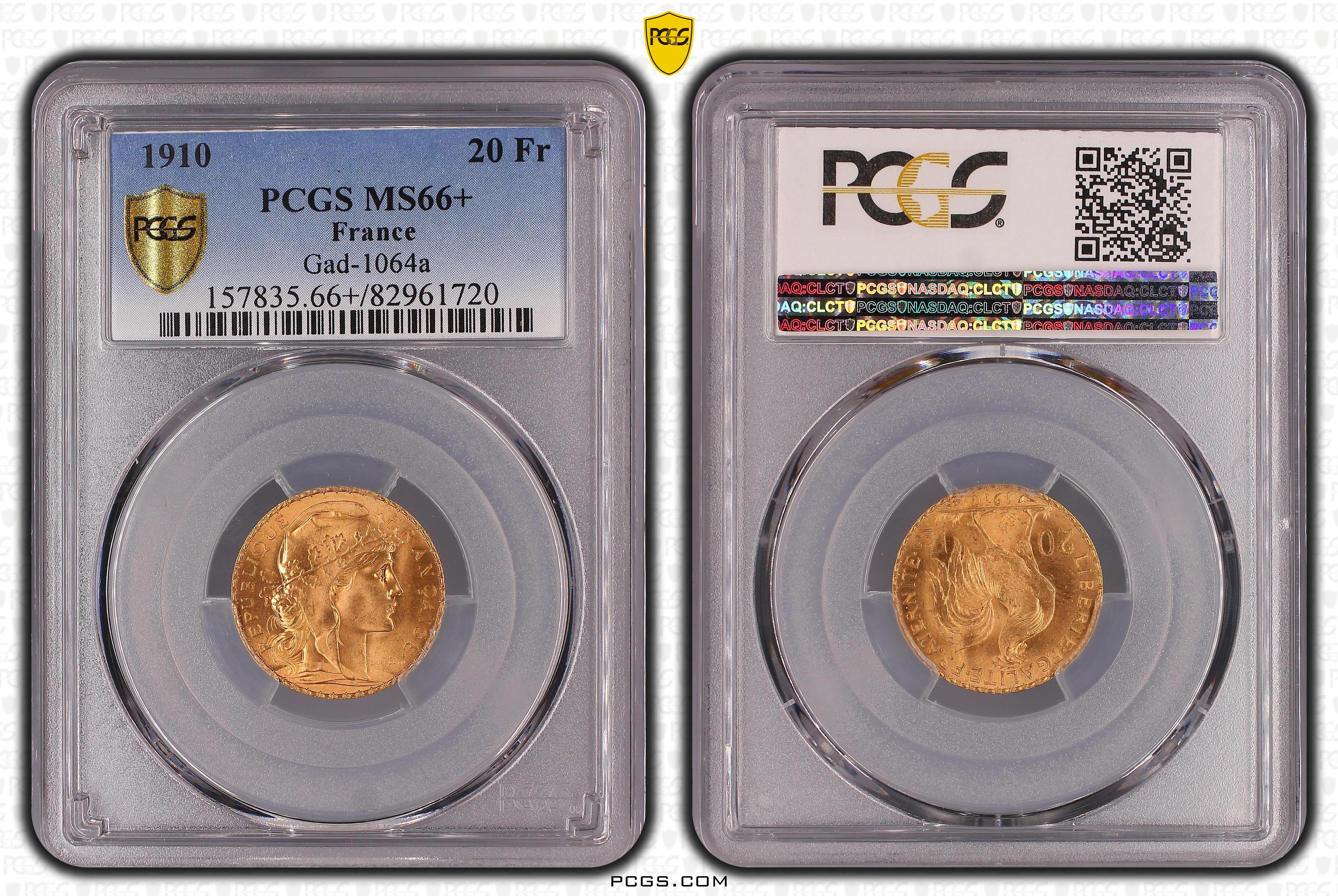
Every time I get a coin from Europe, the TrueView is this messed up slab pic..
My Saint Set
Why was the grade ever hidden to begin with?
Good to know. Posting so I remember.
That’s not a TrueView, but the slab scans we produce at the Paris, HK and Shanghai offices.
Radiant Collection: Numismatics and Exonumia of the Atomic Age.
https://www.pcgs.com/setregistry/showcase/3232
everyone has their personal preferences and it can hard to make a decision on what will please everyone. to me, the TrueView images have one similarity to slab inserts --- there is a fine line between too little information and not enough information present. there's a tipping point where things look cluttered or empty.
my opinion is that we have reached that point, probably a little over it.
Thanks for the update Phil. It's good to see progress but it can take a bit to get used to it.
It's still growing on me. Some of my thoughts posted above still hold regarding symmetry:
Still looking forward to the black version which seems more symmetric from left to right.
Black mikes the coin pop! I would like to see the grade added
https://www.pcgs.com/setregistry/quarters/washington-quarters-major-sets/washington-quarters-date-set-circulation-strikes-1932-present/publishedset/209923
https://www.pcgs.com/setregistry/quarters/washington-quarters-major-sets/washington-quarters-date-set-circulation-strikes-1932-present/album/209923
How interesting, none of the solicited comments had any impact on the final product.
edit to note the numeric font was changed.
I like that the goofy numeric font was retained. Thanks.
Also, if you are done with that 1829 half dollar and need to sell it - I'd be an interested buyer.
Thanks to @mach1ne and @robec for commenting on that earlier. I like the old / current font better too so I'm glad it was retained. It adds character.
I'm late to this party, but here are my thoughts-
1) The asymmetric fade seems a bit too pronounced for my taste, but this is likely simply due to it being new.
2) The "PCGS TRUEVIEW" at the top clashes with the more elegant typeface used at the bottom of the image for the cert number and additional information. Indeed, the typeface used at the top looks cartoonish when compared to the rest of the product.
3) Additionally, the "PCGS TRUEVIEW" text at the top really does appear to be too small given its blocky nature and the fact that it is plopped down in the middle of an otherwise white area of the fade.
4) It may be possible to minimize some of points two and three if "TRUEVIEW" were to appear in the same typeface as the bottom text.
5) I have no doubt we will all get used to this and embrace it, but I am not loving it.
In honor of the memory of Cpl. Michael E. Thompson
Such an easy fix. Put a hyper link on the Cert number. Then you still have the traffic to the website.
The coin is pretty easy to track down but could be easier if there was a link in the photo.
From the cert verification page, we can see that it's in tmitchell's Registry Set Inventory and the Mitchell Collection Registry Set.
I like the new format... plain and uncluttered.... Excellent choice (and of course, a difficult issue, since everyone has an opinion). Cheers, RickO
On a side note - why can we no longer download the largest version? These were necessary to see minor details