Options
Did you ever wonder if the Anthony dollar could have been made more ugly? Wonder no more....
 RogerB
Posts: 8,852 ✭✭✭✭✭
RogerB
Posts: 8,852 ✭✭✭✭✭
The following (awful) sketches and letter describe a serious proposal to change the reverse of the Anthony dollar from the drugged eagle landing on an asteroid, to one of these two wonderfully creative designs: the letters USA or the numeral 1.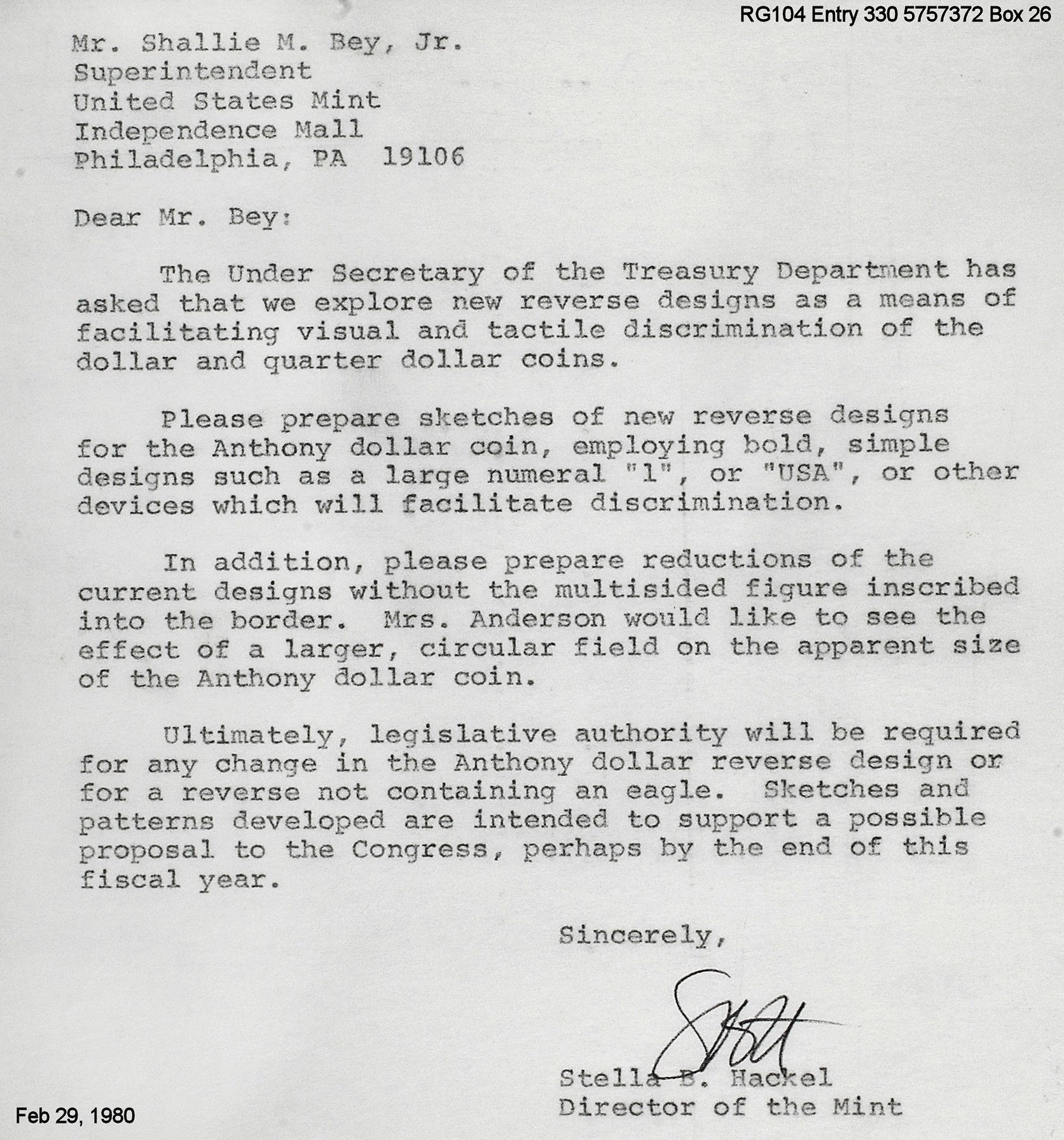
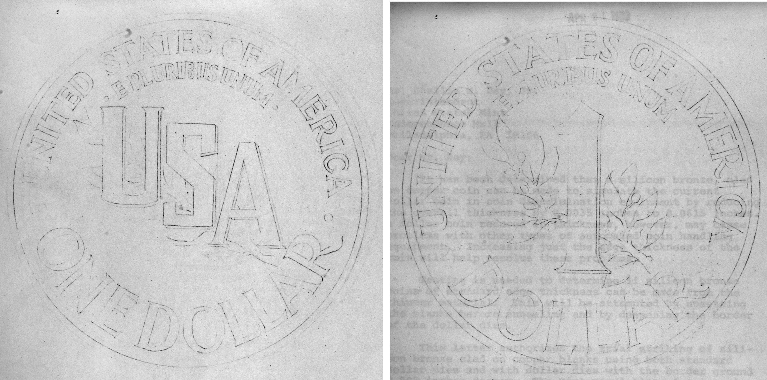
Sorry for the poor sketch quality - that's all I found in the archives.
In a follow-up letter, Engraver Gasparo was asked to eliminate the olive branch as being too complicated. More kudos (or is that kudzus ?) to Director Stella Hackel-Sims and her bursting originality.
2
Comments
If either of those changes had become official, the obverse would have looked better than the reverse.
Who could have believed that? The "USA" design was particularly appealing.
Ugly? One of my Favorite modern designs.
POST NUBILA PHOEBUS / AFTER CLOUDS, SUN
Love for Music / Collector of Dreck
The one on the right looks like a dime.
The both have a resemblance to the half dime designs of John Sinnock made in 1942. Gilroy Roberts was Sinnock's assistant and Gasparro was assistant to Roberts. (Roberts did almost all the Franklin half work.)
Too complicated? Seriously???
Was being sarcastic. If one looks at any photo of the moon from the late 1960s the features are sharp and crisply defined. The Ike/Anthony reverse is blurred, mushy and a nondescript mess. Rather than a bold, confident eagle, the coins have a fuzzy, drugged-looking bird unsure of its target.
All the archival letters indicate that Hackel was entirely supportive of this mess. Gasparro certainly did nothing to improve the situation, and the workmanship is similarly weak on the earlier Liberty version. (Just opinions and worth every cent...)
That is a coin I simply cannot enjoy..... I do have some, somewhere....although, I have since thought that the SBA, as an ugly dollar coin, set the bar for new dollar coins - and not in a good way. Cheers, RickO
The reverse is fine, although a rehash from the Ike Dollar reverse...the obverse is the bad part.
Whenver someone chants USA USA USA! I think of two things; the 1980 USA Olympic Hockey Team, and Hacksaw Jim Duggan.
BST transactions: dbldie55, jayPem, 78saen, UltraHighRelief, nibanny, liefgold, FallGuy, lkeigwin, mbogoman, Sandman70gt, keets, joeykoins, ianrussell (@GC), EagleEye, ThePennyLady, GRANDAM, Ilikecolor, Gluggo, okiedude, Voyageur, LJenkins11, fastfreddie, ms70, pursuitofliberty, ZoidMeister,Coin Finder, GotTheBug, edwardjulio, Coinnmore, Nickpatton, Namvet69,...
My guess is the mint probably took the same artwork that was used on the Ike Dollar and reduced it with a loss of detail. I never viewed that side as the Anthony Dollar to be that bad. It certainly was easier on the eyes that the obverse.
So far design changes go, I wonder if things would have been different if one of the pattern designs, like the "sailor obverse" had been used for the Twenty Cent Piece. Probably not. I think that the similarity in size, instead of the designs, did the Anthony Dollar and the double dime in. I remember what happened to the last Anthony Dollar I had in my pocket. I mistook it for a quarter, based upon size, and donated it to a charity bucket!
The big "1" would have needed some bands to split.
Susie is older than she looks.
Susan B. Anthony, Cleopatra VII
Yes, that Cleopatra, the seducer of Caesar and Mark Antony.
The Mysterious Egyptian Magic Coin
Coins in Movies
Coins on Television
Looks like SBA could have give Cleopatra a run for her money in the looks department. Not sure how SBA was at seducing, though....
I like the SBA. I give them to my son from the tooth fairy when he loses a tooth. I tell him that only the tooth fairy has these, knowing he will never see one in circulation. Makes it all the more real.
RE: "My guess is the mint probably took the same artwork that was used on the Ike Dollar and reduced it with a loss of detail. "
Reductions were made from the Ike dollar models. Gasparro knew how to run the various Janvier lathes, so the reduction to 26.5mm is faithful to the model. It's the original that is at fault.
Used an Ike dollar, a Sacagawea, and Susan B. to buy something today. The girl mistook the SBA for a quarter. I had to explain to her that this is why God made plastic surgeons. Should have paid with my card.
Practice makes perfect & nobody is perfect. So, practice being nobody and be perfect !
I like them, have several sets. but I started in 1979 when they came out. they were odd
You can't blame Gasparro and the US Mint for the design on the Apollo 11 mission patch.
https://nasa.gov/feature/the-making-of-the-apollo-11-mission-patch
Good link Dan. It's nice that team members made their own patches and good to read about the thought process behind the Apollo 11 patch. I like how they picked an eagle, chose not to have their names on it, and went with Arabic numbers instead of Roman ones to make it more accessible. I also didn't know the eagle was traced from a National Geographic book about birds, "Water, Prey, and Game Birds of North America."
I like the Ike dollar, but there are still some differences between the Apollo 11 eagle by Michael Collins and the one by Gasparro. The change that stands out to me the most is that the coin's eagle's beak doesn't look bird like in that there's no curve downwards at the tip or change in angle from the top of the head. For comparison, Gobrecht did a good job on the eagle beak on the Gobrecht dollar. I'm still a fan of the Ike dollar overall, but the eagle's head is a head scratcher for me.
The stars on the reverse are a nice touch for coins, but I also think it would be interesting to imagine the reverse without the stars for a cleaner image like on the patch, similar to how the Gobrecht dollar comes with and without stars.
Here's a comparison of the Apollo 11 patch with the Ike dollar reverse:
The USA design reminds me of the Bar Cent but not as simple and the USO dollar but not as complicated.
On the flip side of mistaking SBAs when spending them, I wonder how many people receive SBAs in circulation but just treat them as quarters.