Home U.S. Coin Forum
Options

Which coin do you like better and why?

BoosibriBoosibri Posts: 12,692 ✭✭✭✭✭
I own or have owned both coins. One graded one is still raw.


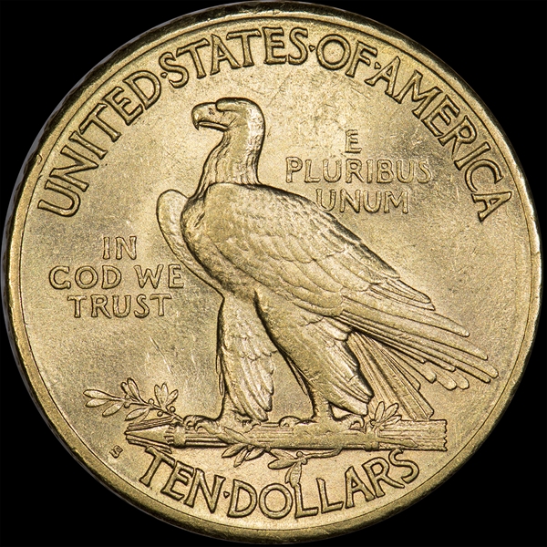
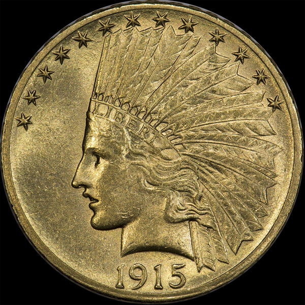
1915-S $10 number 1...
imageimage


1915-S $10 number 2...

imageimage

Comments

  • Options
    lordmarcovanlordmarcovan Posts: 45,119 ✭✭✭✭✭
    Tough call for me.


    Both have roughness to the cheek, but I find the marks on #1 a little less distracting.


    I like the color on #2 a little better, based on the pix, anyway.


    Guess I'd go with the one that was already graded. (What kind of grade are we talkin' about, anyway? 58? 61? 62? Can't see any higher than 62, on a good day... or lower than about 55...?)

    Collector since 1976. On the CU forums here since 2001.

  • Options
    ACopACop Posts: 1,479 ✭✭✭✭✭
    Coin 1 58 Coin 2 61?
  • Options
    BoosibriBoosibri Posts: 12,692 ✭✭✭✭✭
    Originally posted by: lordmarcovan

    Tough call for me.


    Both have roughness to the cheek, but I find the marks on #1 a little less distracting.


    I like the color on #2 a little better, based on the pix, anyway.


    Guess I'd go with the one that was already graded. (What kind of grade are we talkin' about, anyway? 58? 61? 62? Can't see any higher than 62, on a good day... or lower than about 55...?)


    The first one made 62, I think the second will as well.
  • Options
    lordmarcovanlordmarcovan Posts: 45,119 ✭✭✭✭✭
    Yeah, I've had a 62 $10 Indian or two that had similar marks. Seems about right, though I'd max out at 62 on either of those, as mentioned, and who knows whether the raw one would 61 or not?

    Collector since 1976. On the CU forums here since 2001.

  • Options
    TopographicOceansTopographicOceans Posts: 6,535 ✭✭✭✭
    The pictures make a difference, but I guess I'd go with #1 but I bet in hand they have pretty much the same look and eye appeal.
  • Options
    coinkatcoinkat Posts: 24,470 ✭✭✭✭✭
    The second. FWIW, I agree that the second coin will grade 62. The color on the second coin looks rich adding to the eye appeal

    Experience the World through Numismatics...it's more than you can imagine.

  • Options
    DollarAfterDollarDollarAfterDollar Posts: 3,217 ✭✭✭✭✭
    The first one is weakly struck but the second coin has lots of chatter. I'd rather the first one myself. Far less distracting.
    If you do what you always did, you get what you always got.
  • Options
    TwoSides2aCoinTwoSides2aCoin Posts: 45,079 ✭✭✭✭✭
    I like 'em better, in hand. Ask TDN for the inside scoop. image
  • Options
    sparky64sparky64 Posts: 7,063 ✭✭✭✭✭
    I'd pick #2 because it has that rich look like coinkat stated.

    Could just be the lighting I suppose.


    What a great design, eh?

    "If I say something in the woods and my wife isn't there to hear it.....am I still wrong?"

    My Washington Quarter Registry set...in progress

  • Options
    BillJonesBillJones Posts: 35,848 ✭✭✭✭✭
    I like surfaces better on the first one, but the color on the second one.
    Retired dealer and avid collector of U.S. type coins, 19th century presidential campaign medalets and selected medals. In recent years I have been working on a set of British coins - at least one coin from each king or queen who issued pieces that are collectible. I am also collecting at least one coin for each Roman emperor from Julius Caesar to ... ?
  • Options
    ProofmorganProofmorgan Posts: 959 ✭✭✭✭✭
    1.) Appears more lustrous and clean. Fewer distracting marks.


    2.) I like the rich color, but the marks on the cheek/nose are pretty distracting.


    Overall, I'd have to see them in hand but I'm leaning #1 due to the marks on #2.
    Collector of Original Early Gold with beginnings in Proof Morgan collecting.
  • Options
    lkeigwinlkeigwin Posts: 16,895 ✭✭✭✭✭
    Originally posted by: BillJones

    I like surfaces better on the first one, but the color on the second one.


    Same here, assuming the color is accurate in the photos.

    Lance.
  • Options
    kazkaz Posts: 9,351 ✭✭✭✭✭
    I prefer #1 due to it being less baggy.
  • Options
    SonorandesertratSonorandesertrat Posts: 5,695 ✭✭✭✭✭
    Originally posted by: lkeigwin
    Originally posted by: BillJones
    I like surfaces better on the first one, but the color on the second one.


    Same here, assuming the color is accurate in the photos.
    Lance.


    I agree
    Member: EAC, NBS, C4, CWTS, ANA

    RMR: 'Wer, wenn ich schriee, hörte mich denn aus der Engel Ordnungen?'

    CJ: 'No one!' [Ain't no angels in the coin biz]
  • Options
    david3142david3142 Posts: 3,691 ✭✭✭✭✭
    Originally posted by: Sonorandesertrat

    Originally posted by: lkeigwin

    Originally posted by: BillJones

    I like surfaces better on the first one, but the color on the second one.


    Same here, assuming the color is accurate in the photos.

    Lance.


    I agree


    +1 more from me. The cheek is pretty beat up on the second but the detail and color are slightly better.
  • Options
    mercurydimeguymercurydimeguy Posts: 4,634 ✭✭✭✭
    Coin 1 has a better strike/frost, but I like the color of Coin 2.
  • Options
    DDRDDR Posts: 1,678 ✭✭✭✭✭
    There are things I like and dislike about each one.


    But based on the photos posted, I prefer #1.
  • Options
    rickoricko Posts: 98,724 ✭✭✭✭✭
    I like number one best.... gold is my favorite... number one has more 'life'...

    Cheers, RickO
  • Options
    CatbertCatbert Posts: 8,226 ✭✭✭✭✭
    I'd kiss both....
    Seated Half Society member #38

    "She comes out of the sun in a silk dress,
    running like a water color in the rain...."
  • Options
    keyman64keyman64 Posts: 15,650 ✭✭✭✭✭
    I like #1 better. #2 has way too many distracting marks for me.
    "If it's not fun, it's not worth it." - KeyMan64
    Not really looking for much these days but if I were, it might be a toner. :smile:
  • Options
    BryceMBryceM Posts: 11,937 ✭✭✭✭✭
    Originally posted by: lkeigwin

    Originally posted by: BillJones

    I like surfaces better on the first one, but the color on the second one.


    Same here, assuming the color is accurate in the photos.

    Lance.


    Exactly how I see it too.


  • Options
    CharlotteDudeCharlotteDude Posts: 3,299 ✭✭✭✭✭
    I'm more a fan of #1. Based on the lighting, I'd bet #1 has more similar coloration as #2, yet #1 has less hits in the center areas, particularly on the reverse.


    'dude
    Got Crust....y gold?
  • Options
    msch1manmsch1man Posts: 809 ✭✭✭✭
    As others have said, I like number 1 because it appears to have less marks and better overall surfaces, but number 2 has a really nice rich, orangey color. If I had to choose based solely on the photos, I'd go with number 1.
  • Options
    YorkshiremanYorkshireman Posts: 4,613 ✭✭✭✭✭
    The color of #2 makes it my pick.
    Yorkshireman,Obsessed collector of round, metallic pieces of history.Hunting for Latin American colonial portraits plus cool US & British coins.
  • Options
    WalkerfanWalkerfan Posts: 10,324 ✭✭✭✭✭
    I like #1 as the surfaces look better preserved.

    Sometimes, it’s better to be LUCKY than good. 🍀 🍺👍

    My Full Walker Registry Set (1916-1947):

    https://www.ngccoin.com/registry/competitive-sets/16292/

  • Options
    FlatwoodsFlatwoods Posts: 4,270 ✭✭✭✭✭
    I'd take the first one. I try to pick coins that are as mark free as possible.

    I like nice surfaces and color too but marks drive me crazy.

  • Options
    coinhackcoinhack Posts: 1,225 ✭✭✭✭✭
    I like them both for reasons already expressed but number 1 would be my final choice.
  • Options
    BoosibriBoosibri Posts: 12,692 ✭✭✭✭✭
    Number 1 seems like a heavy favourite. It graded 62. If the second can also grade 62 it will be a great result, even 61 would be a big win. Will let you all know the final grade in a few weeks.
  • Options
    goldengolden Posts: 10,478 ✭✭✭✭✭
    I will take door #1.

Leave a Comment

BoldItalicStrikethroughOrdered listUnordered list
Emoji
Image
Align leftAlign centerAlign rightToggle HTML viewToggle full pageToggle lights
Drop image/file