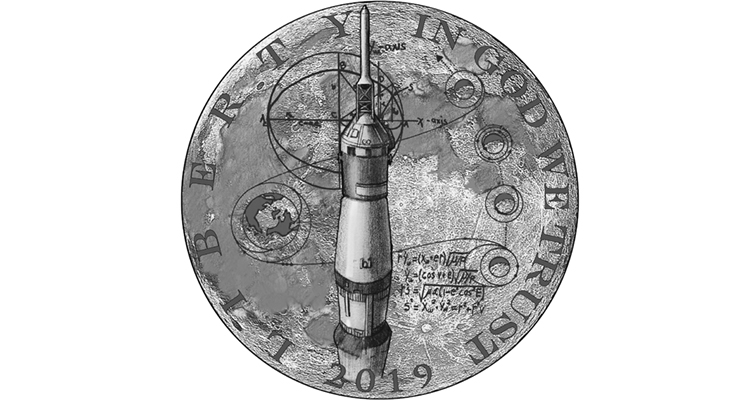
2019 Apollo 11 50th Anniversary design candidates
 BackroadJunkie
Posts: 3,745 ✭✭✭✭✭
BackroadJunkie
Posts: 3,745 ✭✭✭✭✭
Coinworld has 19 images of the design candidates for the 2019 commem...
Your first look at design candidates for the 2019 Apollo 11 50th Anniversary coins
The short of it:
These will be curved (ala the baseball commems).
50K gold half-eagles, proof and uncirc finishes
400K silver dollars, proof and uncirc finishes
750K clad halves, proof and uncirc finishes
100K 5oz silver pucks, PROOF ONLY
Start saving your pennies!
1
Comments
The best design by far is the large Saturn V with the moon in the background. The rest of the designs range from so-so to poor. The design with the astronaut looking up is just plain odd looking.
Some of those are terrible. I like the first the best. You HAVE to play off of the curve somehow, right? I would have done the moon on the convex side, and an astronaut peering out the space shuttle window on the concave side, or something like that.
I like this one.
@jwitten You are putting it mildly when you say some are terrible. The 4th one looks like someone beheaded an astronaut. What kind of idiot came up with that design and what kind of moron actually moved it into the finals?
It's called the CCAC.
Welcome to design by committee...
Should be quite the slab to hold a curved 5 oz puck!
You are right about number 4, that is terrible. A lot of them seem real "busy". A few are OK.
I think the only one I like is the reflection in the helmet visor, and only that side of the coin. It might be good with the Saturn V on the other side. The rest range from mediocre to embarassing. Floating spacesuit? Astronaut conga line? Holy crap! And what's with the concavo-convex gimmick again?
Keeper of the VAM Catalog • Professional Coin Imaging • Prime Number Set • World Coins in Early America • British Trade Dollars • Variety Attribution
Are any Dan Carr designs?
All of them are trite, cheap souvenirs. The legislation demanded use of certain images and that effectively prevented any meaningful creative expression. Buzz Aldrin with two ghost-like eyes is both depressing and frightening.
The committee that picks designs needs to be replaced.
Nothing very exciting there. Eagle to the Moon theme is nice, but the two proposals aren't very good, IMO. Maybe the Saturn rocket?
Here's a warning parable for coin collectors...
I like this one, it has kind of a disco dancing look.
The Mysterious Egyptian Magic Coin
Coins in Movies
Coins on Television
Wow, these are really bad. At least one of the coins should have the "One step for man..." quote, I would think. What about the iconic Earthrise from the moon image? What about the astronaut coming down the ladder from the lunar module? I was really looking forward to this commemorative, as I was actually T-9 days from being born on July 20, 1969. Might have to rethink that if these are the only designs under consideration.
That's "One step for a man..." according to Neil Armstrong. There is a momentary interruption on the tape at that point but he always insisted there was an "a" in there.
I prefer this one.
I grew up with the Space Program. Loved it.
I will get to save money, by not purchasing any of these.
I did buy one of these. They did a really good job on these. https://catalog.usmint.gov/new-frontier-bronze-medal-3-inch-920.html?cgid=humanitarian-cultural#start=1
Smart money says the winning design will be the boot print.
Oh man.
I was in a Copenhagen hotel lobby watching the landing on the one little b&w TV in the whole place, on my 8th birthday.
50 years.
I like the Saturn 5 facing upward, and the idea- but not the execution- of the eagle looping the moon with the earth in background.
That's right. I'd completely forgotten that.
I am 100% confident the CCAC will screw up the designs.
This is an opportunity to shine, but I know they will fail.
Count me out on yet another mint fiasco.
“In matters of style, swim with the current; in matters of principle, stand like a rock." - Thomas Jefferson
My digital cameo album 1950-64 Cameos - take a look!
I was thinking suicidal lunar strip-tease.
Keeper of the VAM Catalog • Professional Coin Imaging • Prime Number Set • World Coins in Early America • British Trade Dollars • Variety Attribution
The empty floating suit is a riot. Disco suit? What the heck? Lots of mediocre designs. I like the Eagle with the laurel leaves around the edge. My guess is that the committee will choose the reflection of the helmet since the coin will be curved just like the space suit visor. Wait, what? Will the 5 oz puck be curved too? That's going to be a bowl.
"To the moon Alice, to the moon!"
This is what came out of the space suit......

Yes. And in proof. I wonder if you can start a fire with it, or whether we'll see any reports about the coin being left in the sun and burned down a house.
Regardless of the design, I'm in for one of the pucks.
That looks like a Campbell’s soup can. The moon looks like a bowl of spaghetti-o’s
"Regardless of the design, I'm in for one of the pucks."
Likewise
The designs are pathetic. The closest to a halfway decent one is the one with the Saturn V. Given the amazing pictures taken at the Moon, you would think that some artist could transform one of those pictures into a scene.
With all due respect, the SPACE SHUTTLE didn't start flying until 1981. It was the APOLLO spacecraft (Command Module and Service Module, CSM) that flew to the Moon (in conjunction with the Lunar Module, LM). Two of the three astronauts in the CSM transferred into the LM and flew it down to land on the Moon's surface, while the third crew member stayed aboard the CSM.
Here's one of my favorite Apollo pictures. It's of the CSM taken from the LM. It gives you an idea of the scale of the adventure by seeing how small the CSM is relative to the Moon, with the Earth just a small, distant globe. I think this would work, particularly on a curved surface.
I have to say, I'm also very happy to have gotten 13 of the 24 guys that went to the Moon to sign a 16" X 20" copy of the above picture that I printed up, including at least one person from every mission that went to the Moon. Two of the 13 are dead, so this could never be recreated.
U.S. Type Set
I like the boot print.
It is interesting that we get to see many of the entrants in the design competition for this Apollo 11 coin.
So how come we never got to see the entrants in the design competition for the WW1 dollar (except for the one "winner") ?
PS: I was invited to submit designs for the WW1 commemorative, but not for the Apollo 11 coin.
An empty suit - just like the members of Congress that came up with the stipulations for this coin (those stipulations being: cupped; visor reflection on convex side; commemorative only and not a circulating dollar).
This is the only one I like, but I wish it wasn't cluttered with equations...
Gobrecht's Engraved Mature Head Large Cent Model
https://www.instagram.com/rexrarities/?hl=en
Design by committee = mediocrity......between personal agenda's and lack artistic skills, any expectations of art or true relevance will be dashed on the rocks of incompetence.....If we expect real art, true relevance, select the artist, not the designs. Cheers, RickO
To me, it looks like the result of a terrible accident. How about we stick to some of the iconic images that already exist?
I agree, cmerlo1. What can be the possible explanation for this design?
Barbarella
The Mysterious Egyptian Magic Coin
Coins in Movies
Coins on Television
There was a very spirited discussion amongst the CCAC in our meeting yesterday morning. Nobody on the committee was thrilled with this package of design candidates. Donald Scarinci said, "If there were a mechanism for rejecting them all, I would do it." But the way the legislation was written, there isn't.
RWB is correct: It was Congress that set up the rules of the public competition for these designs.
The legislation defined the reverse design. These are all candidates for the obverse. And, unfortunately, all four coins in the program are required to share the same designs. So the tiny $5 gold and the much larger three-inch silver will have the same obverse and reverse ---- as mandated by Congress. The Treasury Department, the United States Mint, the CCAC, and the Mint's artists have no control over that.
By the way, to clarify in response to some misunderstandings: The CCAC doesn't design coins. It also doesn't choose coin designs. It reviews coin designs, and it makes recommendations to the Secretary of the Treasury. The Secretary of the Treasury chooses coin designs.
There is no "design by committee" involved in U.S. coinage.
Someone or some groups should turn in the towel.
How about they open designs up for public selection... we have the t cnogy for that and that would lead to more sales
None of the designs are very good IMO....I do like the reverse of the Ike dollar would think that, combined with an obverse showing an Apollo rocket, would be a good melding of the technology of the times and the pride in the achievement of the times (with the Ike like reverse).
@Dentuck - Thanks for the clarification on the selection process!
K
Most of those designs are unforgivably horrible. Some of them appear to be comprised of photographs which will never translate to a coin.
That rumpled empty spacesuit is just plain creepy - did a space alien devour the astronaut and that pile of laundry was all that was left? Or was that what was cast off as two astronauts got involved in a little extraterrestrial hanky panky?
A couple of the designs are OK but not great, but I have every expectation that those will be the first to be eliminated.
What an embarrassment. I dare say even I could do better.
P.S. - @dcarr - any chance that your earlier space designs might have actually worked against you? I wonder of the Mint was afraid that the best designs submitted might be too close to coins/medals already issued elsewhere.
Technically true, and their hands are tied on Congressional mandated commems.
That does not excuse the abysmal FSQ, ATB and even this year's AmLib designs. The committee as a whole have rejected decent designs for more politically correct ones, and can "suggest" changes to the submitted designs.
If you don't like "designed by committee", how about "selected by committee".
Either way, bad decisions have been made.
@Backroadjunkie: I can assure you that the selections are not made by the CCAC, but by the Secretary of the Treasury. That's the way the CCAC was set up by Congress.
In most business environments I have been in or witnessed, the "committee" or person that is the designated party to review and make recommendations usually (not always) gets their way. That is why they are there - to "recommend" to the decision maker what to do. Of course the final decision rests with the decision maker, but their decision is usually based on the recommendations that he/she receives.
I don't know the answer offhand but it would be interesting to see what % of the time the Sec of the Treasury goes along with the CCAC recommendations. The CCAC is there for a reason, whatever that is. It might be that they are really making the decision by means of their recommendations, or it may be that they provide cover for the final decision by recommending what is preferred by the powers that be,
There are two federal groups that provide recommendations to the Secretary of the Treasury on coinage designs. One is the Citizens Coinage Advisory Committee (the CCAC). The other is the U.S. Commission of Fine Arts (the CFA). Both groups review coinage design proposals and make formal recommendations to the Secretary. Sometimes the CCAC and the CFA agree in their recommendations. Sometimes they disagree. The Secretary's choices for coin designs agree with one, the other, both, or neither. Based on what I've seen, I would not describe the Secretary's choices as being a rubber-stamp of either group's recommendations.
Thanks for your input.
Do you happen to know why none of the candidate designs for the WW1 dollar were ever published and why did it take seven months longer than planned for the US Mint to announce the one winning design ?
Do you have any insights regarding the CCAC reviews of the WW1 designs ?
Here's an explanation from the Mint (published in June 2017) of how the WWI coin design competition was arranged:
"The authorizing law for the 2018 World War I American Veterans Centennial Commemorative Coin Program required a competition to be held to select a winning coin design emblematic of the centennial of America’s involvement in World War I. The law called for a single winner to design both the obverse and the reverse of the coin and that all designs submitted be accompanied by a plaster model.
Recognizing that this would be a significant amount of work for the participating artists, the Mint decided to utilize a two-phase program, which allowed artists to demonstrate their interest in the competition without expending significant time and effort.
During Phase One of the competition, which was open from February 29–April 28, 2016, artists were encouraged to submit their contact information and three to five work samples for consideration. These portfolios were evaluated by an expert jury who selected 20 artists to participate in Phase Two.
During this second phase, which closed on August 16, 2016, the artists were required to submit a design for both the obverse and reverse of the coin as well as plaster models of the designs. Because of the demands placed on the artists, the Mint paid a fee of $1,000 to each participating Phase Two artist and provided plaster basins.
The expert jury, composed of three members of the Citizens Coinage Advisory Committee (CCAC), three members of the U.S. Commission of Fine Arts (CFA), and chaired by the Deputy Assistant Secretary for Management & Budget, Department of the Treasury, once again evaluated the entries. The final design of the coin was selected by the Secretary of the Treasury based on the winning design selected by the expert jury. The winning design will be unveiled later this year."
@dcarr: The CFA jury members were Elizabeth Meyer, Edward Dunson Jr., and Liza Gilbert. The CCAC jury members were Mike Moran, Donald Scarinci, and Mary Lannin. The jury was chaired by Beverly Ortega Babers, deputy assistant Treasury secretary for Management and Budget.
Uggggh. When it comes to modern (and even most classic) mint commemorative issues, I just shift my focus somewhere else. Virtually everything I've seen lately is cartoonish and devoid of soul. This one though.... THIS ONE, they just have to get right. I'm firmly convinced that the Apollo program will be viewed by future generations as the most significant human achievement of the last 1000 years. Get it right guys!
The floating zombie spacesuit thing is just embarrassing. The spacesuit fashion show conga line is a joke. The Kennedy floating face ghost is just weird. The control room is a nice thought, but way too busy to look good on a coin. The guy doing the spacewalk over Central America - what does that have to do with the moon? The soaring Saturn V isn't horrible, but misses the point. The equation trajectory thing would be a fine engineering medal. Barrack Obama looking upward from a spacesuit is just bizarre.
The boot print, I like. Neil Armstrong..... remember him? Where is he? The Columbian Commem features Colombus, not the longshoremen that loaded the boats or the sextant-makers.
I think I like Dan's more than any of these.
Symbolism. Art. Beauty. Where did it go?
For both the WW1 and Apollo 11 design competitions, anyone interested in participating was required to first submit a portfolio of images showing past examples of their work. I did that for the WW1 design competition and I was accepted and invited to submit a design for that coin.
Later, when I submitted a portfolio of images for the Apollo 11 application, I used several of the same images that I had in my WW1 application. But some images were substituted. After submitting my Apollo 11 application, I was away on a trip for a week and when I returned I found that the US Mint had sent me an email the day after I had left. The email indicated that two of my images for the Apollo 11 application were invalid, even though those two images were used in the previous successful WW1 application. The email stated that I could submit substitute images. But by the time I had viewed that email, the deadline for submitting substitute images had passed. I was then informed that my Apollo 11 application would still be processed, but with those images deleted from it. However, those two images were key examples of my work.
The reason that these images were declared invalid for the Apollo 11 application was that more than one item was shown in the pictures. One of the rejected pictures, for example, showed a set of five pieces that I had minted, photographed, and marketed as a set:
This exact same image was used successfully in the WW1 application, but rejected for use in my Apollo 11 application.
Beyond that, I am not aware of what reasoning was used in the Apollo 11 selection process.
PS:
See the thread I started regarding the Platinum Eagle obverse design:
https://forums.collectors.com/discussion/988727/how-did-a-previously-copyrighted-design-end-up-on-the-obverse-of-the-platinum-eagle-coins#latest
On the plus side, my opinion of the Susan B. Anthony dollar just went up.