Will we have beautiful coins again? US Mint wants rivals to St. Gaudens, Brenner and Weinman!
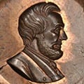
In 2019, Mint Director David J. Ryder said the following regarding artists in the Mint's Artistic Infusion Program (AIP), with my emphasis. This was announced on July 17, 2019. Any results yet?
Mint Director David J. Ryder said:
We’ve selected diverse artists who represent every region of America, from coast to coast. Sixteen of the artists are new to the program and we’re challenging them to exert a major influence on the future of our nation’s coinage, to aspire to the creative mastery of giants such as Augustus Saint-Gaudens, Victor David Brenner, and A.A. Weinman as the Mint creates new designs in the 21st century.
Members include:
Katelyn Arquette
Steven Kenny
Peter Beck
Justin Kunz
Robert J. Clarke
Patricia Lucas-Morris
Chris Costello
Richard Masters
Emily Damstra
Frank Morris
Allen Douglas
Laurie Musser
Lucas Durham
Jennie Norris
Don Everhart
Ron Sanders
Steve Ferris
Ben Sowards
Barbara Fox
Matt Swaim
Dennis Friel
Heidi Wastweet
Elana Hagler
Donna Weaver
Christina Hess
Beth Zaiken
Tom Hipschen
Comments
-
I've been holding my breath for the results since 2019.
 All glory is fleeting.2
 -
I almost wonder if there are too many artists. Didn't Roosevelt and St. Gaudens almost work one to one?
Would love to see the names of these artists attributed to some coins so we can see the results.
3 -
they'll work with sketches since there will be no relief
Current maintainer of Stone's Master List of Favorite Websites // My BST transactions1 -
@MsMorrisine said:
they'll work with sketches since there will be no reliefHeidi Wastweet does a lot of plaster models. It would be great to see some coins use that approach again.
2 -
@Zoins said:
I almost wonder if there are too many artists. Didn't Roosevelt and St. Gaudens almost work one to one?Would love to see the names of these artists attributed to some coins so we can see the results.
If you want good results you find the best artists and commission their work. You don't hold "contests" since the best artists will ignore them. Since politics and political appointees play a big role you can pretty much forget about anything of quality being the end result.
All glory is fleeting.5 -
I'll be excited when I see results. Even our good designs have been dumbed down over the years--Washington and his spaghetti hair being the best example. I understand the technical reasons for doing so, but they don't lend themselves to appealing designs. I'll grant them that perhaps a design made with such limitations in mind from the outset may fare better for a final product, but seeing what happened to Washington, I can't imagine they couldn't have made some slightly different tweaks in 1999 to have a product as technically good, but also more aesthetically pleasing.
Much as I'd be against reviving old designs, they're so much better than what we have, I'd take them over what we've seen as modern creativity. But in clad, the old designs may make me cry.
JK Coin Photography - eBay Consignments | High Quality Photos | LOW Prices | 20% of Consignment Proceeds Go to Pancreatic Cancer Research2 -
@MsMorrisine said:
they'll work with sketches since there will be no reliefThen they’ll load it into a cad program and feign where the highest relief points should be and still of the design will look flat as a pancake.
"I'll split the atom! I am the fifth dimension! I am the eighth wonder of the world!" -Gef the talking mongoose.0 -
“Will we have beautiful coins again? US Mint wants rivals to St. Gaudens, Brenner and Weinman!”
No, those days are unfortunately past us. The mint is primarily concerned with their operating budget and making money off of collectors, plain and simple.
Their poor coin designs reflect my sentiment it and so do the gimmicky offerings, limited mintages, reverse proofs and other poorly thought out and executed ideas.
0 -
I still feel like we have a certain blindness to designs just ‘cause they are new.. i’ve really liked some of the designs that have come out recently.


 "I'll split the atom! I am the fifth dimension! I am the eighth wonder of the world!" -Gef the talking mongoose.8
 -
@kiyote said:
I still feel like we have a certain blindness to designs just ‘cause they are new.. i’ve really liked some of the designs that have come out recently.This is the only one I WOULD like if they removed the gears. Finally a decent rendition of Liberty and the background sucks. Maybe a sunrise without overstated rays coming over mountains would've been nicer.
2 -
Execution of the designs is a far bigger problem than the designs themselves. Imagine a St Gaudens $20 or a buffalo nickel as the mint would produce them today. They’d be flat, sterile, and devoid of emotion.
Imagine how phenomenal a Sac dollar or ASE would look if rendered directly from a physical sculptural model. They’re already good, but they could be outstanding. It’s the touch of the master that is missing. The current Chuck-E-Cheese token garbage coming out if the mint today lacks soul, even when the designs are stellar.
2 -
I have been lamenting our poor coin designs for years - here and elsewhere.... I agree with @291fifth and @airplanenut ..... It is not a competition, it is created beauty.... and make the process work to accurately display the beauty.... No commercialization, just art. Design by committee results in mediocrity without meaning. Cheers, RickO
1 -
@BryceM said:
Execution of the designs is a far bigger problem than the designs themselves. Imagine a St Gaudens $20 or a buffalo nickel as the mint would produce them today. They’d be flat, sterile, and devoid of emotion.Imagine how phenomenal a Sac dollar or ASE would look if rendered directly from a physical sculptural model. They’re already good, but they could be outstanding. It’s the touch of the master that is missing. The current Chuck-E-Cheese token garbage coming out if the mint today lacks soul, even when the designs are stellar.
Actually, the obverse of the St. Gaudens $20 is very disappointing when rendered in the low relief version. It was intended as a high relief design and doesn't look good otherwise.
All glory is fleeting.0 -
I think it mattered more then when a Quarter Eagle represented a weeks pay. Coins today are for the most part worthless. How much can you purchase for a quarter today when a candy bar costs over a dollar?
0 -
coins today must pass lengthy die usage. as die usage went up, relief went down.
perhaps someone could remind the mint, the CFA, CCAC about the low relief "requirement" the mint has on circulating coins.
as fa as numismatic products, perhaps more could be in higher relief should the design look better that way.
Current maintainer of Stone's Master List of Favorite Websites // My BST transactions0 -
As long as the humanity has left the building I won’t expect much. Everything is done by computers now a days. From the design all the way down to the cutting of the dies are done by machine and I for one don’t like it. I want hands on again.
The bitterness of "Poor Quality" is remembered long after the sweetness of low price is forgotten.2 -
It would be nice to have great designs again on coinage but I’m not expecting anything. I think any good design that comes up will end up on bullion, medals, or commemorative coins.
Maybe if they change the composition to a less hard medal they could raise the relief but I don’t think America is ready for aluminum coinage just yet.
0 -
@291fifth said:
@BryceM said:
Execution of the designs is a far bigger problem than the designs themselves. Imagine a St Gaudens $20 or a buffalo nickel as the mint would produce them today. They’d be flat, sterile, and devoid of emotion.Imagine how phenomenal a Sac dollar or ASE would look if rendered directly from a physical sculptural model. They’re already good, but they could be outstanding. It’s the touch of the master that is missing. The current Chuck-E-Cheese token garbage coming out if the mint today lacks soul, even when the designs are stellar.
Actually, the obverse of the St. Gaudens $20 is very disappointing when rendered in the low relief version. It was intended as a high relief design and doesn't look good otherwise.
It's funny... I really like the St. Gaudens design, and overall, I think it's one of the best designs ever on a US coin. That said, I've seen a high relief next to a regular Saint, and would you know, the regular Saint looks pretty bad. But I've also held an ultra high relief next to a high relief, and by golly, the ultra high relief is so incredible, it makes the high relief look like nothing special at all. But when I don't have the high relief variants at my disposal (which is usually the case), the regular design is quite pleasing indeed.
JK Coin Photography - eBay Consignments | High Quality Photos | LOW Prices | 20% of Consignment Proceeds Go to Pancreatic Cancer Research2 -
@ms70 said:
@kiyote said:
I still feel like we have a certain blindness to designs just ‘cause they are new.. i’ve really liked some of the designs that have come out recently.This is the only one I WOULD like if they removed the gears. Finally a decent rendition of Liberty and the background sucks. Maybe a sunrise without overstated rays coming over mountains would've been nicer.
I’ve never really thought about it but yes that kind of loose clothing and exposed machinery would be a bad combination..
"I'll split the atom! I am the fifth dimension! I am the eighth wonder of the world!" -Gef the talking mongoose.1 -
@BryceM said:
It’s the touch of the master that is missing..
They can't even copy something that already existed like the horrible AGE (St Gaudens) or draped bust (Jefferson's liberty)0 -
@ReadyFireAim said:
@BryceM said:
It’s the touch of the master that is missing..
They can't even copy something that already existed like the horrible AGE (St Gaudens) or draped bust (Jefferson's liberty)They can when they want to.
This beautiful 2009 St. Gaudens UHR is from @Goldbully.
It would be great for the TrueView to show the edge on this one.
 2
2 -
@Zoins said:
They can when they want to.Nope...Proportions are all wrong for esthetics.
A real artist takes certain "liberties" and doesn't render a engraving from an image.
.
Look at this one.
The eye is too big but it works.0 -
@ReadyFireAim said:
@Zoins said:
They can when they want to.Nope...Proportions are all wrong for esthetics.
A real artist takes certain "liberties" and doesn't render a engraving from an image.
.Look at this one.
The eye is too big but it works.Too much eye shadow. Looks kinda like Tammy Faye Bakker to me.
 The bitterness of "Poor Quality" is remembered long after the sweetness of low price is forgotten.1
 -
@ReadyFireAim said:
@Zoins said:
They can when they want to.Nope...Proportions are all wrong for esthetics.
A real artist takes certain "liberties" and doesn't render a engraving from an image.
.Look at this one.
The eye is too big but it works.That one actually doesn’t really work for me. In addition to the eye, the chin is too strong and the jaw is too square. Reminds me of Barber’s work. I wouldn’t collect the series for aesthetics, but to each their own.
Many classic designs actually aren’t that great from an aesthetics point of view.
0 -
lol
0 -
Coins, like much else we elect to collectively announce about ourselves as a nation, are a commentary and expression of our ideals .
The end of the nineteenth and beginning of the twentieth centuries was a time of robust national self-confidence, a sentiment much reflected in our coinage. I share the implicit desire of some of our posters here for a revision of such idealism, as represented by all of the powerful assertions of Liberty and all her confidence and optimism that we expressed in issues such as the St. Gaudens and the SLH.
We may be experiencing the competing perspectives about what may constitute and properly express our ideals at this point of our history, in our modern coinage designs.
2 -
Several problems
The mint is stingy. They only paid Glenna Goodacre $5,000 for the Sacagawea design. She was smart and slick. She got paid in 5,000
Sacagawea burnished dollars which were sold through her gallery for almost $2,000 each. She also convinced the mint to allow her to submit a relief instead of a drawing which enabled her to win the contest. This will not happen again
They only let the artists do sketches
instead of reliefs. Sculptors must work in relief. High relief and not a very flat low relief. Mint production will not allow it.0 -
@Zoins said:
That one actually doesn’t really work for me. In addition to the eye, the chin is too strong and the jaw is too square. Reminds me of Barber’s work. I wouldn’t collect the series for aesthetics, but to each their own.What about the chicken?
0 -
@ReadyFireAim said:
What about the chicken?It's actually a Gallic rooster. Searching for "France chicken" on Google returns a lot of recipes for dinner
To me, there appears to be a strange lack of detail on the features on the left side of the device. It makes the coin appear to be very worn there but, it also appears by design. I'm not sure why it would have been done that way, but the lack of detail is distracting to me.
This is also an older design similar to Barber's work as mentioned. It's an earlier style than work of St. Gaudens, Brenner and Weinman.
0 -
@ms70 said:
@kiyote said:
I still feel like we have a certain blindness to designs just ‘cause they are new.. i’ve really liked some of the designs that have come out recently.This is the only one I WOULD like if they removed the gears. Finally a decent rendition of Liberty and the background sucks. Maybe a sunrise without overstated rays coming over mountains would've been nicer.
Perhaps Dan @dcarr could do an overstrike without the gears?
Here's a full TrueView:

Here are the two alternates.
The fist one looks nice, but I could do without the floating circle of stars. If anything, put them across the sky like the Gobrecht dollar.
The second one, AEP-R-04, with the man coming out of the rock with a hammer and chisel looks strange to me. Is this a statue somewhere?

 2
2 -
I'm not holding any hope, but I have been impressed with a few medals.
0 -
@matt_dac said:
I'm not holding any hope, but I have been impressed with a few medals.There are some nice ones. Which ones do you like?
0 -
I also liked the Apollo 11 commem:
 1
1 -
That's a nice one. I wish they made it into a coin but then the design would be less clean with all the mottos that are required.
The design of both sides was from artists in the Artistic Infusion Program.
- obverse design by Richard Masters, AIP
- obverse sculpt by Joseph Menna, US Mint Chief Engraver
- reverse design by Donna Weaver, AIP
- reverse sculpt by Michael Gaudioso, US Mint Medallic Artist
https://www.usmint.gov/coins/coin-medal-programs/medals/2019-american-liberty-silver
1 -
@matt_dac said:
I also liked the Apollo 11 commem:I'm a huge fan of that too!
The footprint side was actually designed by a competition! I'd say design competitions still work!
- obverse design: Gary Cooper of Belfast, Maine via design competition
- obverse sculpt by Joseph Menna, US Mint Chief Engraver
- reverse design and sculpt by Phebe Hemphill, US Mint Medallic Artis
1 -
-
@ReadyFireAim said:

Art appreciation is personal.
Perhaps people should start picking at the St. Gaudens and Weinman originals
0 -
@Zoins said:
Perhaps people should start picking at the St. Gaudens and Weinman originalsThe original 1907 low relief was pretty bad.
Barber should receive as much credit for the coin as St. Gaudens.I've never seen what Weinman gave the mint to work with.
They did become quite nice as a finished product.0 -
Yeah, good luck with that.
0 -
@ReadyFireAim said:
@Zoins said:
Perhaps people should start picking at the St. Gaudens and Weinman originalsThe original 1907 low relief was pretty bad.
Barber should receive as much credit for the coin as St. Gaudens.I've never seen what Weinman gave the mint to work with.
They did become quite nice as a finished product.Barber did do a good job on the Saint Gaudens low relief design. It is much better than his own circulated works and most of his commemorative works (except maybe the Pan Pac). As much as he (wrongly) gets a bad rap in this hobby as a villain, he knew the technical limitations and how to work with them. Barber also probably understood that Saint Gaudens design is a masterpiece, his estate contained many 1907 UHR's. There has been a lot of falsehoods about Barber over the years, but I digress.
2 -
@dpoole said:
Coins, like much else we elect to collectively announce about ourselves as a nation, are a commentary and expression of our ideals .The end of the nineteenth and beginning of the twentieth centuries was a time of robust national self-confidence, a sentiment much reflected in our coinage. I share the implicit desire of some of our posters here for a revision of such idealism, as represented by all of the powerful assertions of Liberty and all her confidence and optimism that we expressed in issues such as the St. Gaudens and the SLH.
We may be experiencing the competing perspectives about what may constitute and properly express our ideals at this point of our history, in our modern coinage designs.
Also coins and sculptural art isn't as important as it was during the early 20th century. There are now other ways of expressing what may constitute and properly express our ideals as a nation, you see this through TV, internet, graphic design, etc. Also today's artists will NEVER be the same as St. Gaudens, Weinman, Fraser because they are familiar with different artistic techniques which lack the manual labor that the older artists had to do. Also our circulating designs have been politicized and aside from quarters, monetary instruments that no one wants to handle. Back then, $10 and $20 gold coins were exported out of the country on a regular basis, so it was important to display American values and make it attractive. Today, the $100 FRN is the most commonly encountered piece of US currency outside the US.
0 -
More artists than collectors. Good luck there.
1 -
@olympicsos said:
@ReadyFireAim said:
@Zoins said:
Perhaps people should start picking at the St. Gaudens and Weinman originalsThe original 1907 low relief was pretty bad.
Barber should receive as much credit for the coin as St. Gaudens.I've never seen what Weinman gave the mint to work with.
They did become quite nice as a finished product.Barber did do a good job on the Saint Gaudens low relief design. It is much better than his own circulated works and most of his commemorative works (except maybe the Pan Pac). As much as he (wrongly) gets a bad rap in this hobby as a villain, he knew the technical limitations and how to work with them. Barber also probably understood that Saint Gaudens design is a masterpiece, his estate contained many 1907 UHR's. There has been a lot of falsehoods about Barber over the years, but I digress.
Is there a book on this? It would be great to read about Barber and his fellow designers/engravers like St. Gaudens and Morgan.
0 -
Now THAT aviator design would be a guaranteed sell out for the mint!
0 -
Let's go for it!
 2
2 -
@Zoins said:
@ReadyFireAim said:
@Zoins said:
Many classic designs actually aren’t > that great from an aesthetics point > of view.
So true!
 "I'll split the atom! I am the fifth dimension! I am the eighth wonder of the world!" -Gef the talking mongoose.0
 -
@kiyote said:
@Zoins said:
@ReadyFireAim said:
@Zoins said:
Many classic designs actually aren’t that great from an aesthetics point > of view.
So true!
The funny thing is that reminds me of big hair from the 80s! It would be nice to have coins showing more recent styles. For example, I love medals from the 1800s showing exceptional beard styles of the era.
0 -
@crazyhounddog said:
As long as the humanity has left the building I won’t expect much. Everything is done by computers now a days. From the design all the way down to the cutting of the dies are done by machine and I for one don’t like it. I want hands on again.This is certainly the view I have also. The older designs... were engraved by hand, giving a personal touch, with nuances and minute imperfections that ended up giving the coin character and warmth.
In contrast, I find the modern renditions rather sterile... while CAD programs can certainly aid in moving elements around to balance designs, and experiment with many designs and concepts, they tend to make things too 'perfect' and thus the sterile bland feel. And of course the trend for politically correct themes/continual focus do not help either (IMO).
----- kj2





Leave a Comment
Categories
- All Categories
- 520.1K Coins and Currency - PCGS
- 328.5K U.S. Coin Forum
- 14.8K PCGS Set Registry Forum
- 5.2K Q & A Forum
- 41.4K World & Ancient Coins Forum
- 3K U.S. & World Currency Forum
- 96.4K Buy, Sell, & Trade - U.S. Coins
- 7.3K Buy, Sell & Trade - World & Ancient Coins
- 1.5K Buy, Sell & Trade - Currency
- 60 Random
- 246.2K Trading Cards, Autographs and Memorabilia - PSA
- 90.3K Trading Cards & Memorabilia Forum
- 1.7K Autographs Forum
- 16.4K PSA Set Registry Forum
- 22K Sports Talk
- 115K Buy, Sell & Trade - Cards & Memorabilia
- 663 Buy, Sell & Trade - Autographs
- 2.2K Stamps
- 1.5K Stamps Forum
- 670 Buy, Sell & Trade - Stamps
- 83 Coin Shows
- 83 General Coin Show Information and Discussion
- 11.9K Misc
- 11.9K Testing Forum