Which would you choose?
 cardinal
Posts: 2,005 ✭✭✭✭✭
cardinal
Posts: 2,005 ✭✭✭✭✭
I've been doing some research, and found a couple of intriguing medals struck in the 1780's. So, you're looking at these and you want to to come away with one of them, based on their online photos:
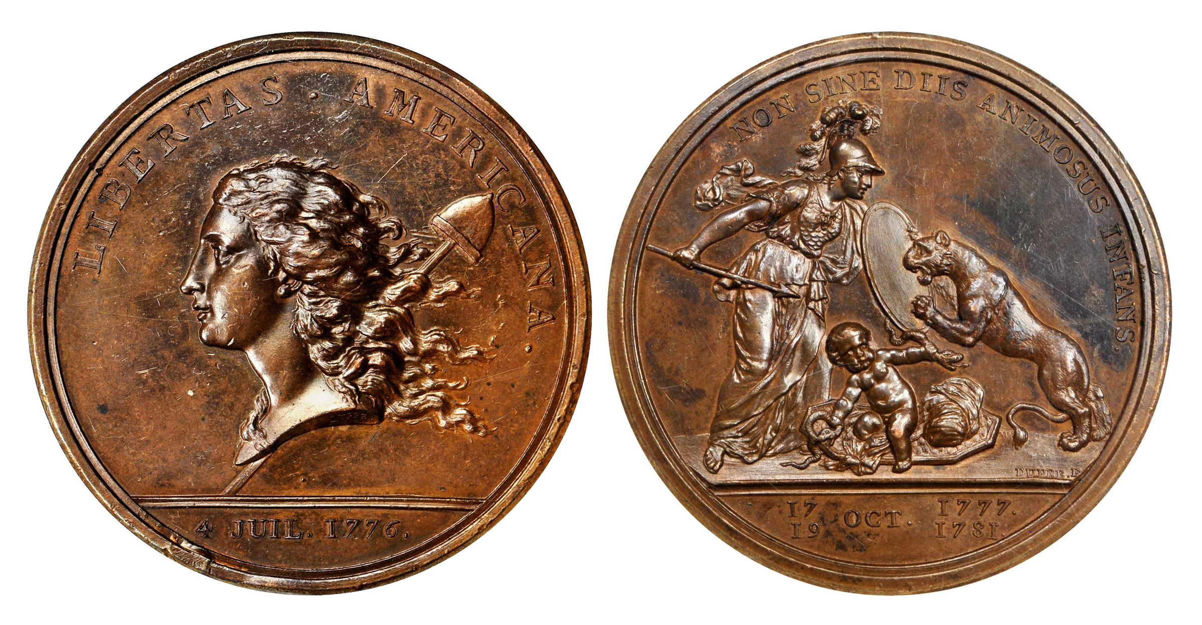
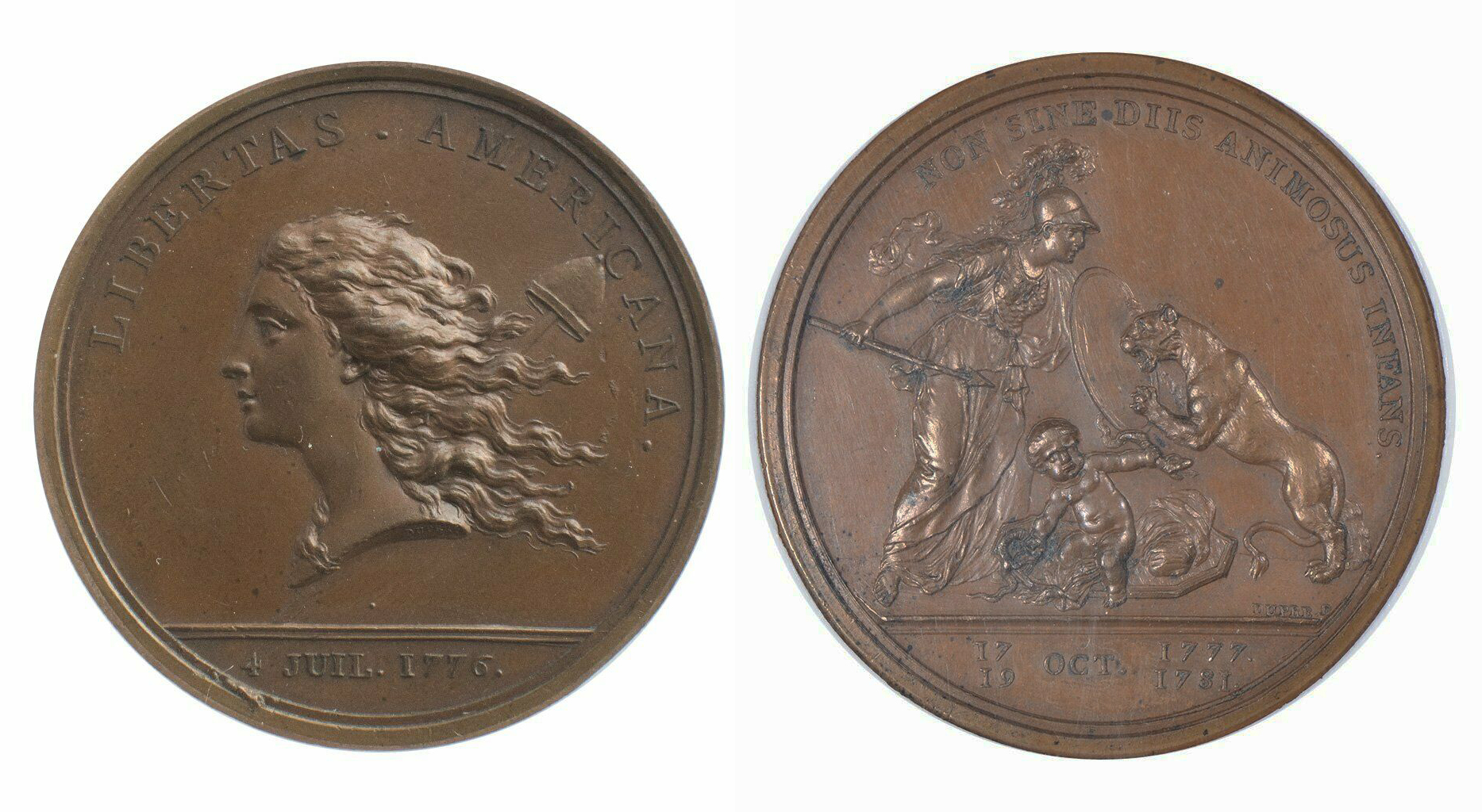
Which would you choose, and why?
4
Comments
I like the second of the two. It looks like the color I'd expect. Interesting that each has evidence of the same cud (?) at 7 oclock.
The relief and detail on the first medal looks almost 3D. You can actually count the scales on the snake. Baby America looks like he has been hitting the gym.
The profile/cheek of Liberty on the second medal is flat. Is this is trial piece of some kind?
No Fleur Di Lis on either shield.
m
Fellas, leave the tight pants to the ladies. If I can count the coins in your pockets you better use them to call a tailor. Stay thirsty my friends......
Tough choice. My initial instantaneous reaction was medal B due to the more even color plus I find the marks on the obverse of medal A a bit distracting. But, as @Justacommeman observes, the 3-D effect (and luster) on medal A may win the day.
Is the first one shellacked? Not that it is a huge problem, but it kind of has that look to me.
The second one has a lot of strike doubling. Loose in the collar? Does that explain the weaker strike?
All comments reflect the opinion of the author, even when irrefutably accurate.
I think I would go for #2 unless #1 is a scarcer variant of the medal as they are obviously different versions.
I'll take #2, much better color.
The cud at 7 o'clock is apparent on every original Libertas Americana (circa 1783), and if it's missing, the cud was tooled off.
I would take coin 2 (bottom).
I'm not a fan of the dark splotching on coin 1. I do like the relief and detail of coin 1 but not enough to overtake its issues.
Both have been messed with. I strongly believe the color on the second one is artificial (expertly done).
Door A
RMR: 'Wer, wenn ich schriee, hörte mich denn aus der Engel Ordnungen?'
CJ: 'No one!' [Ain't no angels in the coin biz]
the first medal looks to have higher relief, especially evident on Liberty's cheek. that medal also looks to have suffered some ED and depending on that I think I would choose door number one.
There's definitely some small corrosion spots on number 2.
All comments reflect the opinion of the author, even when irrefutably accurate.
Ding, ding, ding! Both of these have flat shields without the Fleur D'Lis. I find that interesting! No one today would tool off the Fleur D'Lis from the shield, and have the medal damaged in that manner. My thought is that after the War was over, Benjamin Franklin didn't want to rub the British people's noses in it. Franklin's "Explication" shows a very different looking beast, not to be confused with the British Lion:
In the Explication, the animal has leopard spots. The toning of the shield seems to have developed over a period of many years - such that it blends into place. The shield itself remains, but without the symbolism of the French. If there was only one of these without the Fleur D'Lis, that might be one thing, but seeing more than one, it seems that someone long ago decided to peddle them to the British in a manner that they would not anger them.
2nd one for me too, better eye appeal.
I'm also on the first medal ... the second seems to be too even a color
The more hammered 3D strike effect does not sway me, as appears to be more a trick of the lighting, focus and exposure of the image
But frankly, I'd have a hard time selecting based on these images ... these are ones I'd really want to see in hand to be able to say
“We are only their care-takers,” he posed, “if we take good care of them, then centuries from now they may still be here … ”
Todd - BHNC #242
Both of these had been graded by NGC. The first one was graded at MS62, and was sold at auction at a bit over $16k. (Buyback by NGC.) The second one was graded "Unc Details," as NGC mentioned that a holder had been removed from the rim (while, not mentioning the tooling on the shield).
1st one hands down!
The relief of the mysteriously round beanie, the three dimensional appearance of the symmetrical and gravity-defying ski cap, the straight and rigid aspect of the long, not- quite- contiguous pole.....
It all comes together in an amazing strike and an unforgettable viewing experience!!!!!
Liberty: Parent of Science & Industry
The first one seems to have a better strike, but it might just be the lighting in the photo.
(For example, the pole is visible below the bust).
The second one seems to have smoother surfaces.
If I had to choose based only on the photos and without regard to price, I'd choose the first.
I'd go with #1. The strike is better.
My first reaction was that #2 has been recolored at some point... that and the flat strike. #1 pops for me, but I'm not a huge fan of the obverse discoloration in the field... if it's not so bad in hand... and if I had a bunch of money stacked up, I'd go for that one..
Successful BST transactions with: SilverEagles92; Ahrensdad; Smitty; GregHansen; Lablade; Mercury10c; copperflopper; whatsup; KISHU1; scrapman1077, crispy, canadanz, smallchange, robkool, Mission16, ranshdow, ibzman350, Fallguy, Collectorcoins, SurfinxHI, jwitten, Walkerguy21D, dsessom.
I like the first one!
@cardinal If I remember correctly I viewed the first coin at Stacks in NYC. In was in their auction and the removed Fleur D’ Lis wasn't mentioned in the lot description and NGC “ missed” it. I think we discussed it. Otherwise the medal presented well. It was the first time I saw this alteration.
I was under the impression those sympathetic to the Brits removed the Fleur D’Lis. I only knew of the one. Now there are two that Ive seen. Do you know of more?
Did you buy either?
m
Fellas, leave the tight pants to the ladies. If I can count the coins in your pockets you better use them to call a tailor. Stay thirsty my friends......
I identified the first one, as the StacksBowers writer missed the tooling on the shield, and pointed it out. I suggested that they mention the tooling, and wanted to buy it at the auction. Instead the piece sold for way more, basically NGC bought it at the price of an unimpaired MS62, such that the consignor got the full value that was originally expected. I haven’t seen that one again.
The second one showed up on eBay late in 2019. I noticed it had the shield tooled, and alerted the seller as such. I went back and forth with them, but never connected on a price. That seller had a booth at the February Long Beach show, and they brought the piece. Talking in person, they admitted they didn’t want to sell it at my price, as they would have to pay eBay their sellers fee. I ended up acquiring the piece there.
Aside of the dark fields, the first one was truly MS. The second one looks better in person versus the eBay photos.
I just have to think, if two were modified as seen, maybe there are more, with those having been destined for British collectors.
@cardinal thank you for sharing. I always appreciate it. That’s exactly how I remember it now. It’ was when you were helping me look for a piece.
m
Fellas, leave the tight pants to the ladies. If I can count the coins in your pockets you better use them to call a tailor. Stay thirsty my friends......
I like the second one. The chocolate brown one. But it looks like someone screwed around with it. Who cares? I like it.
Honestly, they both look messed with. But, if my hand were forced, I'd pick number two, because the color is more uniform and looks to have nice patina.
Sometimes, it’s better to be LUCKY than good. 🍀 🍺👍
My Full Walker Registry Set (1916-1947):
https://www.ngccoin.com/registry/competitive-sets/16292/
Based on the pictures, I would choose number one... mainly because the picture of number two is hazy and I cannot see the surface details I suspect are there... In hand, my decision might differ. Cheers, RickO
The second one
Just based on the pics, I choose #1 because I think it's prettier. No experience with medals, but my eye likes #1 more. Shiny and details?
.
End Systemic Elitism - It Takes All of Us
ANA LM, LSCC, EAC, FUN
I prefer #1. Appears to have stronger strike details. IMO. Peace Roy
BST: endeavor1967, synchr, kliao, Outhaul, Donttellthewife, U1Chicago, ajaan, mCarney1173, SurfinHi, MWallace, Sandman70gt, mustanggt, Pittstate03, Lazybones, Walkerguy21D, coinandcurrency242 , thebigeng, Collectorcoins, JimTyler, USMarine6, Elkevvo, Coll3ctor, Yorkshireman, CUKevin, ranshdow, CoinHunter4, bennybravo, Centsearcher, braddick, Windycity, ZoidMeister, mirabela, JJM, RichURich, Bullsitter, jmski52, LukeMarshall, coinsarefun, MichaelDixon, NickPatton, ProfLiz, Twobitcollector,Jesbroken oih82w8, DCW
Has anyone here attended the Broadway Show "Hamilton"? Great Britain's King George III features in that play, as he was in his reign while the United States fought England for our Independence. King George III died in 1820, and his son King George IV was crowned in 1821.
Upon George IV's reign, there was a sharp change to the British coinage in the image of "Britannial":
These are a few of the coins during the reign of George III:
This is one of the coronation medals struck for George IV's ascension to the throne:
These are a few coins during the reign of George IV and his successors:
The reverse designs used by George III were quite different from those used after George III's reign ended. Remarkably, the design going forward looks a LOT like the image of Dupre's Minerva as seen on the Libertas Medal, with each having the Britain emblem on the shield. So, maybe Franklin's modification of the beast on the Explication of the Libertas medal hit home with England, and maybe helped smooth things over post-war?
Neither