Coin World: "New reverse designs for American Eagles undergo Commission of Fine Arts review"
 Goldbully
Posts: 18,253 ✭✭✭✭✭
Goldbully
Posts: 18,253 ✭✭✭✭✭
What do the ASE and AGE collectors think of this change starting in 2021?
Is it overdue or not welcomed?
New reverse designs for American Eagles undergo Commission of Fine Arts review
By Paul Gilkes , Coin World
Published: Jun 19, 2020, 11 AM
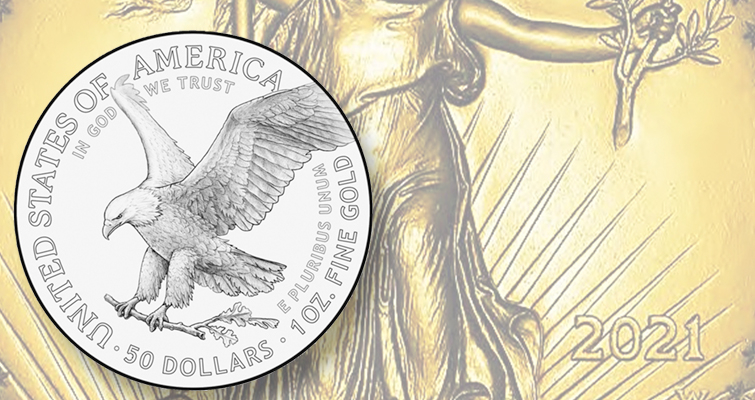

Silver and gold American Eagle bullion coins will exhibit a new look in 2021 with the reverse designs being replaced with new renditions featuring eagles.
The Commission of Fine Arts recommended designs for the gold and silver coins June 18 after considering 39 total submissions. The Mint submitted 39 shared designs for review; each design was presented in two versions, one each for gold and silver. The only differences between the gold and silver version of each design are the inscriptions for the respective denomination and the placement of mandated inscriptions IN GOD WE TRUST and E PLURIBUS UNUM.
Placement of the two standard inscriptions differ on the existing designs. On the gold American Eagle, IN GOD WE TRUST and E PLURIBUS UNUM appear on the reverse. On the silver American Eagle, IN GOD WE TRUST appears on the obverse and E PLURIBUS UNUM on the reverse.
United States Mint officials have not disclosed whether the proposed designs were rendered by the Mint’s engraving staff, outside Artistic Infusion Program artists or both, and whether the designs are completely new works or submissions for previous coin programs such as platinum Proof American Eagles or commemorative coinage.
Article continues in link.............
Comments
I am not a fan of those designs. If I had to pick one it would be this:
I think most of the proposed designs look like commemoratives. I don’t know how to explain the design I was expecting. It should be very simple but enduring...exceptionalist. The old reverse said to me “this is not something to be messed with”
A lot if interesting designs, but 9 trust them to pick the worst ones.
No mention of the gold bullion coin or medal the Mint Director promised for the 400th anniversary of the Pilgrims.
Something irks me about them only changing half. Kill it off or redo the whole thing.
I like these 2:
Instagram
Silver pics
CoinWorld article identifies two groups that review the images but does not make clear who makes the final decision. Those involved with the recommendations and the final decisions need to abandon the idea that a coin surface is a place for creative art. It is a place for simple balanced graphic art as shown on the reverse of the current ASE.
With that in mind here are my two choices, but I'd prefer to see the current ASE reverse remain:
Gold does not need to replace currencies to reshape financial power. It only needs to replace collateral.
Really none of them wow me.
Some of them look like coloring book drawings or something I would draw in elementary school.
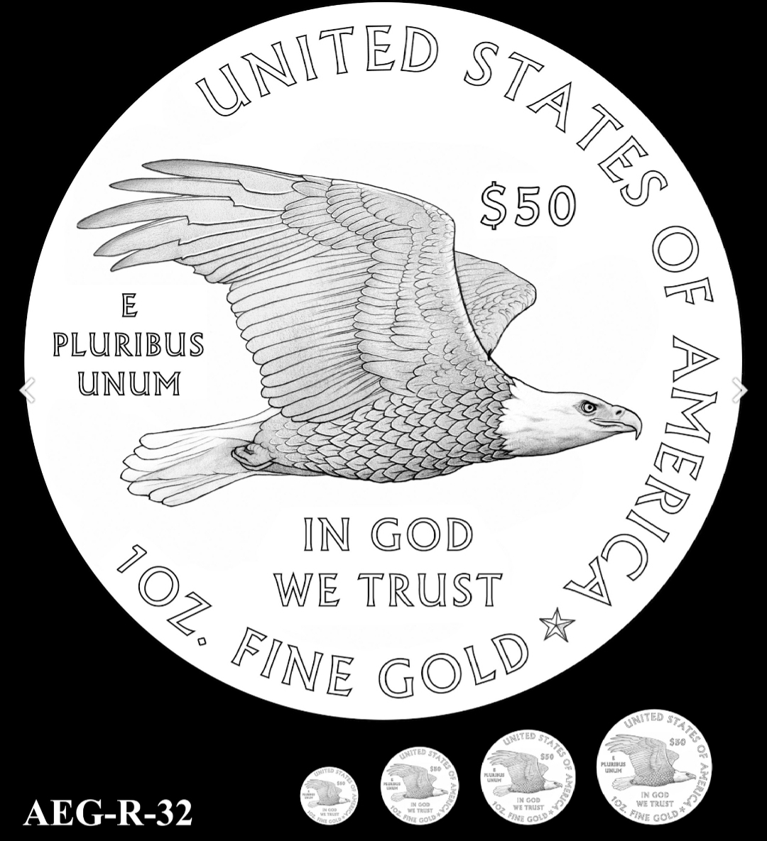
The one with the flying eagle (AEG-R32) would be my choice. A very clean design ... and I like the flying eagle.
I'd love to see an eagle depicted on a coin coming right at you with his claws in the foreground like he was right in your face about to take your eyes out. Something like this but more realistic:
Gold does not need to replace currencies to reshape financial power. It only needs to replace collateral.
Nice!
Arrows in the left talon must remain part of the design.
Great transactions with oih82w8, JasonGaming, Moose1913.
I actually like it.
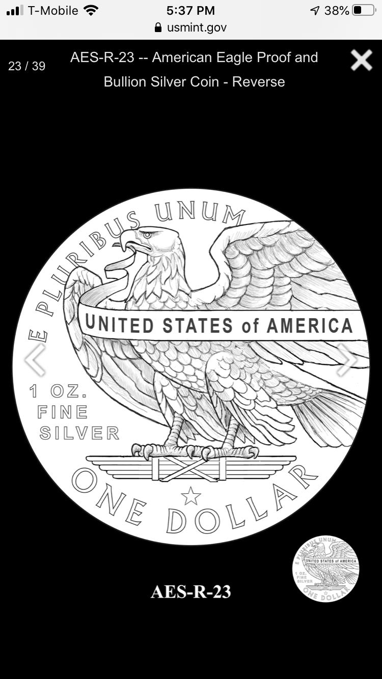
I'd like to see the reverse AES-R-30 developed for the Silver Eagles. With the right sculptor / engraver, that concept could be a stunning piece.
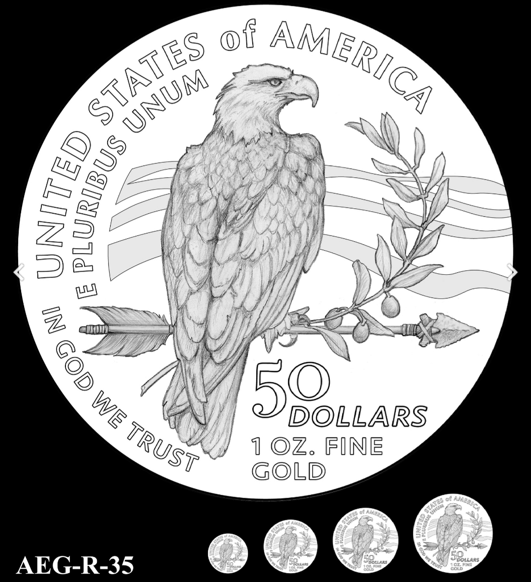
As for the gold, the AEG-R-35 could have potential, but I think the "wavy ground" beyond the Eagle and the over-sized single arrow and olive branch might be too much. I do like the view of the Eagle's back and turned head however.
“We are only their care-takers,” he posed, “if we take good care of them, then centuries from now they may still be here … ”
Todd - BHNC #242
AEGR35 is my choice.
Same old bird.
The Mysterious Egyptian Magic Coin
Coins in Movies
Coins on Television
I never liked the "Family of Eagles" gold reverse, so I would welcome any change.
I like AEG-R-32 .")

But this is my favorite:
or this:")

One catches my eye.
AEG-R-35
Plain with a modern whipping in the stripe.
13 leaves could be cool.
Most arrows have 3 feathers as to look 3d.
Clean it up with detail all around.
Just my thoughts.
Cool.
Thanks for the heads up.
Time for a new album!
The problem of design selection by committee will yield the typical bland result. By they time everyone has made their opinions known, you end up with the least objectionable design - which is usually bland and devoid of any possible controversy. This also eliminates the purpose of art - to inspire and provoke thought. Select an artist, let him create a design, consult with a die maker and let one person make the final choice. (I.E. T. Roosevelt and St. Gaudens).....Cheers, RickO
Some of the gold designs.
Many more here........
https://www.coinnews.net/2020/06/19/2021-american-eagle-gold-and-silver-coin-candidate-designs/
I like the R-30
Way overdue. Current AGE design was not terrible but the reverse of the ASE is among the worst coin designs ever produced.
The whole worlds off its rocker, buy Gold™.
BOOMIN!™
Wooooha! Did someone just say it's officially "TACO™" Tuesday????
Retiring at 55, what day is today?
Only design change I want to see on the 1oz silver is change one dollar to twenty dollars.
I'd like to see the AEG-R-35 with an incuse design.
mbogoman
https://pcgs.com/setregistry/collectors-showcase/classic-issues-colonials-through-1964/zambezi-collection-trade-dollars/7345Asesabi Lutho
I like a lot of the designs more than the currently used designs.
At least they're not dome shaped...
Maybe I missed it in the article but does this mean the design runs flush to the edge of the coin like the $2.50 and $5 Indian gold, or are there still denticles or reeding or whatever around it, they just aren't showing that in these designs?
Collector of randomness. Photographer at PCGS. Lover of Harry Potter.
Yep, family of eagles on the AGE reverse needs to be replaced.
Gold does not need to replace currencies to reshape financial power. It only needs to replace collateral.
OO-raw!