It's hard to not see the Saint-Gaudens knockoff attributes of it, at which point you really see how inferior it is to his work. The concept could have been executed far better than it was.
I like it. Don’t mind the stylizations or ethnic eyes. FWIW, Richard Masters pencil sketch does not show a heavy lower eyelid.
It’s just a medal/coin, not the end of the world they’re trying something a bit different.
"A happy person is not a person in a certain set of circumstances, but rather a person with a certain set of attitudes"--Hugh Downs
@Nysoto said:
I like it a lot, a very creative and expressive emblem of Liberty. I would like to see a creative rendition of Liberty on circulating coinage.
I'll bet Scott would agree with my opinion of that "pig."
I'll bet Scott would agree with my opinion of that "pig."
Nah, Scot was more artistic than that, look at the creative artistry on the draped bust to right gold
The new design is a great use of space and balance to emphasize patriotic symbols of Liberty that have been important since the original Great Seal of the US, in a modern portrayal.
Robert Scot: Engraving Liberty - biography of US Mint's first chief engraver
I'll bet Scott would agree with my opinion of that "pig."
@Nysoto replied: "Nah, Scot was MORE ARTISTIC than that, look at the creative artistry on the draped bust to right gold
Thanks, you just made my point! The obverse of this new issue is not artistic in the least FOR MY TASTE. That's all that counts FOR ME. I'm just posting an opinion that will not change any one or anything except for the fact that I will not purchase this UGLY COIN! Perhaps it will be another "Susie" dollar flop.
Comments
She's one toke over the line.
It's hard to not see the Saint-Gaudens knockoff attributes of it, at which point you really see how inferior it is to his work. The concept could have been executed far better than it was.
Keeper of the VAM Catalog • Professional Coin Imaging • Prime Number Set • World Coins in Early America • British Trade Dollars • Variety Attribution
I figured it was inspired by this
Keeper of the VAM Catalog • Professional Coin Imaging • Prime Number Set • World Coins in Early America • British Trade Dollars • Variety Attribution
I like it. Don’t mind the stylizations or ethnic eyes. FWIW, Richard Masters pencil sketch does not show a heavy lower eyelid.
It’s just a medal/coin, not the end of the world they’re trying something a bit different.
The reverse is great, the obverse,...I like some elements and dislike others.
Is it me or does she look angrier in the silver version?
Well, wouldn't you be a bit cheesed if your twin sister got gold and you just got silver?
Keeper of the VAM Catalog • Professional Coin Imaging • Prime Number Set • World Coins in Early America • British Trade Dollars • Variety Attribution
but, but it's 2.5 oz compared to 1 oz
"Yep...Im gonna pass it"
BST transactions: dbldie55, jayPem, 78saen, UltraHighRelief, nibanny, liefgold, FallGuy, lkeigwin, mbogoman, Sandman70gt, keets, joeykoins, ianrussell (@GC), EagleEye, ThePennyLady, GRANDAM, Ilikecolor, Gluggo, okiedude, Voyageur, LJenkins11, fastfreddie, ms70, pursuitofliberty, ZoidMeister,Coin Finder, GotTheBug, edwardjulio, Coinnmore, Nickpatton, Namvet69,...
I guess I'm in the minority. I love it.
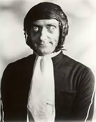
Marty Feldman's granddaughter?

My Saint Set
The head is misshapen imo,
It’s too pointy!
pointy liberty
I like it a lot, a very creative and expressive emblem of Liberty. I would like to see a creative rendition of Liberty on circulating coinage.
I'll bet Scott would agree with my opinion of that "pig."
@Insider2 said:
Nah, Scot was more artistic than that, look at the creative artistry on the draped bust to right gold
The new design is a great use of space and balance to emphasize patriotic symbols of Liberty that have been important since the original Great Seal of the US, in a modern portrayal.
I'll bet Scott would agree with my opinion of that "pig."
@Nysoto replied: "Nah, Scot was MORE ARTISTIC than that, look at the creative artistry on the draped bust to right gold
Thanks, you just made my point! The obverse of this new issue is not artistic in the least FOR MY TASTE. That's all that counts FOR ME. I'm just posting an opinion that will not change any one or anything except for the fact that I will not purchase this UGLY COIN! Perhaps it will be another "Susie" dollar flop.