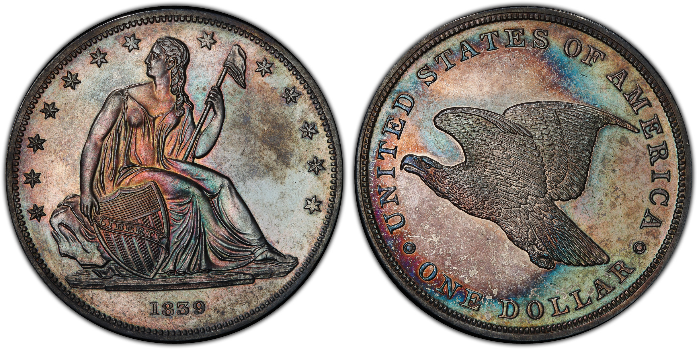
Gobrecht true view
Finally got images done for my ANA newp. 1839 original striking. Note that the actual orientation is medal turn, eagle level

56
Finally got images done for my ANA newp. 1839 original striking. Note that the actual orientation is medal turn, eagle level

Comments
That is a very tough coin. The only examples I almost purchased were restrikes that had been dipped white and were NGC graded. I have given up on a getting an example of this type.
TDN, if you desire, Phil and team will orient the reverse however you would like. Just send them an email with your cert # and explain what you want.
Beautiful coin.
Sublime
Bodacious coin. Congrats on that one.
Lovely coin!
Wonderful.
Awesome.
"Inspiration exists, but it has to find you working" Pablo Picasso
A true beauty!!
Wow!
In honor of the memory of Cpl. Michael E. Thompson
Very Nice!
So beautiful!
Beautiful coin!
Exquisite.
Again, congrats.
Wow, stunning, congratulations !!!
Breathtaking.
I don't recall seeing this at the ANA but would have liked to.
Regardless, congratulations.
"If I say something in the woods and my wife isn't there to hear it.....am I still wrong?"
My Washington Quarter Registry set...in progress
Whatever that funky spot on the front is, it's distracting. Looks environmental or uneven toning on the area of the coin that was cleaned/spot removed sometime in the past. There is something going on under there. CAC didn't like it either.
Coin is newly graded/regraded. What was it before? https://www.pcgs.com/cert/36068656
Stupid is as stupid does. Any more silly comments?
Ooooooooo...me likey!
Stunning
Steve
Absolutely breathtaking!!
.
CoinsAreFun Toned Silver Eagle Proof Album
.
Gallery Mint Museum, Ron Landis& Joe Rust, The beginnings of the Golden Dollar
.
More CoinsAreFun Pictorials NGC FOR SALE
Great coin and design.
Absolutely beautiful!!
TDN, here is the eagle level if you prefer. It's odd that all of the TV's show "ONE DOLLAR" leveled rather than the eagle with the exception of the PR45 example. I wonder if the photo department preferred the text oriented with the denomination level over the true alignment?
Sweet looking coin!
U.S. Type Set
My impression is that Christian intended the text to be level. It seems odd to design the reverse so the text isn’t level.
Agree it’s a great coin!
That's what I was wondering, maybe prior to striking one of the dies was rotated causing the alignment @tradedollarnut mentioned in the OP?
The 1836 design was eagle flying upward. 1839 originals have the eagle flying level
Beautiful coin - have thought it would be fun to do a 1839 pattern set and that would fit the bill nicely!
That's wonderful!
My YouTube Channel
It's so hard to find these undipped/uncleaned. Congratulations!
What is now proved was once only imagined. - William Blake
Beautiful!
Just saw that it was regraded.
PCGS is pretty consistent, PR64 before and after.
Amazing.
Most of us can only dream about owning such a nice piece.
Except it’s not a pattern...
Just an amazing example of rarity and eye appeal, all rolled into one. Congrats!
Dead Cat Waltz Exonumia
"Coin collecting for outcasts..."
Superb!
With the eagle level, then the words "One Dollar" do not look right. Interesting that the mint re-oriented to make the eagle level.
Beautiful coin... Thanks for showing us... Cheers, RickO
I'd have to look at it on my big 4K monitor at home to be sure, but that certainly looks like a DTS State B Original.
For those questioning the alignment, the Starless Reverse is designed such that the denom is centered at the bottom and level. However, when these were struck, the only die cup available was the one left over from the problematic 1836 striking during which the feed fingers were hitting and nicking the reverse die. Almost all J60's show nicking about the reverse rim. The reverse die was rotated several times in an effort to discover the cause of the misfeeding, including making a new die cup that held the die such that the eagle was level. This II/IV die cup was retained and used in 1838 and 1839.
There is some question as to the authorization for the 1839 striking as there is no letter accepting the new Nameless obv and Starless rev designs. Likewise, there is no letter directing the striking of dollars in 1839 and, furthermore, letters do show that the 1840 Seated design was being prepared and approved. Combine that with the 1839 striking of 300 in the last weeks of December and it would seem that Robert Maskell Patterson was a bit miffed at the design he and others worked so hard on being replaced and took it upon himself to have the 300 struck and released to circulation.
Those interested can find our articles on the Gobrecht dollars at http://uspatterns.com/gobdol.html
Gorgeous coin.
Keeper of the VAM Catalog • Professional Coin Imaging • Prime Number Set • World Coins in Early America • British Trade Dollars • Variety Attribution
Really nice coin!
Please visit my website Millcitynumismatics.com
Wowsers! What a beauty in deed!
BST transactions: dbldie55, jayPem, 78saen, UltraHighRelief, nibanny, liefgold, FallGuy, lkeigwin, mbogoman, Sandman70gt, keets, joeykoins, ianrussell (@GC), EagleEye, ThePennyLady, GRANDAM, Ilikecolor, Gluggo, okiedude, Voyageur, LJenkins11, fastfreddie, ms70, pursuitofliberty, ZoidMeister,Coin Finder, GotTheBug, edwardjulio, Coinnmore, Nickpatton, Namvet69,...
Exquisite.
Again, congrats.
thats totally awesome, i like
Beautiful...
POST NUBILA PHOEBUS / AFTER CLOUDS, SUN
Love for Music / Collector of Dreck
stunner, wow I love it too!
We agree. Prima faciae evidence of the brilliance of your purchase.
Very hard mirrors for a survivor of that date They amplify the intensity of the color progression; prettier than any seen in recent memory.
Easy---its right there on the label!! Haha sorry, I couldn't help myself. Its a good question.
The answers are at the link above