Options
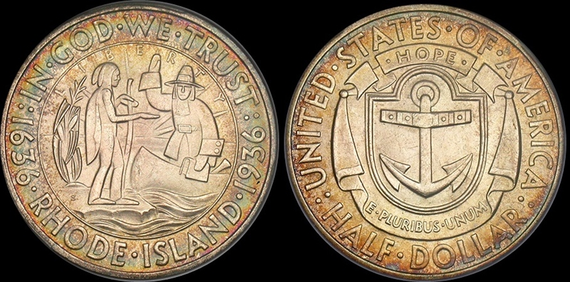
You know how to make a Rhode Island Commem look good?...
 CommemKing
Posts: 2,202 ✭✭✭✭✭
CommemKing
Posts: 2,202 ✭✭✭✭✭
Put some color on it. Man, I need to slow down on these boys. Too many nice ones popping at once. You likey?
16
Comments
The Rhode Island and the Wisconsin commemorative half dollars bear the most amateurish designs in the whole early commemorative series. There is not much one can do to make those coins look better. Even the Monroe, which was poorly executed, stemmed from a good idea with the goddesses of North and South American reaching out to each other. With the Rhode Island, I bought one coin to fill the hole and left it at that.
Like the bullseye toning. The design not so much. That looks as nice as a Rhode Island can.
IMO, the ideal Rhode Island commem is one of the elusive prooflike examples.
Congrats on your pick up.
Of course, this coin is still listed for sale on Collectors.com....that site is quickly becoming useless. The 1935 D Arkansas in 67+ listed as for sale by Apmex on ebay was sold MONTHS ago. I could list other examples, but you get the picture.
This coin is very difficult to photograph in a way that looks like the coin in-hand. Here is the best I could do on my PL example:

Nice! Does it have that proof like quality in hand? Hard to tell from the photo.
Great example!
Phil does a pretty good job
http://images.pcgs.com/CoinFacts/84331930_60711133_2200.jpg
Yes, he does. I was going to send it in for a reholder and trueview, but its got the CAC sticker on it.
Trade it for an Oregon Trail?
I've always thought the high-fivin' pilgrim with the bangs was a hoot. Toning does a lot to salvage this cartoonish design.
That's a super nice example.
Bought this one a month or so ago:
I collected commemoratives of all the states I have lived in - and Rhode Island was one (Navy years)...I liked the anchor on the back (Newport was a huge Navy base)...Cheers, RickO
Until this thread, I had no idea how silly that design was. (the people side)
Nothing against your coin. It’s as nice as they come. However, the Rhode Island is one of the reasons I decided to do a box of 20 commems instead of collecting the series. Chuck-E-Cheese tokens have more artistic merit.
I would take a Rhode Island or Wisconsin over a Washington-Carver any day of the week. And maybe a BTW or Arkansas.
Being a University of Rhode Island graduate this design holds a special place for me...I like the art deco look and have several in a variety of grades and enjoy them all! They are hard to find with decent eye appealing color, the OP's is a nice example and thanks for posting!
K
Here are two PL Rhode Island. One more attractive than the other
https://us.v-cdn.net/6027503/uploads/editor/bl/7038lb9u0n7b.jpg "")
Overland Trail Collection Showcase
Dahlonega Type Set-2008 PCGS Best Exhibited Set
It is sort of pleasing
Successful transactions with : MICHAELDIXON, Manorcourtman, Bochiman, bolivarshagnasty, AUandAG, onlyroosies, chumley, Weiss, jdimmick, BAJJERFAN, gene1978, TJM965, Smittys, GRANDAM, JTHawaii, mainejoe, softparade, derryb, Ricko
Bad transactions with : nobody to date
I don't mind the design.
I agree with @ElKevvo .
Sometime toners seem to highlight print marks and others look like they have soaked for way too long. I do agree that the design is pretty strange. More you look, the more you see. Indian has Nano Nano arm.
Best place to buy !
Bronze Associate member
I actually really like the design of the Rhode Island. I think it's much better than many commems. I don't like the Wisconsin, booker, Washington-carver, or Cleveland.
I agree with all of the above:
My current "Box of 20"
"You know how to make a Rhode Island Commem look good?..."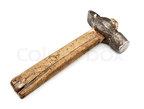
Use this on it:
An interesting design for sure.
My YouTube Channel
I'm assuming you mean the toned example? I like the look.
I find it interesting that the coin actually commemorates the City of Providence and not the State of RI. There's no mention of the city on the coin. I've never found the coin to be that attractive, but I'm still looking for one.
Every time I look at that Indian it looks
like a beetle.