Which Texas Commem Half do you prefer? Got the MS67 in hand.
 CommemKing
Posts: 2,202 ✭✭✭✭✭
CommemKing
Posts: 2,202 ✭✭✭✭✭
I currently own both but an getting rid of one of them. Let me know what you think and why. This is to add to my ever growing commemorative set below.
EDIT: I just got he MS67 Texas in the mail. I don't like it. Its going back to the seller. The MS66 it is!
PCGS MS66 CAC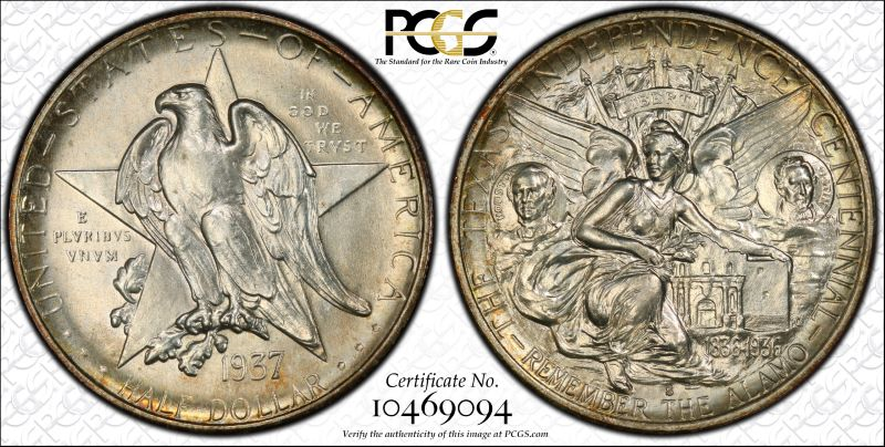
PCGS MS67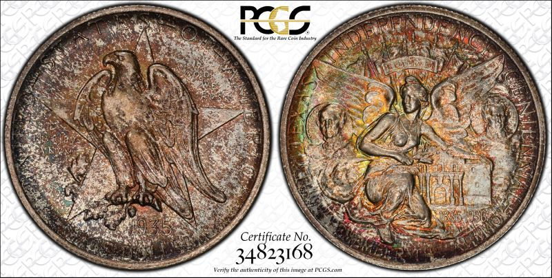
2
Comments
I like the 66 best myself
Why ? I think the toning on the 67 distracts me from the beautiful art on the coin JMO
JMO
Successful transactions with : MICHAELDIXON, Manorcourtman, Bochiman, bolivarshagnasty, AUandAG, onlyroosies, chumley, Weiss, jdimmick, BAJJERFAN, gene1978, TJM965, Smittys, GRANDAM, JTHawaii, mainejoe, softparade, derryb, Ricko
Bad transactions with : nobody to date
I'm going with @ricko on this one (early)
I like the 66
My YouTube Channel
@asheland ... I concur with your early agreement...
 Cheers, RickO
I agree, unless the 67 looks a lot better in hand.
it's crackers to slip a rozzer the dropsy in snide
66 for me too, though I like the reverse of the 67.
Not even close - the 66.
Coinlearner, Ahrensdad, Nolawyer, RG, coinlieutenant, Yorkshireman, lordmarcovan, Soldi, masscrew, JimTyler, Relaxn, jclovescoins, justindan, doubleeagle07
Now listen boy, I'm tryin' to teach you sumthin' . . . . that ain't no optical illusion, it only looks like an optical illusion.
My mind reader refuses to charge me. . . . . . .
i prefer the top one. its got more appeal to me
Agreed... the 66 has better eye appeal.
Successful BST transactions with: SilverEagles92; Ahrensdad; Smitty; GregHansen; Lablade; Mercury10c; copperflopper; whatsup; KISHU1; scrapman1077, crispy, canadanz, smallchange, robkool, Mission16, ranshdow, ibzman350, Fallguy, Collectorcoins, SurfinxHI, jwitten, Walkerguy21D, dsessom.
Top one. Not even close. It's the difference in eye appeal and I personally think one side of the bottom coin is in the toilet!")
Too bad we can't have the upper left image combined with the lower right side.
66 looks better to me, just don't like the obverse toning on the 67
Gotta go with the others and pick the 66. I like nice toning, but #2 has too much.
66 is more pleasant to look at
Pick door number one, but the in-hand look and luster is a a bit tough to judge from the true views.
Keep the 66 for sure. Your keeping the better eye appeal and hopefully making a few bucks on the higher grade.
Ok I'll be the odd ball. Love the 67.
Paper money eventually returns to its intrinsic value. Zero. Voltaire. Ebay coinbowlllc
Exactly what I thought as well!
Collector of randomness. Photographer at PCGS. Lover of Harry Potter.
Lustre shows much better on the 37. So, number 1 would be my choice.
Jim
When a man who is honestly mistaken hears the truth, he will either quit being mistaken or cease to be honest....Abraham Lincoln
Patriotism is supporting your country all the time, and your government when it deserves it.....Mark Twain
The 66 wins hands down. The toning pattern on the 67 is distracting and unattractive. Unfortunately, you may have trouble getting 67 money for it.
I like the 66
The obverse on the MS-67 is too mottled for me. I prefer the first one.
Good thing is, I can still return the MS67. I think im going to be doing just that.
1937 for Eye appeal but they are both worth keeping.
Best place to buy !
Bronze Associate member
I like the 66
“In matters of style, swim with the current; in matters of principle, stand like a rock." - Thomas Jefferson
My digital cameo album 1950-64 Cameos - take a look!
66.
If the 67 was caught earlier it would have had lighter toning of the same type. Just too strong to the point is detracts.
Another vote for the 37-S. Texas commems don't need help with toning to be attractive, and "noisy" toning is a distraction. What little attractive, colorful toning is on the 35 is drowned out by the splotchy, brown toning.
Keeper of the VAM Catalog • Professional Coin Imaging • Prime Number Set • World Coins in Early America • British Trade Dollars • Variety Attribution
I like the ultra toned 67. I know I am in the small group here. I like them both very much.
The 66. I like the TX type blast white best.
Before I decide, can you tilt the bottom coin & take their pics like these?
i
I think the tarnish on coin #2’s obv is much better than it’s shown.
I’ll stick my neck out & take #2.....")
Top one for me.
I'd have to dip them both. If I were forced to own one I'd go with the 66. Congrats
The whole worlds off its rocker, buy Gold™.
BOOMIN!™
Wooooha! Did someone just say it's officially "TACO™" Tuesday????
I like the 66 more because I can easily read the obverse legends. I do prefer evenly toned coins but don’t care for the mottled look. Eye appeal over grade is my personal preference.
67 obverse is too mottled IMO .... go with the 66.
Can you snap some photos of coin #2 to get a better idea of the in hand toning? To me the reverse toning looks great! Hoping the obverse is better than the TV.
Edited: Another thought: do you have a theme for your new commem set? The other coins you have shown lately have color. So if you are going for a consistent look, maybe neither coin is for you?
My current "Box of 20"
67 for me
Don't have the coin in hand yet. Just purchased it online. No can do on the pics for now.
I like the eye appeal, not the number.66.
I like the 66 because it has more eye appeal in my opinion.
Successful BST transactions with lordmarcovan, Moldnut, erwindoc
10 to 1 for the 66. I will go $100 on that 67.👿👿
Coin #2. No brainer.
Even with a beautiful design, plain white silver is just aggressively boring.
66 gets
my vote
I prefer the 66, very nice luster.
Successful Trades: Swampboy,
Sell them both and buy a killer with combined proceeds.
If you are having trouble deciding between the two, then neither is right in your mind.
"She comes out of the sun in a silk dress,
running like a water color in the rain...."
coin#1
I like coin 1. Obverse toning on coin 2 is definitively negative.
These came across my desk a few years ago. I thought long and hard about buying them. I passed.
Note the serial numbers and old fatties.
Lance.
For me, hands down, i prefer the 66cac, absolutely not a fan at all of that type of toning that is on the 67, imho
Well, I guess we will be a pair of oddballs.
(Preferable to being a pair of odd balls.)
If the toned coin's true vue beauty/fantasy shot looks that bad, you can bet it's fugly in hand.
Commems and Early Type
I have to agree with this. If a toned coin has little appeal in a true view glamour shot it has to be a dud in hand. I vote '37-s.