Am I the only one that thinks the US Mint has a hard time getting the Eagle right over the years?
 CommemKing
Posts: 2,202 ✭✭✭✭✭
CommemKing
Posts: 2,202 ✭✭✭✭✭
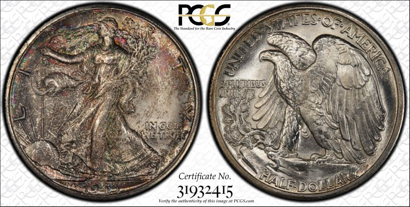
The American Bald Eagle is obviously plastered all over US coinage throughout the years. From my point of view most all just fail in comparison to the real deal. IMO, most look look like chickens and loons more than an actual eagle. Why have they never been consistent with the depiction of an actual eagle? There are a couple that come to mind like the reverse of a St. Guadens $20 and the reverse of the Walking Liberty half dollar as depicted below that actually look like Bald Eagles. Most other fail in comparison. What do you all think? What's do you feel is the best depiction on a US coin of our nations bird? I guess it's kinda like spaghetti hair.
0
Comments
I agree especially when it comes to the use of modernized design depictions of the eagle. I don't like the eagle to look like a robot. Peace Roy
BST: endeavor1967, synchr, kliao, Outhaul, Donttellthewife, U1Chicago, ajaan, mCarney1173, SurfinHi, MWallace, Sandman70gt, mustanggt, Pittstate03, Lazybones, Walkerguy21D, coinandcurrency242 , thebigeng, Collectorcoins, JimTyler, USMarine6, Elkevvo, Coll3ctor, Yorkshireman, CUKevin, ranshdow, CoinHunter4, bennybravo, Centsearcher, braddick, Windycity, ZoidMeister, mirabela, JJM, RichURich, Bullsitter, jmski52, LukeMarshall, coinsarefun, MichaelDixon, NickPatton, ProfLiz, Twobitcollector,Jesbroken oih82w8, DCW
The reverse of the Peace Dollar is one of the worst. I really like the depiction of liberty on them but the bird looks horrid, in my opinion it looks nothing even remotely close to an eagle and the beak is ridiculous. It looks more like a Steller Sea Eagle than anything. I think the Walking Liberty Halves do it the best!
A government accident left me a former man, a potato. That photo on my profile is a low resolution selfie. I like coins.
I agree that the WLH and the St. Gaudens are the best, though the new platinum coin reverse is quite impressive. The rest are poor representations of this regal symbol. Cheers, RickO
Yes the Peace Dollar eagle's head looks like a brick.
There are differences between the actual bird and the symbols that appear on a national emblem. Most often the image of an eagle that has appeared on a national flag or great seal in includes the shield and a crown, which in symbolic of national sovereignty. As much as you might like the look of a more national appearing eagle, it would look silly on a national symbol that is designed to appear formal and stately.
I agree with you that the eagles that appeared on the very early flowing high silver coinage looked skinny and sickly. Those designs were the creations of amateur artists who were feeling their way after the professional coin makers refused invitations to work at the first U.S. Mint. After that, the designs were often modeled after the Great Seal of the United States or design elements from it. Once more I get back to the question of what images a government wishes to project for itself. Usually it’s not based on the eagle that appears in nature.
The WLH reverse is one of the most beautiful renderings, IMHO. St. Gaudens has a wonderful look, too. The FE cent and the Gobrecht dollar are nice, too.
Define “right.”
I'll disagree w/out hitting the button. The Peace Dollar eagle looks much better than most and is realistic. It's similar to the Connecticut Tercentenary Half Dollar, which I also like the look of.
IMO the Morgan Dollar eagle is ridiculous. It looks like a specimen laid out for dissection.
I dunno. I really like the eagle on the Peace dollar. I don't care for the "spread eagle" depiction on many of the coins, but a little variety never hurt anything. One of my favorites is the small eagle design on early US coinage. Interestingly it's an acquired taste as I remember being "unimpressed" when I first encountered these designs.
I too disagree without hitting the button. I like the variety of depictions. Would be very UNinteresting to me if every coin had the exact same representation of the bald eagle. I created a showcase a few years ago on this very subject................
https://pcgs.com/SetRegistry/collectors-showcase/box-20/bolivarshagnastys-depictions-american-bald-eagle/album/2438
What the heck is this creature?")
The main challenge is getting the eagle's proportions correct while fitting it into a circular area.
Here is probably my best attempt:
The half-disme eagle still reminds me of Groucho Marx doing his flying duck dance.
The eagle of US coins has been subject to nearly constant complaint over the centuries - this includes the Saint-Gaudens and MacNeil flying eagles. Most gripes have centered on the eagle not being accurately depicted from life. This included the 1836 flying eagle which was sketched from a dead (we hope), stuffed eagle that had been posed in position at the Mint. Saint-Gaudens and MacNeil were blasted by American and British ornithologists who claimed the flying position of wings and talons were wrong. MacNeil countered with a photo taken in the Adirondacks of an eagle in flight which was his model for the quarter reverse. Saint-Gaudens was dead, so he didn't have much to say.
It looks like a Parrot that is molting...
Later, Paul.
I always liked the eagle on the Standing liberty quarter and flying eagle cent.
Well the Russian Eagle has 2 heads. I do like the rendition on the Palladium Eagle.
Some of the modern renditions are pretty nice. I like the one of the eagles at the nest on the AGE and the eagle on the SAC dollar is well executed:
Looks like something out of a Harry Potter movie.
I always liked the Sac reverse. It especially remarkable considering the low relief Tom Rogers had to deal with.
@bolivarshagnasty that's a great Book/Box of 20. I would say out of those the Bridgeport and Constitution are my least favorite. Your coins are fantastic!
Best place to buy !
Bronze Associate member
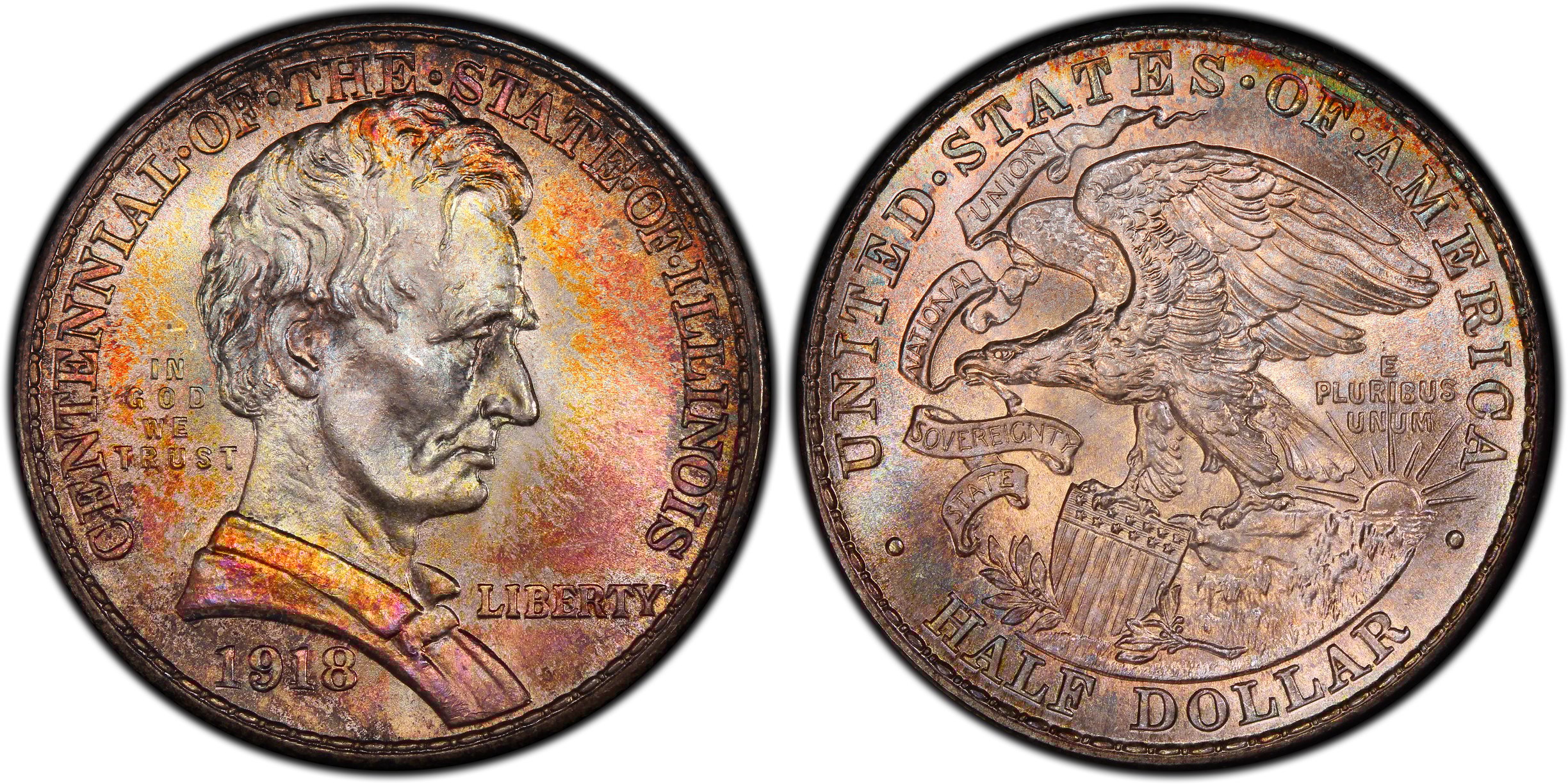
I've always liked the eagle on the reverse of the 1918 Illinois Commemorative:
http://images.pcgs.com/CoinFacts/33004887_48326190_max.jpg
Insert witicism here. [ xxx ]
I think the Seagull on the back of the Washington Quarter takes the cake for worst "eagle".
Things haven't been good since "Peter" died.
I think that the eagle is trying to dab!
Yup, I agree. I like the WLH and St. Gaudens, but I'm sure there are more modern artistic examples that can be submitted for consideration !!!")
I recently posted about major eagle depictions on US coins. Here is a link. Lotsa pics! https://forums.collectors.com/discussion/991777/a-photo-journey-depictions-of-eagles-on-us-coins
I have always thought the Peace eagle looked like a parrot head, but the more I look at it I think maybe with the back facing the viewer, it is maybe looking away towards the new rising sun (just a guess as the new Peace was something they hadn't had in years) and the angle that would make just doesn't translate well on a coin and looks kind of wonky and hard to read.
What about that "thing" on the reverse of the franklin half? Reminds me of something lifting weights
The Peace Dollar image is pretty good, I think.
Lance.
Yes, that was the result of a statutory requirement that the eagle appear on the reverse of the half dollar. They barely made it on a techicality.
I just like Bald Eagles. I'm not too picky!")
One of my favorite depictions