I like the old Commems and am trying to find something to like about this one, but can't. I would keep looking. I judge a coin by how it looks in hand. Just my opinion, it grade well I think.
Very wholesome and it stabilized before ED.
Referencing JA does not make this a CAC thread.
I've been disagreeing with JA about this look for almost 40 years, and he's right.
Uncompromisingly original and virtuously maintained. Exquisite surfaces.
Both of us might likely think it's as much or more fun to ponder raw in an AU presentation box
/Yawn
"People sleep peaceably in their beds at night only because rough men stand ready to do violence on their behalf." - Geo. Orwell
Sorry, but I'm not a fan of it. It's okay, but I would not pay a premium for it. I really don't like the deep tab toning that can be found on some of the old commemoratives.
I know this is boring to many, but I have purchased coins like this at little or no premium for the price.
This Delaware is about as far I want to go with tab toning.
Retired dealer and avid collector of U.S. type coins, 19th century presidential campaign medalets and selected medals. In recent years I have been working on a set of British coins - at least one coin from each king or queen who issued pieces that are collectible. I am also collecting at least one coin for each Roman emperor from Julius Caesar to ... ?
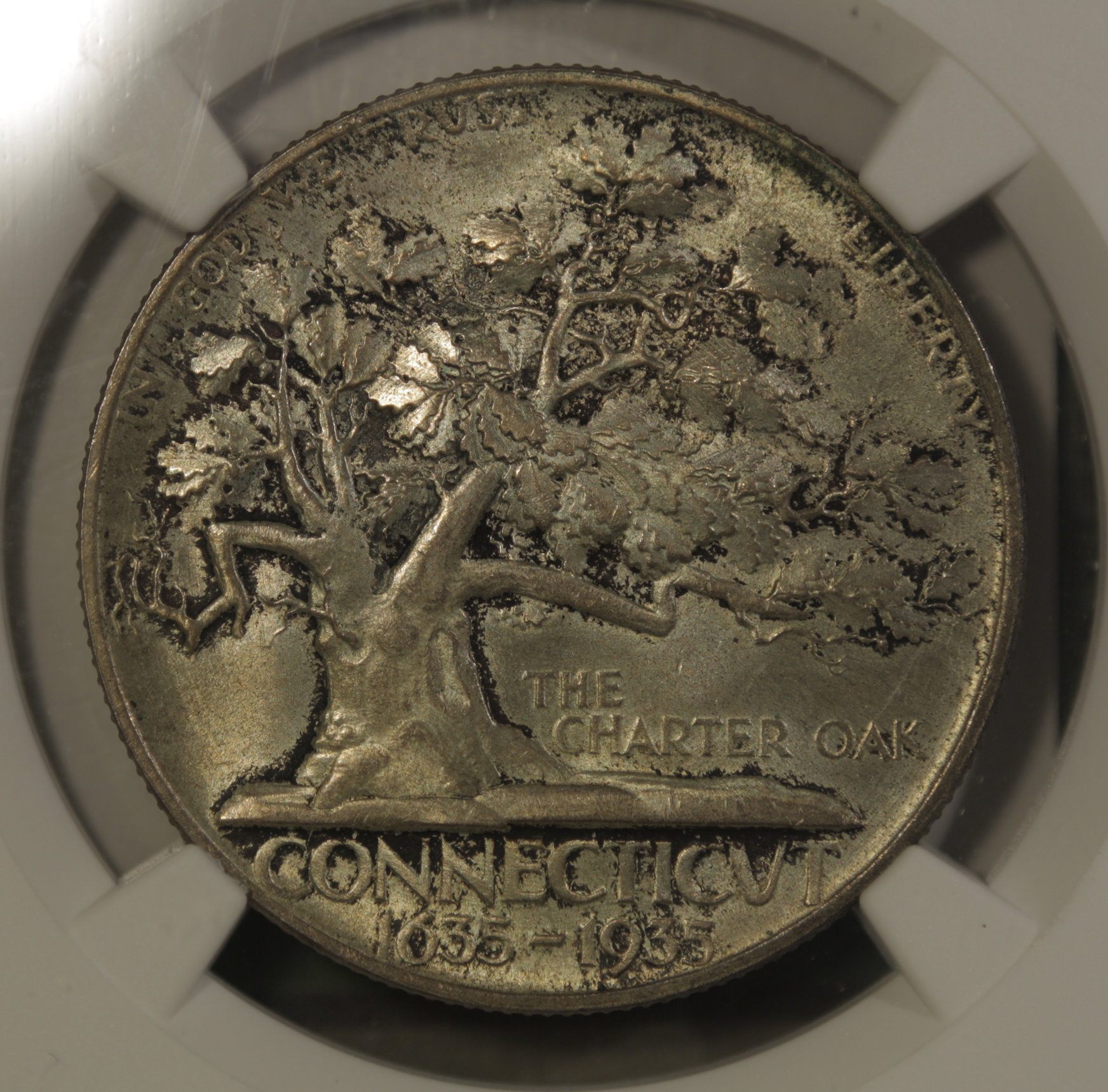
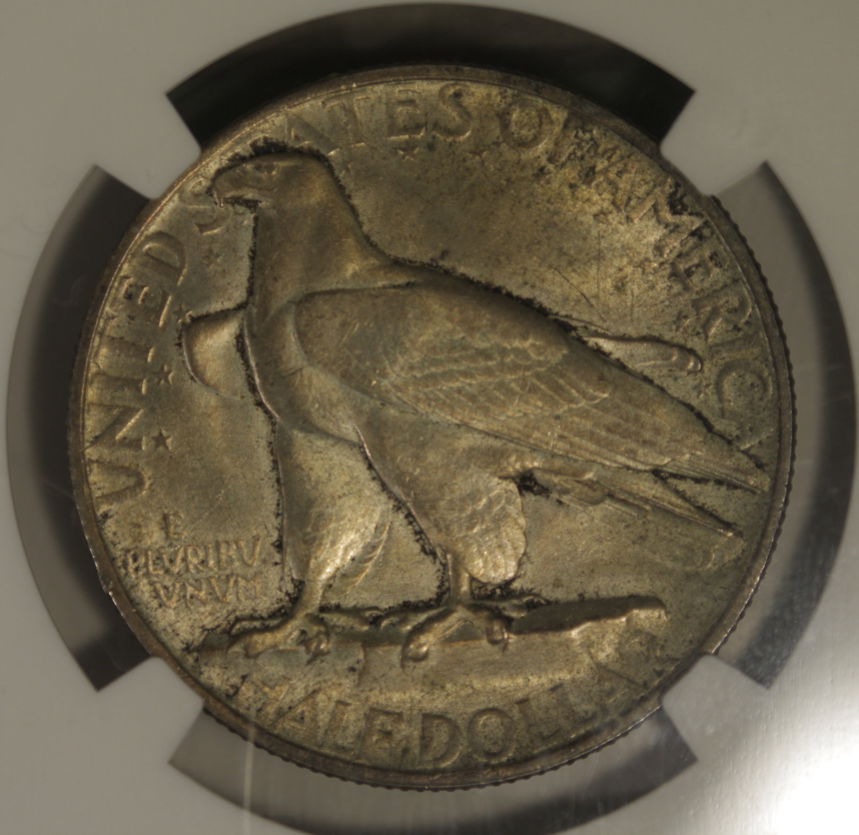
A bit too dark for me. I had a coin with a similar pattern, but much more orange and lively, that I sold to pursue a nicer coin. I have yet to find that nicer Connecticut though, so maybe one in the hand is worth two in the bush...
@BillJones said:
Sorry, but I'm not a fan of it. It's okay, but I would not pay a premium for it. I really don't like the deep tab toning that can be found on some of the old commemoratives.
I know this is boring to many, but I have purchased coins like this at little or no premium for the price.
This Delaware is about as far I want to go with tab toning.
I was not familiar with the term "tab toned" but looked it up before posting this.
I really like the look of that Delaware. Is the toning in the OP tab toning? To me it looks different from the small variety I saw just now when I googled it.
I was not familiar with the term "tab toned" but looked it up before posting this.
That Delaware was stored in an original holder which looked like this on the inside.
Here is the front cover.
That Delaware is a few marks away from MS-67. It has great luster, and the toning is colorful and looks better in person that it does in my photographs. PCGS graded it MS-65.
I was born and raised in Delaware and have long looked for the "perfect" Delaware half dollar. I have three of them, and I have yet to find it. This one comes the closest.
Retired dealer and avid collector of U.S. type coins, 19th century presidential campaign medalets and selected medals. In recent years I have been working on a set of British coins - at least one coin from each king or queen who issued pieces that are collectible. I am also collecting at least one coin for each Roman emperor from Julius Caesar to ... ?
I'm neutral on it.
I really appreciate an original, unmessed with coin but the appeal just isn't there for me.
I probably wouldn't purchase it unless the price was right.
I have toning like that which appears on the OP coin on pieces that were stored for a long time in the orginal box. The box probably had some sulfur in the felt that reacted with the coin.
I like original boxes for commemorative coins, including the modern pieces. The trouble is they are hard to find for most of the "old commemorative" issues, and usually pricey. I have only three of them, the Delaware, the Lexington & Concord wooden box, which one of the most common, and one of the boxes for the Panama - Pacific set. It is NOT the copper frame. I figured if I was willing to spend that much for a set of Pan-Pac coins that I might as well get the box which is really neat.
Retired dealer and avid collector of U.S. type coins, 19th century presidential campaign medalets and selected medals. In recent years I have been working on a set of British coins - at least one coin from each king or queen who issued pieces that are collectible. I am also collecting at least one coin for each Roman emperor from Julius Caesar to ... ?
I don't really care for that look on classic silver commems. I don't dislike it, but I also find that coins like the one in the OP are not only very difficult to sell when the time comes, but that I don't derive as much enjoyment out of looking at them. It is still cool, but lower on the cool scale.
Here are my other two Delaware commemorative half dollars.
This one is an NGC MS-64.
This one is a PCGS MS-65, CAC
Retired dealer and avid collector of U.S. type coins, 19th century presidential campaign medalets and selected medals. In recent years I have been working on a set of British coins - at least one coin from each king or queen who issued pieces that are collectible. I am also collecting at least one coin for each Roman emperor from Julius Caesar to ... ?
Just about every coin has an "irresistible" price. The "slug" I posted cost $2 in the junk bin and has a few stories to tell about its history and the condition of its surface. There is a horse on the reverse.
I like the look of the coin in the op, that's the toning they picked up in the little presentation boxes. I appreciate the way it brings out the details.
I prefer the 'crusty' look to tarnish... though some crust is indeed tarnish.... The OP is not necessarily one I would purchase, but I would give it a second look if in the market for commem....Cheers, RickO
I don't care for it. I would not buy it.
It may be "original" but I still don't care for the appearance.
I'm not sure, but I don't think that "crust" will dip off either.
Eye-appeal is the "bowl" that holds all the requisites for each part of the Mint State grade determination. Unfortunately , it is the ONLY subjective part of that formula as all the others can be measured with a semblance of precision.
I should be very interested to read personal opinions on the MS grade of this coin from members here.
@BillJones said:
Sorry, but I'm not a fan of it. It's okay, but I would not pay a premium for it. I really don't like the deep tab toning that can be found on some of the old commemoratives.
I know this is boring to many, but I have purchased coins like this at little or no premium for the price.
I like both coins. However, I prefer the OP coin. It looks like it went straight into a holder at the time it was made and then never had a thing done to it after that. The latter coin probably looked like the OP coin prior to being dipped. The slight hazy splotches on the reverse (which I highlighted below) look like they were darker toned areas before dipping.
The toning on the OP coin is neutral for me. The picture is rather dark, and I'd have to see it in hams to know of I really liked it or not.
I can't generalize as to whether I like "crusty" commems. Some look good that way, others don't. I'm also nor a big fan of dramatic tab toning unless it complements the design, which it usually doesn't.
I appreciate the originality, and like the look,...to a point. The OP's coin is nice, but getting a litlle too dark for a premium. The wholesomeness and originality is there, but the eye apeal is starting to fade.
 Smittys
Posts: 9,876 ✭✭✭✭✭
Smittys
Posts: 9,876 ✭✭✭✭✭
Comments
I like it a lot.
I like the old Commems and am trying to find something to like about this one, but can't. I would keep looking. I judge a coin by how it looks in hand. Just my opinion, it grade well I think.
Very wholesome and it stabilized before ED.
Referencing JA does not make this a CAC thread.
I've been disagreeing with JA about this look for almost 40 years, and he's right.
Uncompromisingly original and virtuously maintained. Exquisite surfaces.
Both of us might likely think it's as much or more fun to ponder raw in an AU presentation box
/Yawn
By this do you mean that the toning occurred in such a way to not cross the line into ED?
Sorry, but I'm not a fan of it. It's okay, but I would not pay a premium for it. I really don't like the deep tab toning that can be found on some of the old commemoratives.
I know this is boring to many, but I have purchased coins like this at little or no premium for the price.
This Delaware is about as far I want to go with tab toning.
A bit too dark for me. I had a coin with a similar pattern, but much more orange and lively, that I sold to pursue a nicer coin. I have yet to find that nicer Connecticut though, so maybe one in the hand is worth two in the bush...
Partner @Gold Hill Coin

I was not familiar with the term "tab toned" but looked it up before posting this.
I really like the look of that Delaware. Is the toning in the OP tab toning? To me it looks different from the small variety I saw just now when I googled it.
no.
What is ED
That Delaware was stored in an original holder which looked like this on the inside.
Here is the front cover.
That Delaware is a few marks away from MS-67. It has great luster, and the toning is colorful and looks better in person that it does in my photographs. PCGS graded it MS-65.
I was born and raised in Delaware and have long looked for the "perfect" Delaware half dollar. I have three of them, and I have yet to find it. This one comes the closest.
I'm neutral on it.
I really appreciate an original, unmessed with coin but the appeal just isn't there for me.
I probably wouldn't purchase it unless the price was right.
I have toning like that which appears on the OP coin on pieces that were stored for a long time in the orginal box. The box probably had some sulfur in the felt that reacted with the coin.
I like original boxes for commemorative coins, including the modern pieces. The trouble is they are hard to find for most of the "old commemorative" issues, and usually pricey. I have only three of them, the Delaware, the Lexington & Concord wooden box, which one of the most common, and one of the boxes for the Panama - Pacific set. It is NOT the copper frame. I figured if I was willing to spend that much for a set of Pan-Pac coins that I might as well get the box which is really neat.
@BillJones thank you for posting those pictures. I had not seen one before.....and good luck in the fun pursuit of the "perfect" one.
I don't really care for that look on classic silver commems. I don't dislike it, but I also find that coins like the one in the OP are not only very difficult to sell when the time comes, but that I don't derive as much enjoyment out of looking at them. It is still cool, but lower on the cool scale.
In honor of the memory of Cpl. Michael E. Thompson
Here are my other two Delaware commemorative half dollars.
This one is an NGC MS-64.
This one is a PCGS MS-65, CAC
I don't care for it.
Your coin is corroded.
do not like at all
Us detectorists are all about crusty. Peace Roy
BST: endeavor1967, synchr, kliao, Outhaul, Donttellthewife, U1Chicago, ajaan, mCarney1173, SurfinHi, MWallace, Sandman70gt, mustanggt, Pittstate03, Lazybones, Walkerguy21D, coinandcurrency242 , thebigeng, Collectorcoins, JimTyler, USMarine6, Elkevvo, Coll3ctor, Yorkshireman, CUKevin, ranshdow, CoinHunter4, bennybravo, Centsearcher, braddick, Windycity, ZoidMeister, mirabela, JJM, RichURich, Bullsitter, jmski52, LukeMarshall, coinsarefun, MichaelDixon, NickPatton, ProfLiz, Twobitcollector,Jesbroken oih82w8, DCW
Would this be more crusty
Lafayette Grading Set
These folks posting DON'T KNOW "Crust" do they?")
@thisistheshow asked: "By this do you mean that the toning occurred in such a way to not cross the line into ED?"
It is somewhat attractive "market acceptable" corrosion.
I like it OK but wouldn’t buy a coin with that look.
Just about every coin has an "irresistible" price. The "slug" I posted cost $2 in the junk bin and has a few stories to tell about its history and the condition of its surface. There is a horse on the reverse.
well, since the Colonel posted it, I am assuming ED means erectile dysfunction.
Check out some of my 1794 Large Cents on www.coingallery.org
Crusty and original. Worthy of sticker.
How much ya want fer it?
I like the look of the coin in the op, that's the toning they picked up in the little presentation boxes. I appreciate the way it brings out the details.
I like the coin in the OP.
I like silver coins that have that look.
I'm not a fan of the crust, on any coin. I'll agree with some that the crust does show off some of the detail.
Donato
Donato's Complete US Type Set ---- Donato's Dansco 7070 Modified Type Set ---- Donato's Basic U.S. Coin Design Set
Successful transactions: Shrub68 (Jim), MWallace (Mike)
In this case it means Environmental Damage")
"A dog breaks your heart only one time and that is when they pass on". Unknown
I don't care for that type of toning. It's too dark in some areas and not attractive or colorful.
Sometimes, it’s better to be LUCKY than good. 🍀 🍺👍
My Full Walker Registry Set (1916-1947):
https://www.ngccoin.com/registry/competitive-sets/16292/
It made me feel like picking on those crust
I really like that type of toning when its amber-colored, but once it turns black it's far less appealing.
Commems and Early Type
I prefer the 'crusty' look to tarnish... though some crust is indeed tarnish.... The OP is not necessarily one I would purchase, but I would give it a second look if in the market for commem....Cheers, RickO
I don't care for it. I would not buy it.
It may be "original" but I still don't care for the appearance.
I'm not sure, but I don't think that "crust" will dip off either.
Me like crust very much. Mostly on gold, but crusty silver can be quite fetching also.
Eye-appeal is the "bowl" that holds all the requisites for each part of the Mint State grade determination. Unfortunately , it is the ONLY subjective part of that formula as all the others can be measured with a semblance of precision.
I should be very interested to read personal opinions on the MS grade of this coin from members here.
I like both coins. However, I prefer the OP coin. It looks like it went straight into a holder at the time it was made and then never had a thing done to it after that. The latter coin probably looked like the OP coin prior to being dipped. The slight hazy splotches on the reverse (which I highlighted below) look like they were darker toned areas before dipping.
CAC has a special little blue sticker for that.
Keeper of the VAM Catalog • Professional Coin Imaging • Prime Number Set • World Coins in Early America • British Trade Dollars • Variety Attribution
The toning on the OP coin is neutral for me. The picture is rather dark, and I'd have to see it in hams to know of I really liked it or not.
I can't generalize as to whether I like "crusty" commems. Some look good that way, others don't. I'm also nor a big fan of dramatic tab toning unless it complements the design, which it usually doesn't.
Keeper of the VAM Catalog • Professional Coin Imaging • Prime Number Set • World Coins in Early America • British Trade Dollars • Variety Attribution
Diamond shaped?
The only crust I like is on a cherry pie.
Not a fan at all.
Its unique in its own way, but I'd select one without the crust for the simple fact I wouldn't have to explain it away when/if I tried to sell it.
"A dog breaks your heart only one time and that is when they pass on". Unknown
I do like the OP coin, and never had a problem selling them like that. They are much more interesting to me than the toneless dipped examples.
I appreciate the originality, and like the look,...to a point. The OP's coin is nice, but getting a litlle too dark for a premium. The wholesomeness and originality is there, but the eye apeal is starting to fade.
I like it at MS64 money, not MS65.
On a side note, Commemoratives look cool with original toning, on other coins? Perhaps not as much: