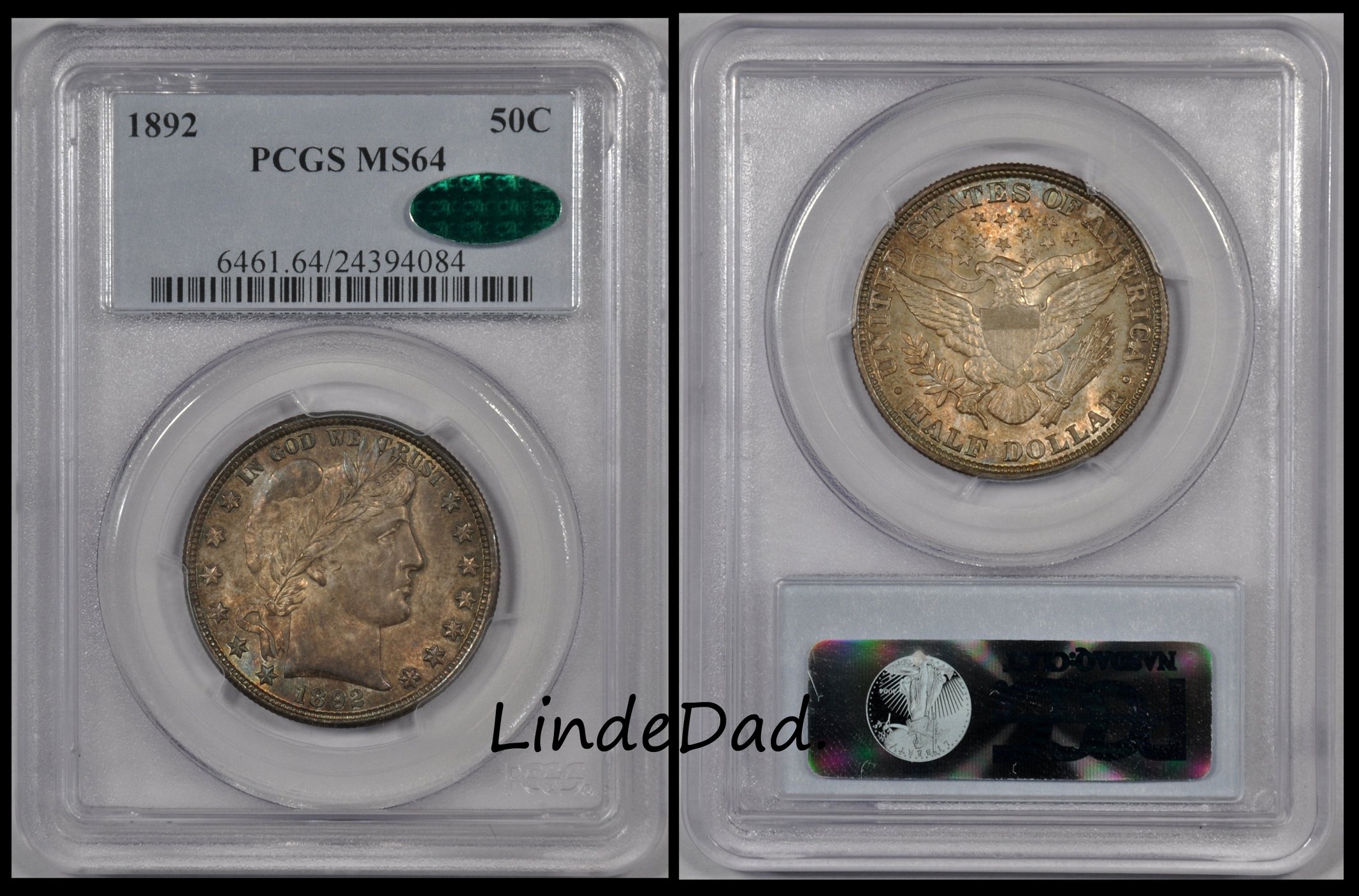
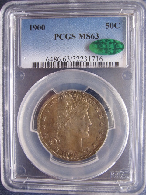
I'd take it. PCGS doesn't assign a + sign for coins that don't have strong eye appeal. I'd bet under different lighting that coin is a "looker." Sign me up. Let's see the real photo before this thread ends.
I've owned plenty of gem mint state seated/barber coins with thicker green/blue toning where the luster blows right through that toning. I prefer those to blast white dippers. May not be market acceptable to 80% of participants...it's only the 20% that might end up buying it that count.
PLease tilt it so I can see how pretty it REALLY is (pcgs doesn't award the + grade other than sparingly and it is a coin that must be totally worth it).
I would love it if it was priced at a deep discount from MS63 bid. Take a look at what is posted in Skyman's thread "Post a toned coin" If you want a sense of what many collectors prefer in a toned coin. Subjectively, you could say that any one of those coins are either beautiful or butt ugly, but the colors shown there speak volumes about what matters.
There are three kinds of people in this world. Those who believe there are three types of people and those who don't. the third group is those that are indifferent to the opinions of the first two groups.
@Kkathyl said:
looks like poor color and the letter placement is not appealing. Probable worth collecting
Still trying to wrap my head around this. I may need someone to spot me.
mark
Walker Proof Digital Album Fellas, leave the tight pants to the ladies. If I can count the coins in your pockets you better use them to call a tailor. Stay thirsty my friends......
Based solely on the picture, I do not find it attractive....I am sure no one here is surprised at that. I will say that if I had the opportunity to view the coin 'in hand', I would take the time for a more critical study... the tarnish pattern around the upper right area is strange.... could be some residues there. Cheers, RickO
Comments
I like coins that have that look ... but the "market" doesn't. The "market" wants 'em white. Unfortunate, isn't it.
Ugly JMO
JMO
Successful transactions with : MICHAELDIXON, Manorcourtman, Bochiman, bolivarshagnasty, AUandAG, onlyroosies, chumley, Weiss, jdimmick, BAJJERFAN, gene1978, TJM965, Smittys, GRANDAM, JTHawaii, mainejoe, softparade, derryb, Ricko
Bad transactions with : nobody to date
Too dark for my liking...but I have seen worse.
BST transactions: dbldie55, jayPem, 78saen, UltraHighRelief, nibanny, liefgold, FallGuy, lkeigwin, mbogoman, Sandman70gt, keets, joeykoins, ianrussell (@GC), EagleEye, ThePennyLady, GRANDAM, Ilikecolor, Gluggo, okiedude, Voyageur, LJenkins11, fastfreddie, ms70, pursuitofliberty, ZoidMeister,Coin Finder, GotTheBug, edwardjulio, Coinnmore, Nickpatton, Namvet69,...
If it's really that dark, then it's a little too dark for me.
Ugly toning, ugly design, ugly grade.
What's not to like!
I'd take it. PCGS doesn't assign a + sign for coins that don't have strong eye appeal. I'd bet under different lighting that coin is a "looker." Sign me up. Let's see the real photo before this thread ends.
I've owned plenty of gem mint state seated/barber coins with thicker green/blue toning where the luster blows right through that toning. I prefer those to blast white dippers. May not be market acceptable to 80% of participants...it's only the 20% that might end up buying it that count.
way fugly
Meh....
I don't think it's beautiful but not ugly, either.
I would accept it into my collection.
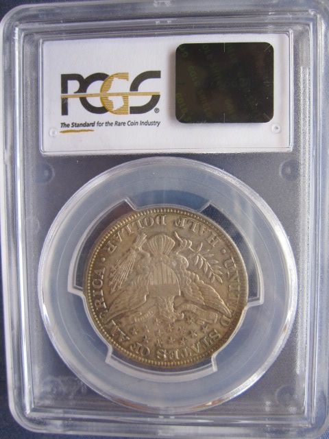
What's the reverse look like?
Sometimes, it’s better to be LUCKY than good. 🍀 🍺👍
My Full Walker Registry Set (1916-1947):
https://www.ngccoin.com/registry/competitive-sets/16292/
Too dark for my tastes, but I wouldn't call this piece 'butt ugly' either.
RMR: 'Wer, wenn ich schriee, hörte mich denn aus der Engel Ordnungen?'
CJ: 'No one!' [Ain't no angels in the coin biz]
I'd want to see it in hand before arriving at either end of the spectrum.
Keeper of the VAM Catalog • Professional Coin Imaging • Prime Number Set • World Coins in Early America • British Trade Dollars • Variety Attribution
I think it's a tweener too, I'd rather have this than blast white, but lighter toning would be better.
looks like poor color and the letter placement is not appealing. Probable worth collecting
Best place to buy !
Bronze Associate member
Count me in the 'like' column.
If it was mine she would be taking a little dip in the pool before she put on her new plastic forever clothes.
Successful trades.... MichaelDixon,
Coal Miner's Daughter
Too dark for me.
Fan of the Oxford Comma
CCAC Representative of the General Public
2021 Young Numismatist of the Year
+1
I would not buy it based on that picture but I might after viewing it in hand.
Lance.
I would own it.
Not crazy about it but put me down for the 'yes' crowd.
"“Those who sacrifice liberty for security/safety deserve neither.“(Benjamin Franklin)
"I only golf on days that end in 'Y'" (DE59)
I agree with @roadrunner -- there is likely more to that coin than the dreary OP photo reveals! I'd take it.
ANA LM
USAF Retired — 34 years of active military service! 🇺🇸
I would also say that I would expect that piece would look much better in hand.
Carry on
Mine in my type set is almost that dark so guess I'm in the like crowd.

need better light on it.
the light seems to come from overhead.
Too dark for my taste.
The picture is too dark. I suspect that it looks much better in hand.
My YouTube Channel
My YouTube Channel
I vote ugly, but, possibly pretty if the luster is all there... That picture however is not flattering at all.
My YouTube Channel
I am with those that think the image is not showing the true coin. I reserve judgement.
I like U.S. coins. Some are better in hand.
``https://ebay.us/m/KxolR5
I like it... And I suspect it is stunning in hand. congrats
Experience the World through Numismatics...it's more than you can imagine.
+2
PLease tilt it so I can see how pretty it REALLY is (pcgs doesn't award the + grade other than sparingly and it is a coin that must be totally worth it).
.
I would love it if it was priced at a deep discount from MS63 bid. Take a look at what is posted in Skyman's thread "Post a toned coin" If you want a sense of what many collectors prefer in a toned coin. Subjectively, you could say that any one of those coins are either beautiful or butt ugly, but the colors shown there speak volumes about what matters.
"Everything is on its way to somewhere. Everything." - George Malley, Phenomenon
http://www.american-legacy-coins.com
There are three kinds of people in this world. Those who believe there are three types of people and those who don't. the third group is those that are indifferent to the opinions of the first two groups.
Too dark for me based on the photo. Here my 63 CAC...IMO, it is a bit on the dark side.


Like
I certainly would prefer it over a dipped white example. I suspect it is quite handsome in hand.
Joseph J. Singleton - First Superintendent of the U.S. Branch Mint in Dahlonega Georgia
Findley Ridge Collection
About Findley Ridge
Ugh! Buttly!!
a.k.a "The BUFFINATOR"
I thought there were three:
There are three kinds of people in this world: people who make it happen, people who watch what happens, and people who wonder what happened.
I think 2 out of 3 would think it's a fugly coin
Still trying to wrap my head around this. I may need someone to spot me.
mark
Fellas, leave the tight pants to the ladies. If I can count the coins in your pockets you better use them to call a tailor. Stay thirsty my friends......
not a fan of that coin
Many members on this forum that now it cannot fit in my signature. Please ask for entire list.
I would have to see that coin in hand before I could make a judgement. That's a coin that could be gorgeous or fugly based on the picture supplied!
I'm in the tone camp and believe the OP's posted coin is a lot flashier that the images show.
Toned MS64
Based solely on the picture, I do not find it attractive....I am sure no one here is surprised at that. I will say that if I had the opportunity to view the coin 'in hand', I would take the time for a more critical study... the tarnish pattern around the upper right area is strange.... could be some residues there. Cheers, RickO
I bet it blossoms in the right light.