I like this thread. Even though I didn't know Louis Armstrong from Duke Ellington. Thank you Bill Dugan. Maybe, just maybe, if this thread would become a mega-thread, with thousands of posts, like some of the other threads, over a long period of time, with influential people contributing, we could make a difference with regards to how the mint selects the designs for coins. It could happen. I think it's worth a try. Let's give it a shot. Don't let this thread die. It's too important. In my opinion it's the most important. Let's do it!
@DIMEMAN said:
It would be easier to name the good ones......NONE. There hasn't been anything good since the 40's.
I sure hope my wiffleball doesn't roll into your yard!
I don't think that is completely accurate...while the majority have been mediocre or worse, there have been a few standouts.
The 1999 $5 Washington was an attractive coin, as was the 1999 Ct. quarter.
Several of the recent National Parks quarters have been pretty good...I like the 2013 White mountain, Rushmore, Great Basin, and Ft. McHenry. 2013 quarters are pretty cool actually.
The 2016 Shawnee National Forest, and the 2015 Kitsachie (sp?), and the Everglades issue are above average.
The previously mentioned Dolley Madison has its followers.
The Bald Eagel coin though I am unsure what it is supposed to commemorate, is an attractive design.
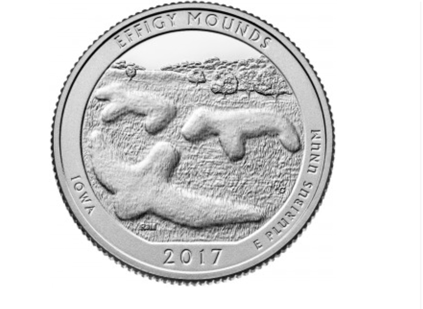
I know I'm in the minority but I like the 2017 Effigy Mounds Quarter.
The great majority of the "recent" coins stink, but there have been a few redeemers. Obviously, just my opinion, and our opinions of what is pleasing differs....... but.....Come on DimeMan, don't be a humbug!
Kissatchie is a very good design. It also reminds us that Ben Franklin once proposed the Wild Turkey as our national emblem - in that respect, it is a 'what might have been' thingie.
Harpers Ferry is very good. It reminds us of the very bizarre story of the violent abolitionist John Brown.
The upcoming George Rogers Clark Quarter is also a reminder of an oddball in the early history of our nation. Although his western military campaigns during the Revolutionary were important, the only historical record of certain of Clark's important exploits came from Clark's own writings and nowhere else. He was an older brother of the more famous William Clark (as in 'Lewis & Clark').
The mint should knock off the specialty / special interest crap and do something crazy...... Like make serious coins for commerce that display only renditions of liberty which remain unchanged for 25+ years minimum.
Great transactions with oih82w8, JasonGaming, Moose1913.
@DIMEMAN said:
It would be easier to name the good ones......NONE. There hasn't been anything good since the 40's.
Do you just not like the new ones because they are modern? I really can't see prefering a Barber quarter over the Rushmore quarter.
No not at all. The modern designs just suck. The Barber design to me is classic and it's silver. The last year a beautiful coin was struck was 1947......the Walking Liberty Half. They need to get rid of the dead President coins and get back to Liberty.
@DIMEMAN said:
It would be easier to name the good ones......NONE. There hasn't been anything good since the 40's.
I sure hope my wiffleball doesn't roll into your yard!
I don't think that is completely accurate...while the majority have been mediocre or worse, there have been a few standouts.
The 1999 $5 Washington was an attractive coin, as was the 1999 Ct. quarter.
Several of the recent National Parks quarters have been pretty good...I like the 2013 White mountain, Rushmore, Great Basin, and Ft. McHenry. 2013 quarters are pretty cool actually.
The 2016 Shawnee National Forest, and the 2015 Kitsachie (sp?), and the Everglades issue are above average.
The previously mentioned Dolley Madison has its followers.
The Bald Eagel coin though I am unsure what it is supposed to commemorate, is an attractive design.
I know I'm in the minority but I like the 2017 Effigy Mounds Quarter.
The great majority of the "recent" coins stink, but there have been a few redeemers. Obviously, just my opinion, and our opinions of what is pleasing differs....... but.....Come on DimeMan, don't be a humbug!
You can retrieve your wiffleball without fear. The modern designs just suck. The Barber, Mercury, Standing Quarter, Seated and of course the Bust designs to me are all classic and beautiful. The last year a beautiful coin was struck was 1947......the Walking Liberty Half. They need to get rid of the dead President coins and get back to Liberty.
@Golden1 Last time I looked, the sales figures weren't bad.
However, it was a huge mistake NOT to make the quarter and the half dollar the same sizes as the originals. Had the Mint done so, some people likely would have removed the gold coins from the packaging and put them into albums and holders along with the originals. The planchets the Mint did use were too small for that purpose and also too small to better show the artwork.
One assumes that The Mint is no longer capable of making their own precious metal coin blank planchets and that the price of obtaining PROPER-sized gold bank planchets in the marketplace was prohibitive.
The most popular current mint offerings are retreads of 100 year-old designs. That speaks volumes.
There is no shortage of horrible designs to pick the worst from. Virtually any coin designed and produced by computer & CNC machinery lacks soul. The touch of the artist, as so beautiful rendered on the buffalo nickel or $20 Saint just isn’t there. The low relief of today’s stuff doesn’t help.
Ones the mint got right IMO include the Ike reverse, Sac obverse, bicentennial designs, and many of the platinum proof reverses. The reverse of the AGE isn’t terrible either.
@BackroadJunkie said:
I have to put the 50SQ jewelry and spoons in there.
I wish I had bought a couple of those spoons just to prove they existed once...
The spoons were god-awful!
Numismatist. 54 year member ANA. Former ANA Senior Authenticator. Winner of four ANA Heath Literary Awards; three Wayte and Olga Raymond Literary Awards; Numismatist of the Year Award 2009, and Lifetime Achievement Award 2020. Author "The Enigmatic Lincoln Cents of 1922," due out late 2025.
I forgot about the S-Mint uncirculated ATB quarters introduced in the second year of the program. Collect them all! Except for the first year, they don’t exist.
"I'll split the atom! I am the fifth dimension! I am the eighth wonder of the world!" -Gef the talking mongoose.
The First Spouse series gets my vote. Other than political correctness, what's the point?
Worry is the interest you pay on a debt you may not owe.
"Paper money eventually returns to its intrinsic value---zero."----Voltaire
"Everything you say should be true, but not everything true should be said."----Voltaire
Aside from the March of Dimes connection, I see nothing special about the Roosevelt Dime design.
Some of the $5 gold commems - 1995 Civil War, 1998 Nike Olympics, G. Washington and even the 2013 McArthur - all are very good designs. Many of the ATB designs are nice. The many of the changing reverse proof Plats are impressive.
The 2009 UHR turned out very nice - the 2007 RP 1/2 oz proof Plat, not so much. The proof Gold Buffalos are awesome in every sense.
Q: Are You Printing Money? Bernanke: Not Literally
@PerryHall said:
The First Spouse series gets my vote. Other than political correctness, what's the point?
Commemative coins should be issued to honor those who have accomplished significant things, not just married well. There are some First Ladies, like Mary Lincoln, who actually made their husband's job harder. That conduct does not rate a commemorative coin.
Retired dealer and avid collector of U.S. type coins, 19th century presidential campaign medalets and selected medals. In recent years I have been working on a set of British coins - at least one coin from each king or queen who issued pieces that are collectible. I am also collecting at least one coin for each Roman emperor from Julius Caesar to ... ?
As some of the Classic designs, here is a coin that is both expensive and unattractive in my opinion.
Oh, yes, the Fat Head! But this is a 200 year old design so "tastes" have changed. Maybe someone can photoshop it with a likeness of Melania Trump. Then the US Mint can do a 205th anniversary not-so-fathead revival!
I'm still trying to figure out who the guy is on that coin.
Worry is the interest you pay on a debt you may not owe.
"Paper money eventually returns to its intrinsic value---zero."----Voltaire
"Everything you say should be true, but not everything true should be said."----Voltaire
@CaptHenway said:
Are you talking about the worst thing authorized by Congress that the Mint had to produce,
or the worst marketing option (such as a special finish) chosen by the Mint to sell more product?
Investment/marketing aside, just post what you think is the most hideous design, include finish if you like. The worst product , coin, or medal ever produced by the US Mint.
So many modern commems to choose from...........
I agree and its dishearting to see it as well. jmo
The most politically incorrect U.S. coin is the Ronald Reagan dollar, which was issued out of sequence ahead of the Jimmy Carter dollar.
Numismatist. 54 year member ANA. Former ANA Senior Authenticator. Winner of four ANA Heath Literary Awards; three Wayte and Olga Raymond Literary Awards; Numismatist of the Year Award 2009, and Lifetime Achievement Award 2020. Author "The Enigmatic Lincoln Cents of 1922," due out late 2025.
Any of the presidential dollars. The artwork is terrible on all of them and they're only slightly better in quality than car wash/video game tokens.
You Suck! Awarded 6/2008- 1901-O Micro O Morgan, 8/2008- 1878 VAM-123 Morgan, 9/2022 1888-O VAM-1B3 H8 Morgan | Senior Regional Representative- ANACS Coin Grading. Posted opinions on coins are my own, and are not an official ANACS opinion.
Oh, yes, the Fat Head! But this is a 200 year old design so "tastes" have changed. Maybe someone can photoshop it with a likeness of Melania Trump. Then the US Mint can do a 205th anniversary not-so-fathead revival!
I'm still trying to figure out who the guy is on that coin.
@kiyote said:
Are we just going by design? If so, this gets my vote.
The presidential dollar series was a disaster as well, especially when people started scamming the mint to get free credit card points. Presidents no one even really remembers were given a place on our coinage. When everyone is on a coin it doesn't make it so special to be on one.
I think this one might edge out the Wyoming quarter. This design jumped out on a quarter in my change at a quick glance one day,and I wondered whether the Mint really produced such a shoddy design or if it was a grossly altered/butchered novelty piece.
Oh, yes, the Fat Head! But this is a 200 year old design so "tastes" have changed. Maybe someone can photoshop it with a likeness of Melania Trump. Then the US Mint can do a 205th anniversary not-so-fathead revival!
I'm still trying to figure out who the guy is on that coin.
Oh shaddap! I like mine a lot.
That is not quite the same type coin. That type was minted from 1813 to 1829. The later type was issued from 1829 to '34.
But yes, I can't understand why John Reich changed his first half eagle design for this one.
Retired dealer and avid collector of U.S. type coins, 19th century presidential campaign medalets and selected medals. In recent years I have been working on a set of British coins - at least one coin from each king or queen who issued pieces that are collectible. I am also collecting at least one coin for each Roman emperor from Julius Caesar to ... ?
Well the Coin and pouch thingy in 2004 the Lewis & Clark Coin & Pouch Set they did was not my favorite offering but I respect why they did it... I think there was lots of political ramifications and some "fake" pouches sold if memory serves..
Oh, yes, the Fat Head! But this is a 200 year old design so "tastes" have changed. Maybe someone can photoshop it with a likeness of Melania Trump. Then the US Mint can do a 205th anniversary not-so-fathead revival!
I'm still trying to figure out who the guy is on that coin.
Oh shaddap! I like mine a lot.
That is not quite the same type coin. That type was minted from 1813 to 1829. The later type was issued from 1829 to '34.
But yes, I can't understand why John Reich changed his first half eagle design for this one.
I agree that the first version was aesthetically superior, but I still like them both. Even the second version looks better to my eyes than any regular circulation issue from the last 70 years.
The Michigan statehood quarter was pretty boring, just the state outline as created by Mother Nature. They should have added a car somewhere.
Numismatist. 54 year member ANA. Former ANA Senior Authenticator. Winner of four ANA Heath Literary Awards; three Wayte and Olga Raymond Literary Awards; Numismatist of the Year Award 2009, and Lifetime Achievement Award 2020. Author "The Enigmatic Lincoln Cents of 1922," due out late 2025.
@Coinlearner said:
A little over 20 years but this is my favorite for worst design
Yes, but it was true to the subject matter. As far as original designs, I am leaning towards the USO dollar obverse.
If they had put an image of Mr. Bob Hope on that USO coin, they could have sold five million pieces. A real missed opportunity.
I would have been a buyer.
Below is a screen shot from one of his last Christmas specials honoring the troops. Was there for its filming as archived by my appearance, video camera in hand, as one of the crowd standing on the bank of San Antonio's Riverwalk as Bob Hope and his guest Phylicia Rashad together sang "Silver Bells."
(His eyesight was so limited at that point in time that only two or three words, at most, could be fitted on each cue card.)
("Bob Hope's Four-Star Christmas Fiesta from San Antonio" 1992)
In 1944 my Dad was stationed on Guadalcanal as an Army M.P. The fighting was over, but they needed M.P.'s to guard the supply dump, direct traffic, etc. One afternoon he was on traffic duty at a certain intersection that usually quieted down after seven, when another M.P. was supposed to come by and pick him up and bring him back to the M.P. "office" where he would be on duty for a few more hours.
The guy with the jeep was watching a USO show and didn't pick my Dad up until 8. Boy, was he mad, standing out there when he could have sitting in the "office" having a Pepsi.
Somewhere between 7 and 8 the Navy called the office and requisitioned an M.P. to enforce the No Smoking rules on an ammo ship being unloaded in the harbor. One guy got picked at random and left. During the night the ship blew up. My Dad and his buddies named their VFW post for him after the war.
Numismatist. 54 year member ANA. Former ANA Senior Authenticator. Winner of four ANA Heath Literary Awards; three Wayte and Olga Raymond Literary Awards; Numismatist of the Year Award 2009, and Lifetime Achievement Award 2020. Author "The Enigmatic Lincoln Cents of 1922," due out late 2025.
@Coinlearner said:
A little over 20 years but this is my favorite for worst design
Yes, but it was true to the subject matter. As far as original designs, I am leaning towards the USO dollar obverse.
If they had put an image of Mr. Bob Hope on that USO coin, they could have sold five million pieces. A real missed opportunity.
I would have been a buyer.
Below is a screen shot from one of his last Christmas specials honoring the troops. Was there for its filming as archived by my appearance, video camera in hand, as one of the crowd standing on the bank of San Antonio's Riverwalk as Bob Hope and his guest Phylicia Rashad together sang "Silver Bells."
(His eyesight was so limited at that point in time that only two or three words, at most, could be fitted on each cue card.)
("Bob Hope's Four-Star Christmas Fiesta from San Antonio" 1992)
@CaptHenway - thanks for sharing the experience of your father, another member of the "Greatest Generation."
An added footnote to my prior post:
FWIW, here is a summary of my recollections from that day:
I became partial to "Silver Bells" when by chance I got to watch Bob Hope and Phylicia Rashad (the Cosby show mom) serenade each other in a boat on San Antonio's River Walk during the filming of one of, if not the last, of the Bob Hope Christmas Specials. (I believe it was the last one where he went to visit "The Troops" though there was at least one other filmed from his home.) I was in San Antonio on business and had my video camera with me back before camcorders were common place. I was allowed to video tape the multiple takes and somewhere I still have the footage on tape. Although it was still late Fall, the whole Riverwalk had been lit up with Christmas lights for the taping of the Special.
One of the things about that magical evening that has stayed with me over the years was watching Bob Hope escort his wife Dolores over the arched bridge that crossed the waterway in front of their hotel on the Riverwalk. Despite their evident impaired mobility it was touching to see them ascend the arched bridge together arm in arm. Another thing that impressed me was how gracious Bob Hope was to the film crew when the cameras were turned off. He was more concerned about their comfort and well being than his own on that somewhat chilly evening. His eyesight was so poor at that point that the cue cards contained at most two or three words on each one so that the words could be big enough for him to read them.
So when I now hear "Silver Bells" it takes me back to that memory of a man from "The Greatest Generation" (as so termed by Tom Brokaw,) and how he exemplified the Christmas Spirit on that enchanted evening.
(The song itself was first performed in 1951 when Bob Hope and Marilyn Maxwell sang it in the Christmas movie, "The Lemon Drop Kid." Over the years it was a mainstay of multiple Bob Hope Christmas Specials.)
Comments
I like this thread. Even though I didn't know Louis Armstrong from Duke Ellington. Thank you Bill Dugan. Maybe, just maybe, if this thread would become a mega-thread, with thousands of posts, like some of the other threads, over a long period of time, with influential people contributing, we could make a difference with regards to how the mint selects the designs for coins. It could happen. I think it's worth a try. Let's give it a shot. Don't let this thread die. It's too important. In my opinion it's the most important. Let's do it!
I didnt read every thread entry, but someone must have mentioned the first spouse series, that's gets my vote as a contender for sure.
eBay ID-bruceshort978
Successful BST:here and ATS, bumanchu, wdrob, hashtag, KeeNoooo, mikej61, Yonico, Meltdown, BAJJERFAN, Excaliber, lordmarcovan, cucamongacoin, robkool, bradyc, tonedcointrader, mumu, Windycity, astrotrain, tizofthe, overdate, rwyarmch, mkman123, Timbuk3,GBurger717, airplanenut, coinkid855 ,illini420, michaeldixon, Weiss, Morpheus, Deepcoin, Collectorcoins, AUandAG, D.Schwager.
Do you just not like the new ones because they are modern? I really can't see prefering a Barber quarter over the Rushmore quarter.
I sure hope my wiffleball doesn't roll into your yard!")
")
")
I don't think that is completely accurate...while the majority have been mediocre or worse, there have been a few standouts.
The 1999 $5 Washington was an attractive coin, as was the 1999 Ct. quarter.
Several of the recent National Parks quarters have been pretty good...I like the 2013 White mountain, Rushmore, Great Basin, and Ft. McHenry. 2013 quarters are pretty cool actually.
The 2016 Shawnee National Forest, and the 2015 Kitsachie (sp?), and the Everglades issue are above average.
The previously mentioned Dolley Madison has its followers.
The Bald Eagel coin though I am unsure what it is supposed to commemorate, is an attractive design.
I know I'm in the minority but I like the 2017 Effigy Mounds Quarter.
The great majority of the "recent" coins stink, but there have been a few redeemers. Obviously, just my opinion, and our opinions of what is pleasing differs....... but.....Come on DimeMan, don't be a humbug!
Kissatchie is a very good design. It also reminds us that Ben Franklin once proposed the Wild Turkey as our national emblem - in that respect, it is a 'what might have been' thingie.
Harpers Ferry is very good. It reminds us of the very bizarre story of the violent abolitionist John Brown.
The upcoming George Rogers Clark Quarter is also a reminder of an oddball in the early history of our nation. Although his western military campaigns during the Revolutionary were important, the only historical record of certain of Clark's important exploits came from Clark's own writings and nowhere else. He was an older brother of the more famous William Clark (as in 'Lewis & Clark').
The mint should knock off the specialty / special interest crap and do something crazy...... Like make serious coins for commerce that display only renditions of liberty which remain unchanged for 25+ years minimum.
Great transactions with oih82w8, JasonGaming, Moose1913.
No not at all. The modern designs just suck. The Barber design to me is classic and it's silver. The last year a beautiful coin was struck was 1947......the Walking Liberty Half. They need to get rid of the dead President coins and get back to Liberty.
You can retrieve your wiffleball without fear. The modern designs just suck. The Barber, Mercury, Standing Quarter, Seated and of course the Bust designs to me are all classic and beautiful. The last year a beautiful coin was struck was 1947......the Walking Liberty Half. They need to get rid of the dead President coins and get back to Liberty.
nothing worse than seeing the Langbord’s get taken.
``https://ebay.us/m/KxolR5
"What is the worst US Mint offering you've seen in the last 20 years"
All of them
BHNC #203
I'm surprised this one wasn't better received
@Golden1 Last time I looked, the sales figures weren't bad.
However, it was a huge mistake NOT to make the quarter and the half dollar the same sizes as the originals. Had the Mint done so, some people likely would have removed the gold coins from the packaging and put them into albums and holders along with the originals. The planchets the Mint did use were too small for that purpose and also too small to better show the artwork.
One assumes that The Mint is no longer capable of making their own precious metal coin blank planchets and that the price of obtaining PROPER-sized gold bank planchets in the marketplace was prohibitive.
The most popular current mint offerings are retreads of 100 year-old designs. That speaks volumes.
There is no shortage of horrible designs to pick the worst from. Virtually any coin designed and produced by computer & CNC machinery lacks soul. The touch of the artist, as so beautiful rendered on the buffalo nickel or $20 Saint just isn’t there. The low relief of today’s stuff doesn’t help.
Ones the mint got right IMO include the Ike reverse, Sac obverse, bicentennial designs, and many of the platinum proof reverses. The reverse of the AGE isn’t terrible either.
totally agree!
BHNC #203
the state quarters spoon collection is a joke
The spoons were god-awful!
Would the gold Merc, SLQ, and Walkers be old or new?
Not a fan in any event.
I forgot about the S-Mint uncirculated ATB quarters introduced in the second year of the program. Collect them all! Except for the first year, they don’t exist.
Least favorite - all the first spouse medals
Favorite - 2015 US Marshal Dollar
The First Spouse series gets my vote. Other than political correctness, what's the point?
Worry is the interest you pay on a debt you may not owe.
"Paper money eventually returns to its intrinsic value---zero."----Voltaire
"Everything you say should be true, but not everything true should be said."----Voltaire
All of them
BHNC #203
Aside from the March of Dimes connection, I see nothing special about the Roosevelt Dime design.
Some of the $5 gold commems - 1995 Civil War, 1998 Nike Olympics, G. Washington and even the 2013 McArthur - all are very good designs. Many of the ATB designs are nice. The many of the changing reverse proof Plats are impressive.
The 2009 UHR turned out very nice - the 2007 RP 1/2 oz proof Plat, not so much. The proof Gold Buffalos are awesome in every sense.
I knew it would happen.
Commemative coins should be issued to honor those who have accomplished significant things, not just married well. There are some First Ladies, like Mary Lincoln, who actually made their husband's job harder. That conduct does not rate a commemorative coin.
Oh, yes, the Fat Head! But this is a 200 year old design so "tastes" have changed. Maybe someone can photoshop it with a likeness of Melania Trump. Then the US Mint can do a 205th anniversary not-so-fathead revival!
Oh yes, the James Brown coin.
If you understand what is coming, then you can duck. If not, then you get sucker-punched. - Martin Armstrong
The worst is the politically correct Liberty:
I'm still trying to figure out who the guy is on that coin.")
Worry is the interest you pay on a debt you may not owe.
"Paper money eventually returns to its intrinsic value---zero."----Voltaire
"Everything you say should be true, but not everything true should be said."----Voltaire
Where others see weakness I see strength.
Carry on
"Inspiration exists, but it has to find you working" Pablo Picasso
I actually kind of like it. I like the simplistic design. Being an alumnus of the U Wyo, I suppose I might be a bit biased.
Good thread!
My YouTube Channel
I agree and its dishearting to see it as well. jmo
The most politically incorrect U.S. coin is the Ronald Reagan dollar, which was issued out of sequence ahead of the Jimmy Carter dollar.
Any of the presidential dollars. The artwork is terrible on all of them and they're only slightly better in quality than car wash/video game tokens.
Oh shaddap! I like mine a lot.
There are too many to choose from. I’ll go with most of them.
I think this one might edge out the Wyoming quarter. This design jumped out on a quarter in my change at a quick glance one day,and I wondered whether the Mint really produced such a shoddy design or if it was a grossly altered/butchered novelty piece.
That is not quite the same type coin. That type was minted from 1813 to 1829. The later type was issued from 1829 to '34.
But yes, I can't understand why John Reich changed his first half eagle design for this one.
Well the Coin and pouch thingy in 2004 the Lewis & Clark Coin & Pouch Set they did was not my favorite offering but I respect why they did it... I think there was lots of political ramifications and some "fake" pouches sold if memory serves..
I agree that the first version was aesthetically superior, but I still like them both. Even the second version looks better to my eyes than any regular circulation issue from the last 70 years.
The Michigan statehood quarter was pretty boring, just the state outline as created by Mother Nature. They should have added a car somewhere.
I would have been a buyer.
Below is a screen shot from one of his last Christmas specials honoring the troops. Was there for its filming as archived by my appearance, video camera in hand, as one of the crowd standing on the bank of San Antonio's Riverwalk as Bob Hope and his guest Phylicia Rashad together sang "Silver Bells."
(His eyesight was so limited at that point in time that only two or three words, at most, could be fitted on each cue card.)
("Bob Hope's Four-Star Christmas Fiesta from San Antonio" 1992)
In 1944 my Dad was stationed on Guadalcanal as an Army M.P. The fighting was over, but they needed M.P.'s to guard the supply dump, direct traffic, etc. One afternoon he was on traffic duty at a certain intersection that usually quieted down after seven, when another M.P. was supposed to come by and pick him up and bring him back to the M.P. "office" where he would be on duty for a few more hours.
The guy with the jeep was watching a USO show and didn't pick my Dad up until 8. Boy, was he mad, standing out there when he could have sitting in the "office" having a Pepsi.
Somewhere between 7 and 8 the Navy called the office and requisitioned an M.P. to enforce the No Smoking rules on an ammo ship being unloaded in the harbor. One guy got picked at random and left. During the night the ship blew up. My Dad and his buddies named their VFW post for him after the war.
@CaptHenway - thanks for sharing the experience of your father, another member of the "Greatest Generation."
An added footnote to my prior post:
FWIW, here is a summary of my recollections from that day:
I became partial to "Silver Bells" when by chance I got to watch Bob Hope and Phylicia Rashad (the Cosby show mom) serenade each other in a boat on San Antonio's River Walk during the filming of one of, if not the last, of the Bob Hope Christmas Specials. (I believe it was the last one where he went to visit "The Troops" though there was at least one other filmed from his home.) I was in San Antonio on business and had my video camera with me back before camcorders were common place. I was allowed to video tape the multiple takes and somewhere I still have the footage on tape. Although it was still late Fall, the whole Riverwalk had been lit up with Christmas lights for the taping of the Special.
One of the things about that magical evening that has stayed with me over the years was watching Bob Hope escort his wife Dolores over the arched bridge that crossed the waterway in front of their hotel on the Riverwalk. Despite their evident impaired mobility it was touching to see them ascend the arched bridge together arm in arm. Another thing that impressed me was how gracious Bob Hope was to the film crew when the cameras were turned off. He was more concerned about their comfort and well being than his own on that somewhat chilly evening. His eyesight was so poor at that point that the cue cards contained at most two or three words on each one so that the words could be big enough for him to read them.
So when I now hear "Silver Bells" it takes me back to that memory of a man from "The Greatest Generation" (as so termed by Tom Brokaw,) and how he exemplified the Christmas Spirit on that enchanted evening.
(The song itself was first performed in 1951 when Bob Hope and Marilyn Maxwell sang it in the Christmas movie, "The Lemon Drop Kid." Over the years it was a mainstay of multiple Bob Hope Christmas Specials.)