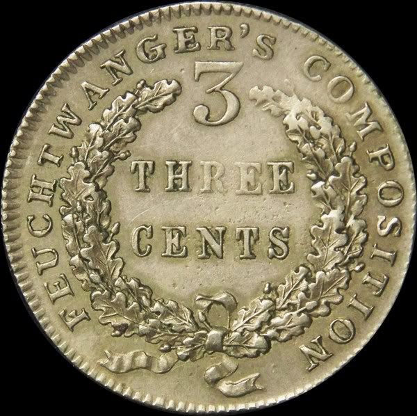
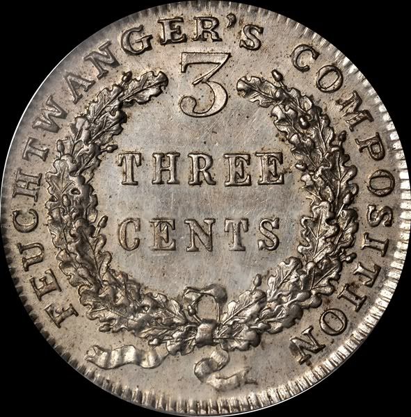
By Golly! Ive made a Discovery! 3 Cent Feuchtwanger reverse
 ambro51
Posts: 14,011 ✭✭✭✭✭
ambro51
Posts: 14,011 ✭✭✭✭✭
The two later three cent pieces, the HT265 and the HT267 are SUPPOSED to share a common reverse die. All auction info, all the reference material Ive read...all say the reverse die is shared.
Well. There is a subtle difference here, and I just noticed it last night. As far as I know, this IS a new discovery, or at least one that has never been mentioned.
Dr. Feuchtwanger liked ornamental serifs on a few of his letters. What letters get the ornamental letter, and which ones do NOT vary within the series. As far as I know, no one has noticed THIS>
Take a look at the upper letters, and notice the E and the R. Also note the M in compositon. The coin on the left is the HT265, which shows a flat based serif. NOW, look at the one on the right, this is the HT267 (the 1864 dated piece)....and notice that NOW the serifs are 'cut in' and ornamental. Hmmmmmmm
So, a clear difference on the reverse die. Question is, WHICH came first?????
(PS also note one of Feuchtwangers little 'trademarks'. He liked the middle diagonal of the 3 to be very long. All the one cent pieces show this feature in the date, and now we see that the existing punch for the large numeral 3 did not suit his tastes, and rather crudely he reengraved the middle line quite a bit longer than the punch set it in)
0
Comments
New collectors, please educate yourself before spending money on coins; there are people who believe that using numismatic knowledge to rip the naïve is what this hobby is all about.
<< <i>Reminds me of this thread but unfortunately the pic is not showing any more. >>
That is the thread I was looking for. There are also a few threads that show early silver coinage with the same effect. Waiting for other actual expert opinions.
Other Thread
Edited to add link.
<< <i>Reminds me of this thread but unfortunately the pic is not showing any more. >>
Correct. The Feuchwanger shows bifurcation, as explained in the linked thread.
TD
C'mon guys........take a look here. If Breen or Bowers had discovered this....."word of LAW". Ill email Dave Bowers today and send some Macros to him for his opinion.
PS Get out your own specimens of these and take look with your loupe!
On an R7+ piece?
<< <i>Reminds me of this thread but unfortunately the pic is not showing any more. >>
I will re-post the photo showing the similiar look on the serifs of the 54 Jeff.
Thats all Im saying here, is that he used a new die on the 1864 rather than reuse the HT265 die. Nothing earth shattering, in fact a small detail that is so inconsequential life in the Known Universe would have went on just fine without my discovering this difference.
But it is neat that in numismatics, small discoveries like this can still be made.
<< <i>Ambro,
me stupid, your photos are fine, I didn't realize your photo was bigger than my screen, so all I saw was the E and no R and half of the M, I have a small laptop. Now that I see those bottom serifs I see what you are speaking about. You have the coin in hand, the photo has a little shadow as if the serif's outline is still there on the worn coin, if it isn't and it does go straight across on the worn coin then you are correct. And my gut says it does go straight across and the shadows are just playing tricks with me so i will offer a big CONGRADS!!!!!!! >>
I agree, looks like you found something here. Way to go!
Sugar magnolia blossoms blooming, heads all empty and I don't care ...
<< <i>Definitely out of my element here on these coins... but the difference is clear, and, in my experience with studying die wear, I have never seen wear manifested in this manner. Good luck, Cheers, RickO >>
I agree with Ricko. Nice find
Tom
I just went through my 2 inch thick stack of Heritage, BM Stacks etc auction printouts on 3 cent feuchtwangers and it showed that every specimen within the two types showed these same lettering differences. That encompasses the finest known of the 265 and 265a type, and the other 267s. (maybe 20 different specimens, which accounts for at least 75% of the known survivors))
Looks like something new is now known! No records are left on these pieces, so the Tokens themselves must provide answers.
<< <i>The two later three cent pieces, the HT265 and the HT267 are SUPPOSED to share a common reverse die. All auction info, all the reference material Ive read...all say the reverse die is shared.
Well. There is a subtle difference here, and I just noticed it last night. As far as I know, this IS a new discovery, or at least one that has never been mentioned.
Dr. Feuchtwanger liked ornamental serifs on a few of his letters. What letters get the ornamental letter, and which ones do NOT vary within the series. As far as I know, no one has noticed THIS>
Take a look at the upper letters, and notice the E and the R. Also note the M in compositon. The coin on the left is the HT265, which shows a flat based serif. NOW, look at the one on the right, this is the HT267 (the 1864 dated piece)....and notice that NOW the serifs are 'cut in' and ornamental. Hmmmmmmm
So, a clear difference on the reverse die. Question is, WHICH came first?????
(PS also note one of Feuchtwangers little 'trademarks'. He liked the middle diagonal of the 3 to be very long. All the one cent pieces show this feature in the date, and now we see that the existing punch for the large numeral 3 did not suit his tastes, and rather crudely he reengraved the middle line quite a bit longer than the punch set it in)
These are indeed from the same die. Note the extra-thick denticle at about 6:30. All the apparent differences are caused by striking differences.
Did you read the explanation of bifurcation in the linked thread?
TD
Pretty obvious all the letters are exactly alike.
Guess I need to go to the eye doctor.,
Dead Cat Waltz Exonumia
"Coin collecting for outcasts..."
<< <i>Die Wear?
On an R7+ piece?
Yes. Die wear. Just because it's R7+ today doesn't mean the dies weren't used a lot. Look at the denticles--they're flattened and stretched in the way that is absolutely typical of standard die erosion from collar-less striking.
Simple analysis of the positioning of of the die elements shows that this is clearly the same die... the position of everything matches. The only difference is that the "ornamental" serifs die has more wear... eroding the denticles and the peripheral letters. The wreath protected the letters nearby better than the low-sitting fields and relatively low digit 3, which explains why the heaviest erosion (producing the most dramatic ornamentation) occurred on the ER in his name.
Keep in mind that Feuchtwanger's composition contained significant nickel, making the alloy very hard... this would erode the dies very quickly, especially with collar-less striking. The US Mint experienced similar problems when they began striking nickel-based coins in the 1860s, except the Mint used collars, so their dies shattered instead of eroding as broadly as Feuchtwanger's.
You're clearly knowledgeable in this series. However, this is not a new die.
watch the serifs switch back and forth. this is in the engraving, not haphazard die wear on proof like coins with only a few produced. LIke I said, I have photos of every one of these that has sold at auction for the last decade or two and every specimen of either type shows the same exact letter styles.
[URL=http://www.makeagif.com/i6U0s7]
TD
Nope. Not going to believe that when I have specimens in hand that show different letter styles as well as photos of every specimen that has came to auction over the past 20 years that show this exact same letter difference between the two types.
Will take much more than theory to overcome the photographic evidence here. Feuchtwanger did NOT shy away from creating new dies. Why is it so difficult to recognize the different reverses here?
If Breen had seen this forty years ago and noted it.......it would be word of law but now that Im the one to finally see and note it.....different rules?
I love this stuff
I find it interesting that both coins show areas of weaker strike at different places
I wonder if the planchets were not exactly level after rolling?
the lights and angles play tricks on my eyes (like imagining CPGs off of bad eBay pics)
your overlay looks cool but the strong struck one at 12-1 oclock shows a missing serif on top left of the R (before the 'S)
but your source pic shows it ?
maybe it is the revenge of the computers just playing with us
<< <i>Which one of the prooflike hammered coins pictured in the GIF is incompletely struck?
Nope. Not going to believe that when I have specimens in hand that show different letter styles as well as photos of every specimen that has came to auction over the past 20 years that show this exact same letter difference between the two types.
Will take much more than theory to overcome the photographic evidence here. Feuchtwanger did NOT shy away from creating new dies. Why is it so difficult to recognize the different reverses here?
If Breen had seen this forty years ago and noted it.......it would be word of law but now that Im the one to finally see and note it.....different rules?
I love this stuff
Um.....the one with the incompletely struck letters???????
It is difficult to recognize different reverses when they do not exist.
Same rules. Rule number one: Wishing don't make it so.
TD
Its not an issue of me "wanting it to be". I invite you, take a stroll through the auction archives, Stacks has the most of either variety, and take a good close look for yourself.
I emailed Dave Bowers on this, and he'll respond eventually (always has).
Low 119 HT 265 1837 date
Sinin what you are seeing is the result of the different obverses. Remember, this is a planchet the size of quarter that only weighs 62 grains. It is rather thin, and is a hard metal. the 265 obverse is the dramatic hulking defiant eagle, while the 267 uses an open displayed eagle, which is much more centralized within the wreath area. The defiant eagle, the high points (and it IS high relief) oppose certain structures of the wreath. I think this problem is what caused a refinement of the eagle design to the displayed eagle, thus leaving more metal available to flow into the wreath devices.
PS 265 (defiant eagle) is struck medal turn while the 267 is struck coin turn. The high point of the wing opposes the weak area of the wreath, upper right. The high point of the body opposes the weakness to the right in THREE CENTS
If Breen had seen this forty years ago and noted it.......it would be word of law but now that Im the one to finally see and note it.....different rules?
I love this stuff
If you know anything about Breen, and I am sure you do, be happy you are not viewed in the same regard------------BigE
In Feuchtwanger cents alone, his numbering/lettering system has become so commonplace the Br. designation is no longer used. Ive not found anything he wrote on the Three cent pieces. Im sure he studied them at one time...and would love to find his notes.
Best of luck.
Jim
When a man who is honestly mistaken hears the truth, he will either quit being mistaken or cease to be honest....Abraham Lincoln
Patriotism is supporting your country all the time, and your government when it deserves it.....Mark Twain
This sort of random misalignment is common on hand-punched dies, but unless, as Nysoto suggested, he hand cut an original die and then made a hub from it and used the hub to sink a duplicate die, you could not get this exact same random alignment on two different dies.
TD
Visit my son's caringbridge page @ Runner's Caringbridge Page
"To Give Anything Less than Your Best, Is to Sacrifice the Gift" - Steve Prefontaine
1) The chances of Dr. Feuchtwanger having made a hub to create his reverse dies are roughly zero.
Even the Philadelphia Mint was unable to do this until 1836 or 1837. Prior to 1836 even the Mint did
not use full hubs and it was not until the return of Franklin Peale from Europe that full hubs were first
done at Philadelphia.
2) With the above in mind, Feuchtwanger - who presumably executed his own dies - punched in the
elements, including each of the letters, by hand. The chances of getting them in the precise same
arrangement are again roughly zero. Or less.
3) Bifurcated letters are seen for early United States coinage and are relatively common in some series.
4) The quality of the strike and the hardness of the metal varied from piece to piece in this series
because the nickel alloy was very difficult to work with. As a result, bifurcated lettering is to be expected
and that is exactly what we see here.
5) Poorly struck or somewhat worn coins from the same die do appear to be different but are not.
6) This is NOT a die variety.
We can theorize on any matter of thing, ....if a lead balloon can fly, or if a fish can live out of water....but the fact remains, that the specimen strikings of the HT265 and the HT267 show distinctly different letter serifs on several letters. Either a hub was altered, or a new die created.....one or the other. But, there is a significant difference on each and every survivor....all of which are in high MS and many prooflike and hammered....and some aspects of the reverse die lettering are different.
We can theorize on any matter of thing, ....if a lead balloon can fly, or if a fish can live out of water....but the fact remains, that the specimen strikings of the HT265 and the HT267 show distinctly different letter serifs on several letters. Either a hub was altered, or a new die created.....one or the other. But, there is a significant difference on each and every survivor....all of which are in high MS and many prooflike and hammered....and some aspects of the reverse die lettering are different.
What you are suggesting for a hub is not technically possible. It is possible, however, that the die
was lapped and some of the letters strengthened or slightly changed. It is not a new die and there
was no hub involved.
<< <i>
<< <i>Die Wear?
On an R7+ piece?
Yes. Die wear. Just because it's R7+. >>
Working on a series such as HTT's which has limited printed reference material is tough, as the degree of rarity assigned to many tokens needs to be re-addressed. IMHO these 3 Cent Feuchtwangers are not as scarce on the rarity scale degree assigned by Lyman Low 110 years ago. Russell Rulau's rarity scale which adopted Lyman Low's has also not changed over the course of 9 editions. His last printing in 2001 is a very out dated guide book compared to the impact the internet has placed on locating examples in this series. There are plenty of R-1 and R-2 HTT's that are tougher to locate then some of the elusive examples on the rarity scale. These R-1 and R-2's should be raised to R-3 or R-4's and also some R-7's which should be tapered down to R-5 or R-6.
With due respect to Broadstruck, whose opinion I value highly, it is well known from the mid 19th century, basic rarity of these pieces. There are not hundreds, or thousands of them unaccounted for. They were highly valued, as early as 1881 the HT265 (low 119) sold for $19.50, an extremely high price for the era.
But anyway.....Denga I FULLY agree that the only change on the die was the modification of some of the letters. I totally agree with that. fully agree. That being said (three timies) the very act of changing the letters on the die prior to its use with a new obverse technically makes it not a variety, but a seperate reverse that is unique to the specific obverse it is paired with, and is known to be unchanged on all specimens.
Of course, one thing Im not buying in this thread is the thought that the exquisite ornamental detail that has appeared on several of the letters is 'accidental' or the result of some type of die wear or bifurcation (I had to look up that word
I could go hog wild and crop out these two specific letters Ive targeted for analysis on the image of every one of these two type tokens that has appeared for sale, and it would show that each type has a specific letter style. The 265 has a flat based ER, while the 267 shows these letters ornamental (and yes there are other letters also that show this alteration, the P and others). But that is a point which if youi are concerned enough you can easily search Stacks Archives (best selection) and arrive at this same conclusion.
Since written records of these are just about non existant....we must analyze what the specimens themselves tell us.
It has long been speculated that both the HT265 and HT267 were made closer to the civil war era than the HT262 and HT263. They did not appear in any collections that went to auction until 1881. One written record that DOES remain is a letter from Feuchtwanger to mint director Pollack on March 28, 1865 basically looking for a contract.
I quote the entire letter here since is shows this board exactly how strong Feuchtwangers capability was
" Having made for the week past a number of experiments on the three cent planchets for the purpose of giving you the exact value at which I can furnish you 50,000 lbs. I came to the conclusion that at the present price of materials and the extreme hardness of the compositon and rolling down No. 21 in order to make the planchets weigh 30 grains each I cannot afford to furnish them for less than Two Dollars ($2.00) per pound and at that price am ready to deliver at once on recieving exact pattern from you for size, thickness, etc, in quantities suifficent to send you a weekly supply
My capacity is to cast and roll two tons a day and to cut with a punch press 120 lb. or 3,000 pieces for each press. My first proposition seems to have been misunderstood by the Department, as I meant swhen I set the 1st of July to have the whole amound furnished by that date and in quantities as wanted no to keep you delayed until that time, as I am prepared to commence Immediately.
I shall endeavor to meet with your approbation if you will conclude to give me a chance Awaiting your kind orders, I am
Lewis Feuchtwanger"
On March 30, a reply was written
"Sir
Yours of the 28th inst. enclosinng bid for the manufacture of teh new 3c planchet is recieved.
Other parties having bid much lower than yourself your proposal cannot be accepted.
Jas. Pollock, Director.
So we see that during 1865 Feuchtwanger was making 3 cent pieces, as an experiment. This is in perfect harmony with the fact that all those known today are in high mint state and few in number.
The above information comes from QDB, in "more adventures with rare coins" (which I suggest as required reading for Feuchtwanger fans.....
He also writes,
"Regarding the three cent pieces made by Feuchtwanger, the same reverse used on the 1864 dated coin is known combined with a "new' 1837 dated obverse, not known to have circulated in 1837. Perhaps these, too, were produced circa 1864-5 to illustrate the three cent concept, the 1837 date being a link with the past (of course, this is speculation).
so even QDB is speculating.....
And now we see that the reverses between the two issues have a few slight differences, in the letter serifs. The question in my mind has always been to form a timeline of the issues. Now, technically, since this was a product of the mid 1860s, and Feuchtwanger was very capable and had ties to German manufacturing....the question arises, which came first?
I see no way a die can be made to create the inward cut serif on the 1864 from the die that was created to make the flat cut serif. I CAN however see how the die for the 1864 could have the letters recut to a flat base to present possibly a more modern appearance (?).
so in this line of reasoning, by way of timeline, the 1864 piece would have been struck first, and then the 1837 (dated) piece struck from a die which has had the letters somewhat altered to remove the inward cut up into the serif of the R (among other letters).
And thats my thoughts......
Denga I think we are basically on the same page and in agreement. If there is implication that I call this a 'variety' in the strict sense of the word....I clarifgy by stating that my meaning in this post is to note that a different reverse was used on the two pieces. Thats all.
With due respect to Broadstruck, whose opinion I value highly, it is well known from the mid 19th century, basic rarity of these pieces. There are not hundreds, or thousands of them unaccounted for. They were highly valued, as early as 1881 the HT265 (low 119) sold for $19.50, an extremely high price for the era.
But anyway.....Denga I FULLY agree that the only change on the die was the modification of some of the letters. I totally agree with that. fully agree. That being said (three timies) the very act of changing the letters on the die prior to its use with a new obverse technically makes it not a variety, but a seperate reverse that is unique to the specific obverse it is paired with, and is known to be unchanged on all specimens.
Of course, one thing Im not buying in this thread is the thought that the exquisite ornamental detail that has appeared on several of the letters is 'accidental' or the result of some type of die wear or bifurcation (I had to look up that word ) The letters were, as Denga points out, altered on the die. A fact which I fully agree with.
It is not quite clear to me what is being said here. If it means the bifurcation was part of the changes made
to the die, this is not correct. A bifurcated letter is the result of the die cavity, in this case a letter, not filling
properly due to a weak strike by the coining press. On the other hand, the added serifs could well have been
a change made to the original die.
As to whether a die alteration is in fact a new variety I will leave to others to decide.
The bifurcated letters, like everyone says, are common in some series. Consider early dollars for example. Actually, I suppose everyone can read up on that topic now that QDB's silver dollar opus is online.
Ed. S.
(EJS)
If it were any other way, there would be specimens that did not show this, but all do.
search auction archives, look for yerself
*maybe when I go home and cook dinner tonite Ill have time on the better computer and will provide images*
The other thread mentioned above discusses bifurcation well with a good pic and explanation by Edgar Souders.