New Winged Lib', new picture layout ... thoughts?
 pursuitofliberty
Posts: 7,434 ✭✭✭✭✭
pursuitofliberty
Posts: 7,434 ✭✭✭✭✭
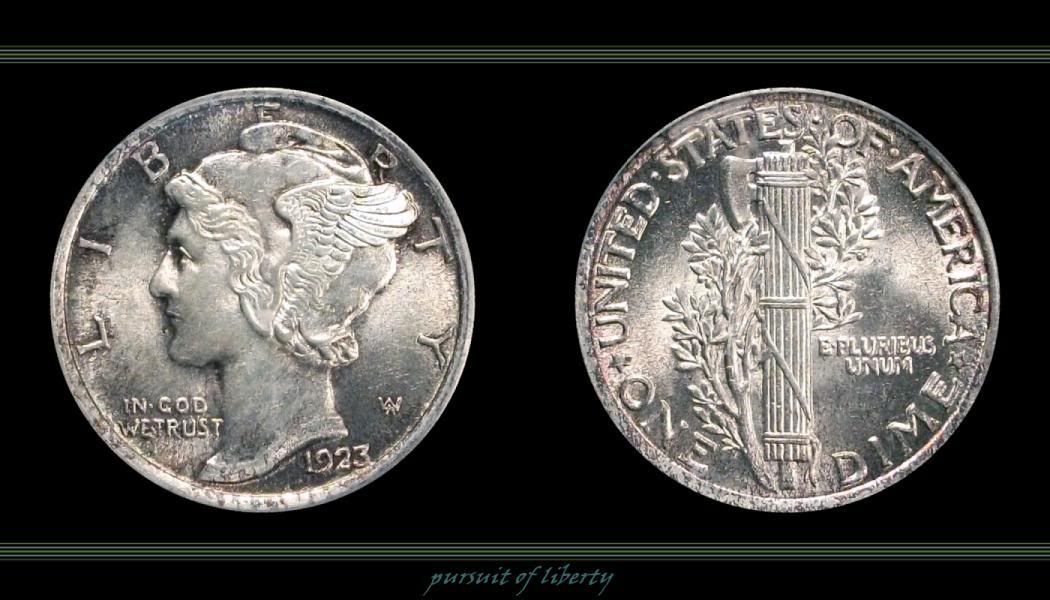
Took a long nap after getting abused at work ... thought I would play around with a coin I picked up in January that I hadn't photographed yet. Now it's back to bed so I can get abused again tommorow. 
Anyway, my questions are ... do you like the coin? the display layout? the photo's?
FWIW my camera setup is pretty lame in comparison to many, but I'm trying to improve and this one looks almost spot on to what it looks like in hand. Not crystal clear, but even decent photo's are better than none when they sit in lockdown most of the time.
Fire away if you wish!
“We are only their care-takers,” he posed, “if we take good care of them, then centuries from now they may still be here … ”
Todd - BHNC #242
0
Comments
Love the coin, love the bands, lighting etc. I have not imaged a Merc in years and those were all Proofs - can you get some luster on the cheek? The presentation - I am missing those stripes down the side to cement the "frame" you have created. I'd make them each a hair wider and I'd try sampling some colors off the coin to create a cohesive feel. Also the text could show up more. I might suggest a font more appropriate to the coin. And, I think the spaces between the obv and rev should at least be equal to the spaces between coins edge and the edge of your "frame" for an even composition. Just suggestions - please take them with the good intentions with which they are offered.
Best wishes,
Eric
Here is a coin that looks great on my monitor but again it is lacking in reguard too the luster aspect.
I have also found out through the years that a few other coins are much easier to image. Lincolns are the easiest imo along with roosevelt dimes. Again though just the slightest movement loses detail.
Ken
In honor of the memory of Cpl. Michael E. Thompson