Home U.S. Coin Forum

Which 1943-D Merc Toner Do you Like Best for a Toned Merc Registry Set 1934-1945?

keyman64keyman64 Posts: 15,519 ✭✭✭✭✭
edited January 15, 2023 10:04AM in U.S. Coin Forum

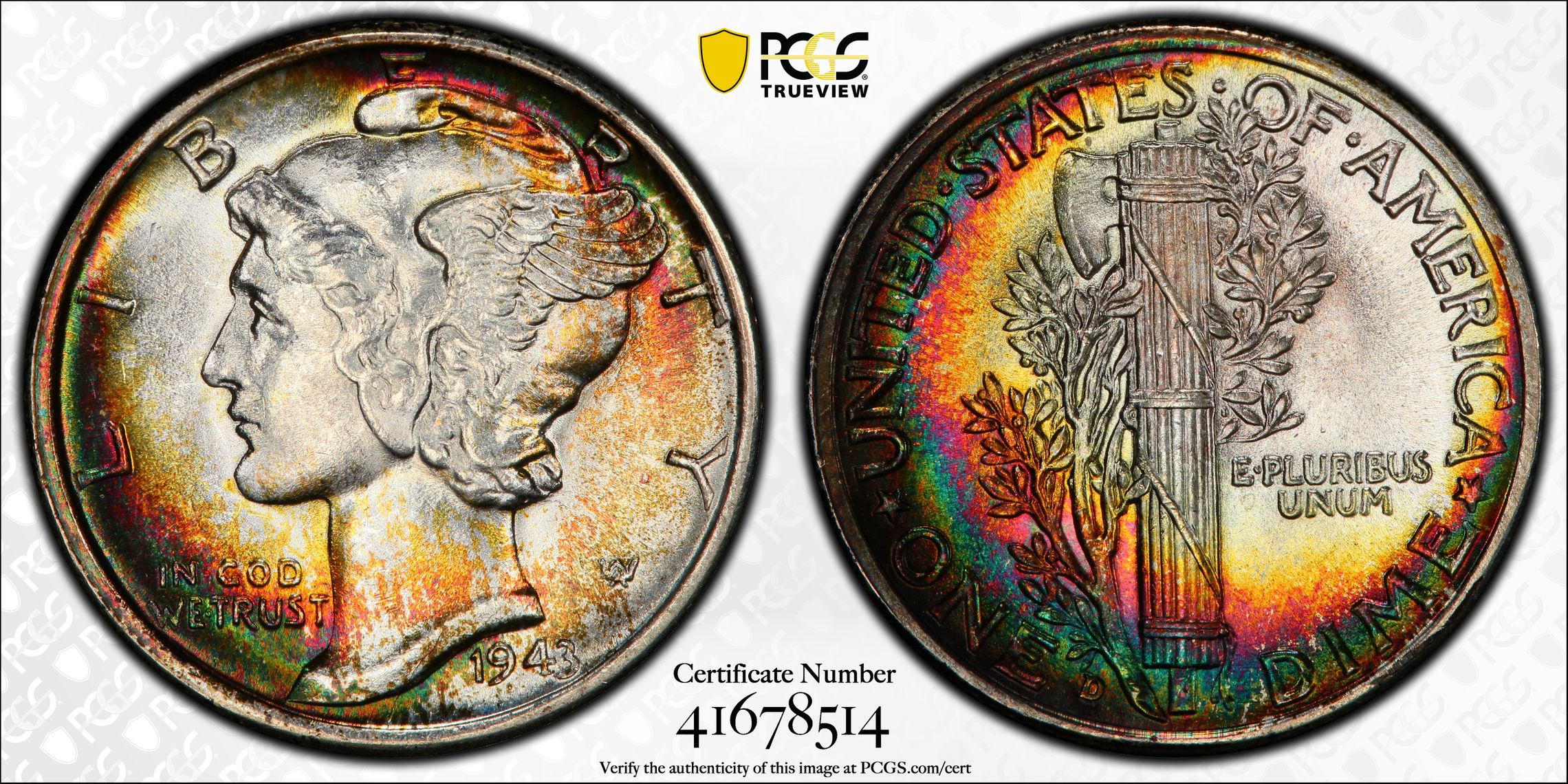
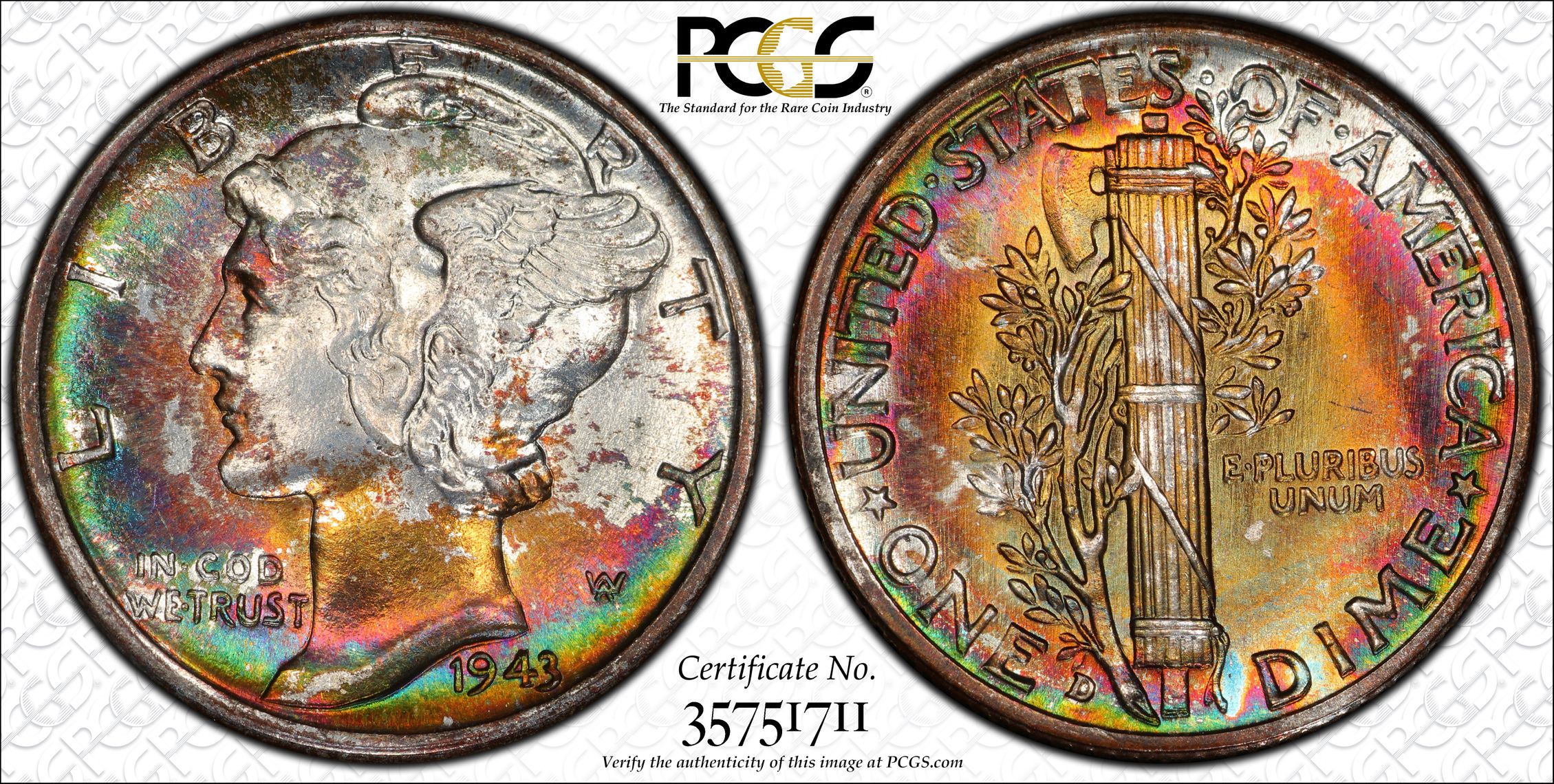
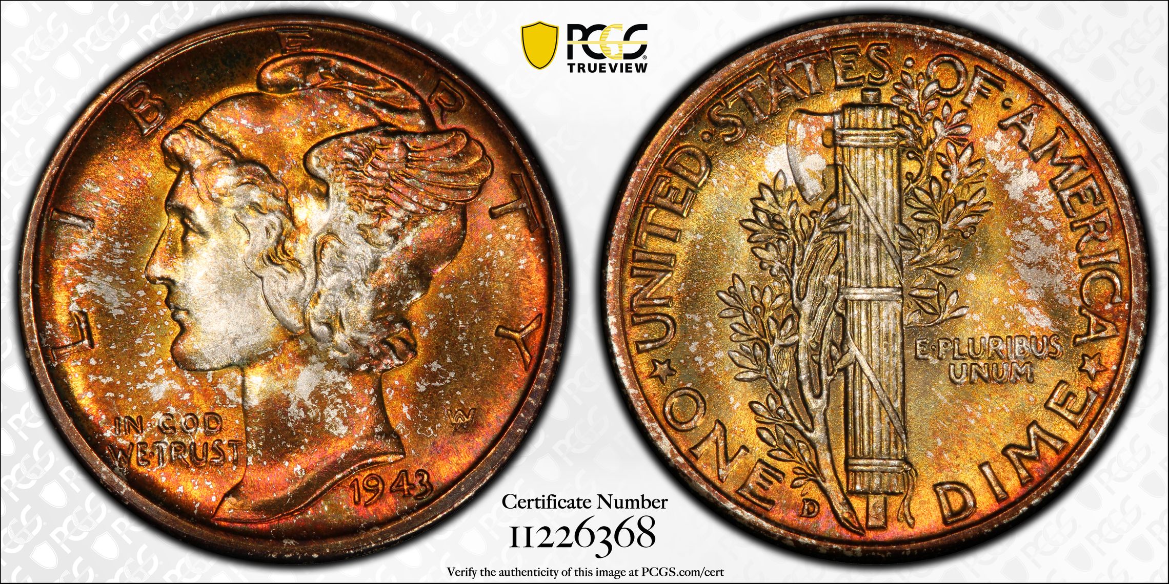
I'd like to see if we can get to a clear majority. The first and third are 67+FB and the second one is in for regrade, currently a 67FB.
I have a showcase but if I were to start a registry I would need to select one 1943-D. The first one has a CAC sticker but I do not think the other two have ever visited CAC...knowing who I got the coins from. Yes, the first one has a little bit more green than what shows in the photos and no, it does not go black/terminal. For those that prefer coins free of tarnish, this thread might not be for you. ;)

1.

2.

3.

"If it's not fun, it's not worth it." - KeyMan64
Looking for Top Pop Mercury Dime Varieties & High Grade Mercury Dime Toners. :smile:

Which 1943-D Merc Toner Do you Like Best for a Toned Merc Registry Set 1934-1945?

This is a public poll: others will see what you voted for.

Comments

  • TomBTomB Posts: 21,563 ✭✭✭✭✭
    2

    I love them all and would happily own all three, but the middle one is my favorite-

    Thomas Bush Numismatics & Numismatic Photography

    In honor of the memory of Cpl. Michael E. Thompson

    image
  • keyman64keyman64 Posts: 15,519 ✭✭✭✭✭

    @TomB said:
    I love them all and would happily own all three, but the middle one is my favorite-

    Thanks, Tom.

    "If it's not fun, it's not worth it." - KeyMan64
    Looking for Top Pop Mercury Dime Varieties & High Grade Mercury Dime Toners. :smile:
  • ashelandasheland Posts: 23,396 ✭✭✭✭✭
    2

    Totally agree, all are nice but I really like #2!

  • TPRCTPRC Posts: 3,805 ✭✭✭✭✭
    2

    I much prefer 2 as well.

    Tom

  • nwcoastnwcoast Posts: 2,880 ✭✭✭✭✭
    2

    I’d vote for #1 if that toning hadn’t gone so dark near the rims.
    They’re all lovely coins!

    Happy, humble, honored and proud recipient of the “You Suck” award 10/22/2014

  • WalkerfanWalkerfan Posts: 9,466 ✭✭✭✭✭
    edited January 15, 2023 11:06AM
    1

    They are all great.

    But #1 is my favorite (love the vibrant spectrum of colors!) followed by #2 and #3.

    Funny, as you have ordered them in the rank that I like them. ;)

    Sometimes, it’s better to be LUCKY than good. 🍀 🍺👍

    My Full Walker Registry Set (1916-1947):

    https://www.ngccoin.com/registry/competitive-sets/16292/

  • CatbertCatbert Posts: 7,350 ✭✭✭✭✭
    2

    I like the aqua toning and the toning pattern (or lack thereof) of #2.

    Seated Half Society member #38
    "Got a flaming heart, can't get my fill"
  • OldIndianNutKaseOldIndianNutKase Posts: 2,710 ✭✭✭✭✭
    1

    The toning is much more uniform on No. 1. The toning enhances the devices rather than obliterating them.

  • MFeldMFeld Posts: 13,962 ✭✭✭✭✭
    2

    I’d go with:
    2 (by a slim margin) over
    1 (by a wide margin) over
    3

    Mark Feld* of Heritage Auctions*Unless otherwise noted, my posts here represent my personal opinions.

  • PeakRaritiesPeakRarities Posts: 4,067 ✭✭✭✭✭

    I’m on the fence between 1&2, not a fan of 3 as much.

    Founder- Peak Rarities
    Website
    Instagram
    Facebook

  • FlatwoodsFlatwoods Posts: 4,192 ✭✭✭✭✭

    I think I would prefer #1 if the rims were lit.

  • OAKSTAROAKSTAR Posts: 7,731 ✭✭✭✭✭
    2

    Yes, gotta go with #2

    Disclaimer: I'm not a dealer, trader, grader, investor or professional numismatist. I'm just a hobbyist. (To protect me but mostly you! 🤣 )

  • ctf_error_coinsctf_error_coins Posts: 15,433 ✭✭✭✭✭
    2

    2 is uniquely awesome.

  • david3142david3142 Posts: 3,563 ✭✭✭✭✭
    2

    The reverse of 1 is almost enough for me to pick it over 2 but the obverse of 2 carries the day and it’s reverse is still plenty nice. Beautiful coins!

  • maymay Posts: 1,590 ✭✭✭✭✭
    3

    I like #3, reminds me of fall. :)

    Type collector, mainly into Seated. -formerly Ownerofawheatiehorde. Good BST transactions with: mirabela, OKCC, MICHAELDIXON, Gerard

  • Jzyskowski1Jzyskowski1 Posts: 6,650 ✭✭✭✭✭

    🤐

    🎶 shout shout, let it all out 🎶

  • pursuitoflibertypursuitofliberty Posts: 7,098 ✭✭✭✭✭
    2

    Really tough choice between 2 and 1 for me. Love them both.

    3 is no slouch, but not really close to the others in tone appeal, at least for me.


    “We are only their care-takers,” he posed, “if we take good care of them, then centuries from now they may still be here … ”

    Todd - BHNC #242
  • JBNJBN Posts: 1,872 ✭✭✭✭✭
    1

    Just like you have them listed. Number 2 is a close second, tho.

  • BillJonesBillJones Posts: 34,294 ✭✭✭✭✭
    edited January 15, 2023 12:46PM
    2

    I am not a big fan of any of them, but I chose #2 because it was the most attractive to me.

    I am concerned about the reverse of #1. The color has turned black around the edge, and I am not sure that it’s done. This could be environmental damage a decade from now.

    Number 2 is the best to my eye, but the toning is not even. I have seen more attractive toners, although the standard for modern coins might have a different standard. Moderns are of less interest to me.

    I don’t find #3 attractive. There is nothing wrong with it, but it’s also not outstanding.

    Retired dealer and avid collector of U.S. type coins, 19th century presidential campaign medalets and selected medals. In recent years I have been working on a set of British coins - at least one coin from each king or queen who issued pieces that are collectible. I am also collecting at least one coin for each Roman emperor from Julius Caesar to ... ?
  • gumby1234gumby1234 Posts: 5,591 ✭✭✭✭✭
    1

    @BillJones he said that #1 has not gone black and not terminal.

    Successful BST with ad4400, Kccoin, lablover, pointfivezero, koynekwest, jwitten, coin22lover, HalfDimeDude, erwindoc, jyzskowsi, COINS MAKE CENTS, AlanSki, BryceM

  • hummingbird_coinshummingbird_coins Posts: 1,213 ✭✭✭✭✭
    1

    @BillJones said:
    I am not a big fan of any of them, but I chose #2 because it was the most attractive to me.

    I am concerned about the reverse of #1. The color has turned black around the edge, and I am not sure that it’s done. This could be environmental damage a decade from now.

    Number 2 is the best to my eye, but the toning is not even. I have seen more attractive toners, although the standard for modern coins might have a different standard. Moderns are of less interest to me.

    I don’t find #3 attractive. There is nothing wrong with it, but it’s also not outstanding.

    Contrary to the photos, the OP states that the 1st coin does not go terminal around the rim. Zooming in reveals there may be some reddish toning there that the camera just couldn't pick up on.

    Young Numismatist • My Toned Coins
    Life is roadblocks. Don't let nothing stop you, 'cause we ain't stopping. - DJ Khaled

  • BillJonesBillJones Posts: 34,294 ✭✭✭✭✭
    2

    @hummingbird_coins said:

    @BillJones said:
    I am not a big fan of any of them, but I chose #2 because it was the most attractive to me.

    I am concerned about the reverse of #1. The color has turned black around the edge, and I am not sure that it’s done. This could be environmental damage a decade from now.

    Number 2 is the best to my eye, but the toning is not even. I have seen more attractive toners, although the standard for modern coins might have a different standard. Moderns are of less interest to me.

    I don’t find #3 attractive. There is nothing wrong with it, but it’s also not outstanding.

    Contrary to the photos, the OP states that the 1st coin does not go terminal around the rim. Zooming in reveals there may be some reddish toning there that the camera just couldn't pick up on.

    I have a coin that is toned like that, which I have owned for over 20 years. It has gotten darker since I bought it, and I am concerned about it.

    Retired dealer and avid collector of U.S. type coins, 19th century presidential campaign medalets and selected medals. In recent years I have been working on a set of British coins - at least one coin from each king or queen who issued pieces that are collectible. I am also collecting at least one coin for each Roman emperor from Julius Caesar to ... ?
  • bagofnickelsbagofnickels Posts: 349 ✭✭✭✭
    2

    I find all 3 of them to be quite appealing but 2 is my favorite. 1 would be extremely close as a second favorite. I suspect #3 would be exceptional on its own accord but the other 2 are just so so nice.

  • ponderitponderit Posts: 1,544 ✭✭✭✭✭
    2

    Any of them would be nice additions but given the choice I'd go with 2

    Successful BST transactions with Rob41281, crazyhounddog, Commoncents, CarlWohlford, blu62vette, Manofcoins, Monstarcoins, coinlietenant, iconbuster, RWW,Nolawyer, NewParadigm, Flatwoods, papabear, Yellowkid, Ankur, Pccoins, tlake22, drddm, Connecticoin, Cladiator, lkeigwin, pursuitofliberty
  • MidLifeCrisisMidLifeCrisis Posts: 10,547 ✭✭✭✭✭
    1

    I like 1. I think toning should be complimentary, not overwhelming. That's how I would describe #1, when compared to the other two.

  • keyman64keyman64 Posts: 15,519 ✭✭✭✭✭

    @BillJones said:

    @hummingbird_coins said:

    @BillJones said:
    I am not a big fan of any of them, but I chose #2 because it was the most attractive to me.

    I am concerned about the reverse of #1. The color has turned black around the edge, and I am not sure that it’s done. This could be environmental damage a decade from now.

    Number 2 is the best to my eye, but the toning is not even. I have seen more attractive toners, although the standard for modern coins might have a different standard. Moderns are of less interest to me.

    I don’t find #3 attractive. There is nothing wrong with it, but it’s also not outstanding.

    Contrary to the photos, the OP states that the 1st coin does not go terminal around the rim. Zooming in reveals there may be some reddish toning there that the camera just couldn't pick up on.

    I have a coin that is toned like that, which I have owned for over 20 years. It has gotten darker since I bought it, and I am concerned about it.

    Bill brings up a valid point.
    The coin does get dark near the rim but there is still clear luster in there, indicating the toning has not eaten through to become terminal. But given time...you never know.

    "If it's not fun, it's not worth it." - KeyMan64
    Looking for Top Pop Mercury Dime Varieties & High Grade Mercury Dime Toners. :smile:
  • JimnightJimnight Posts: 10,846 ✭✭✭✭✭
    2

    I like the balance in the toning.

  • Dave99BDave99B Posts: 8,600 ✭✭✭✭✭
    1

    All are beautiful. I was torn between 1 and 2. Voted 1.

    Dave

    Always looking for original, better date VF20-VF35 Barber quarters and halves, and a quality beer.
  • gumby1234gumby1234 Posts: 5,591 ✭✭✭✭✭
    1

    @keyman64 Looks like you won't be getting a clear majority. Coin 3 was definitely ruled out thou.

    Successful BST with ad4400, Kccoin, lablover, pointfivezero, koynekwest, jwitten, coin22lover, HalfDimeDude, erwindoc, jyzskowsi, COINS MAKE CENTS, AlanSki, BryceM

Leave a Comment

BoldItalicStrikethroughOrdered listUnordered list
Emoji
Image
Align leftAlign centerAlign rightToggle HTML viewToggle full pageToggle lights
Drop image/file