Options
New 2019 Innobuck designs released
 WALLE
Posts: 352 ✭✭✭✭
WALLE
Posts: 352 ✭✭✭✭
American Innovation $1 Coin Program Designs
August 14, 2019

0
Comments
Gag. what a bunch of dull, prosaic, lifeless crap !
Where's the innovation in design ?
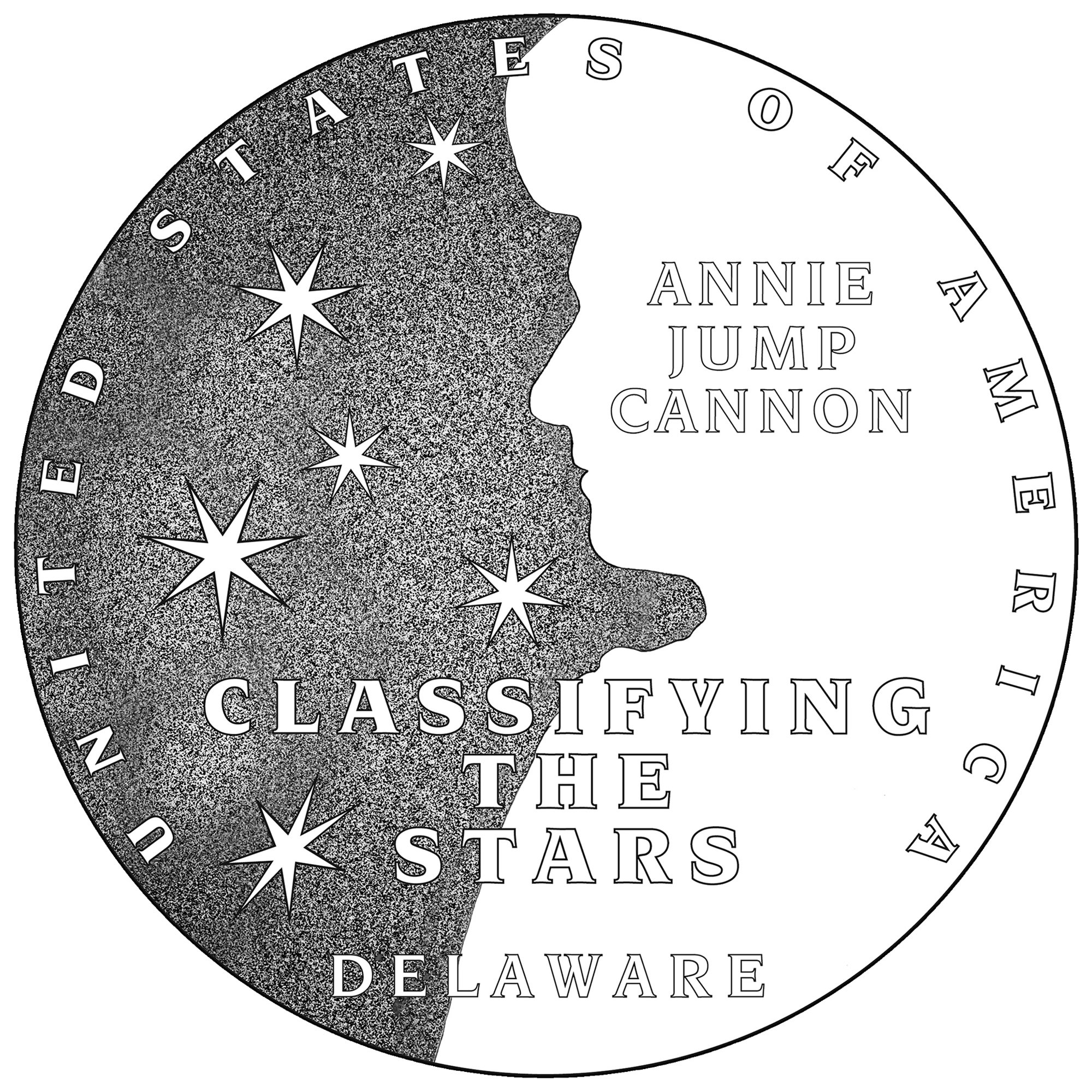
First Dancing... Now Jumping Cannons with the Stars
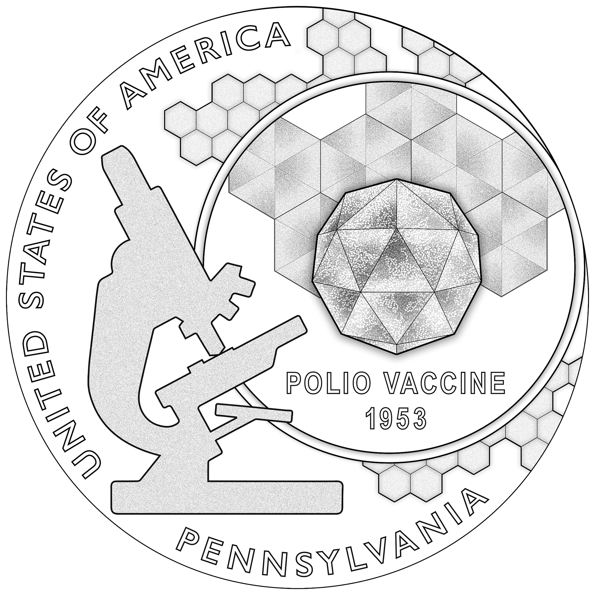
I’all take the polio vaccine in Proof.
Microscopes are not usually used in a tilted position...the subject will slide off.
This one, simply as an example, is trite, silly and says nothing about the public fear of American families of polio striking their child. An adult neighbor and family friend, High School basketball coach, got polio. The entire community was on edge about any public gathering. Parents worried openly and in private about a disease that looked at first like a common cold, then your child woke up not being able to move their legs, or possibly breathe. Iron Lungs sitting in rows in hospitals and sanatoriums, their massive bulk overwhelming tiny figures trapped within - possibly for life.
The design says nothing. Nothing. It might be for a bee-keeper's token.
All comments reflect the opinion of the author, even when irrefutably accurate.
Actually, I think all 4 designs are acceptable and might end up being very attractive. Roger needs prune juice.
All comments reflect the opinion of the author, even when irrefutably accurate.
At least the parachuting toothbrushes were nixed.
Just wait as the fifth upcoming reverse design will depict prune juice")
I don't mind a prune juice "before" picture...just don't include an "after"
All comments reflect the opinion of the author, even when irrefutably accurate.
I remember standing in line at the High School with parents and kids to get the vaccine in the early 50's.
What's with no design on the exergues? So many beautiful designsp patterns past to enhance the main image. Come on! Peace Roy
BST: endeavor1967, synchr, kliao, Outhaul, Donttellthewife, U1Chicago, ajaan, mCarney1173, SurfinHi, MWallace, Sandman70gt, mustanggt, Pittstate03, Lazybones, Walkerguy21D, coinandcurrency242 , thebigeng, Collectorcoins, JimTyler, USMarine6, Elkevvo, Coll3ctor, Yorkshireman, CUKevin, ranshdow, CoinHunter4, bennybravo, Centsearcher, braddick, Windycity, ZoidMeister, mirabela, JJM, RichURich, Bullsitter, jmski52, LukeMarshall, coinsarefun, MichaelDixon, NickPatton, ProfLiz, Twobitcollector,Jesbroken oih82w8, DCW
I remember that too. Thank god for that vaccine.
All four designs are fairly strong, from concept to execution. Compositions are well-balanced and quite visually dynamic. Add in the inherent difficulty of conveying an idea in miniature scale, and you have four good examples of excellence in design.
But heck, what does an old retired art teacher know?
Maybe you can point out where the artistic part is because I'm not seeing it.
I'm with you. But I'm just a "wish I was retired" chemistry teacher...
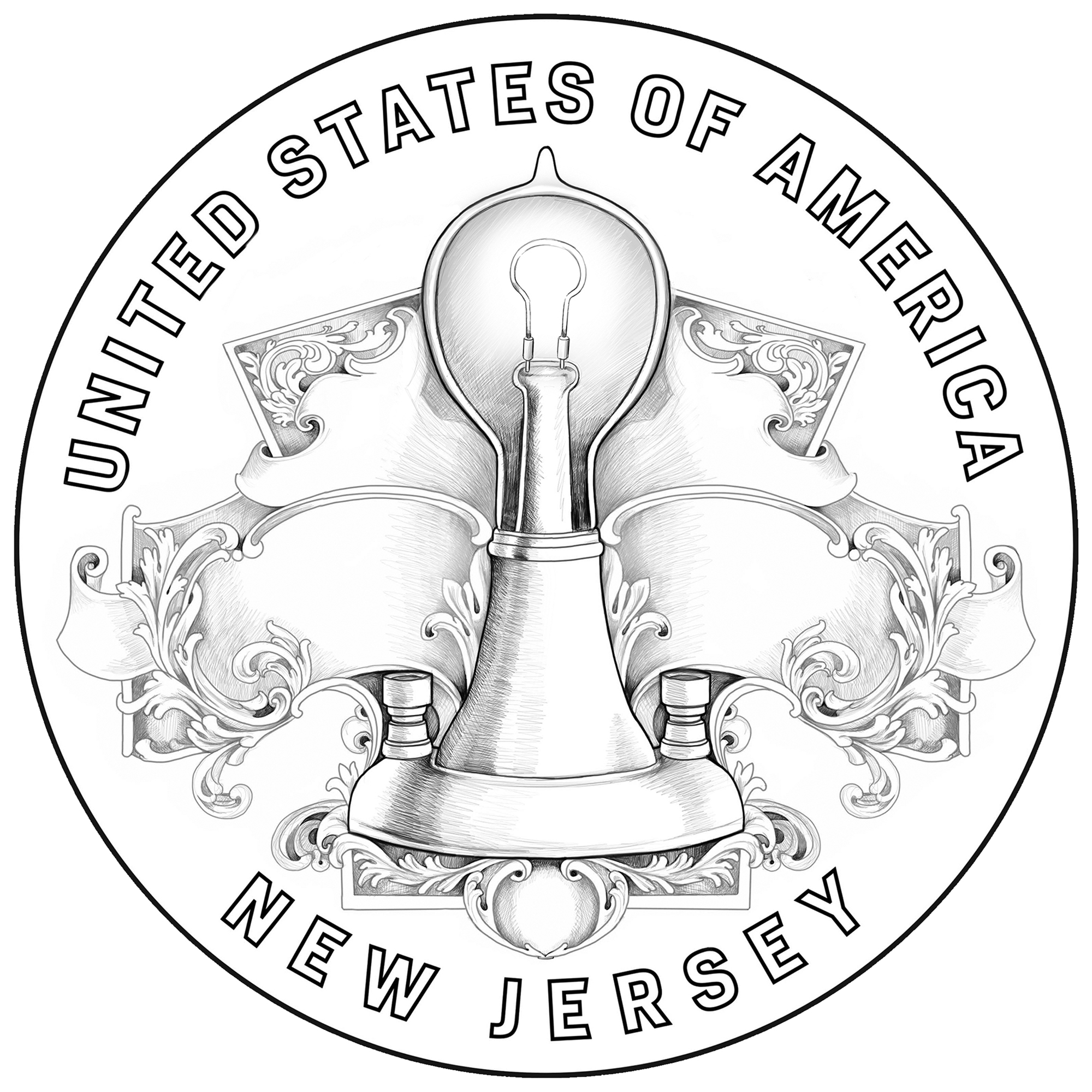
I like the neo-classical flair with the light bulb.
I LOVE the plants rooted in the text.
The polio design may lack the poignancy of children in iron lungs, but it has a really clean laboratory feel to it. I think it celebrates the science rather than mourning the disease.
The stars are my least favorite. I mean it isn't horrible, but it made me think "New Zealand flag".
All comments reflect the opinion of the author, even when irrefutably accurate.
Trite, dull, unimaginative and silly. The Georgia one is the "best of the bad."
Sure it's a challenge to create something interesting and evocative on such a small space - but these are supposed to be among our best artists. I get no hint that any of the artists understood the impact of the insights brought to human knowledge that are being celebrated.
As for the stupid prune juice crack, more was expected from the poster.
I was trying to express an idea on a small palette.
You just seem crabby. You don't have to love them, but those designs are not without their charms.
All comments reflect the opinion of the author, even when irrefutably accurate.
Not "crabby."
I'm very disappointment at all the blabbing from Mint Officials about quality, when nothing has been done for nearly a decade. The CCAC issued a detailed, objective report on improving the quality of commemorative coin designs in 2011. Some of the recommendations have been implemented, but the key ones affecting quality remain undone despite loads of empty promises.
These and most of the other designs, trivialize the importance of the event and of its impact on American - and world - society. We get cheap, easy, meaningless dross. Compare even with President Roosevelt's December 1904 complaint about our coinage.....
Design for the highest and best.
I'll withhold judgment until coins-in-hand. Most of the recent designs (whether you liked them or not) looked better in ART than in COIN.
The delicate shadings are going to disappear on the flat coin (except maybe on an enhanced proof)
 (Effigy Mounds 2)
ANA 50+ year/Life Member (now "Emeritus")
Author: 3rd Edition of the SampleSlabs book, https://sampleslabs.info/
The polio vaccine is very near and dear to my heart. I was born a few years before it was available and contracted polio. I don’t give a damn what the design is so long as it promotes vaccinations.
Think I'm joking?
https://www.numismaticnews.net/article/ccac-meets-to-discuss-commemorative-quarter-coin-designs
ANA 50+ year/Life Member (now "Emeritus")
Author: 3rd Edition of the SampleSlabs book, https://sampleslabs.info/
Effigy mounds is a special case. Many designers look better, especially proofs and enhanced
All comments reflect the opinion of the author, even when irrefutably accurate.
I certainly appreciate the polio design.... My Dad had the disease and recovered, his sister was in a wheel chair for life. I remember getting the vaccine as a kid. Cheers, RickO
The iron lung was not a great innovation, the vaccine was.
They did keep a lot of people alive, but for those who never recovered enough to live without one (as most victims who needed one did) it was a horrible life. I got to spend half an hour in one of of morbid curiosity about what might have been, and it scared the hell out of me!
Spot on. The Mint's official descriptions states:
"The Pennsylvania $1 Coin recognizes the creation of a vaccine to prevent polio. This design depicts an artist’s conception of the poliovirus at three different levels of magnification along with the silhouette of a period microscope, representing the extensive research that was conducted to develop a cure for polio."
I guess I'm in the minority, but I like all the designs. Sure beats having the same old boring dead Presidents, tired old Greek and Roman deities, or eagles that have the look of hungry vultures ... oops I forgot, they are vultures")
The $1 series - NIFC - sure you push the boundaries and designs that look better in proof or enhanced uncirculated have a chance to execute the design vision.
But the quarters are supposed to circulate and the designs there are the same shaded drawings that look nice on paper and terrible on circulation quality coins.
My point was that designers need to learn how to use their new tools to create more accurate representations of their designs as they will be used.
ANA 50+ year/Life Member (now "Emeritus")
Author: 3rd Edition of the SampleSlabs book, https://sampleslabs.info/