Hey, I bought a coin!!
 keets
Posts: 25,351 ✭✭✭✭✭
keets
Posts: 25,351 ✭✭✭✭✭
Tell me what you think.
Al H.
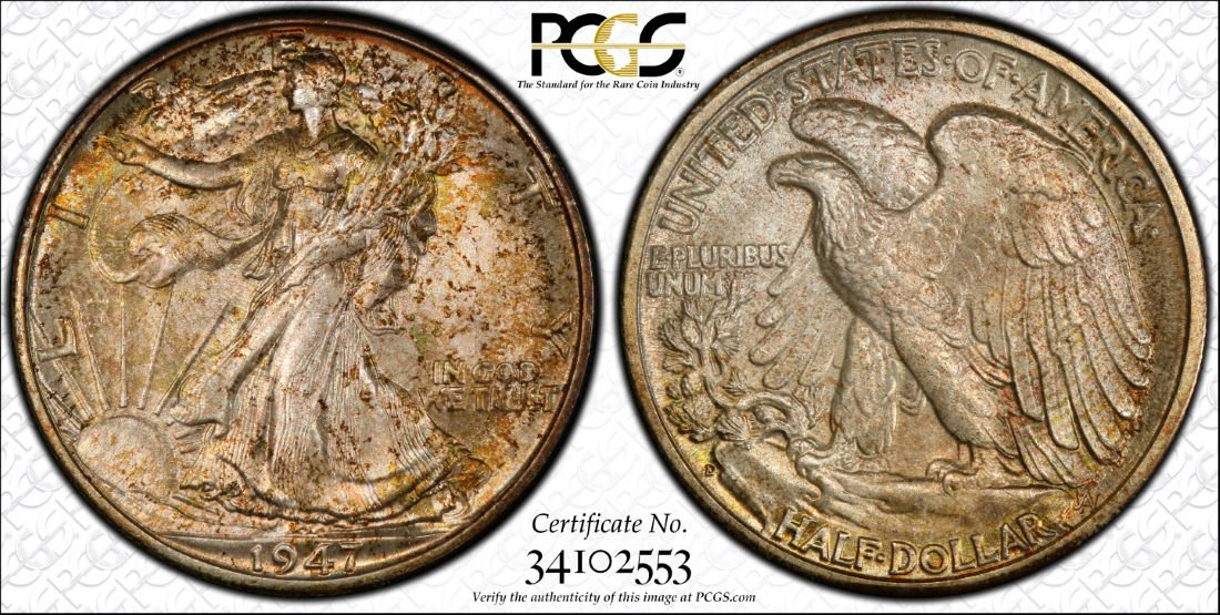
10
keets
Posts: 25,351 ✭✭✭✭✭
Tell me what you think.
Al H.
Comments
"She comes out of the sun in a silk dress,
running like a water color in the rain...."
Thumbs up all the way on this little beauty! So original!
Dave
Nice clean and original. Not my series, but I like it a lot.
the rims look clean and the fields look clean, I especially like the reverse. the tone could be more colorful but it has a certain appeal to me and doesn't seem to be hiding anything. minimum friction on Ms. Liberty's leg and the Eagle's leg told me it was OK to own.
Beauty is in the eye of the beholder... So as along as you like it that's all that matters")
I like it. It has character and what looks like a decent strike.
I appreciate the toning and the print on the eagles feathers adds a lifelike element. The tone gives the coin a “stationary movement” look, like slow motion (if that makes any sense at all)
Having bought a coin from you before, I know you have a good eye for quality.
Nice pick up.
https://www.autismforums.com/media/albums/acrylic-colors-by-rocco.291/
You bought a coin ? Well smack my azz and call me Sally
Mustang Sally ok?
you guys crack me up. Sally is my ex-wife's name!!!
I like the toning on the reverse but not the toning on the obverse.
It looks so tiny next to your flag.
"Inspiration exists, but it has to find you working" Pablo Picasso
Personally, I like that type of toning......nice coin.
I could do without the fingerprint.
Sometimes, it’s better to be LUCKY than good. 🍀 🍺👍
My Full Walker Registry Set (1916-1947):
https://www.ngccoin.com/registry/competitive-sets/16292/
It gets an "A" for originality, but I am not in love with the toning.
Wow - and on the heels of the "I can't find anything" thread.....

hey, Lakes, that's why I posted it. I knew it wouldn't be loved by all but I'm OK with that. most often what we want to see is vibrant color in many shades and all this really has is brown, gold and green. if you go to the cert check page(or click on the picture above) and look at the larger pictures you can see that it's sort of clean and rather well struck.
I'm not defending the coin or my purchase just saying what i see. one thing that's interesting is the placement of the "print" which is actually in a good place if such can be said. because of the design, the print doesn't lay flat so it's broken up somewhat and almost looks like normal tone.
I am tempted to run a DNA check!!")
It looks great. Details on the reverse look crisp. That kind of toning doesn't always photograph well but is great and original. I bet it's even nicer in hand.
Felicidades!!
Nice honest skin on that one
https://www.pcgs.com/setregistry/quarters/washington-quarters-major-sets/washington-quarters-date-set-circulation-strikes-1932-present/publishedset/209923
https://www.pcgs.com/setregistry/quarters/washington-quarters-major-sets/washington-quarters-date-set-circulation-strikes-1932-present/album/209923
A crusty old girl for sure. Original and beautiful.
Bob Sr CEO Fieldtechs
Nice pick up!
My YouTube Channel
Nice one love that original look with a touch of toning!!
The only thing I don't like about it is the date. If it was a 1916 I'd love it.
Nice toning
They don't make coins like that anymore. The toning's okay, the coin is unspectacular but decent.
I knew it would happen.
Someone flung poo at a screen door and your coin was on the other side!
I am heavy into pre-33 gold, but this thread has inspired me to buy a graded walking liberty half
I have a feeling this looks better in-hand. Not ALL True views are flattering.
Nice original coin that I'm sure looks even better in hand.
I like it very much. I just got a new coin today as well.
A little mottled.
I agree with Catbert and BG.
It's a '47D for crying out loud, what am I missing besides your latest view concerning "nice" rims?
I'm not a fan of the obverse toning...BLAH! (I do like the reverse)
It has... character.
Very Beautiful Coin... I loved it")
Such a diplomat.
Nice
More leg than I've seen in a long time
It has great detail underneath the tarnish/residue... A great coin and the WLH is a personal favorite of mine....Cheers, RickO
the overall strike and clean surfaces are overlooked by both factions of the thread, those who like the tone and those who don't like the tone. sure, it's a relatively common date and has the advantage of being issued in Mint Sets. that means there's a higher likelihood of better examples to be found. I don't know if this is a Mint Set coin, but I do know three things: it is pretty clean and well struck, the tone is pleasant to my eyes and the next grade up presents a 10x+ price increase.
The only WLH I would ever buy is a toned one. There are a billion dipped and blash white WLHs....boring. I enjoy the gold speckled toning. It makes the coin unique in a way.
Too many freckles to my liking but of course I am on @ricko team")
ARCO, that is even true for most of the Proofs.