Options
Which one would you choose?
 Regulated
Posts: 2,994 ✭✭✭✭✭
Regulated
Posts: 2,994 ✭✭✭✭✭
Augustus Humbert kept one proof slug and sent one back to the Mint in 1851 - which would you choose and why?
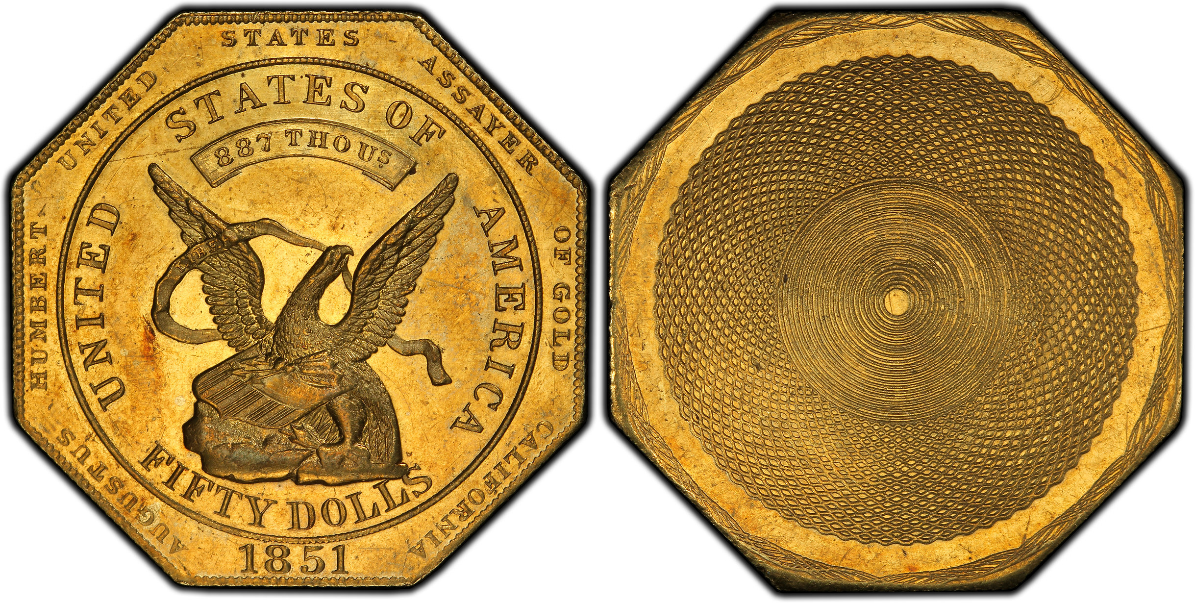
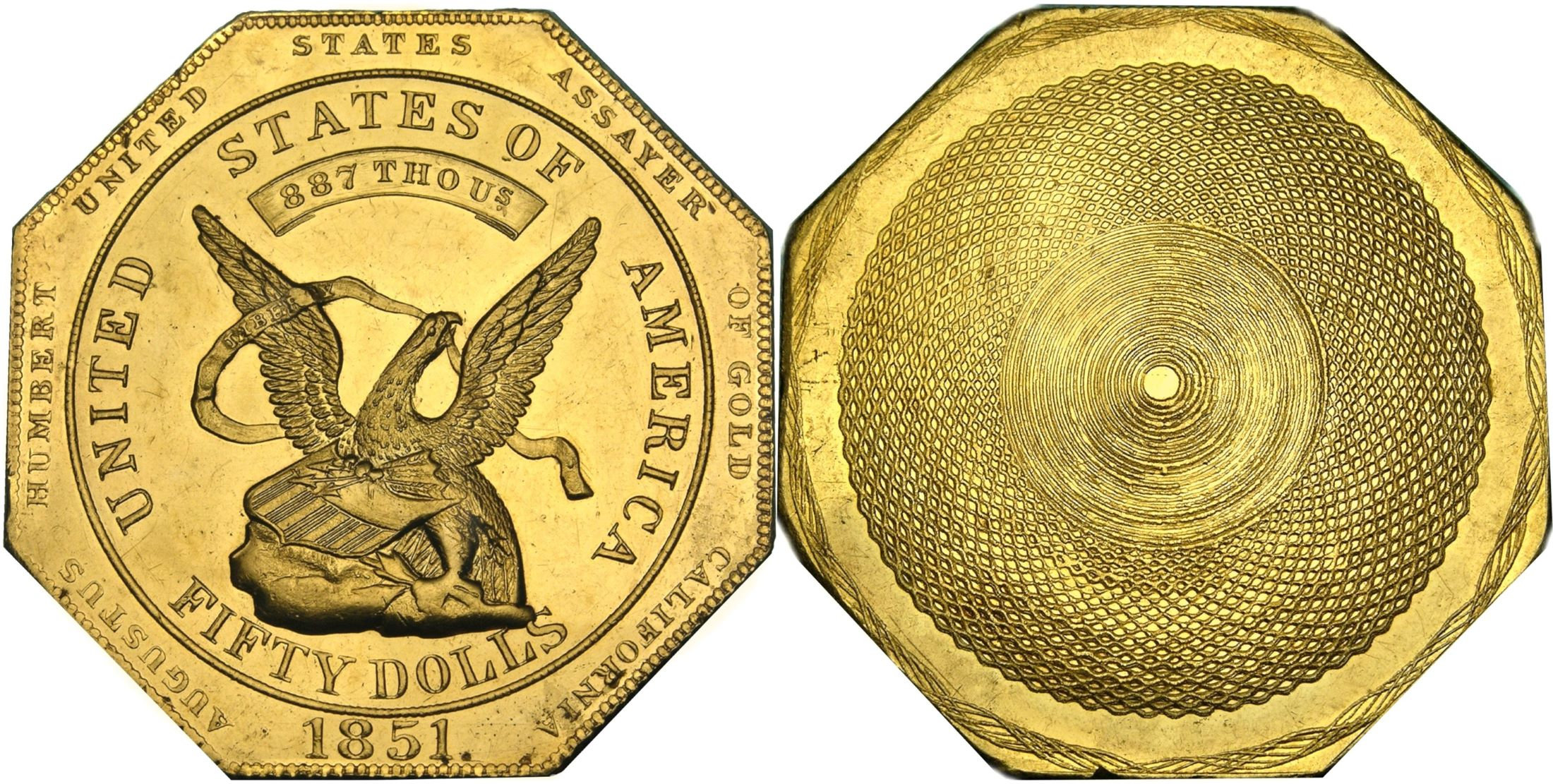
What is now proved was once only imagined. - William Blake
12
Comments
I would keep them both! I have a hard time letting go of duplicates. Both are very attractive.
But since you asked and I have to keep only one. I would keep the top one because I prefer the deeper orange gold color.
Technically, we all own part of one of them...
What is now proved was once only imagined. - William Blake
Top looks more original to my eyes
The second one to me looks a little cleaner with less marks. $50 was a good chunk of change back then but maybe he should have kept both.
It's interesting to note that one is an earlier die state than the other, which I wouldn't have expected.
What is now proved was once only imagined. - William Blake
If I were him, I would keep the second one and send the first one to the Mint,
because the first one has more uniform spiral lines on the back, and I'd like them to see my best work.
The first one. I prefer the colors. The second one looks like “white gold.”
I also would choose the top one because of the deep color.
I’m not sure if they are both the same grade but the second one looks
like a weaker strike on the reverse to me.
.
Color wise I must say since I have been putting a so called slug collection I
can tell you some have the nice rich gold color and others have the lighter yellow gold
just like the pics you posted. I prefer the golden pl ones I have.
.
CoinsAreFun Toned Silver Eagle Proof Album
.
Gallery Mint Museum, Ron Landis& Joe Rust, The beginnings of the Golden Dollar
.
More CoinsAreFun Pictorials NGC FOR SALE
DOOR #1,,,,, I like the color better.
Having seen both in hand, they're about the same grade. The toned example is an earlier die state (the other one was heavily polished or lapped on both sides between strikings), and is better struck. The brighter coin does have a rim issue that resembles a test cut, but is probably from handling.
What is now proved was once only imagined. - William Blake
Didn’t Humbert choose #1? I’ll go with the guy’s opinion who held them both.
I think the top one is more attractive overall.
I prefer #1. The mellow color is the deciding factor.
Joseph J. Singleton - First Superintendent of the U.S. Branch Mint in Dahlonega Georgia
Findley Ridge Collection
About Findley Ridge
Top one for color!
My YouTube Channel
Top one because of color as others have stated.
If I were Humbert back in the day, I would have kept the second one. Toning was a detracting factor, which the first one has.
If I had the opportunity to choose to keep one of the two today, I would choose the first one since I love its originality and look.
Me want top one, yellow gold good.
BST: endeavor1967, synchr, kliao, Outhaul, Donttellthewife, U1Chicago, ajaan, mCarney1173, SurfinHi, MWallace, Sandman70gt, mustanggt, Pittstate03, Lazybones, Walkerguy21D, coinandcurrency242 , thebigeng, Collectorcoins, JimTyler, USMarine6, Elkevvo, Coll3ctor, Yorkshireman, CUKevin, ranshdow, CoinHunter4, bennybravo, Centsearcher, braddick, Windycity, ZoidMeister, mirabela, JJM, RichURich, Bullsitter, jmski52, LukeMarshall, coinsarefun, MichaelDixon, NickPatton, ProfLiz, Twobitcollector,Jesbroken oih82w8, DCW
Probably hadn’t toned much back in the day.
Top one looks nice and pops more looking at the pics.
I like the color of the first one better.
Yes, I also assume neither coin was toned mellow gold back in 1851....I would have taken the top one back then for the stronger rings, and today for the mellow surfaces.
Number one, due to the color.
I would choose the top. Looks like a stronger strike.
1 because of the color.
1, just looks more interesting
I too am on the bandwagon for #1, due to the nice orangey color.
But ... geez. Either one of those!
Collector since 1976. On the CU forums here since 2001.
I definitely like the top one due to the color and strike.
Sometimes, it’s better to be LUCKY than good. 🍀 🍺👍
My Full Walker Registry Set (1916-1947):
https://www.ngccoin.com/registry/competitive-sets/16292/
I would choose the top one because of the reddish orange toning. It gives the coin character
Sadly, we're all partners in the lower one - the one on top belongs to a private individual.
What is now proved was once only imagined. - William Blake
I would choose the second one... I like the bright gold...I also like crusty gold... the top one just looks dirty to me...Cheers, RickO
I like the originality of the top one but would keep the both of them, just saying
I like the top one love toned gold
https://www.pcgs.com/setregistry/quarters/washington-quarters-major-sets/washington-quarters-date-set-circulation-strikes-1932-present/publishedset/209923
https://www.pcgs.com/setregistry/quarters/washington-quarters-major-sets/washington-quarters-date-set-circulation-strikes-1932-present/album/209923
The first example is extremely well struck on both front and back and nice deep color, the second is weak and deteriorated dies, with a pale look. Send back the second example
https://www.autismforums.com/media/albums/acrylic-colors-by-rocco.291/
Easy: Top one. Very original. Second one has likely been 'monkeyed with'.
Cool coins!
Dave
Bottom ups for me!
Door numero uno for me.
Andrew Blinkiewicz-Heritage
i like the bottom one, i like the clean fields and i prefer the color of the bottom one, imho
Talk about a great pair of cufflinks!!!!
Both gorgeous. I would probably prefer #2 but I would not turn either one down!
Toner for me.
Top is better struck.
2nd is in the Smithsonian....i doubt any of us will "profit" from this ownership, but we all can enjoy it!
Personally I like #1 because of the toning but Humbert probably chose #1 because the strike was better...especially noticeable on the left Obverse reeding and his name!!!
The reverses appear to have been struck by different dies.
I like #1.
I'm on the bandwagon with #1 for the strike. Both are beautiful.
The reverse images are turned 90 degrees relative to each other. Look at the pimple on the top one about 10 rings right of the center. Now look at the bottom coin 10 rings down from the center.
This isn't the precursor to another giveaway, is it? I'll take the top one. Better strike, no nick in the rim.
Keeper of the VAM Catalog • Professional Coin Imaging • Prime Number Set • World Coins in Early America • British Trade Dollars • Variety Attribution
For me I’d have to go with the top one. I like coins that look they’re age. Original. Both are beautiful, no arguing that
Tom is the smartest one in the bunch again - I missed the reverse rotation, too. Above are the 2 in sync.
I assume the photographers were not consistent in how they shot the reverses,
and that Humbert did not rotate the die.