Felix Schlag, Father of the Jefferson Nickel
 leothelyon
Posts: 8,492 ✭✭✭✭✭
leothelyon
Posts: 8,492 ✭✭✭✭✭
You will need to scroll way way down to Feb. 1966 and click on the 45 record if you'd like to listen to a speech given by Felix Schlag himself.
http://www.felixschlag.com/FelixSchlag
There are also a few competitor's Jefferson nickel designs shown on this great website on Felix Schlag.
I am not affiliated in any way with this website other than being a collector of Jefferson nickels.
Also, I could not find any information on this website concerning the two 1966 SMS Jefferson nickels Felix Schlag received when they added his initials FS to the obverse of the Jefferson nickel.
Leo
The more qualities observed in a coin, the more desirable that coin becomes!
My Jefferson Nickel Collection
7
Comments
I often feel the Jefferson nickel, while being a nicely designed coin with historical significance, is largely ignored by the collector community. No idea why this is, since it is a great coin. Cheers, RickO
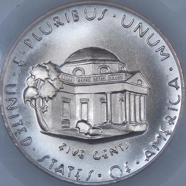
I have never been a fan of the reverse of the Jefferson Nickel. When you have to put the name of a well-known building under it, you know that the design might be lacking something.
In fairness to Felix Schlag, that was not his design. The claim was that Schlag's original Menticello design could not be struck properly on a mass-produced basis. The mint changed his Jefferson portrait too. In the end the original Schlag design was more of a suggestion than a blueprint for the finished nickel.
Thanks @leothelyon. Always good to read and hear some history.
Any opportunity to revisit the FSNC Schlag design:
--Severian the Lame
WOW!! I own that actual record. I vaguely remember sending someone photos of the record and jacket, the recording, and transcript to use on a web site. That was many, many years ago. I had forgotten all about it.
There is also one by Gilroy Roberts on the Kennedy Half Dollar. If anyone is interested, I'm sure I have (somewhere) photos, the recording, and transcript. I could post them if anyone would like.
Love the FSNC Schlag nickels by GMM / Ron Landis and Joe Rust. I remember when it was pretty easy to pick these up. Supply seems to have dried up in the past few years. Glad I was able to pick up 3 of them.
- Bob -

MPL's - Lincolns of Color
Central Valley Roosevelts
RE:
"In fairness to Felix Schlag, that was not his design. The claim was that Schlag's original Menticello design could not be struck properly on a mass-produced basis. The mint changed his Jefferson portrait too. In the end the original Schlag design was more of a suggestion than a blueprint for the finished nickel."
Minor changes were made to the portrait, and the lettering was completely revised. There was no claim that his design could not be mass produced. Lettering was changed because it was considered too idiomatic and irregular in scale look good on the coin.
The reverse was designed by Schlag after President Roosevelt asked for a basic straight-on view. The original building was geometrically flawed and Schlag was, evidently, not interested in correcting the problems. Schlag was also way behind his promised schedule in delivering final models. This threw introduction from July 1 into the autumn, and also earned the ire of director Ross.
Searching through the archives this website provides> @RogerB said:
This Director Ross also said the $1000 award could not be split up 1938-4-29. Whether Mr Schlag was asking for an advance payment or that there was a suggestion to have two winners of the competition, one for the obverse and another for the reverse because half of the contestant's models shown on this website had straight-on views of the Monticello (some were designed with steps on the Monticello, others were not). Why not use one of those and not bother Schlag with additional workload that he obviously made known the money was not worth his time. Back then, Ross likely threaten Schlag to either make the changes or forfeit the contest. But.....adjusted for inflation, $1,000.00 in 1938 is equal to $17,119.72 in 2018.
On another note; a couple of letters received by the US Mint from those archives were people making claims that there was no flag shown on the White House on the Jefferson nickel. That's hilarious since Monticello is clearly spelled out just beneath the building on the reverse side. Another asked for an appraisal for his newly discovered Floating head 1961-D nickel which was denied.
It would be interesting to have access to the many various letters, telegrams and footnotes to phone calls made back in those days.
Leo
The more qualities observed in a coin, the more desirable that coin becomes!
My Jefferson Nickel Collection
The entire file is in NARA at College Park, MD. The web site, I think, has all of it.
The competition was for a design for the coin -- not just one side of it.
RE: "Back then, Ross likely threaten Schlag to either make the changes or forfeit the contest."
No, that is conjecture. Schlag won the competition and was expected to complete the work, But he took time out to accept other work in June when he should have been completing the nickel. Ross was clearly furious over the delay.
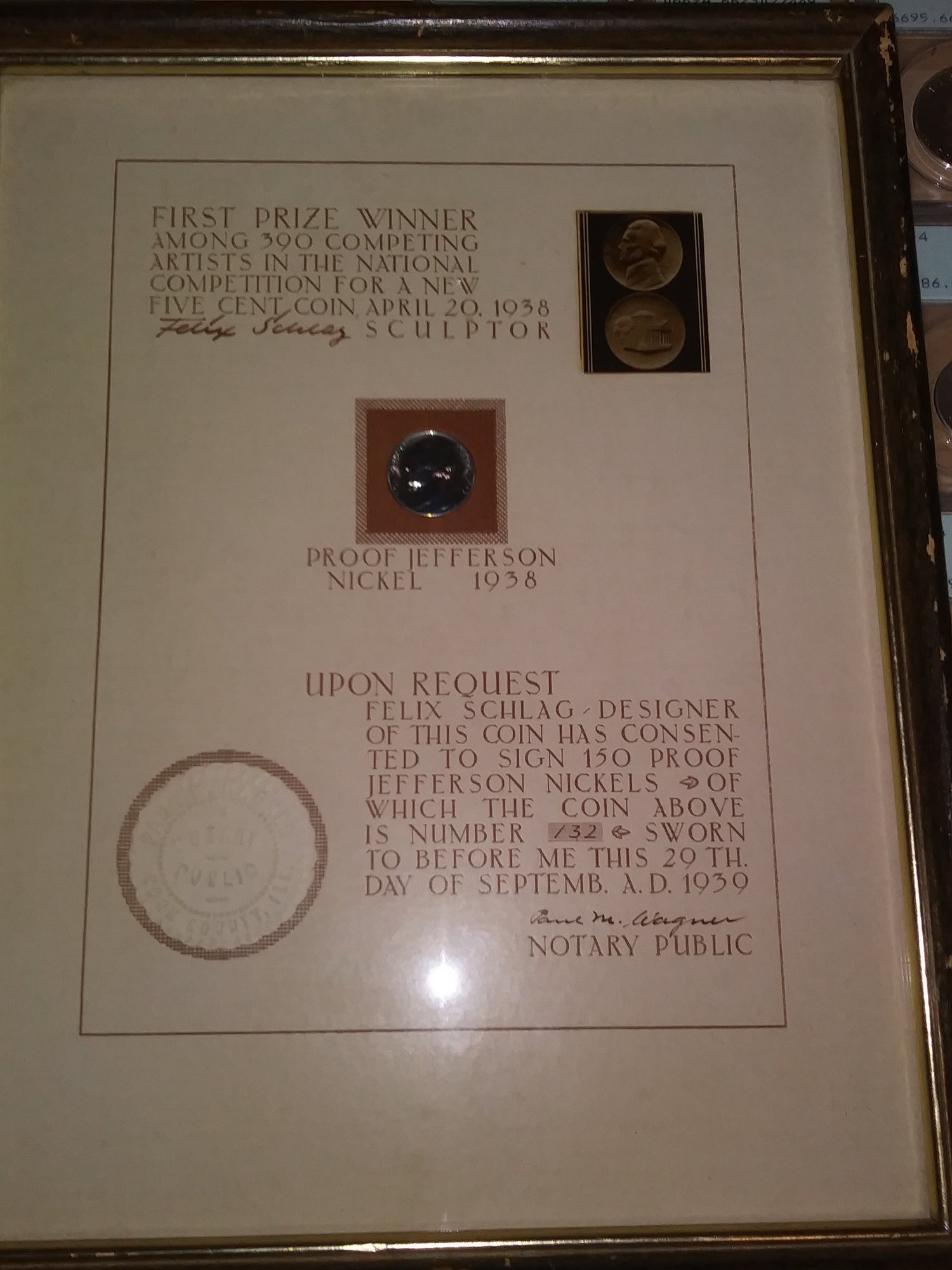
A faint blue tone on the non proof strike. Set #32.
I posted this a few days ago on another thread, but I think it belongs here too
http://www.felixschlag.com/gallery/registry
The more qualities observed in a coin, the more desirable that coin becomes!
My Jefferson Nickel Collection
And finally, here it is, a detail description of an aspect of a coin seldom discussed or considered as a very important criteria in collecting and grading high quality coins. I have referred to this effect as the spoon or bowl-like look in the strike of the coin. Where the field curves up as it approaches towards and just inside the rim. Heck, I tried collecting all my coins with this effect and did quite well. Similar to locating a coin with the cherry-cheek affect on the portrait. It's actually a very important aspect in the design of the coin.
From this website;
-The models in order to be acceptable to the Treasury Department must be of plaster and should not exceed 8½ inches in diameter and should be executed in such a manner as to be suitable for coinage purposes. The background or field should have a slight radius, that is, the background must curve slightly from the center to meet the edge of the coin or border. A model with an absolutely flat background would be practically impossible to coin. The extreme depth of relief from the border to the deepest part should not exceed 5/32 of an inch and the highest part of the design should be kept slightly under the level of the border.-
It's great to finally see this effect/design of the coin spelled out by the US Mint to reaffirm the way I've collected this series for 28+ years.
Leo")
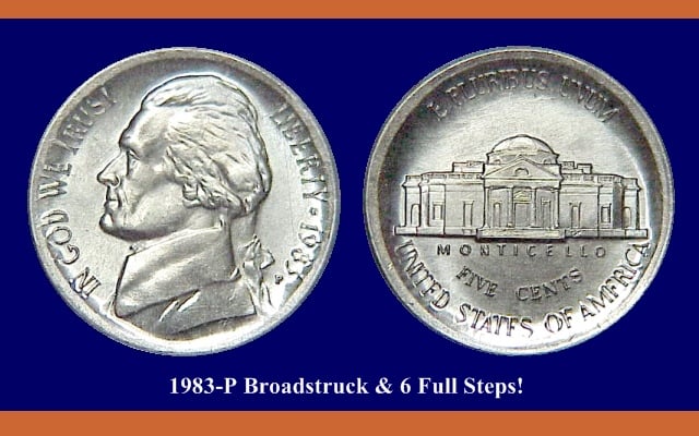
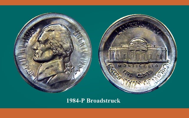
Added pics to show, in an extreme way, the dish bowl effect/strike for those who might have been puzzled about what was described above.
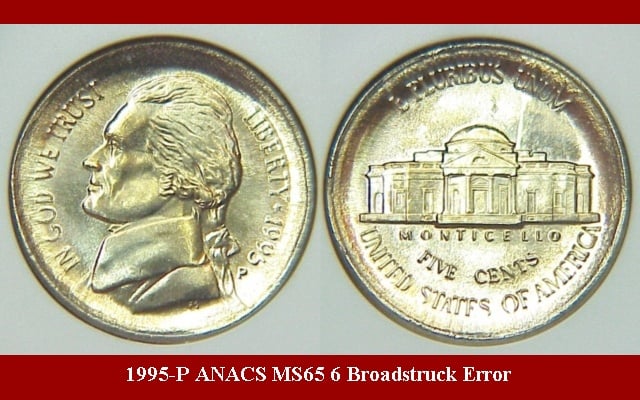
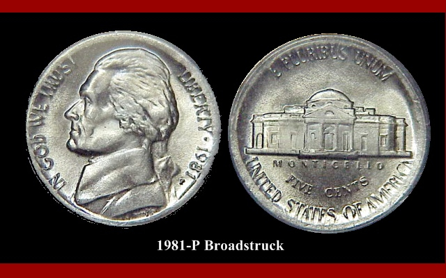
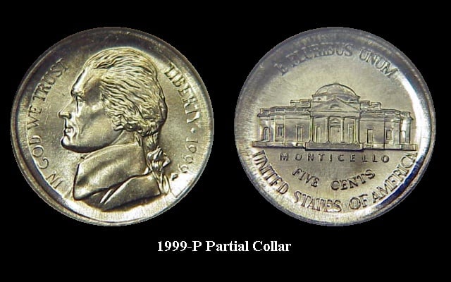
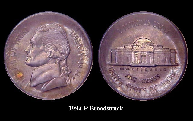
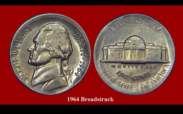
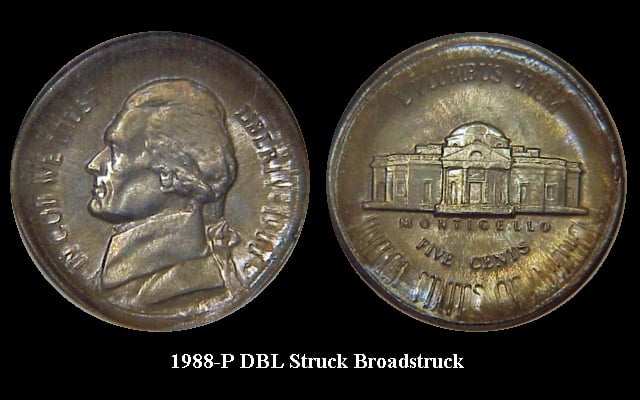
The more qualities observed in a coin, the more desirable that coin becomes!
My Jefferson Nickel Collection