Before and After
 Crazy4Coins
Posts: 1,922 ✭✭✭
Crazy4Coins
Posts: 1,922 ✭✭✭
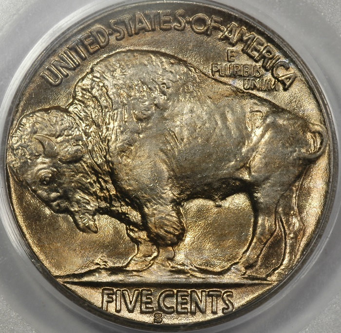
Since selling my Buffalo nickels, I've been checking coinfacts regularly as I expected a number of my old coins would be resubmitted and upgrades would be made. To date, I've noticed at least 13 have upgraded.
What I hadn't expected to see was such a big difference in the coin's appearance. I would like to get others opinions. If this is just image editing to make a coin look more attractive....why? Shouldn't the TrueView be a somewhat accurate representation of the coin in hand? I know we all want great images of our coins for show, but to make it look like something it is not doesn't make sense. What am I missing? I would also love to hear from our forum photographers as to what setting/image edits create the variance in color.
Exhibit A:
My image - this is what the coin looks like in hand:

TrueView when I submitted:
TrueView(s) recently added to Coinfacts:

Comments
Now, I will add that I held that 14-D a many times and twirled it all around under different lamps, and never once did I see and reds, blues or greens.
Exhibit B:
My Image - this is what the coin looks like in hand:


Great Collection's auction image:


TrueView recently added:

The Whisker Cheek Collection - Top 50 Peace VAM Registry
Landmark Buffalo Collection
Exhibit C:
My Image - this is what the coin looks like in hand:


Great Collection's auction image:


TrueView recently added:

The Whisker Cheek Collection - Top 50 Peace VAM Registry
Landmark Buffalo Collection
Probably why I've never collect MS buffs, too easily toned. Can't believe what I see.
bob")
Phil Arnold, PCGS's photographer, uses a very high-end setup which allows coins to be shot with very vertical, tall lighting under powerful tungsten lighting. Such an arrangement can bring out colors that are truly there but are difficult to see in hand (you can approach it with a loupe and a good lamp but often the reflected light/glare hurts the eye).
All cameras or post-processing editors allow for color adjustment due to lighting types (light has a blue-to-yellow temperature and green-to-red tint). If this white balance is not adjusted properly the overall colors suffer. This can explain the image of a coin that appears too red, let's say.
Phil, on an average day, shoots 400-500 coins. Twice that at shows. Imagine the workload! He has the advantage of shooting raw coins so he doesn't necessarily have to fuss with focus, tilted coins, scratched slabs and plastic glare. But nonetheless, it is a huge effort. Day in and day out. (When I put my head down I can maybe get 80 coins shot in a full day. Usually less.)
What is even more remarkable is that Phil encourages anyone unhappy with his images, or desiring something special, to contact him directly and he takes care of it.
So I'd suggest you contact @PCGSPhoto and I'm sure he'd strive to make you happy with your Trueviews.
Nice buffalo!
Lance.
Great reply Lance.
When you meet the girl would you rather be remembering the glamour shots on her profile (and be a bit disappointed) or a quick snapshot (and be pleasantly surprised)?
Personally, I find some of the newer TrueViews to be a bit over the top color-wise. Sharpness and detail are great. An accurate, fair representation of the coin is what I try to shoot for. It’s got to be a good enough photo to get the date but not so good that she’s not recognizable once you see her in person.")
But what do I know? Next year will be 25 years of wedded bliss.....
Personally I think your ex-buffalos have been cherried enhanced a bit. Not just the photography but the coins themselves.
A coin can look numerous ways under different angles and lights. That is why holding them in your hand and tilting them is so fun. I don't think trueviews are edited, altered, etc.... I just think he is really good at finding that WOW angle/light combination that really makes the coin come alive. That's my favorite way of seeing the coin in hand, so why not have a picture of it?
Calling @brg5658, who is an excellent coin photographer to comment.
I prefer realistic shots that capture toning but don’t artificially glamorize appearance. I think the OP has a point.
"She comes out of the sun in a silk dress,
running like a water color in the rain...."
I think the TrueView should reflect how the coin looks "in hand".
He who knows he has enough is rich.
I'll bet if we took a vote 99% of us would vote for a realistic shot over a glamour shot.
Same here! We should meet up. How's Tanzania sound?
I'm with the crowd on an in-hand look. I have intentionally backed down beautifully colored images the camera caught because they just felt too extreme...not what the average collector would see.
In the business of coin photography everything has to be about a real look. A true view. If anything, the coin should be prettier than the photos.
Lance.
@lkeigwin
Tanzania! That's a place I need to see before I die. Won't work next year though. We've been cooking up plans for quite a while for next year.
The threat prompted me to go back and look at my coins that have TrueViews. I have to admit, most of them look pretty good, like this one:
Here, I think they did a better job than I did capturing the luster and beauty of the coin. The colors are pretty true to the in-hand look.
On this one, the coin looks a lot more like the photo I took. The TV is just plain juiced. I suppose you can get that much color in one particular viewing angle on a good day, but it isn't really what it "looks like."
Same thing here. If I was to sell this coin, I'd be really up-front that in-hand, the coin looks like the second one, not the first.
Nothing here is meant to imply that Phil and his team don't do incredible work. I've shared the two that strike me as the most garish while most are like the Merc dime and very true to the source. Comparing photography techniques and results is a minefield and shooting (and viewing) through plastic is always just a little different. I can take stunning photos of certain coins while getting anything decent from others eludes me. The guys in the TV office have to churn huge volume and accommodate a tremendous variety of surfaces and coin types.
Looks like the coins were doctored after you sold them. I own a ton of toned coins that have trueviews and they're all pretty close to what they look like in hand.
I think that the photos should reflect the actual look of the coin in hand. That's what I try to do with my photos. Making a coin look better than it is might be good for history books that enhancing the image of a bygone age, but it is not the ideal scenario for numismatic study. It also establishes unrealistic expectations for those who are using the images as education tools for those who are learning to grade coins.
Just to repeat myself: this is why I treat all internet purchases as "sight-unseen" and barely look at the photographs. I will sometimes take a shot if it looks to me like it's a bad photo. But I keep my bidding at sight-unseen levels.
All comments reflect the opinion of the author, even when irrefutably accurate.
I prefer the in-hand look... and I am sure most who buy coins from a picture (i.e. internet sales/auctions) would prefer the same. We all know that skilled photographers can provide 'beauty shots'...all a matter of lighting, focus and other things I do not understand (not a photographer)...Since I have no shows or shops in my area, photographs are what I judge to buy a coin...so give me the 'realistic' shot...") Cheers, RickO
Cheers, RickO
I'm wondering if the glamor shot results are mainly because of the specific lighting being used is pulling out more luster than the average coin photographer can.
There’s at least one dealer who is adept at adding color to buffs and getting them upgraded. He has bragged many times he can get anything through the services
Looks like the buyer had some good results... (I wouldn't blame the camera in this case)
After looking at the Photos it is hard to believe that those are the same coins (I know they are).
I would be more than a little disappointed if I bought the based on the recent photo, and then found it that different in Hand.
I'm in agreement with almost everyone else, it would be best if the photo was an accurate representation of the coin in hand.
SELF EDIT
Never mind what you think I erased as I'm staying out of this one.")
I just got a bunch of True Views for some amazingly toned Morgan’s, and honestly the TVs are a tad conservative relative to how the coins look in hand. I think most are missing the obvious explanation; the toning on those buffs had some help between grading events (with the pssible exception of the first 14-d TV; that could just be a difference in lighting). As TDN noted, this has been an area of specialization for at least one dealer in the past.
All of the old cert numbers are still active on the Buff's, so they were cracked and resubmitted.
Seems to me it's just not that the new Trueview just happened to capture more color.
The color is probably actually on the coin now
Some of the photos look over saturated in Photoshop.
I pissed off a seller by asking....REPEATEDLY....(with no response) if the ...color... of the coin was closer to the True View or the slab picture.
More and more, I'm noticing VAST differences in the images of the True View and the accompanying slab image.
Losing trust in those TVs.
I would like to see someone Photoshop any of the original photos and make it look like the current Trueview.
Especially on the 28-D.
Two different coins in exhibit C
If you blow up the HA photos and compare it to the Trueview you can see it's the same coin by checking the contact marks in the Indian's hair and also notice the diagonal contact mark to the right of the buffalo's eye.
https://coins.ha.com/itm/buffalo-nickels/1928-d-5c-ms66-pcgs-cac/a/1207-3213.s?hdnJumpToLot=1&x=0&y=0
Thanks to everyone for their comments.
Lance, I agree, Phil does a great job of imaging. For the most part, I've been very pleased with the TrueViews that I have received of my coins. Most have represented the coin quite well. The images typically have just did a great job of capturing and emphasizing the color as seen by the eye. The issue I'm raising in my OP is showcasing color that doesn't seem to appear on the coins - at least not while I owned them. If this is done by post image editing - why?
Bryce, beautiful Mercury. This is a great example of a good representation. Phil's image did a great job of pulling out the luster and highlighting the toning. I don't really even have a problem with the '53 as I can visually see the color is there and if twirling under a lamp could probably generate the same look as seen in the TV. The '43 is borderline. I can see the tone, but the TV changes the actual in hand appearance just a little too much.
Obviously, I'm in the same camp as those that think the TV should be an accurate representation of the coin, not a overly glamorized image.
To Bill Jones' point, I would expect many collectors, including myself, refer to image archives - such as Coinfacts, to educate themselves. I think you have to be careful about over glamorizing the coins as this could have a negative impact on future collectors and what is perceived to be great coins. Great original coins could be left in a storage box because the owner compared one to a glamour shot and felt theirs wasn't worthy.
A few have mentioned that the coins look enhanced in some way. I don't know one way or the other. I will say, they look different. The TV images are not what the coins looked like when I held them. If it isn't from camera settings/lighting or post image editing - then.....well, you know.
The Whisker Cheek Collection - Top 50 Peace VAM Registry
Landmark Buffalo Collection
I would also love to see this attempted
The Whisker Cheek Collection - Top 50 Peace VAM Registry
Landmark Buffalo Collection
Here's another....
My image as it looked in hand:

TrueView recently added:

The Whisker Cheek Collection - Top 50 Peace VAM Registry
Landmark Buffalo Collection
I'm curious if PCGS' imaging is any different for straight graded vs. problem coins; I noticed that NGC's images on problem coins seemed to have been been shot at an angle vs. the straight graded ones.
This is the only conclusion I can come to after seeing the before and after photos. TDN is as big an insider as anyone, so this is likely true
This ^
Sorry I'm late to this, but I was on vacation.
I understand the philosophy of wanting your coins to look good in images, but I have many examples of coins in my collection that simply don't look like the TrueView in hand, period. I find these images attractive, but not very realistic for purposes such as selling coins. Glamour shots is an apropos descriptor.
I am not saying my images are better than Phil's; they are different and, in my opinion, more accurate representations of the coin and the colors in hand. That being said, I believe Phil (and his team) are extremely skilled artists. I spend hours clicking around on the PCGS images, and they are an invaluable resource for research and other uses, not the least of which is to draw in new collectors and interest to the hobby.
My main (and repeated) complaints have been:
1) TrueView images are consistently red-shifted in their white balance. They have been consistently this way for years, and this seems to help "bring out" some warm colors that are not visible in hand under "normal" lighting conditions.
2) TrueView images depict the coin as it would be seen in a very narrow angle of lighting, as tilted into the light source. This is not how coins look under 95%+ of circumstances in hand.
3) Because of the issue note in (2), TrueView images can sometimes hide surface issues (e.g., hairlines), because such surface conditions are "blown out" in the reflection of the lighting.
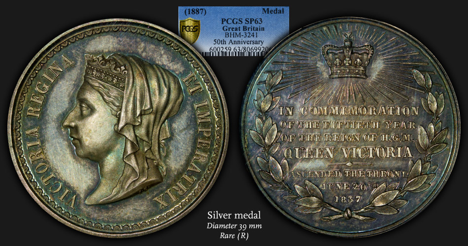
Below is one example of TrueView images versus my images. It demonstrates all of my complaints above. The medal in hand is not pinkish/purple...it is awash with shades of mostly blues and greens. The medal is reflective and proof-like, but it doesn't look like the glamour shot at most viewing angles. And, as is evidenced by the grade of SP63, there are a handful of surface marks that are completely masked in the blown out reflections of the colorful TrueView images.
TrueView:
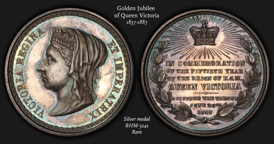
My image:
-~-~-~-~-~-~-~-~-~-~-~-~-~-~-~-~-~-~-~-~-~-~-~-~-~-~-~-~-~-~-~-~-~-~-~-~-~-~-~-~-~-~-~-~-~-~-~-~-~-~-~-~-
My sets: [280+ horse coins] :: [France Sowers] :: [Colorful world copper] :: [Beautiful world coins]
-~-~-~-~-~-~-~-~-~-~-~-~-~-~-~-~-~-~-~-~-~-~-~-~-~-~-~-~-~-~-~-~-~-~-~-~-~-~-~-~-~-~-~-~-~-~-~-~-~-~-~-~-
Here is my take. A lot of the TV images are taken using an Axial hybrid setup. The main light source is an axial set up, where the light source strikes the coins surface from the same position as the camera lens. This is done by placing the raw coin under a pane of glass that is angled at approximately 45 degrees. A light source that is 90 degrees off axis from the camera lens is then aimed at the pane of glass. The surface of the glass reflects that light directly down onto the coin. This causes the coins surface to illuminate any toning present and makes it pop directly back up into the lens. The downside to this type of lighting is it kills the luster and it hides quite a bit of the surface hits and hairlines.
The hybrid part of the equation is the addition of extra lights set up in a traditional manner. These are then added to reintroduce the luster that is lost in the axial light. Some of the surface issues are then revealed but do not appear nearly as dramatic had they been lit using just traditional lighting.
My theory on the red shift of the TV's is due to mixture of light sources/white balances of the light. I believe the red shift is caused by the surface of the glass and it's coatings. I've noticed this myself when I implement an axial light source. You then have a mixture of warm and cooler light. If the color balance was shifted to neutralize the warm axial lights, then the traditional lighting would have a much cooler look. Our eye's are much more sensitive to the blues and are more accepting of the warm. So our eye's would perceive the blue cast of the traditional lights as being off, the coin would then feel wrong. The neutral white balance of the traditional lights which causes the warm shift of the axial is far more acceptable to our eyes than the blue shift.
Most of us photographers outside of the PCGS studios don't get to use axial lighting as we have the plastic slabs to contend with. The surface of the plastic causes glare and completely washes out the coin. Which is also why you sometimes don't see the same colors in hand with the coin in a slab. You could see it if you were able to tolerate looking through the extreme glare on the slab.
I would agree with the above about most of the color changes on the Buffalo's shown above is an actual physical change to the coin prior to resubmission. The photo technique could not alter the coins appearance that much without blatant Photoshop alterations or physically altering the coin.
I kinda want it look look like the way I see it.
Pete
I also vote that a coins photo should represent how it appears in hand. I strive to photograph a coin the way it appears as I hold it under my viewing lamp.
I see that one went to a floor bidder in the HA auction at a pretty hefty price.
I don't think that TrueViews are doctored at all, for those stating that they are. They simply are taken at optimal lighting, usually with fully lit fields. I would argue that these are just as accurate representations of the coin as any other image - they just might not seem to be as they are not taken under normal, every-day natural lighting. I prefer to look at my coins under optimal lighting conditions and because of this my coins do appear the same or close to the same in hand as they do in TrueViews.
Gobrecht's Engraved Mature Head Large Cent Model
https://www.instagram.com/rexrarities/?hl=en
I'm in the "true view doesn't look like the coin in-hand" crowd.
"“Those who sacrifice liberty for security/safety deserve neither.“(Benjamin Franklin)
"I only golf on days that end in 'Y'" (DE59)
I'm in the 28-d has been doctored camp.
Most of the TrueView images are much lighter than forum members coin shots. That does make a difference in how a coin will look.
All of the Buffaloes in the first few posts have been doctored in the exact same way. 14d, 17s, 28d ... all the same toning method and signature of the coin doc