Incuse letters on Coins
 Aspie_Rocco
Posts: 3,865 ✭✭✭✭✭
I noticed the lettering on this great looking Jefferson Dollar is normal then switches to incuse when it merged into the design. I find this to be unique and a creative way to utilize space.
I also think incuse features add to eye appeal and wonder why more coins don’t have this?
How many other coins display incuse letters partially or entirely? I am only aware of the $2.50 & $5 Gold designs as the other Coins with incuse design.
Is the opposite of incuse... excuse?


When I rotate the the image the light source is from the left. The shadows cast inside the letters appear dark until the design rises to the surface where the light is caught and reflecting. The cell phone camera grain makes it look kinda funny 
3
Comments
Maybe it's my eyes but I don't see incuse lettering in AMERICA.
Lance.
I do and I think it's very clever!
Google "images for coins with incuse lettering" there are a lot.
"A dog breaks your heart only one time and that is when they pass on". Unknown
Of course it's incuse! If it were raised, it would be sticking way out of those trees!! Very cool~
... And more prone to wear if a Jefferson commemorative silver dollar ever got into circulation, which it won’t.
I don’t think that you will see more incuse lettering anytime soon on any regular issue coins, probably because of die wear patterns. Regular issue coins have to be made in large numbers, and the mint needs to push as many coins out of the dies as they can for economic reasons.
The incuse $2.50 and $5 Indian coins were sort of an experiment. The idea was that having the features below the surfaces of the coin would prolong their useful life. That was true. If you have ever seen one in VG, for example, the design details are still sharp. The trouble was, having the fields as the highest part of the design made the coins prone to unsightly marks, almost from the moment they were struck. That’s one of the reasons why the $5 Indian is so hard to find grades of MS-63 and higher.
One of the goals of the mint is to make attractive coins. When coins are overly prone to marks, the mint is missing that objective.
I had not looked at the Jefferson dollar at all... I like the reverse design. I do, however, take exception to the words on the obverse - 'Architect of Democracy'....He was, in fact, Architect of the Republic.... a distinction many people do not understand, but critical. Cheers, RickO
Look at “LIBERTY” on gold dollars, 3-cent nickels, Indian head gold $2.50 & $5, Seated coins (except the 20c), Barbers, Morgan dollars........ plenty of others. Those are just the ones that come to mind.
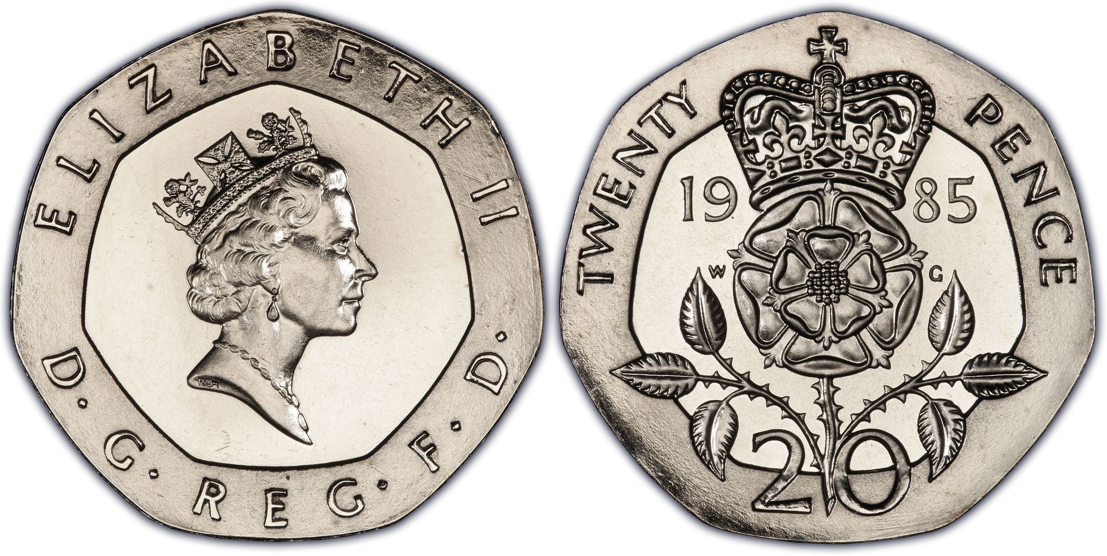
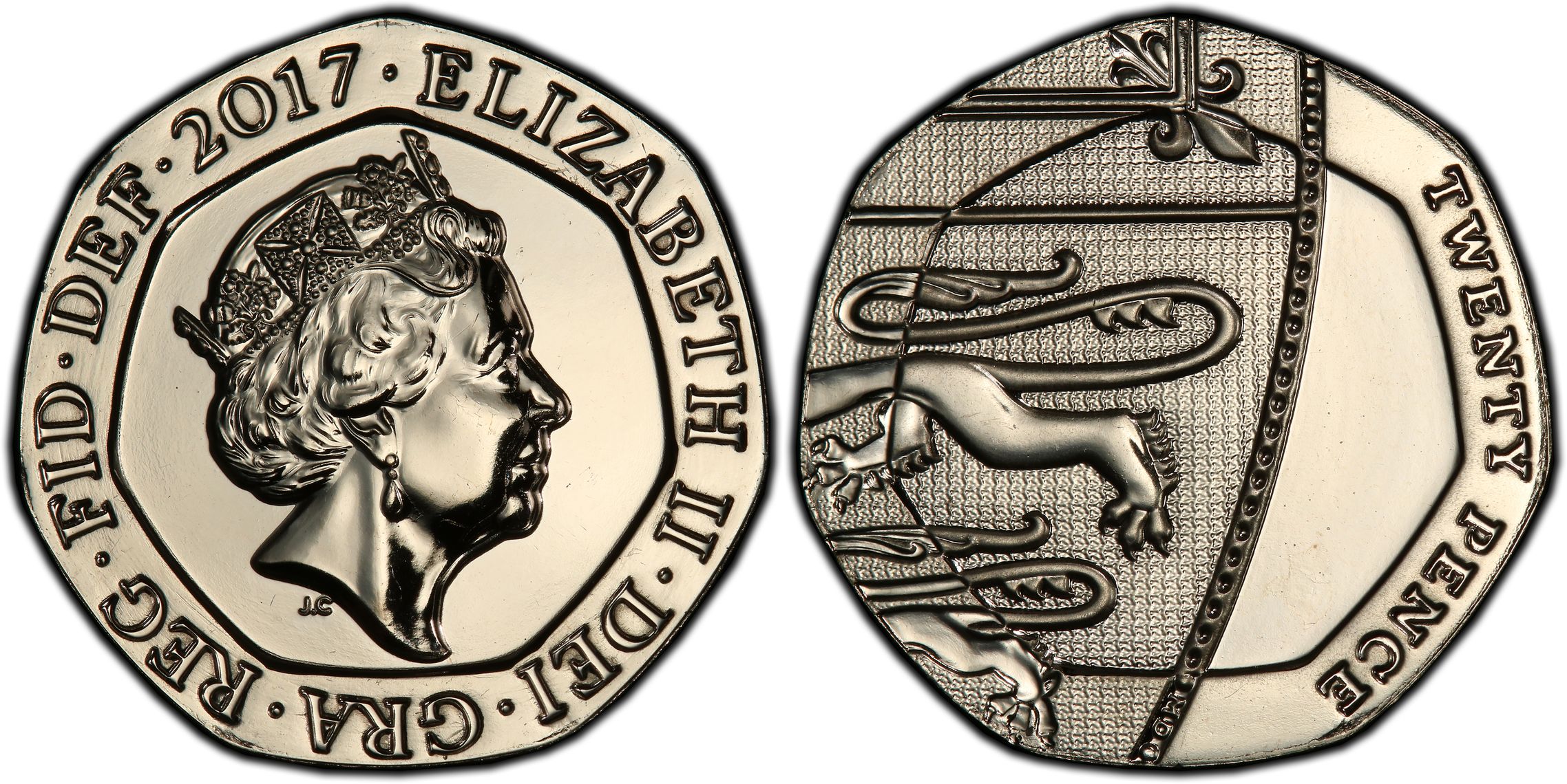
The British 20p has done this one better since 1982. Not only does it have both incuse and raised lettering, but the "20" on the reverse from 1982 through 2008 is both.


On later coins, the part of the arms that overlaps the wide rim also changes relief.
Keeper of the VAM Catalog • Professional Coin Imaging • Prime Number Set • World Coins in Early America • British Trade Dollars • Variety Attribution
Looking at the $50.00 MS Buffalo, the F on the obverse is incuse. The reverse, $50, 1oz .9999 Fine Gold is incuse.
Don't the national park quarters have an outer ring on the reverse with incuse lettering?
Paper money eventually returns to its intrinsic value. Zero. Voltaire. Ebay coinbowlllc
You beat me to the disagree! However, some members might say (incorrectly) that they are not actually regular issue coins!
I would believe with them being produced for circulation that they are a regular issue. Just my opinion.
Paper money eventually returns to its intrinsic value. Zero. Voltaire. Ebay coinbowlllc
1986 $5 gold SofL. E and Y of LIBERTY through the rays.
I love the combination of normal and incuse lettering on coins. The first extensive use that I can think of on a U.S. piece is on the Fugio Cent, and is a by-product of Abel Buell's ingenious use of hubbing technology (also a first in North America, I think). It's most impressive on the American Congress pattern, where you can see it on the reverse rings with the state names, as well as on the face of the sundial and the inner ring of the reverse:
The die sinking techniques on these coins surpassed a lot of what would be done at the mint in its first few decades.
What is now proved was once only imagined. - William Blake
Some very cool images and insightful comments folks.
Thank you for the meaningful contributions.
Simply googling it is boring and leaves no room for discussion, or community education. When you say there are “a lot” of images... how many?
Did I do this right?
https://www.autismforums.com/media/albums/acrylic-colors-by-rocco.291/
This is really cool. I don't think I've seen this before, I'll have a combo coin please, incuse and raised lettering please?!~
Are we including edge lettering?
A: The year they spend more on their library than their coin collection.
A numismatist is judged more on the content of their library than the content of their cabinet.
2001-D Buffalo --- ONE DOLLAR and mintmark D
Nice! I forgot about this thread. The reverse of the Jovita Idar is pretty cool looking and has some incuse letters

https://www.autismforums.com/media/albums/acrylic-colors-by-rocco.291/
the atb quarters in both 3 inch silver and the normal diameter
E PLURIBUS UNUM is incuse on a scroll on capped bust half dimes, dimes, quarters, half dollars.
The scroll position is the primary marker for reverse die identification.
Isn't it like that for the indian half and quarter eagles. also old thread alert
Proud follower of Christ! I love the USA! Land of the Bright and Beautiful! 🇺🇸🇺🇸🇺🇸🇺🇸🇺🇸
the first one is a mistakenly released variety called "frosted freedom"
Yes, but all the lettering on those is incuse, and Bill Jones already mentioned them in the 6th post in this thread.
I agree, they are the first series I think of when the word incuse comes up.
Here's an interesting article on the Ancient Italian coins with incuse lettering. https://www.ngccoin.com/news/article/8345/Ancient-Greek-coins-Italy/
Proud follower of Christ! I love the USA! Land of the Bright and Beautiful! 🇺🇸🇺🇸🇺🇸🇺🇸🇺🇸
I know this thread is primarily about US coins, but I'll mention that many French gold coins from the 19th-century have incused inscriptions on their edges.