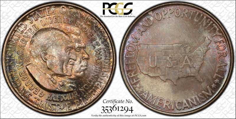
Another unpopular commem for your opinions and grade guesses.
 CommemKing
Posts: 2,202 ✭✭✭✭✭
CommemKing
Posts: 2,202 ✭✭✭✭✭
What do you think about this Wash-Carver commem? I know, I know, nobody like these coins, but unfortunately I gotta have one for my set and for some reason I personally like the original toning of this one and the luster is booming in hand. What are your opinions and grade guesses?
2
Comments
I like the obverse.
The surfaces seem to be in good condition with excellent detail.... guess would be 65-66...Cheers, RickO
Gandhi and Claude Akins look ok.
Ms66.
Paper money eventually returns to its intrinsic value. Zero. Voltaire. Ebay coinbowlllc
It is a lovely coin.
I like many of the Commems. I think it is an underappreciated series.
All comments reflect the opinion of the author, even when irrefutably accurate.
And here I thought it was Dennis Haysbert with Ghandi.
Anyway, as these go, it's nice looking. Probably 66.
Keeper of the VAM Catalog • Professional Coin Imaging • Prime Number Set • World Coins in Early America • British Trade Dollars • Variety Attribution
Yours is a nice coin, although the obverse mottled color is not for everyone. The design is one of the least inspired of the commem series. MS66?
Commems and Early Type
The reverse is a bit uninspired, but I really think the obverse is nicely done.
All comments reflect the opinion of the author, even when irrefutably accurate.
I think that it has a better than average look for this design. The faces are really clean, and quite often you see these pieces marked up. I’d say that MS-66 is about right.
I like the political implications that surround this piece. Back in the day, when Joe McCarthy was active, it was said that the funds earned from the sale of these pieces would go toward fighting the spread of Communism among American Negros. Some how I doubt that the promoters put much of their money toward that cause.
Yep, unpopular design...really nice tone!
BST transactions: dbldie55, jayPem, 78saen, UltraHighRelief, nibanny, liefgold, FallGuy, lkeigwin, mbogoman, Sandman70gt, keets, joeykoins, ianrussell (@GC), EagleEye, ThePennyLady, GRANDAM, Ilikecolor, Gluggo, okiedude, Voyageur, LJenkins11, fastfreddie, ms70, pursuitofliberty, ZoidMeister,Coin Finder, GotTheBug, edwardjulio, Coinnmore, Nickpatton, Namvet69,...
I like this series way better than the Booker T Washington commem series. The Washington Carver series is a slice of history from the 50s. Proceeds were slated to be used to curtail the spread of communism among "Negroes"..
The first time I saw one of these I thought it was a token. The map of the US on the reverse just doesn't look right. I do own one though, I can't help myself sometimes.
Toning is a little dark for me.
Most come with many problems on both faces on the obverse. I like yours though, just so price was right. Looks 66 to me.
I feel the obverse of this one is a beautiful MS-66. The reverse has what appears to be muted luster that I would call MS-63/64. Overall I would go MS-65 on it.
The mottled toning doesn't work for everyone, but yours appears attractive to me and if it has really good luster (as you say it does) then I imagine that I would really like it. In my opinion, the mid-century style of lettering hurts the coin more than anything else as it has a stripped down, sterile look (again in my opinion and I am not an artist) whereas earlier commems oftentimes had much different, more stylized letters that gave their coins more character.
In honor of the memory of Cpl. Michael E. Thompson
I also like the obverse, nice coin !!!")
I would have to see the luster before I could evaluate the color. It could be very interesting, or very dull.
I think I may have owned this coin in NGC plastic.
I like it. As for being 'unpopular', I believe it is more the huge number minted along with loads of scuffed up and unattractive toned pieces out there. I guess is MS66+CAC.
I just looked it up, and believe you did well on that one, CommemKing. Nice coin imo.