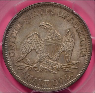
I always take lousy pics even though I have a decent camera. Purchased a new lens this weekend. Picture still kind of flat though. But i think it is better for me.
Numismatist. 50 year member ANA. Winner of four ANA Heath Literary Awards; three Wayte and Olga Raymond Literary Awards; Numismatist of the Year Award 2009, and Lifetime Achievement Award 2020. Winner numerous NLG Literary Awards.
You guys sure about the background? Just looking at the coin - the one with the pink background looks more like the coin. I just need to capture the luster better. How about another color background? I have just about every color from my kids construction paper.
you can get fancy and make .gif out of a couple images to show what a coin looks like with cartwheel blaring or to show off luster/color pretty simple too
Not bad. I always use a white background when shooting the coin then when I edit I put the coin on a black background...just me and a ton of other people.
Nice coin. Too bad it isn't from a few years earlier with an 'S'. Nice one!
"If it's not fun, it's not worth it." - KeyMan64 Looking for Top Pop Mercury Dime Varieties & High Grade Mercury Dime Toners.
Some gold Need to retake the reverse - blurry. Stupid question. When looking though the view finder. Do you keep your glasses on? I would assume not since I am near sighted only.
Love the pink, go with it, keep the pink no matter what you do...lol. Yes, the pink is the first thing I focused on too. I tell you this, if you always used pink in your back round for your auctions you would definitely be remembered. Might help, might not help...lol.
I think the goal for pictures is two fold.
1. We want to capture what the coin actually looks like. (Over all) With this we want to capture the true eye of the coin.
2. We want our picture to show a specific attribute of our coins (A trouble area etc.) With this, we might adjust the light to accent the area.
Personally, I like photo's a bit larger than what you offered.
I actually went with the pink because I figure no one else would have it and it would be easy to id my listings. I have plans to sell some coins this month on the bay - not any of these though - these are keepers.
<< <i>I actually went with the pink because I figure no one else would have it and it would be easy to id my listings. I have plans to sell some coins this month on the bay - not any of these though - these are keepers. >>
Photo the coin with the back round that shows the coin the best. Then photo shop it onto the Pink back round (If that is the color you want).
I did purchase Mark's book. But have not sat down and read it though yet. I dont read directions a Christmas time for my kids gifts either LOL. I have the day off so I am going to read along with a book I purchased at BN on my specific camera. So these pics are my current baseline. Hopefully I can improve by the end of the day
The peace dollar is not bad, you're getting there. As others have said, read Mark Goodman's book.
Another reason to use a white background is that you can use it to help adjust white balance later. You can always crop onto a different colored background later.
Here's your first coin with the colors tweaked in Photoshop.
I used to be somebody, now I'm just a coin collector. Recipient of the coveted "You Suck" award, April 2009 for cherrypicking a 1833 CBHD LM-5, and April 2022 for a 1835 LM-12, and again in Aug 2012 for picking off a 1952 FS-902.
Regarding the OP coin, now that you've lost the pink background, you need a "harder" (more contrasty) light to bring out luster where it is overly subdued. Do this by making your light source smaller, either by moving it away from the coin or by blocking part of it. Either way, you'll increase your exposure time. As an increased exposure time makes your picture more susceptible to ambient room light, you'll have to make sure other light sources are neutralized. Also, make sure you are not using the auto white balance.
I've used a matte black background on silver coins, and thought it brought out the natural color of a toned silver coin most effectively. The lighting is much more critical though.
Comments
i think your image is a great in hand look...not mega high rez barely fit my monitor type
i bet that's exactly what it looks like in hand in general lighting
great job...
How about another color background? I have just about every color from my kids construction paper.
"Jesus died for you and for me, Thank you,Jesus"!!!
--- If it should happen I die and leave this world and you want to remember me. Please only remember my opening Sig Line.pretty simple too
http://gickr.com
Nice coin. Too bad it isn't from a few years earlier with an 'S'.
Looking for Top Pop Mercury Dime Varieties & High Grade Mercury Dime Toners.
I think the photo should be larger than posted, but not huge, perhaps 50% larger, to demonstrate the coin better for those of us who are older.
Need to retake the reverse - blurry. Stupid question. When looking though the view finder. Do you keep your glasses on? I would assume not since I am near sighted only.
I think the goal for pictures is two fold.
1. We want to capture what the coin actually looks like. (Over all) With this we want to capture the true eye of the coin.
2. We want our picture to show a specific attribute of our coins (A trouble area etc.) With this, we might adjust the light to accent the area.
Personally, I like photo's a bit larger than what you offered.
The coin looks good though,
Ray
<< <i>I actually went with the pink because I figure no one else would have it and it would be easy to id my listings. I have plans to sell some coins this month on the bay - not any of these though - these are keepers. >>
Photo the coin with the back round that shows the coin the best. Then photo shop it onto the Pink back round (If that is the color you want).
Another reason to use a white background is that you can use it to help adjust white balance later. You can always crop onto a different colored background later.
did you set the white balance manually?
are you using a copy stand?
are you triggering your shutter remotely or by delay?
<< <i>are you in macro setting?
did you set the white balance manually?
are you using a copy stand?
are you triggering your shutter remotely or by delay? >>
No just manual
Yes I set the white balance with a sheet of white paper
I dont have a copy stand - but am using a tripod
No - I have a delay I will try that next
Thanks for the advice
<< <i>Not bad at all, I think the coin would stand out better with a white piece of paper under the slab. >>
I like the white paper better. It makes the coin's fetters stand out more.
This. Like others mentioned, using a delay would also help.
Recipient of the coveted "You Suck" award, April 2009 for cherrypicking a 1833 CBHD LM-5, and April 2022 for a 1835 LM-12, and again in Aug 2012 for picking off a 1952 FS-902.
Keeper of the VAM Catalog • Professional Coin Imaging • Prime Number Set • World Coins in Early America • British Trade Dollars • Variety Attribution
"Everything is on its way to somewhere. Everything." - George Malley, Phenomenon
http://www.american-legacy-coins.com