Options
Lets hear your US Coin Design complaints !
 WingedLiberty1957
Posts: 3,016 ✭✭✭✭✭
WingedLiberty1957
Posts: 3,016 ✭✭✭✭✭
So one thing that always bothered me was how it was impossible to "level" the stars, and the bust design, and the date at the bottom. One of those elements were always off center. An easy fix would have been to make the lady liberty bust smaller, so the 13 stars could have been spread evenly and symmetrically across the top. And the date could be centered at the exact bottom.
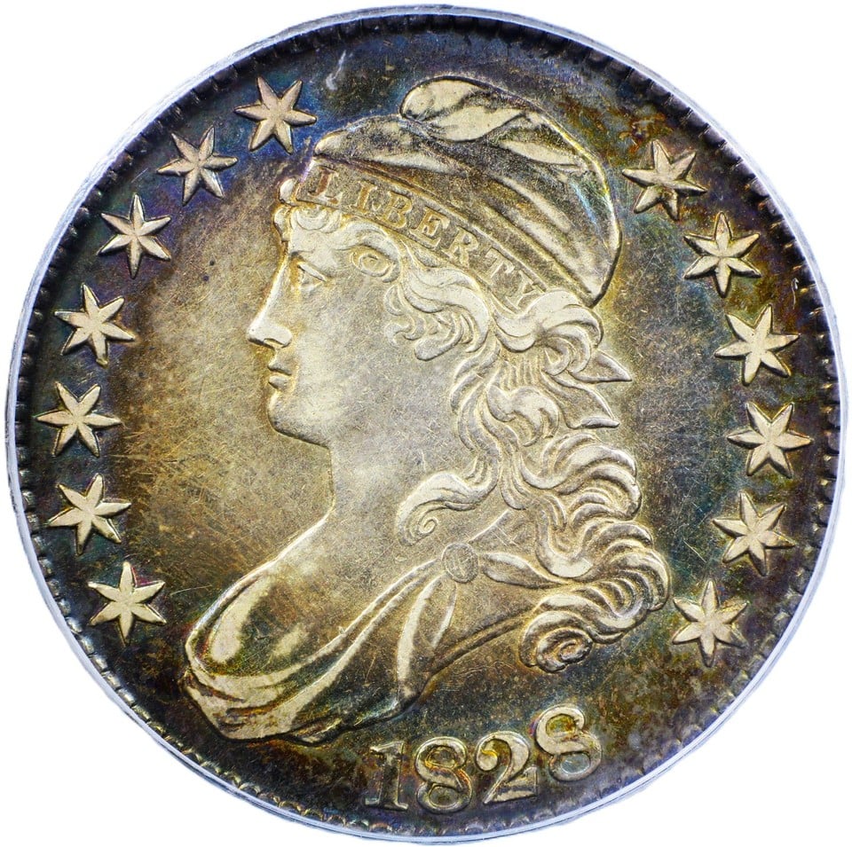
1
Comments
Another general complaint is i miss the old artistic designs for the 1910s thru the 1930s. And got really sick of all the dead president designs.
My Coin Blog
My Toned Lincoln Registry Set
Another complaint is the mint dropping the date on the obverse of the Saca Dollar. The coin looks naked without an obverse date after 2009.
My Coin Blog
My Toned Lincoln Registry Set
I think this world would be better with less complaining and more thankfulness. Maybe try that....
"But seek ye first the kingdom of God and His righteousness and all these things shall be added unto you" Matthew 6:33. Young fellow suffering from Bust Half fever.
BHNC #AN-10
JRCS #1606
I prefer mintmarks on the reverse in non-obnoxious locations (looking at the Type 2 Silver Eagle...)
Custom album maker and numismatic photographer.
Need a personalized album made? Design it on the website below and I'll build it for you.
https://www.donahuenumismatics.com/.
Smart people complain.
Llamas and alpacas are camels. They aren't like camels, or related. They are camels. When was anyone going to tell me this?! How long had Bill Nye been holding out on us?
As an outsider looking in (I'm from Australia), my main "complaint" about US coinage in general is that it's way too verbose. Too wordy. The coin the OP has posted is not guilty of this, but modern US coins certainly are. You've got the full name of the country, the full name of the denomination, and not just one but three mottoes ("Liberty", "In God We Trust", and "E Pluribus Unum"). All that verbiage means there's less room for actual interesting designs, especially on the smaller coins.
Roman emperor Marcus Aurelius, "Meditations"
Apparently I have been awarded the DPOTD twice.
I don't like what you're suggesting.
Thank's for thinking of me ' ! ..... lol
Complaints about coin design? Forget the classics and the one the OP posted, I love them all!
How about this modern design stuff? Sure, there are a handful of beautiful ones. But the vast majority? Where's the Mints Chief Engraver? Is there one? What's he doing?.....using a CAD?.... The mint is producing coins today like the post office produces stamps!
I'm old school. I generally think all the clad stuff is junk.
Don't shoot the messenger, you asked for my complaints.
Disclaimer: I'm not a dealer, trader, grader, investor or professional numismatist. I'm just a hobbyist. (To protect me but mostly you! 🤣 )
i hate everything (simple)
A perfect example of cartoonish stuff coming out of the mint. These things should be on USPS stamps.... They probably already are! 🤣
https://forums.collectors.com/discussion/1124545/comic-art-three-medal-set-2025-super-heroes-superman-batman-wonder-woman
Disclaimer: I'm not a dealer, trader, grader, investor or professional numismatist. I'm just a hobbyist. (To protect me but mostly you! 🤣 )
Maybe I'm just lame but I don't like the non-round liberty bell coin (I don't like its purposefully extremely low mintage either, but that's a different topic). It looks like something that would be monetized by the Bank of Fiji or some other Pacific island. So do the Semiquincentennial Peace & Morgan dollars with how crowded they are with extra stuff.
I collect world proof sets, coins featuring composers, mid-20th century U.S. proof coins, U.S. type coins, and whatever else I want.
But fortunately, we actually have a bunch of rights that no other country has, like a First Amendment so we cannot get thrown in jail for complaining about problem groups like in the UK. And we should celebrate such things IMHO.
As far as the verbosity, that is all now required by law but has a complex history, and just because a coin must have those -- they can be on the edge or incorporated nicely: the Standing Liberty Quarter and Walking Liberty Half had all of them and are still classic coins that are far superior to anything today.
Here is a brief background on the verbosity, which I find a weak excuse for crappy looking art work:
"Liberty" Required beginning with the Coinage Act of 1792. Every regular U.S. coin since 1793 has featured Liberty either as the female Liberty or the words beginning in 1909 on the Lincoln cent, the most consistently used motto on a wide array of coins over time.
"In God We Trust" First authorized in 1865, and required on all U.S. coins since 1955 based upon cold war citizen sentiment, and widely used on many coins before that time.
"E Pluribus Unum" First used in 1795 on certain gold coins; not originally required by law until 2010, although Lincoln cents carried it since 1909 and Jefferson since 1938, among many other coins.
Except Fiji would have done it better and for a much lower price.
Here is a quiet Norfolk from 1936 (not mine). It has only about 36 words from 183 letters and 5 dates made of 20 digits. There is still a tiny bit of open space they could have filled with more writing.
Oh, for the good old days. Somehow I do sort of still like the design in its over-the-topness.
"To Be Esteemed Be Useful" - 1792 Birch Cent --- "I personally think we developed language because of our deep need to complain." - Lily Tomlin
The 1927 Vermont 50c had a big Cat on it. Like a Puma or something, and supercool looking. Since then, nada.
So here’s my complaint:
99 years later, and nary a peep about striking a 2027 coin commemorating the Centennial of when we had a Cat on a US coin. What a missed opportunity! Where’s the Cat Lady Lobby when they’re needed?
30+ years coin shop experience (ret.) Coins, bullion, currency, scrap & interesting folks. Loved every minute!
A gold one with a "kitten on a Roomba" privy might just get a new segment of the public interested in coins.
"To Be Esteemed Be Useful" - 1792 Birch Cent --- "I personally think we developed language because of our deep need to complain." - Lily Tomlin
Liberty on the front, eagle on the back.
They are really getting carried away with all the designers initials. Getting hard to tell what the mintmark is supposed to be on a few recent coins…
No problem , I'm here all week ! lol
I really don't care for the GW dollar coin & the new GW quarter
Cartoon Characters and Cartoonish Characters:
eg.
!
This interesting article by Ron Guth from 2020 touches on some of the topics you bring up.
Coin Images and Their Orientation – A Case Study
https://coinweek.com/coin-images-and-their-orientation-a-case-study/
.
"To Be Esteemed Be Useful" - 1792 Birch Cent --- "I personally think we developed language because of our deep need to complain." - Lily Tomlin
The VDB is not centered, not even close. C'mon Vic, if you're gonna blatantly self-promote, at least line the thing up.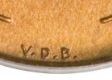
Always got my goat.
To the guy who designed the Mayflower quarter..men didn’t wear beards then
I heard we are getting another president, but not a dead one
I'd like to complain about this post.
It clearly got the attention of the Chief Engraver, Charles Barber who engraved another reverse and placed the periods differently (Type 1), unlike Brenner's Type 2:
If I recall correctly, all the S mint VDBs were struck with Barber's Type 1 reverse as shown at https://www.pcgs.com/coinfacts/coin/1909-s-vdb-1c-rd/2428 , none with Brenner's Type 2 reverse so all known genuine SVDB are Barber's engraving, with diagnostics discussed below. The reason was that the San Francisco Mint stuck Lincoln cents August 2-5, 1909. By that date, the only reverse dies supplied to San Francisco were the original reverse dies prepared in Philadelphia using Charles Barber's modified reverse hub (what collectors today call the "Barber reverse"). https://www.pcgs.com/coinfacts/coin/1909-vdb-1c-rb/3301/64 And the proofs are discussed at the bottom of that CoinFact link.
Here is a list of the differences (can't seem to get them into a real nice grid form from my desktop to here):
The diagnostics below are compiled from the work of Ed Fleischmann, Shawn Tews, Rick Snow, and other Lincoln cent researchers. Some are considered primary diagnostics (used by attribution specialists), while others are supporting diagnostics that are useful only after the primary diagnostics have identified the reverse.
Feature Brenner Reverse (Type 2) Barber Reverse (Type 1) Reliability
Period after D in V.D.B. Centered between D and B Close to the D ★★★★★
N in ONE Deep-cut N Shallow-cut N ★★★★★
V in V.D.B. Taller, narrow V with sharper point Slightly wider V ★★★★☆
D in V.D.B. Lower curve more rounded Lower curve slightly flatter ★★★★☆
B in V.D.B. Center bar nearly horizontal Center bar slants upward to the right ★★★★★
Periods after V and B Slightly larger and more centered Slightly smaller and positioned differently ★★★☆☆
Spacing of V.D.B. More even Slightly tighter between D and period ★★★☆☆
N in UNITED Deep-cut N Shallow-cut N ★★★★☆
N in CENT Similar deep interior angle Shallower interior angle ★★★☆☆
E's in ONE Squarer terminals Slightly softened terminals ★★☆☆☆
O in ONE Slightly more oval Slightly rounder ★★☆☆☆
Lettering overall Crisp, deeply engraved Slightly softened from re-engraving ★★★☆☆
Wheat ears Minor differences in leaf junctions Minor recutting in some leaves ★★☆☆☆
Rim relationship to V.D.B. Initials appear fractionally farther from rim Fractionally closer on many dies ★★☆☆☆
This was discussed in a thread long ago (well 2009, seems like long ago) at https://forums.collectors.com/discussion/746931/1909-v-d-b-master-die-varieties
At variety vista RDV-002 and RDV-004 are Brenner and RDV-001 and RDV-003 are Barber, IIRC. http://varietyvista.com/25 What Are Die Varieties/Lincoln Cent Wheat RDV Changes.htm
Frank Costanza (Jerry Stiller) must have been a genius.
Llamas and alpacas are camels. They aren't like camels, or related. They are camels. When was anyone going to tell me this?! How long had Bill Nye been holding out on us?
I may have misunderstood your post about the 1909-S VDB. I have always heard it is the Type 1, with the dot centered between the D and B and also with the shallow N.
- Bob -

MPL's - Lincolns of Color
Central Valley Roosevelts
Yes, you are correct.
Since I am sure that all 1909-SVDB are Barber reverses, that was my point of confusion. The table that I created listing all of the elements has the wrong set of headers, should be Barber Type 1 and Brenner Type 2. Sorry for the confusion. I'll have the table headers fixed by changing the Type numbers that Chat GPT flipped on me. It does make corrections, and I have found a number of them and reported. Thanks for catching this one.