New Pricing Pages on Greysheet.com for subscriber feedback
 JohnF
Posts: 401 ✭✭✭✭✭
JohnF
Posts: 401 ✭✭✭✭✭
FYI, this is not a sales attempt. This message intended for existing subscribers, but I really would like your feedback!
I'm really excited to announce (soft launch) new pricing pages on our web site as of noon today. I've been wanting to upgrade these for years now, and it's just so much more work than we expected. But we have a good team in place, and making changes much faster. Would love your feedback. (The pages are better now, even for non-subscribers). Thank you in advance.
John
Here's a few sample pages:
https://www.greysheet.com/prices/item/1795-flowing-hair-half-dime-h10c/gsid/3718
https://www.greysheet.com/prices/item/1998-silver-onza-libertad-mexico-world-coins/gsid/296592
https://www.greysheet.com/prices/item/fr-16-1862-one-dollar-legal-tender-large-size-bank-note-united-states-currency/gsid/59861
https://www.greysheet.com/prices/item/no-date-sig-1-collins-allen-prefix-m-intro-13-07-1913/gsid/86441
Whitman Brands: President/CEO (www.greysheet.com; www.whitman.com)
PNG: Executive Director (www.pngdealers.org)
Comments
Feedback specific to the web version of the site and not the app: the pricing table should be higher above the fold given that this is the primary use case for any pricing page.
I would imagine this section could take precedence over the obverse / reverse description section and the catalog information section. This is more vital, in my opinion, on the mobile version vs. the desktop version, but important for both nonetheless. It doesn't look like any pricing pages on the app have changed, where pricing is currently front and center visible above the fold.
Hope this is valuable for you and the team @JohnF! Thanks for rolling out more and more changes and asking us for feedback. Your stewardship has been fantastic.
I'm not clear how, on a computer, having to flip through 6 pages on the 1795 5c to see all the grades as opposed to the previous all on 1 page is an upgrade or an improvement.
"To Be Esteemed Be Useful" - 1792 Birch Cent --- "I personally think we developed language because of our deep need to complain." - Lily Tomlin
Agree with winlosewin on the visibility of the grades. I will note that if I select the 'card view' at the top of the grades that it then allows me to scroll (left to right) through the grades. Therefore, for the 'table view" if all of the grades are not to be shown at one time, then make it so that one can scroll (top to bottom) similar to the 'card view' through all of the grades. Another option would be to have a button at the bottom of the grades to 'show all'.
https://youtube.com/watch?v=OwZlYz2V4AM Sophie Lloyd, guitar shred cover Paranoid (Black Sabbath)
https://youtube.com/watch?v=fbEW8BrNctI Haley Reinhart, Don't Know How To Love You Live (direct to record)
RLJ 1958 - 2023
@JohnF
All feedback based on PC website.
1. I agree with the others. When I'm using the website, 99% of the time all I want to see is the pricing grid. I'm not looking for an education. It should be the most prominent thing in the result and "above the fold." The description and image gallery are not going to be things I look at much.
2. The pricing grid either needs to default to more than 10 records or be settable via preference, but if you look at lower F/VF prices it sucks to scroll through 4 pages. I do see the filters on the left help with that though, I guess I just have to use them more, but showing 20 rows would be helpful.
3. I do like the price by grade and price history graphs though, but for the price history chart maybe don't default to the highest grade. If you can somehow determine the grade that is the hockey stick inflection point, that would be the most useful default price history graph to show.
4. I don't know that the "Related Items" are ever going to be useful for me. I can't see how it would be useful for anyone really and you have a lot of content at the bottom already.
You didn't ask for it, but searching is a pain.
1. For example, enter "7590" or "7272" in the search bar (without hitting enter), and the search result below it that I want comes up straight away: "1901 $1 MS" (great!). I click on that expecting it to take me to prices for 1901 Morgan Dollars, but instead it takes me to another search page where I now have to locate the coin I just selected which is toward the end on the second row of results (the first row shows 1901 Indian Cents for some reason). It's very inefficient and frustrating to have to search for coins twice.
2. Then when looking at auction results, if I click on a CAC price I expect to get CAC-only results and vice versa, but instead they are combined. Would be nice to have a filter or setting for that and further, would be nice to further filter by TPG.
Wishlist items & Suggestions:
1. I don't know a good way to do this, but for example, the 1901 Morgan Dollar VAM 3 and the 1901 DDR Morgan Dollar are the same coin but have two different records, probably because they have separate coin IDs. It would be nice to have a way to indicate that the records are linked (I assume they are), and be assured that pricing info and auction results are shared, as I hope they are.
2. It might be nice to have a button somewhere to report an error or report a sale (if that's data you want from users) and that report tells you what page/coin we're reporting on.
3. The ultimate enhancement - if you can find a way to elegantly present it - would be to show pop reports by TPG.
Caveats: I use the CDN Exchange layout for pricing now, not Greysheet, so I don't know which features are new and which are "old", since it's been a few years for me (any links to examples of the old format?). I only use desktop for pricing, not mobile/app.
My real question is...which of these features, if any, will be coming to the CDN layout? I realize I can click on the GSID button to take me to the specific Greysheet listing page, and honestly, that can work just fine. My biggest request, at this moment, is to have a "copy" button next to the PCGS# on CDN. It would be very useful for checking out prices on GC
Thanks John, always appreciate how Greysheet/CDN listens to feedback and is consistently working on improvements.
This is GREAT feedback. I will take these suggestions to the dev team in a few days. I agree with everything I see, so will try to fix what I can. John
Whitman Brands: President/CEO (www.greysheet.com; www.whitman.com)
PNG: Executive Director (www.pngdealers.org)
I've notice the recent changes and I'm not a fan of tiled display of auction prices. I prefer it the way it used to be. I can see that all of the same info is present but it somehow seems harder to visually analyze in that format. Luckily if you click on "See all" it presents it in what I'd call a list format which is my go-to. However, it seems that part of this isn't working as expected. When you click on the "See all" under Auction prices, what I expect is to see auction prices only for that grade but it provides results for all grades. If you click on "See all" under "Auction Prices, Other grades" it gives the same results as clicking on the "See all" above it. My expectation was the the top See All would be only for that grade and the bottom See all would be for "other grades."
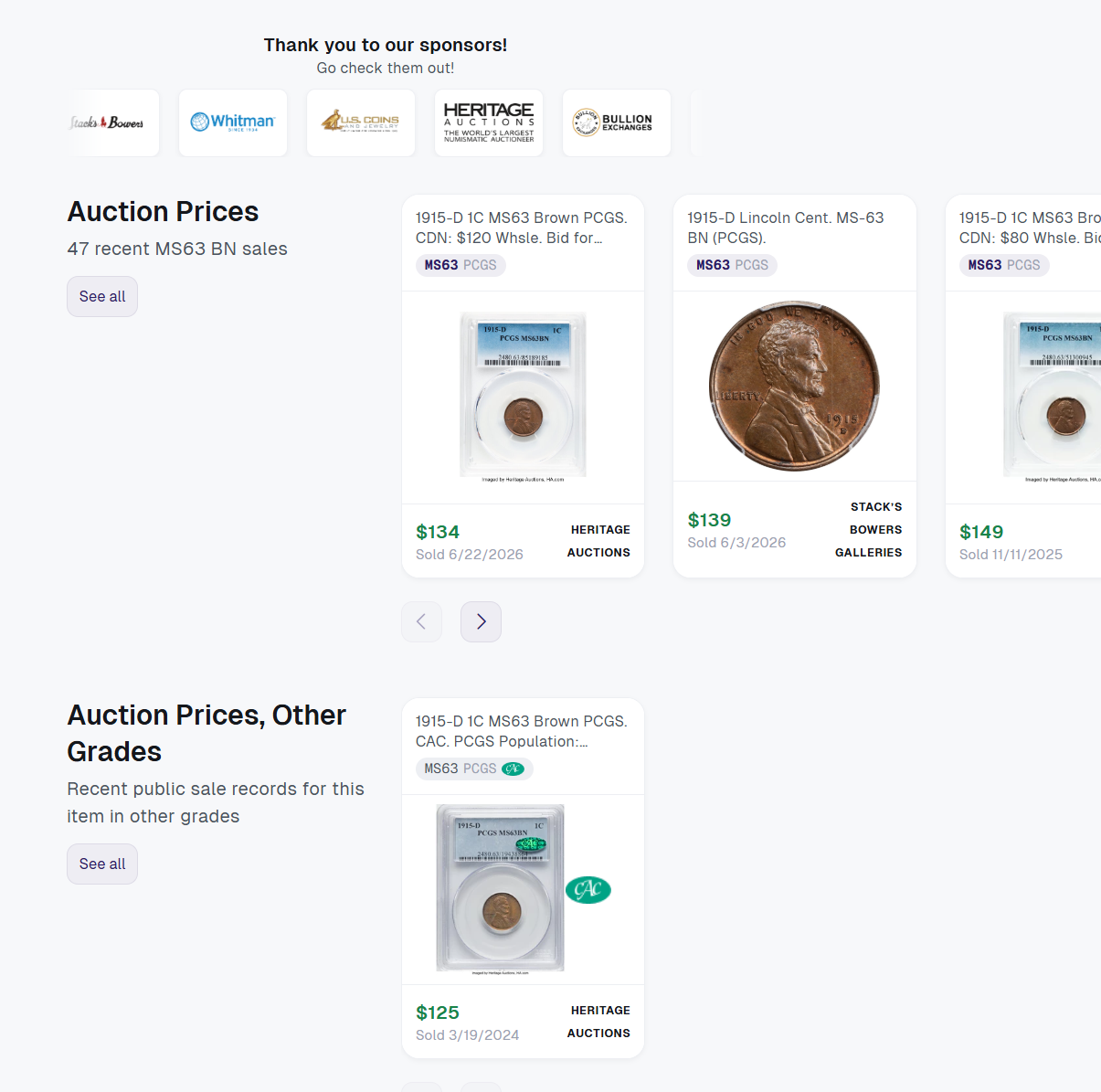
I'm going to add that the price results are not sorted by date (recency) which makes it a bugger to see price trends. It makes the page really hard to use.
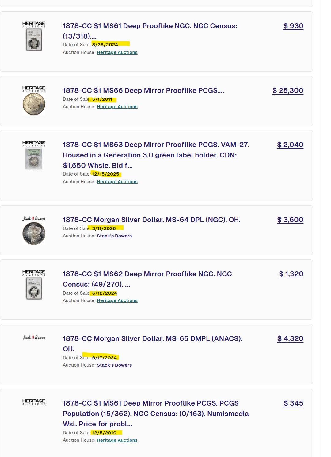
https://www.greysheet.com/prices/apr/1878-cc-morgan-silver-dollar-deep-mirror-proof-like-coin-values/gsid/7705
Great feedback! We are working on a fix to the date ordering of auction results asap.
Whitman Brands: President/CEO (www.greysheet.com; www.whitman.com)
PNG: Executive Director (www.pngdealers.org)