Who Doesn’t Like a New Standing Liberty Quarter added to their Collection?
 jfriedm56
Posts: 2,963 ✭✭✭✭✭
jfriedm56
Posts: 2,963 ✭✭✭✭✭
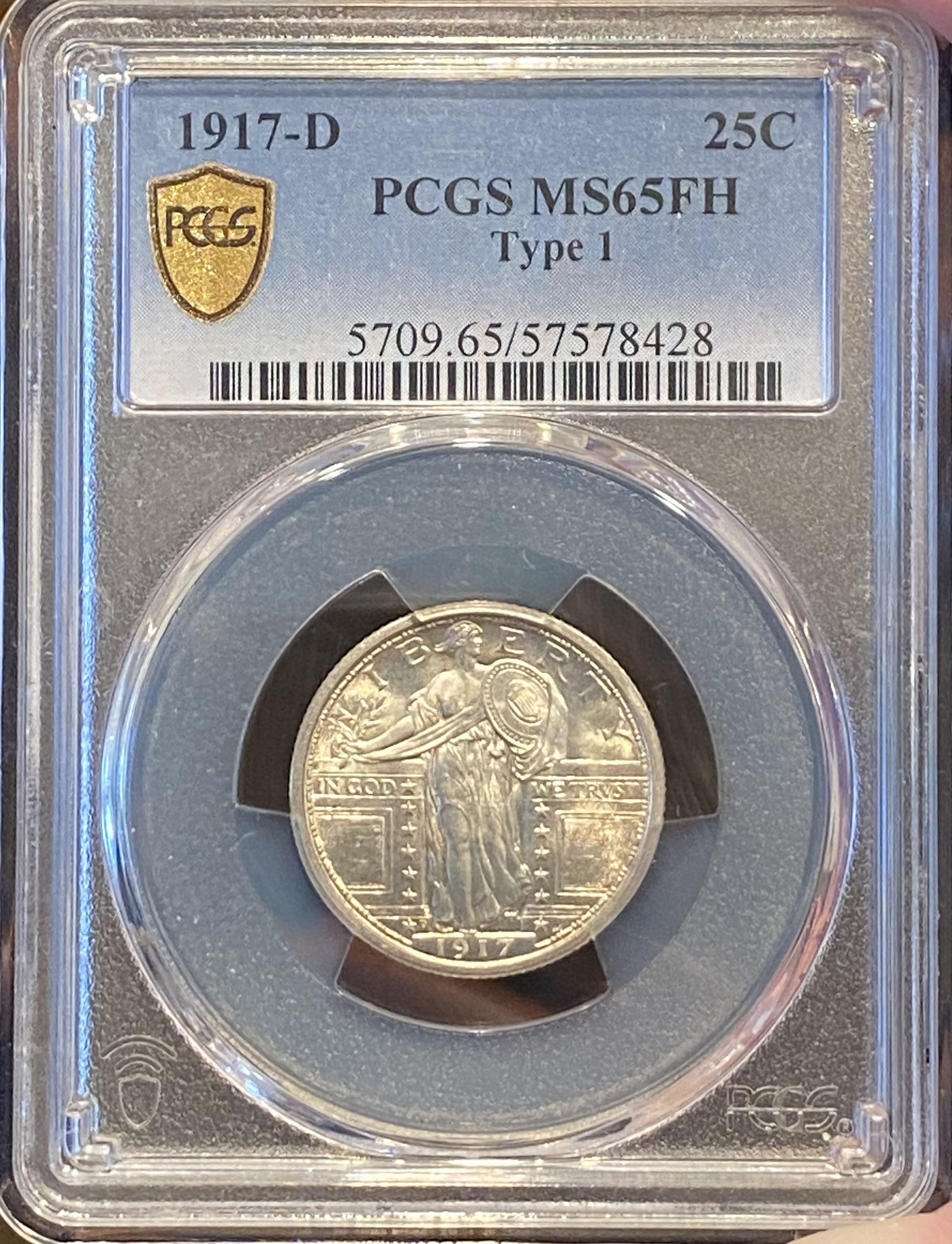
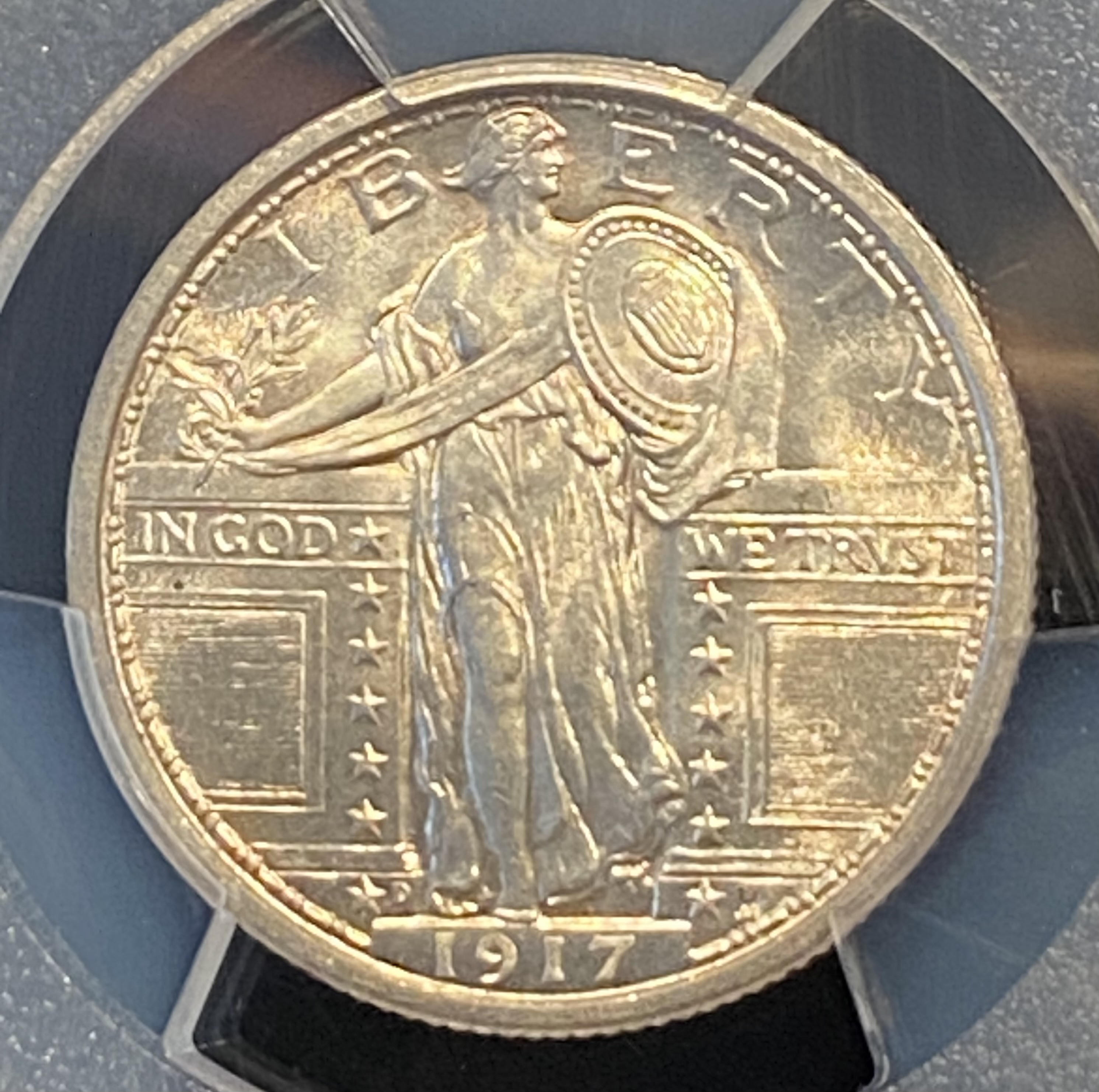
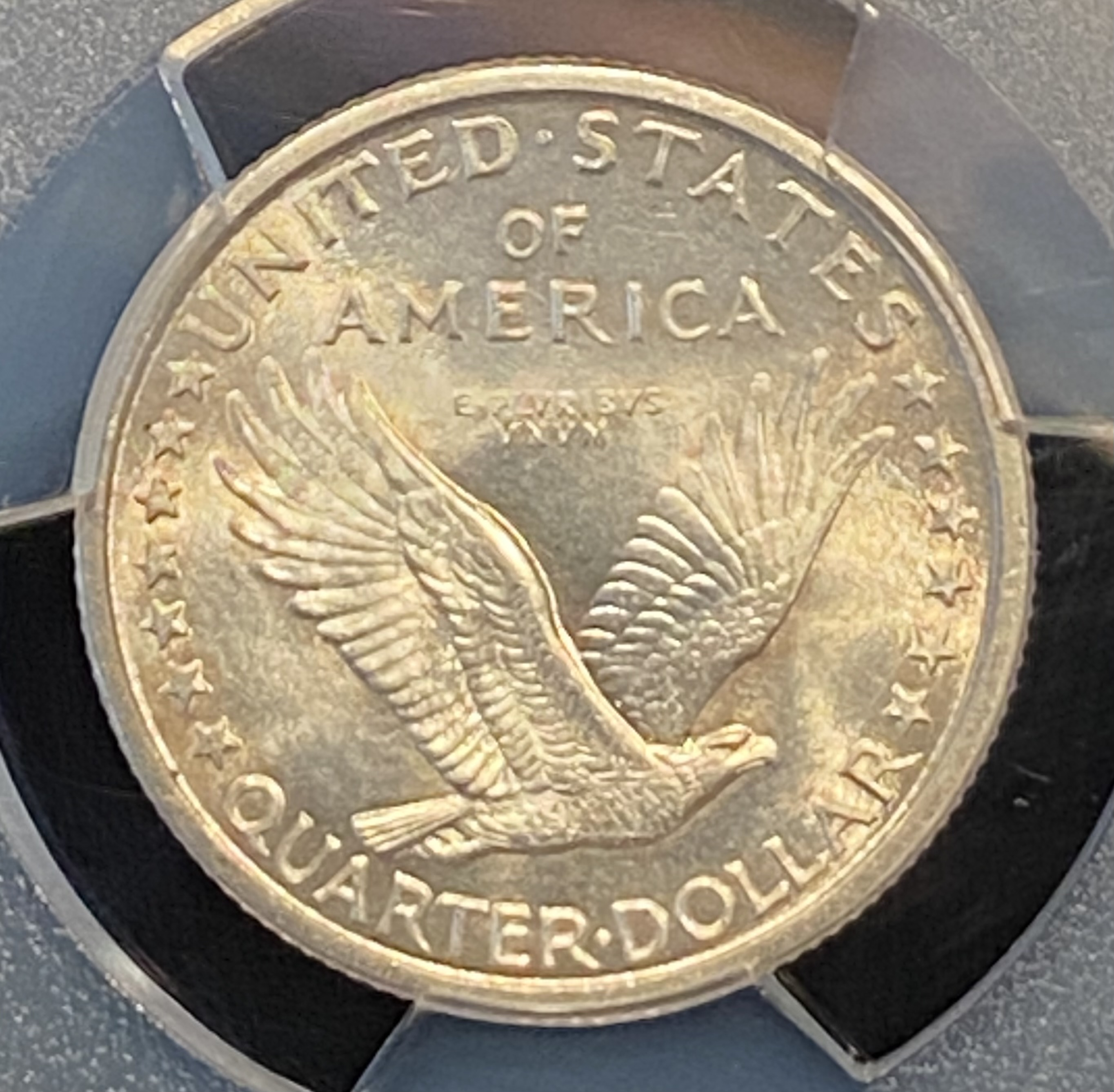
I was just at a local coin show this past weekend and was able to make a deal for this well struck type 1, SLQ in gem condition. Type 1’s are so detailed when fully struck, truly a beautiful series which lets us enjoy the full artistry intended by H. MacNeil. This is one of my top 3 favorite series! Thanks for looking. Zack.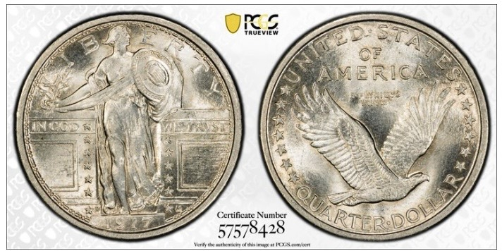
34
Comments
Great coin, and nice to see a T1 that isn’t a ubiquitous P mint example!
I'm looking for one just about like that myself. Congratulations, and enjoy!
Collector of Liberty Seated Half Dimes, including die pairs and die states
A solid example with the coveted full head designation. I also place the series high on my list, behind the $2.50 Indian head eagles.
I don't always like adding Standing Liberty Quarters to my collection unless they look like that. Very nice piece!
Custom album maker and numismatic photographer.
Need a personalized album made? Design it on the website below and I'll build it for you.
https://www.donahuenumismatics.com/.
Congrats on your new collection addition, very blasty which I like.
My Collection of Old Holders
Never a slave to one plastic brand will I ever be.
Congratulations!
Micah Langford - https://www.oldglorycoinsandcurrency.com/
The Standing Liberty Quarter is a beautiful coin in Mint State and AU, but the design did not hold up well in the circulated conditions. McNeil made a mistake when he ditched the Type I design for the lady dressed in chain mail for entry into World War I.
Wasn't he pressured by the government to change the design and cover up Miss Liberty's breast due to some negative public sentiment or was it trying to correct a design flaw during the minting process. I've read both explanations. The major design flaw was not using the design elements to protect the date from premature loss. Probably not a good idea to mount the date on the coin's highest point of wear.
Zack - totally agree with your SLQ assessment. Awesome pickup; beautiful with outstanding eye appeal!
As far as the design change, the reason I’ve heard most is “covering the breasts” due to negative public comments.
But, congrats!
Ken
“The thrill of the hunt never gets old”
PCGS Registry: Screaming Eagles
Copperindian
Copperindian II
Indy Eagles
Gold Rush
Retired sets: Soaring Eagles
Copperindian
Nickelodeon
Early Walkers
Successful transactions: redraider, winesteven, renomedphys, splitaces, oreville, ajaan, Cent1225, onlyroosies, justindan, blitzdude, DesertMoon, johnnyb, Heubschgold, SunshineRareCoins, ParadimeCoins, ndeagles, Southern_Knights, pcgsregistrycollector
@Copperindian, thanks Ken. That’s the explanation for the design change that I’ve always heard too, but then I’ve also heard it wasn’t, so who knows? Love that type 1 design too. Zack.
The full head on that coin is outstanding!
And it was minted in Denver.
Pete
Surprisingly, there are only about 350 in FH in that grade, with another 200 in the next 2 higher grades.
According to Roger Budette, modestly had nothing to do with the change; it was a product of World War I cheerleading.
A lot of people won’t like this opinion, but the Standing Liberty design was not a good one for a circulating coin. There were too many design elements in a small space. This was the problem with having artists with no experience in designing made for circulation coins was that they didn’t know what was possible for a mass produced coin which had to look good during 20 years of use. Charles Barber knew how to do that; the artists didn’t. Barber took the St. Gaudens designs, and made they work.
This is why I admire the work of Adolph Weinman so much. He made art which held well in circulation which was very attractive. The split bans don’t matter to me on the dime, and hand on the Walker was mostly a San Francisco Mint problem.
Thats a very nice coin.
Thanks for sharing!
Student of numismatics and collector of Morgan dollars
Successful BST transactions with: Namvet Justindan Mattniss RWW olah_in_MA
Dantheman984 Toyz4geo SurfinxHI greencopper RWW bigjpst bretsan MWallace logger7 JWP BruceS bigjpst
JWP PROMETHIUS88
Bill, with respect to Barber’s coinage, the two coins he designed and executed that I think of off the top of my head were Liberty/V nickels and the Liberty dime, quarter, and half dollar series. The MacNeil SLQ series as you stated was not a good one for a circulating coin. His Standing Liberty design was aesthetically superior to the dull and mundane designs of Barber. Also if you look at how the Barber designs wore through time, IMO they were much inferior to MacNeils. Personally I’d take an artistically superior design over those dull, drab, boring designs of Barber. That’s just my personal opinion. And if you could please explain what a design change has to do with a product of WW1 cheerleading. Not following the logic of this statement . Thanks Zack.
The idea was that Ms. Liberty was covering herself with chain mail in preparation for war. Budette claimed that he was unable to find a contemporary editors where the Type I quarter was called “obscene.”
As for the designs, I agree that Barber’s designs were dull and uninspired. The issues that many collectors ignore is that the mint must make coins quickly and economically with as little fuss as possible. Dies were met to last as long as possible. Strikes needed to be sharp to make things harder for counterfeiters. That was a problem with the Standing Liberty Quarter design. It was probably why the design didn’t last for the customary 25 years.
The designs must hold up in circulation and problems like those with the Twenty Cent Piece and the quarter and the quarter and the Susan B. Anthony Dollar must be avoided. The coins need to be attractive as a matter of national pride, but attractiveness is only one factor.
As for the attractiveness of well worn Barber and Standing Liberty Quarters, I would that they are both ugly.
@BillJones, thanks for your explanation Bill. But I believe the reason that the SLQ didn't last the mandated 25 years was due to the fact that the 200th birthday of The Founding father of our nation, George Washington, was being celebrated and the citizens preferred the portrait of George better than Lady Liberty. And I don't find the worn rendition of SLQ's ugly.
I thought about ignoring this response, but the dollar would have been a more impressive response, but the problem with the Standing Liberty Quarter design was a better explanation. No other design had more production problems. The date area had to be fixed in 1925. Some of the previous coins were poorly struck in the date area from day 1. I know; I had one.