Options
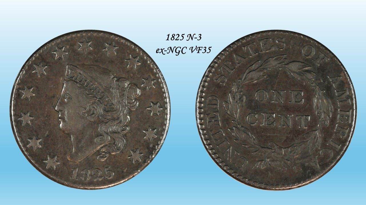
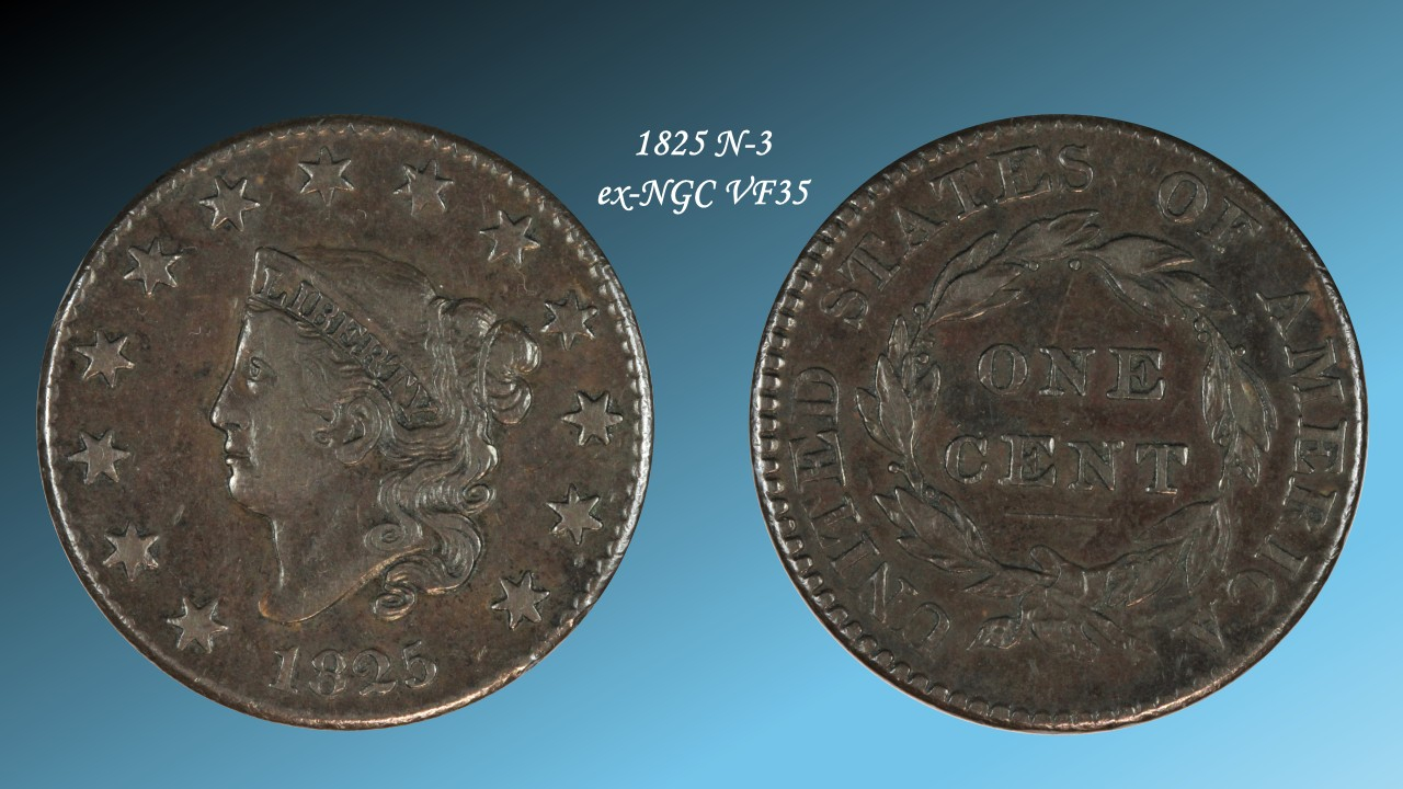
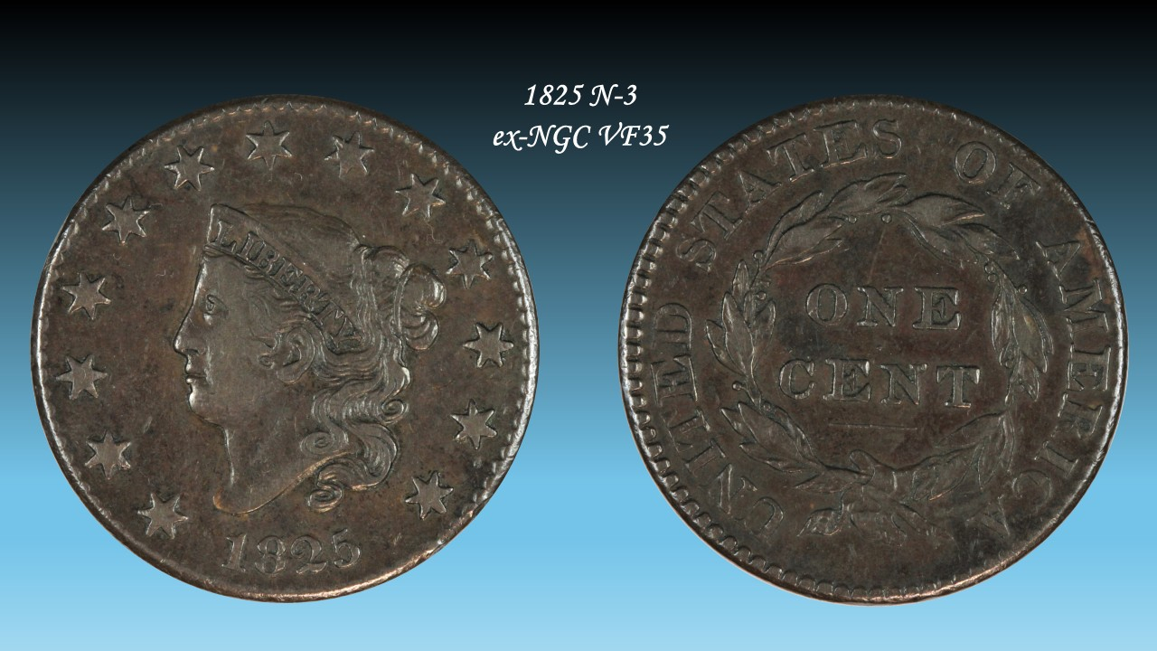
Background for images... which do you prefer?
resized.jpg) lkenefic
Posts: 9,556 ✭✭✭✭✭
lkenefic
Posts: 9,556 ✭✭✭✭✭
I've been playing around with the camera and photo-finishing/processing. Which image do you prefer?
1. Tan Crosshatch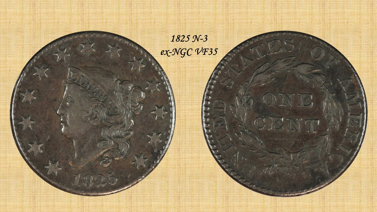
White Fade In
Black Fade In
Black 2 Fade In
Collecting: Dansco 7070; Middle Date Large Cents (VF-AU); Box of 20;
Successful BST transactions with: SilverEagles92; Ahrensdad; Smitty; GregHansen; Lablade; Mercury10c; copperflopper; whatsup; KISHU1; scrapman1077, crispy, canadanz, smallchange, robkool, Mission16, ranshdow, ibzman350, Fallguy, Collectorcoins, SurfinxHI, jwitten, Walkerguy21D, dsessom.
Successful BST transactions with: SilverEagles92; Ahrensdad; Smitty; GregHansen; Lablade; Mercury10c; copperflopper; whatsup; KISHU1; scrapman1077, crispy, canadanz, smallchange, robkool, Mission16, ranshdow, ibzman350, Fallguy, Collectorcoins, SurfinxHI, jwitten, Walkerguy21D, dsessom.
Background for images... which do you prefer?
This is a private poll: no-one will see what you voted for.
0
Comments
background colors have been discussed here a number of times, ultimately white gets the best reviews
Something like this?
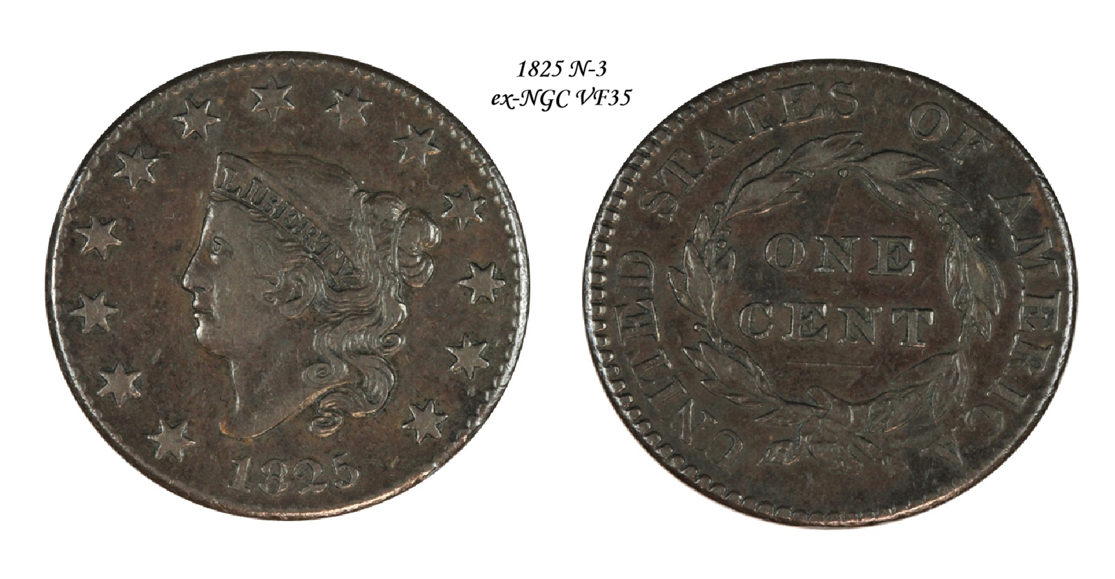
Successful BST transactions with: SilverEagles92; Ahrensdad; Smitty; GregHansen; Lablade; Mercury10c; copperflopper; whatsup; KISHU1; scrapman1077, crispy, canadanz, smallchange, robkool, Mission16, ranshdow, ibzman350, Fallguy, Collectorcoins, SurfinxHI, jwitten, Walkerguy21D, dsessom.
Of the four you have offered to us, I think "Black 2 Fade In" is best, but that doesn't mean I like it.
In honor of the memory of Cpl. Michael E. Thompson
Keep it simple. Black and white have always been in style because they put the coin as the focus. Even GC uses dark blue for that reason, and even that color pushes it a little.
I used to think black was the move, but I always gravitate to white backgrounds as my personal favorite. White is often more requested than black as well when people have a preference.
Coin Photography
yeah
i got the feeling something wasn't 100%, and i checked a tv. pcgs puts an artificial shadow around them. but yeah, boring white, unless you want to hand edit a different color for each coin.
my choice of the 4 given would be the tan
These are old pictures of coins I don't own anymore, but I've always liked the background.
For a dark (copper) coin I like a neutral dark background.
How about Greyscale? The all white background makes my eyes hurt after a while... lol... I guess I'm working on my cataracts...
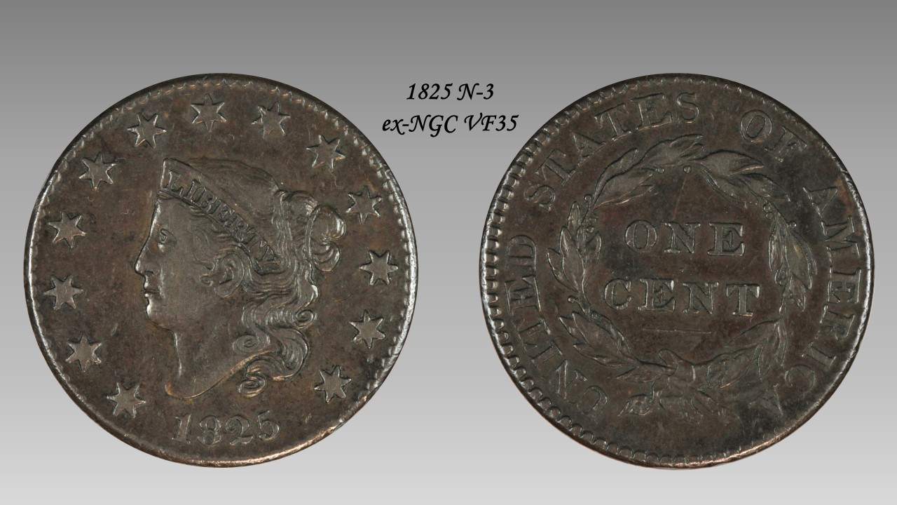
Successful BST transactions with: SilverEagles92; Ahrensdad; Smitty; GregHansen; Lablade; Mercury10c; copperflopper; whatsup; KISHU1; scrapman1077, crispy, canadanz, smallchange, robkool, Mission16, ranshdow, ibzman350, Fallguy, Collectorcoins, SurfinxHI, jwitten, Walkerguy21D, dsessom.
Get what your happy with
The doily background seems to be popular with many forum members here.
Worry is the interest you pay on a debt you may not owe.
"Paper money eventually returns to its intrinsic value---zero."----Voltaire
"Everything you say should be true, but not everything true should be said."----Voltaire
I’ve been playing with this blue color and a drop shadow. I kind of like it.
Newbie collector of type and circulated Peace dollars, photographer of places and animals, player of instruments and builder of amplifiers, espresso industry professional, and a person distracted by shiny objects.
CACG Registry
MyCollect Registry
Greyscale is the way to go, IMHO. Peace Roy
BST: endeavor1967, synchr, kliao, Outhaul, Donttellthewife, U1Chicago, ajaan, mCarney1173, SurfinHi, MWallace, Sandman70gt, mustanggt, Pittstate03, Lazybones, Walkerguy21D, coinandcurrency242 , thebigeng, Collectorcoins, JimTyler, USMarine6, Elkevvo, Coll3ctor, Yorkshireman, CUKevin, ranshdow, CoinHunter4, bennybravo, Centsearcher, braddick, Windycity, ZoidMeister, mirabela, JJM, RichURich, Bullsitter, jmski52, LukeMarshall, coinsarefun, MichaelDixon, NickPatton, ProfLiz, Twobitcollector,Jesbroken oih82w8, DCW
My latest TV's have a background with a light grey "PCGS logo" running at 45 degree angles... look in the lower corners, it's very subtle and blended in. I agree, I'm not a huge fan of the shadow effect either...
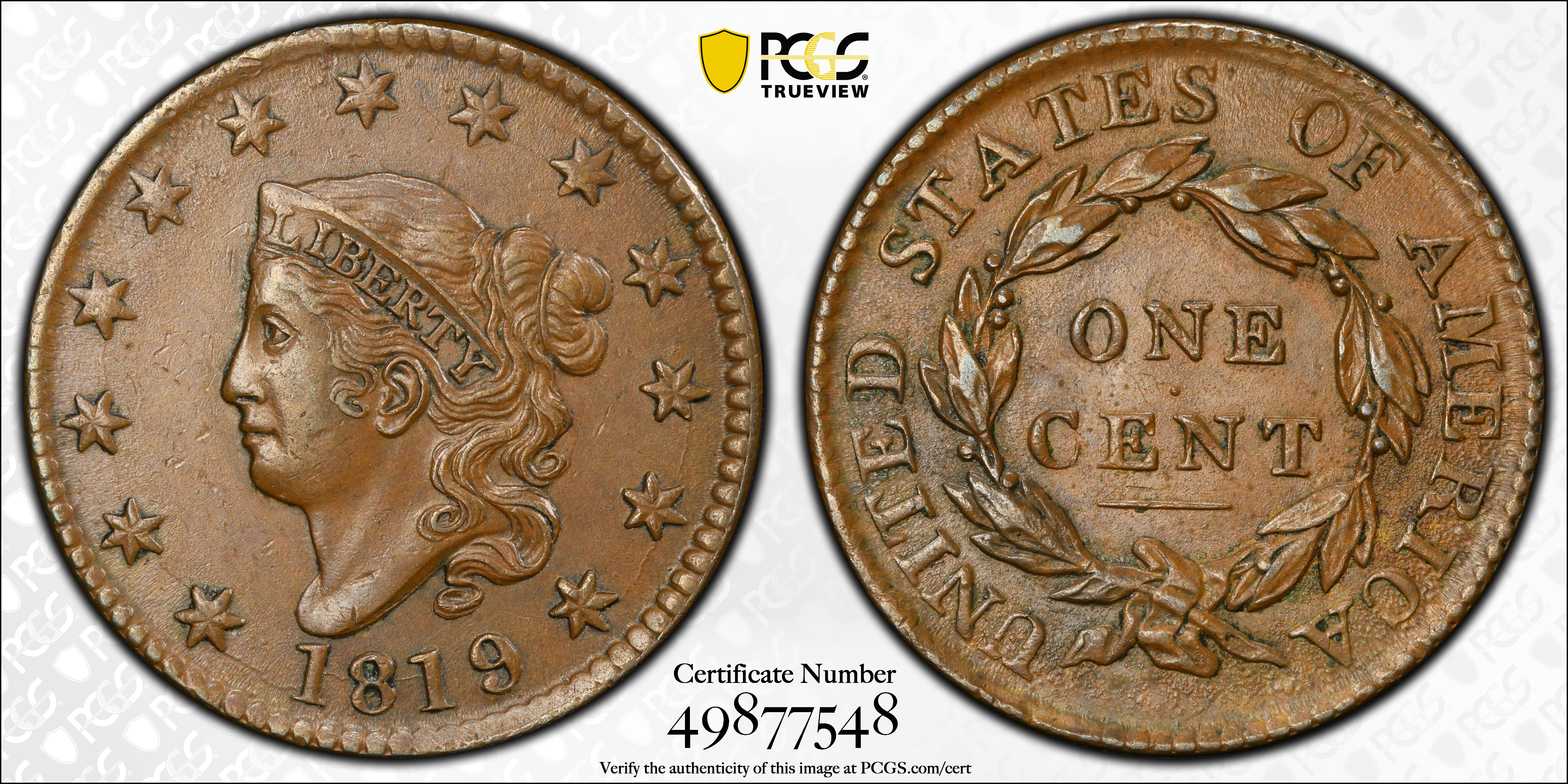
Successful BST transactions with: SilverEagles92; Ahrensdad; Smitty; GregHansen; Lablade; Mercury10c; copperflopper; whatsup; KISHU1; scrapman1077, crispy, canadanz, smallchange, robkool, Mission16, ranshdow, ibzman350, Fallguy, Collectorcoins, SurfinxHI, jwitten, Walkerguy21D, dsessom.
This one gets my vote
Collector, occasional seller
I really like @MidLifeCrisis background above.
One thing you may want to specify is how the image will be viewed; full-screen or otherwise. Eg. Within a webpage with a white background versus a selectable image that expands to fill the screen when selected. If it's not full-screen, the other colors will effect how the image is received by the eye. Imho
I prefer white since I want it to be all about the coin, not the background. That said, I do like your greyscale example. I think with dark copper, a light background color is much preferable to a black background that some prefer.
"She comes out of the sun in a silk dress,
running like a water color in the rain...."
There's the winner, if you ask me. Since some coins look better against a dark background and others look better against a lighter background, the greyscale/gradient gives you the best of both worlds, in a way.
I use it myself. I usually create seven or eight images of each of my coins to save on my OneDrive, though I'll probably only end up using five for each coin when I finally have a website up and running.
This is my current standard. I wish I used 1,000 pixels wide, but I've been using an 800-pixel standard width for so long that it would be too much of a pain to go back and change 'em all.
#1- The primary display image. 800 x 500, greyscale background, with slab label added.
#2- The TPG's image, if there is one. Resized to 800 x 400.
#3- Black background. 800 x 400.
#4- Gradient background. 800 x 400.
#5- White background. 800 x 400.
#6- Full obverse. 800 x 800.
#7- Full reverse. 800 x 800.
#8- The slab image. 800 wide; height varies slightly.
Regarding those "shadowbox" or "reflective" templates like @MidLifeCrisis posted, I really like those. And that used to be my standard, but since I lacked the photo editing skills and software to make them myself, I had to rely on others to do them for me, and it was too much of a hassle. So I switched to the more simple grey gradient standard you see above, which I have no problem doing by myself.
Here's one of my older "shadowbox" style images.
Collector since 1976. On the CU forums here since 2001.
Once in a while, just for giggles, I'll also do a themed, scenic "coinscape" image like I did for this Greenland polar bear coin.
Collector since 1976. On the CU forums here since 2001.
How about a chrome background? 🤔
Might be too sparkly.
Collector since 1976. On the CU forums here since 2001.
I've been going without backgrounds and saving as .png or .tiff files. I'm a fan of the transparency.
Custom album maker and numismatic photographer.
Need a personalized album made? Design it on the website below and I'll build it for you.
https://www.donahuenumismatics.com/.
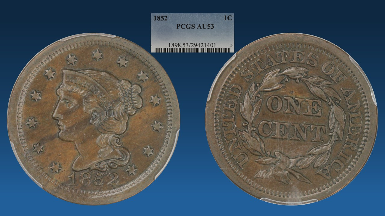
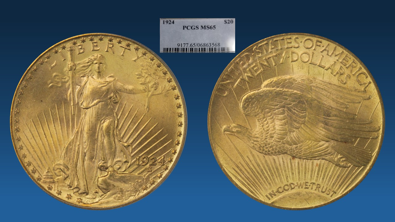
@lordmarcovan Thanks! I looked at your US Coins website and saw you were using it already... I realize these things aren't proprietary, but I also don't want any confusion either... I've been playing around in Powerpoint with backgrounds and whereas I still like the greyscale I also like this dark blue to medium blue gradient too:
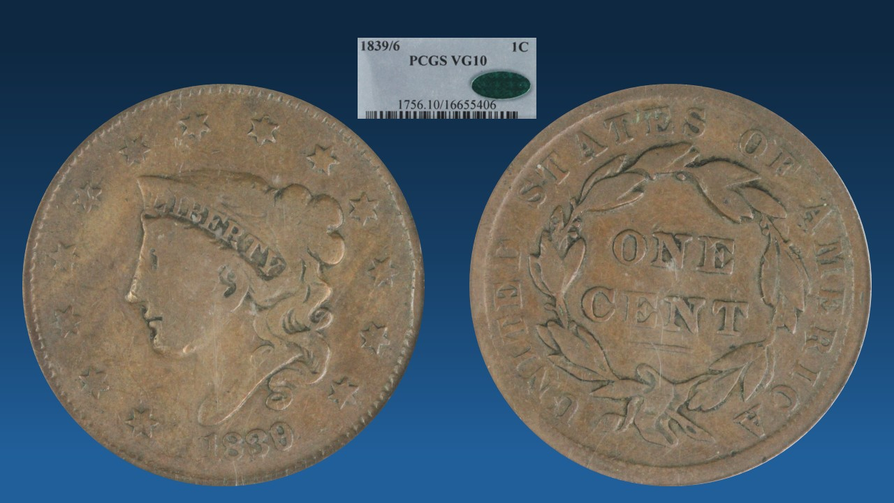
Successful BST transactions with: SilverEagles92; Ahrensdad; Smitty; GregHansen; Lablade; Mercury10c; copperflopper; whatsup; KISHU1; scrapman1077, crispy, canadanz, smallchange, robkool, Mission16, ranshdow, ibzman350, Fallguy, Collectorcoins, SurfinxHI, jwitten, Walkerguy21D, dsessom.
Of those in the OP, I prefer the black to blue gradient. The cross-hatched one has too regular of a pattern and becomes distracting. If you have a copy of Penny Whimsy, shoot a picture of the back of the book and use that as is for big copper. You could use any clothbound hard cover book, of course, but cents look good on that background. If you want tan instead, you can change the hue by about 100° and you have tan. A black outer glow or drop shadow helps set the coin off from any colored background.
Keeper of the VAM Catalog • Professional Coin Imaging • Prime Number Set • World Coins in Early America • British Trade Dollars • Variety Attribution
…..
Sparkles are nice though! 🤪😉
The reflection template has always been my fav. The only coins that are difficult are very dark copper coins like this 22, they do tend to blend into the background. @lkenefic If you want to test out this reflection style I can send you the template, it was made available/public here by a member many years ago.
My Collection of Old Holders
Never a slave to one plastic brand will I ever be.
I love backgrounds more than most, but they do distract from the coin images. So I normally just post images with a white background unless I’m in a mood to be more artistic and less focused on the coins themselves. But here’s one I really like that’s a takeoff of greyscale
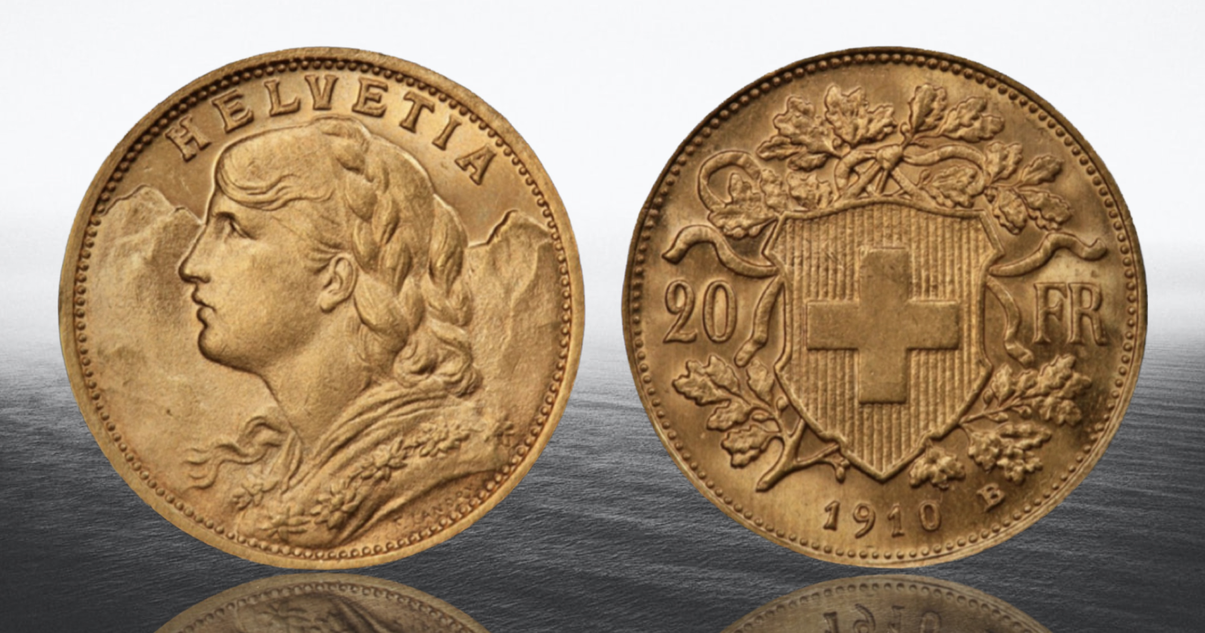
But here’s my normal background I use
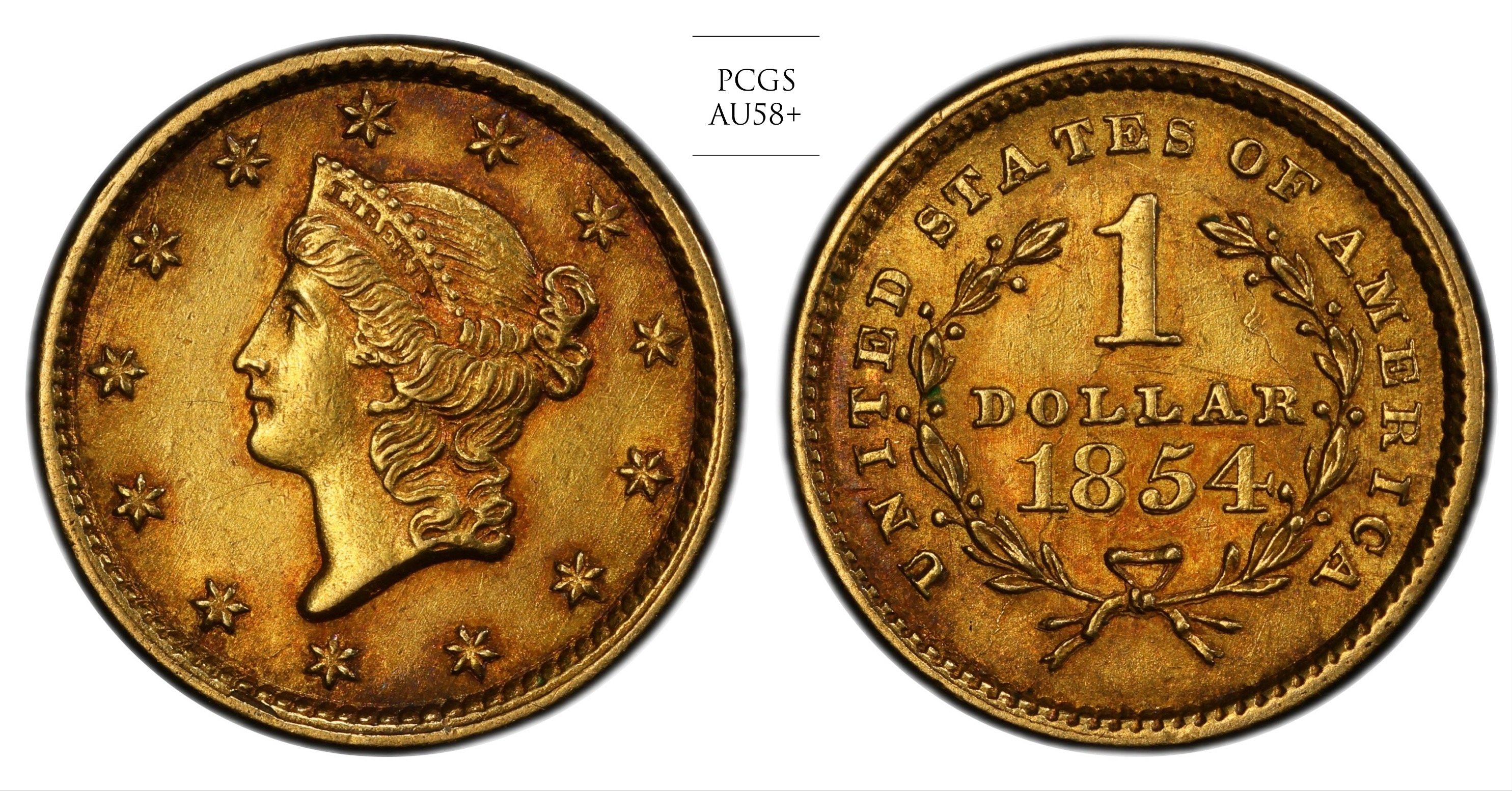
But if I’m feeling more artistic I tend to use one like this
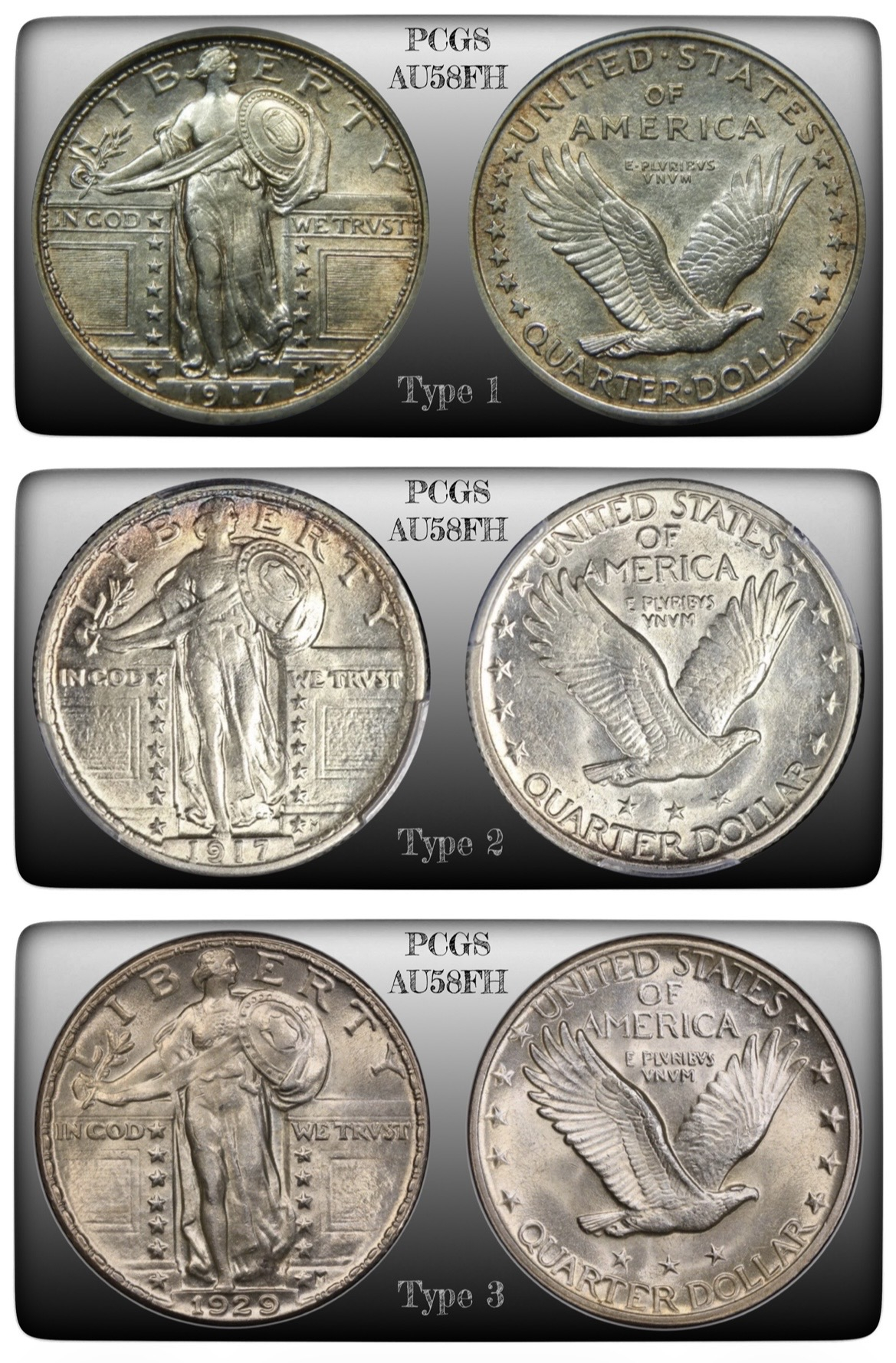
But sometimes I like to use a more basic greyscale, like for this where I wanted to show 3 types of SLQ
Mr_Spud
Here's the Penny Whimsy cover (green). Adjusted the hue by -52 to get the tan version. Picked a vintage font and textured it to look hot stamped. Added a black outer glow. Those prongs, though.
Keeper of the VAM Catalog • Professional Coin Imaging • Prime Number Set • World Coins in Early America • British Trade Dollars • Variety Attribution
I like raw coins and “keep it honest”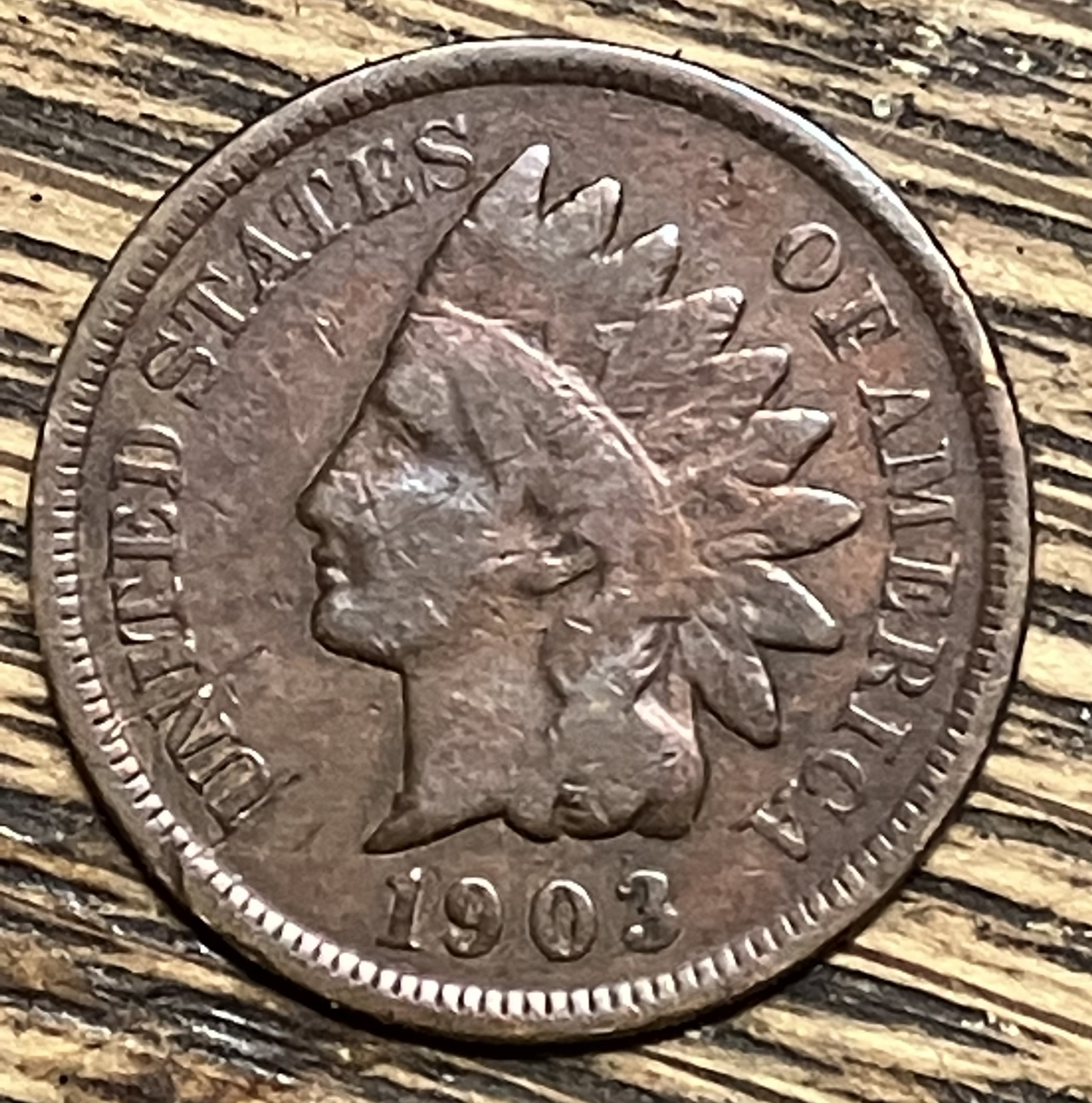
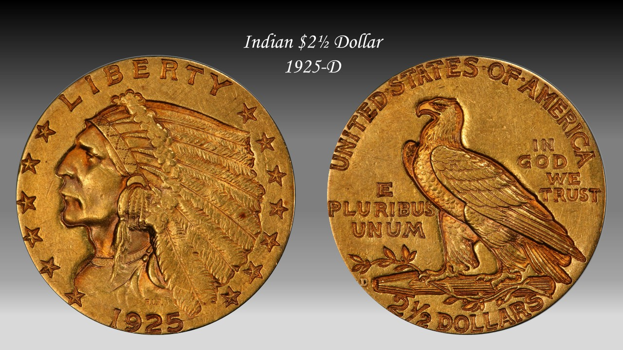
Thanks for sharing.... Everyone! There are some talented folks on these boards.... I'm narrowed down to these two.. greyscale gradient or dark blue gradient. Here's Gold, Silver, and Copper on both:
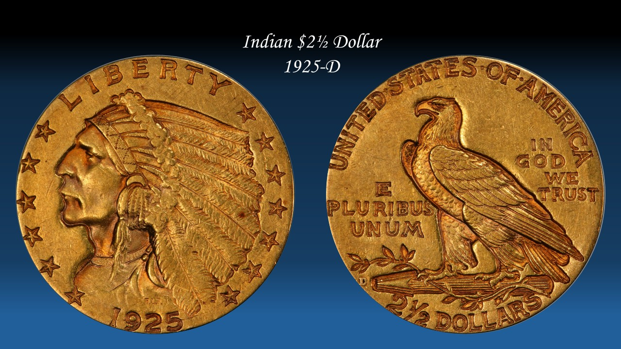
Successful BST transactions with: SilverEagles92; Ahrensdad; Smitty; GregHansen; Lablade; Mercury10c; copperflopper; whatsup; KISHU1; scrapman1077, crispy, canadanz, smallchange, robkool, Mission16, ranshdow, ibzman350, Fallguy, Collectorcoins, SurfinxHI, jwitten, Walkerguy21D, dsessom.
Voted “Other” - prefer black:
But white’s a close second:
“The thrill of the hunt never gets old”
PCGS Registry: Screaming Eagles
Copperindian
Copperindian II
Indy Eagles
Gold Rush
Bust Caps
Retired sets: Soaring Eagles
Copperindian
Nickelodeon
Early Walkers
Successful transactions: Eagle Eye, redraider, winesteven, renomedphys, splitaces, oreville, ajaan, Cent1225, onlyroosies, justindan, blitzdude, DesertMoon, johnnyb, Heubschgold, SunshineRareCoins, ParadimeCoins, ndeagles, Southern_Knights, pcgsregistrycollector, BruceS
Other
Black backround
Mike
My Indians
Dansco Set
The blue's not bad, but I prefer the greyscale.
Collector since 1976. On the CU forums here since 2001.
Love the 56 large cent
Depends on the coin. This one it was butterflies>>>
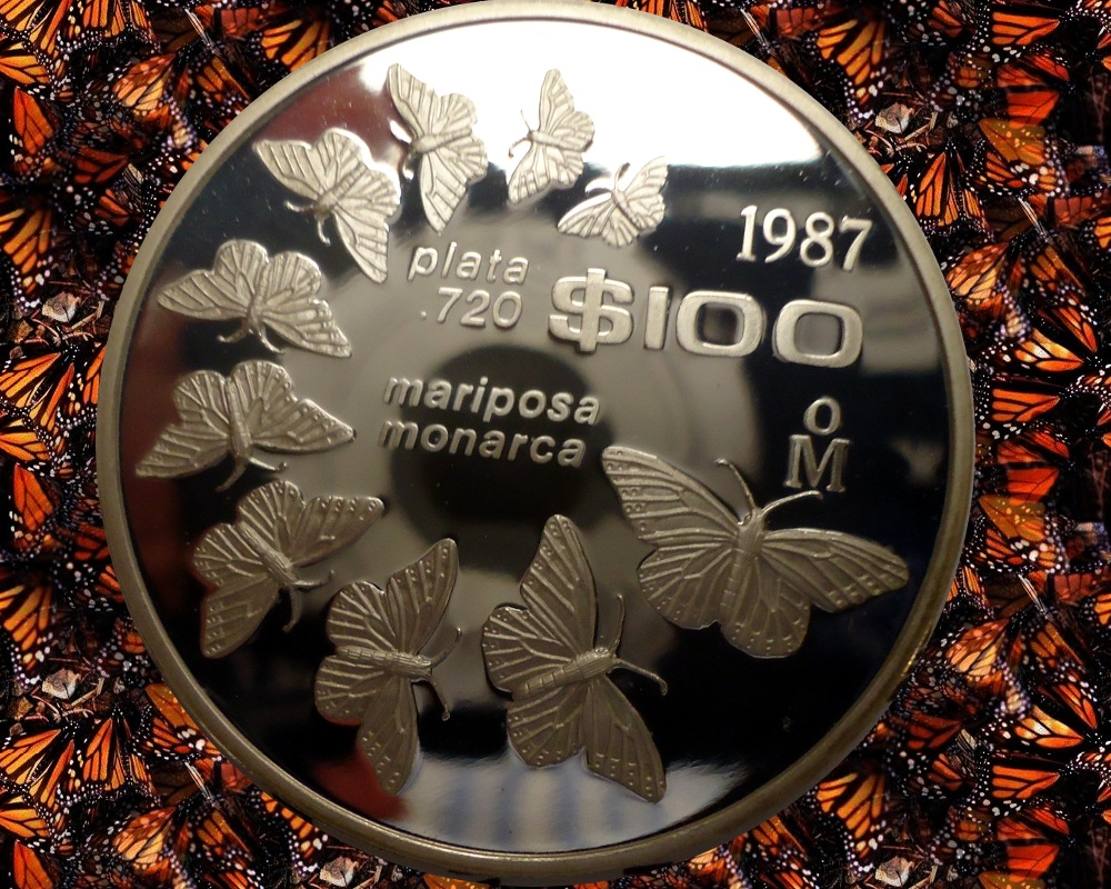
Butterflies in the background and house plans in the reflection?
How about a Savanna?
House Plants?
Stain Glass
Old Carpeting
Fine Grain wood
My thought process as well. I started with black but as time went on I also found I preferred the cleaner look, plus the drop shadow doesn’t work well with a black background.
- Bob -

MPL's - Lincolns of Color
Central Valley Roosevelts
I thought I posted this but it was in my Drafts folder.
.
Different coins seem to do better with different colors. This is especially true of dark copper.
While I normally feel white, and then black, I think grey has a place as well, and your grey fade was good.
Too much color and other distraction takes away from clean and enjoyable images, in my opinion.
“We are only their care-takers,” he posed, “if we take good care of them, then centuries from now they may still be here … ”
Todd - BHNC #242
I think my initial thoughts after looking at the poll results and thinking "greyscale" was good. Most of what I'm going to image is copper but I wanted to settle on a background that would be decent for Silver and Gold as well... Thanks all...
Successful BST transactions with: SilverEagles92; Ahrensdad; Smitty; GregHansen; Lablade; Mercury10c; copperflopper; whatsup; KISHU1; scrapman1077, crispy, canadanz, smallchange, robkool, Mission16, ranshdow, ibzman350, Fallguy, Collectorcoins, SurfinxHI, jwitten, Walkerguy21D, dsessom.
White.