Options
New 2026 designs are here . . .
 Russell12
Posts: 806 ✭✭✭✭✭
Russell12
Posts: 806 ✭✭✭✭✭
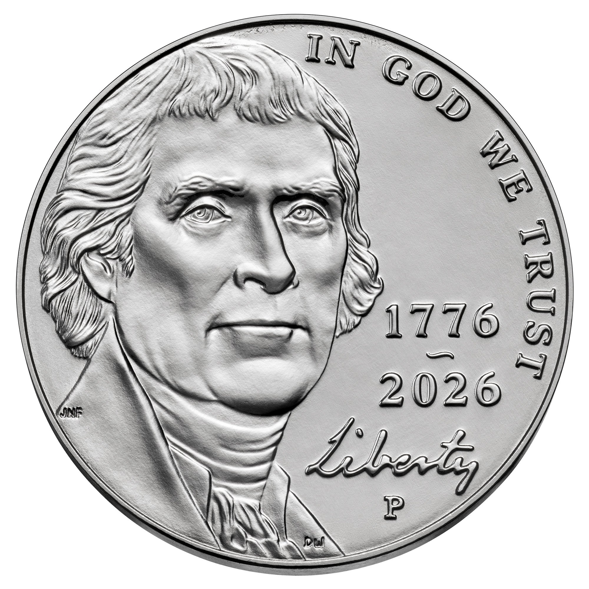
Overall I like them. I do hope the portraits look better on a coin.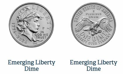
11
Comments
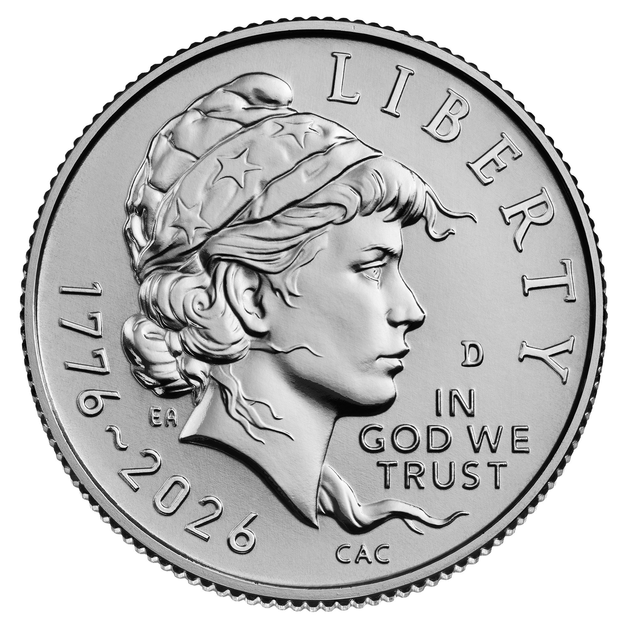
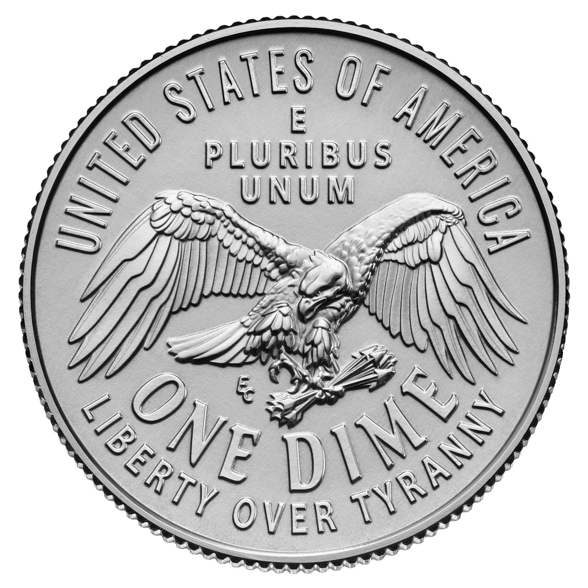
I love that dime. The rest of them are, to me, derivative and uninspired.
All comments reflect the opinion of the author, even when irrefutably accurate.
reused some art from prez bucks and commem
Exactly
All comments reflect the opinion of the author, even when irrefutably accurate.
+1
That dime design rocks. I would love to see that actually get used.
At least they mostly commemorated the actual event and not the CCAC activist wish list.
These are the actual coins for 2026 from the Mint's website
These are better than I was expecting. I do hope they look good in pocket change.
Custom album maker and numismatic photographer.
Need a personalized album made? Design it on the website below and I'll build it for you.
https://www.donahuenumismatics.com/.
I can't wait for that dime!
Make the dime permanent. They hit a home run with that except for the 5 different fonts and large initials.
Keeper of the VAM Catalog • Professional Coin Imaging • Prime Number Set • World Coins in Early America • British Trade Dollars • Variety Attribution
Many of those designs look like things we have seen before in nearly the same design. Does anyone else see that?
In honor of the memory of Cpl. Michael E. Thompson
- Bob -

MPL's - Lincolns of Color
Central Valley Roosevelts
I know why everyone loves the dime! It’s giving a shoutout to CAC on the lower obverse. 🤣
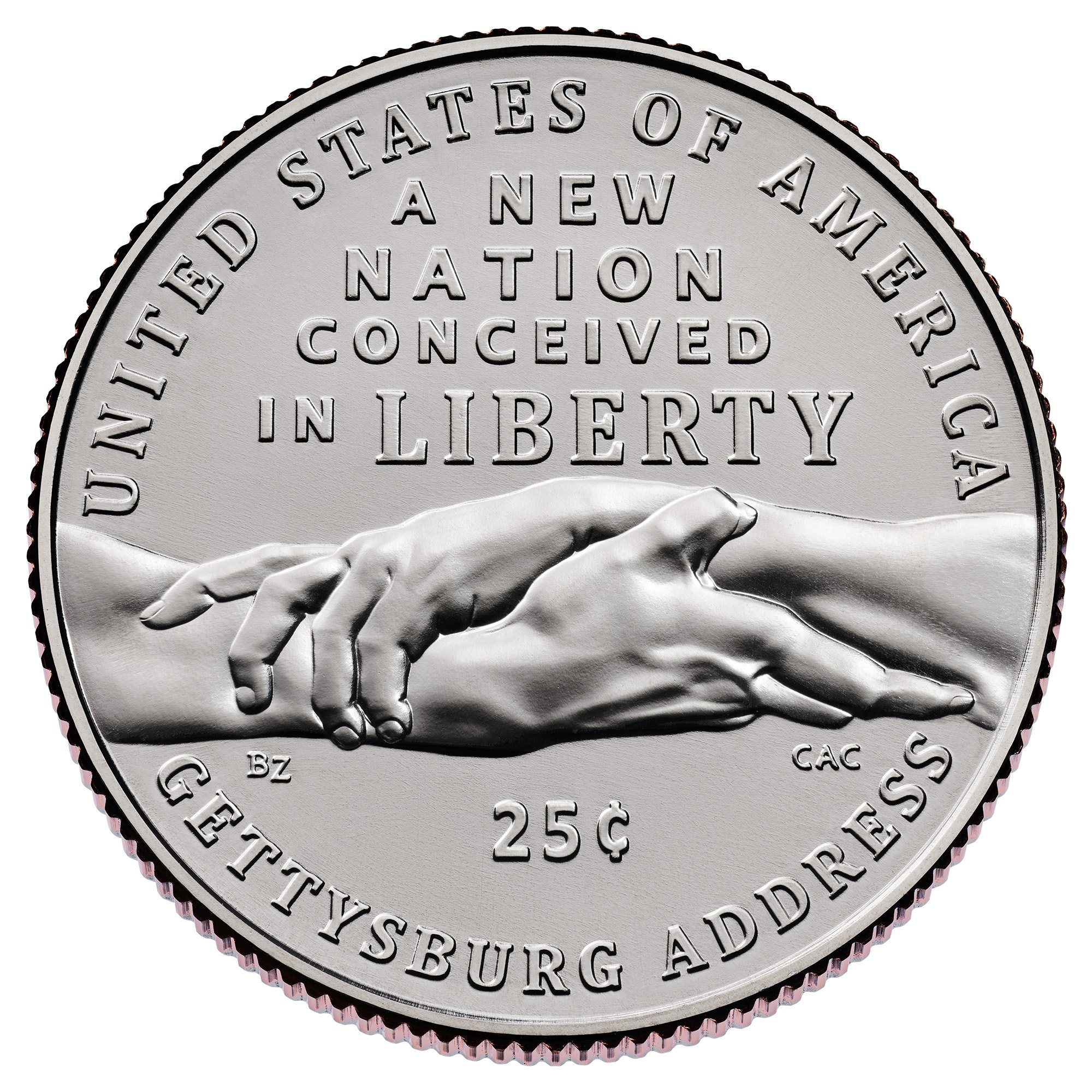
(The CAC “endorsement” is also on the reverse of the Gettysburg quarter).
Steve
My collecting “Pride & Joy” is my PCGS Registry Dansco 7070 Set:
https://www.pcgs.com/setregistry/type-sets/design-type-sets/complete-dansco-7070-modified-type-set-1796-date/publishedset/213996
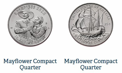
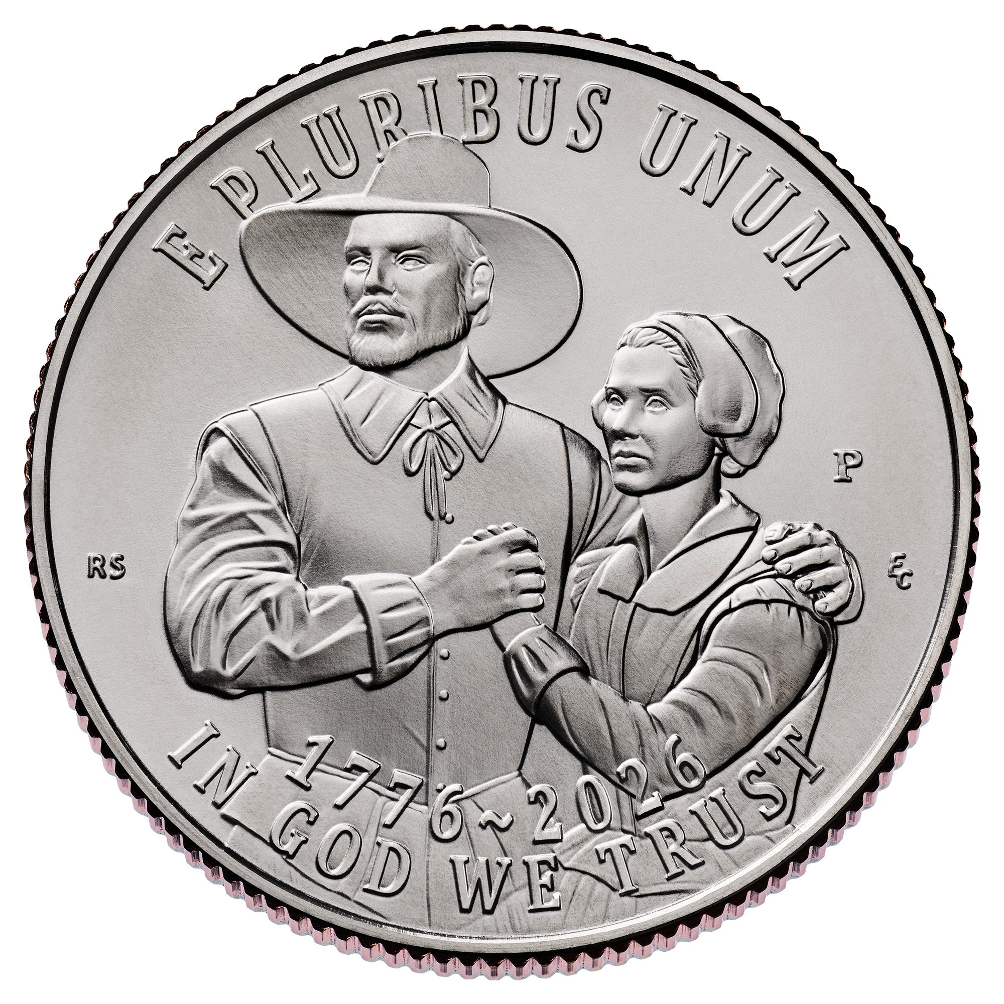
As expected, there are five quarter designs. To me though, the one with the Mayflower design looks the exact same size as the other four. I thought it would be compact? 😆
Steve
My collecting “Pride & Joy” is my PCGS Registry Dansco 7070 Set:
https://www.pcgs.com/setregistry/type-sets/design-type-sets/complete-dansco-7070-modified-type-set-1796-date/publishedset/213996
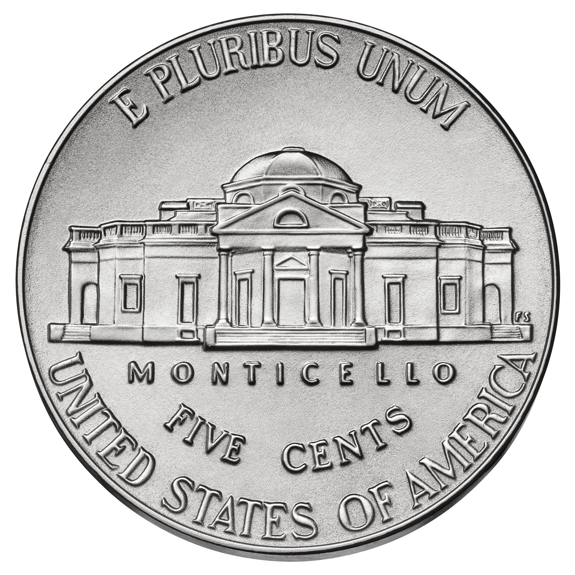
What about the nickel ?
Successful BST transactions- Bfjohnson, Collectorcoins, 1peter223, Shrub68, Byers, Greencopper, Coinlieutenant, Coinhunter4, SurfinxHI, ProfLiz
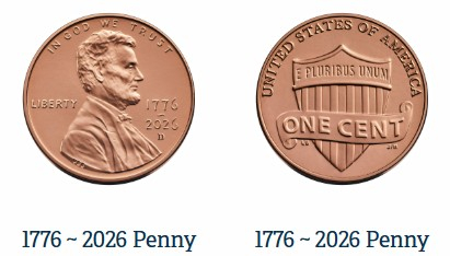
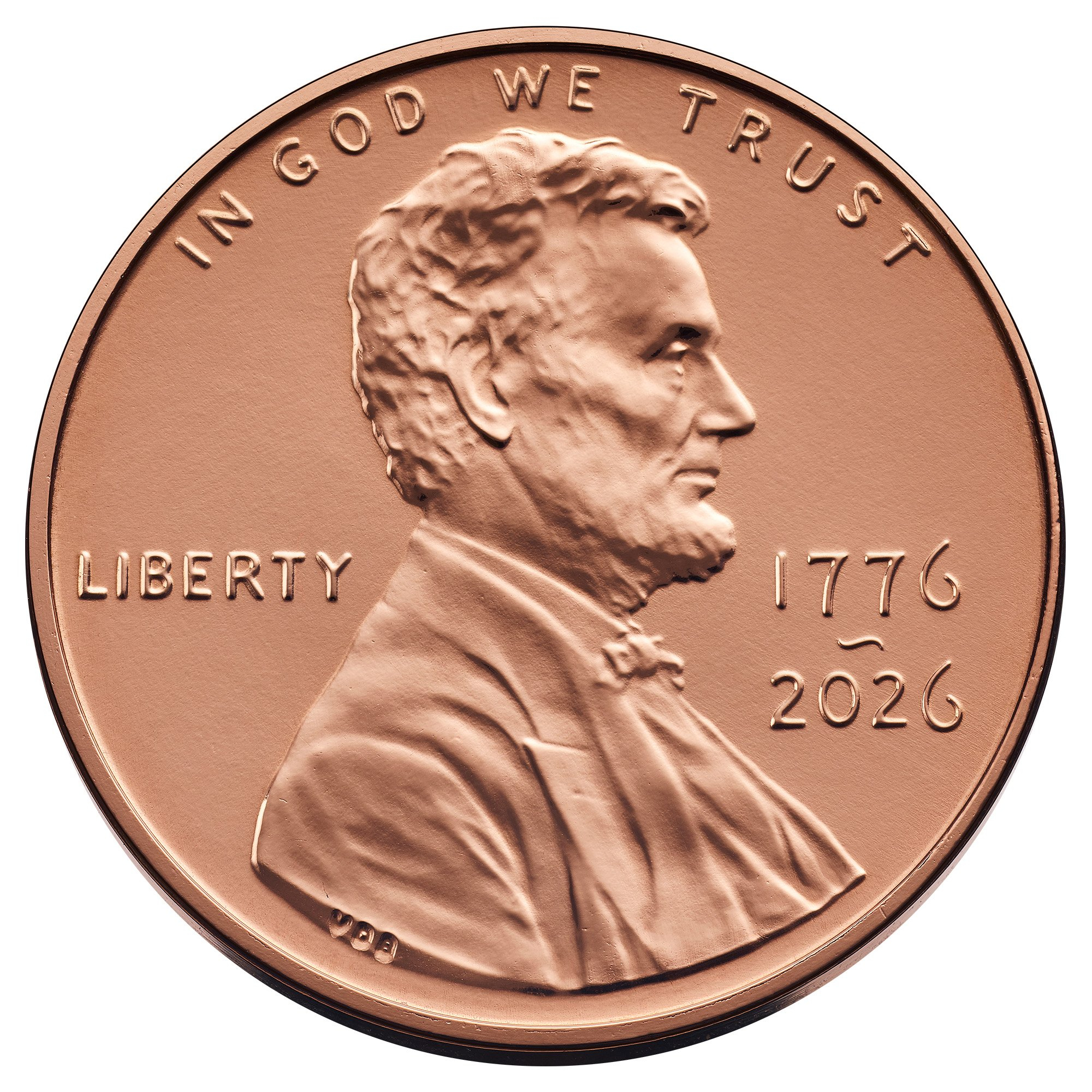
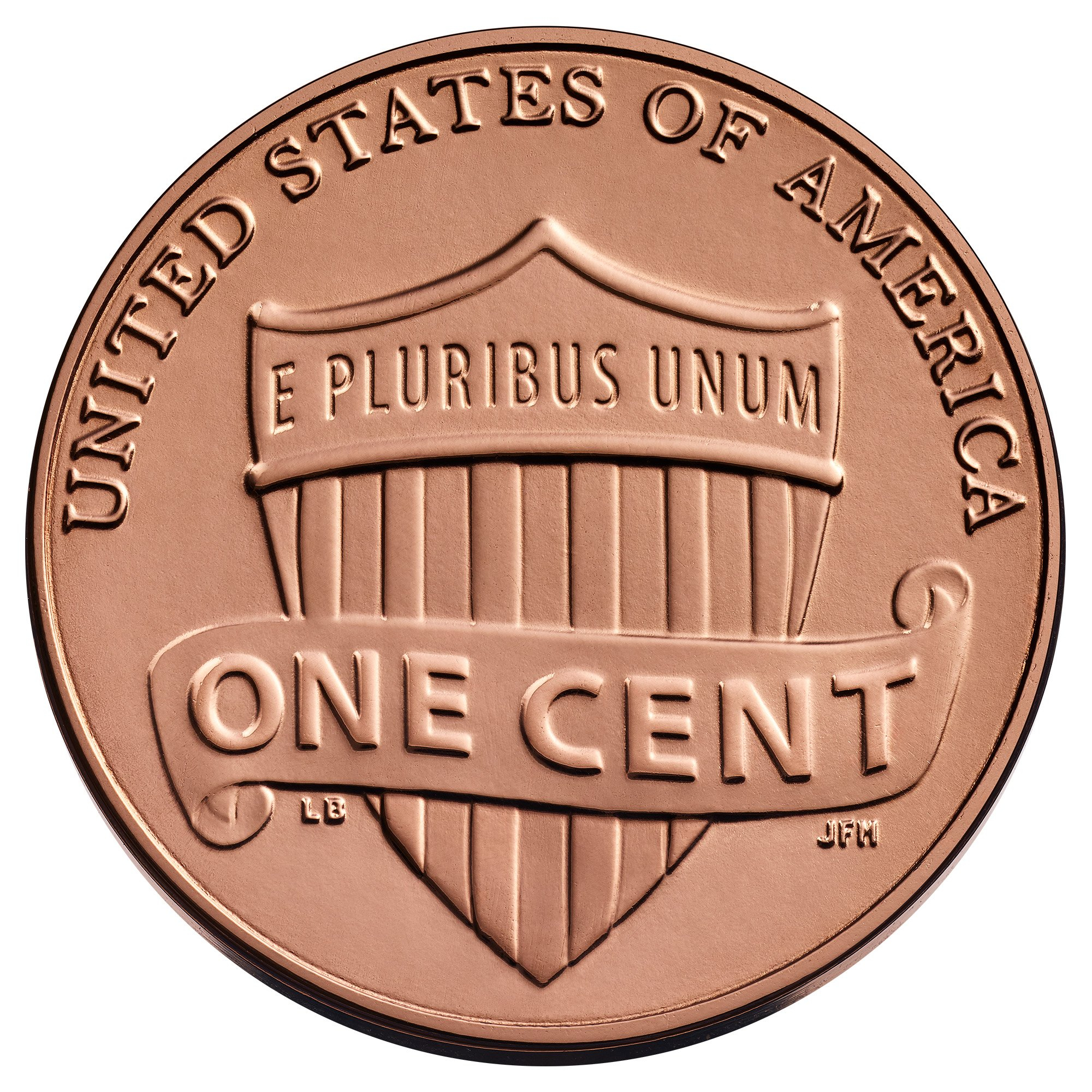
and the cent or "penny" as the Mint calls it . . .
I don't see the word "Liberty" on the Pilgrim quarter. 🧐
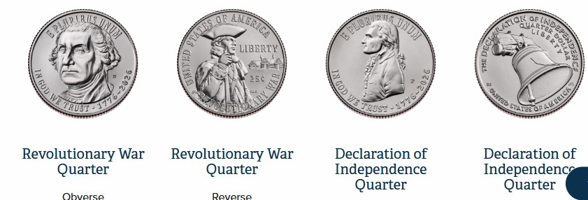
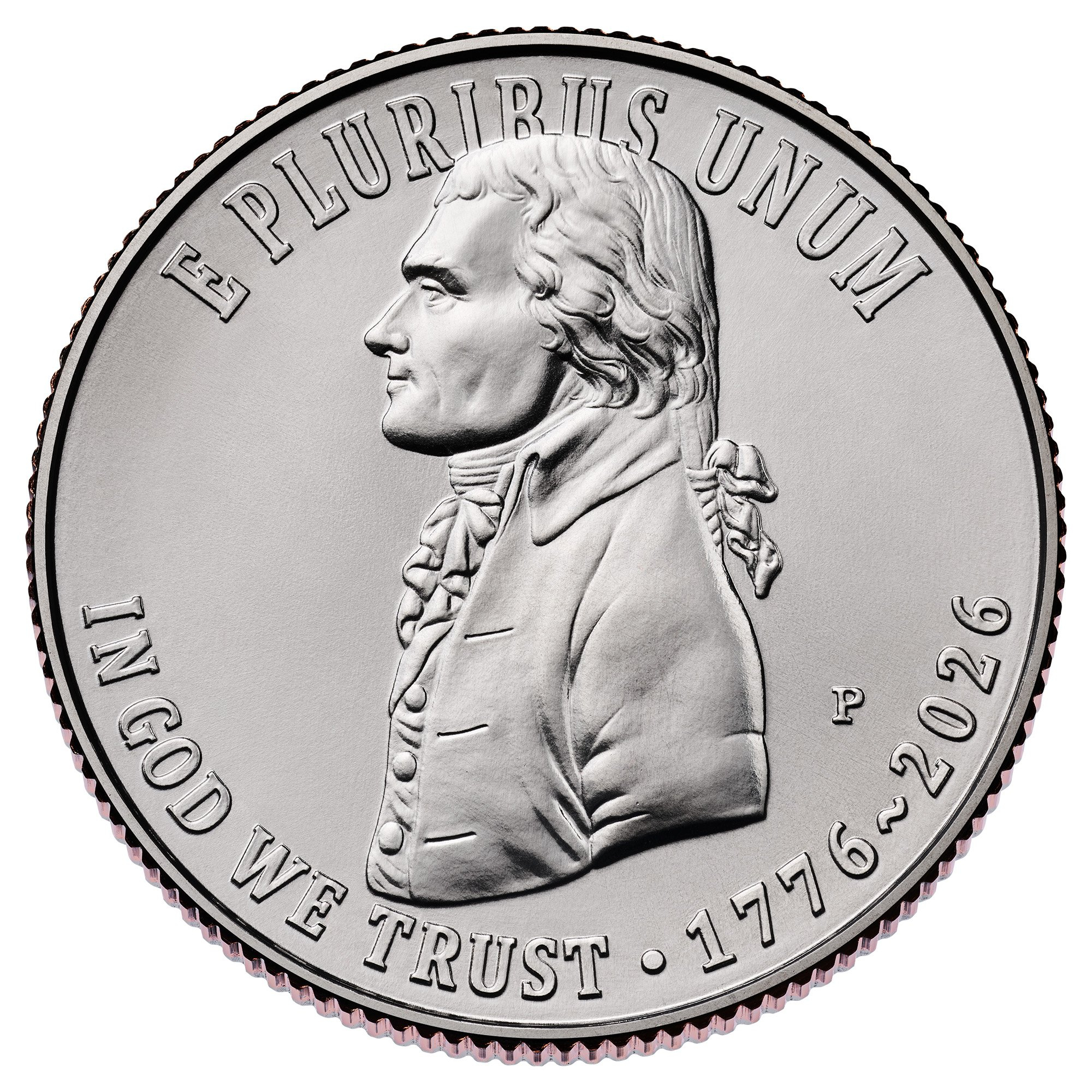
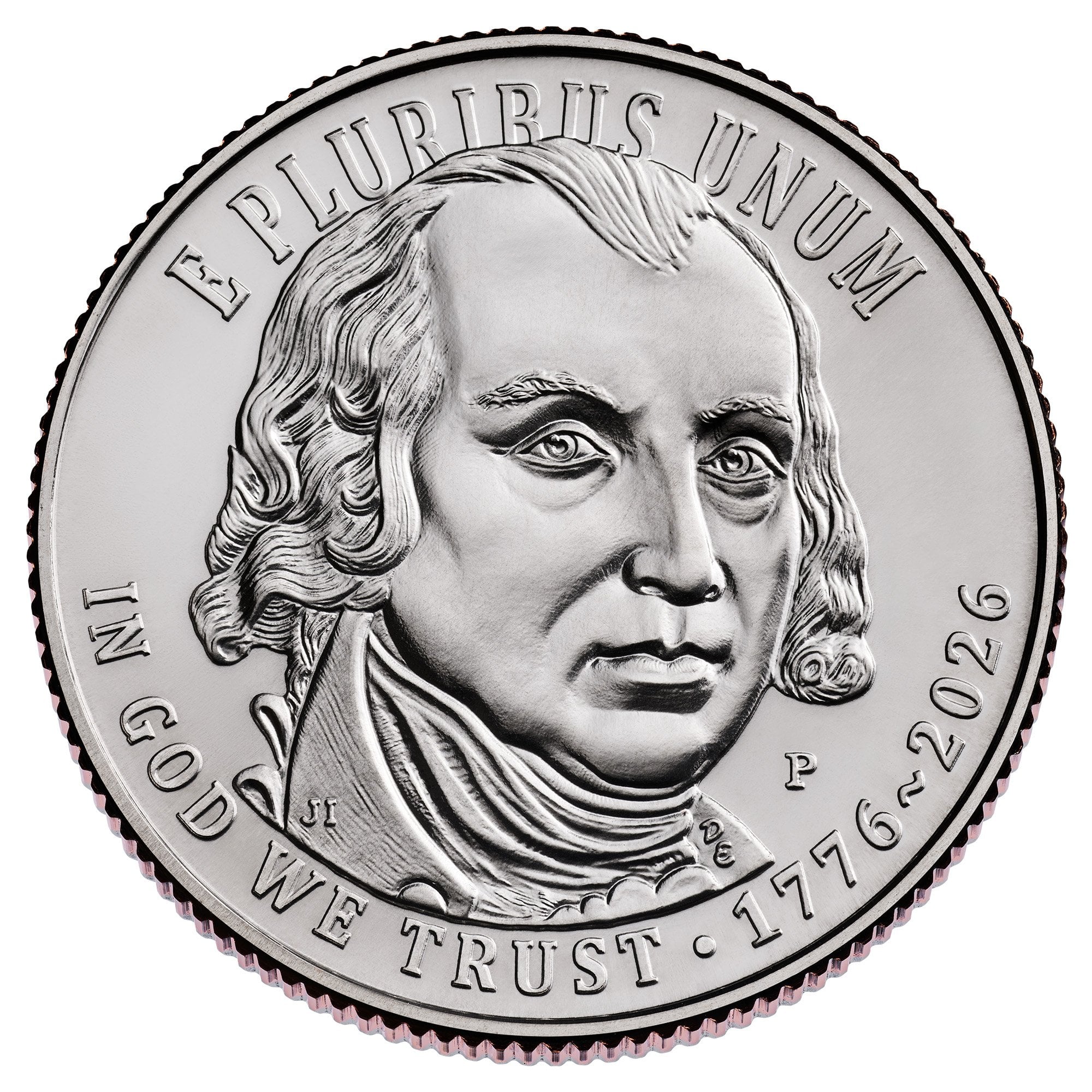
I think this is a disservice to John Adams. The other three (of the the first four) presidents are represented (Jefferson twice).
Now I get to show this again")
Great way to confuse cashiers across America. First we'll remove the penny and force cash sales to be rounded...then we'll change designs on all the other coins so they can't be easily recognized. Maybe we should have added new denomination coins too, a 15¢ coin and maybe a 75¢ coin. With inflationary prices, perhaps a $5 or $10 dollar coin could be introduced as common pocket change. Then after the 250 celebration ends, we could change all the designs again! Quarters can have Youth Sport designs, and all the others can be random AI chosen designs.
A $5 coin might be warranted if it could circulate. I think the Mimt should launch its own Toonie and collaborate with Canada to design a $5 coin. I know it's wishful thinking.
Custom album maker and numismatic photographer.
Need a personalized album made? Design it on the website below and I'll build it for you.
https://www.donahuenumismatics.com/.
They are different sizes for a reason.
All comments reflect the opinion of the author, even when irrefutably accurate.
So nothing ever changes?
Certainly a mixed bag. I am happy with the themes they settled on but as many have noted, a LOT of recycled designs. The dime is the winner—would have loved if that were on a larger coin and with denticles around the edge included to make it look even more like a classic design.
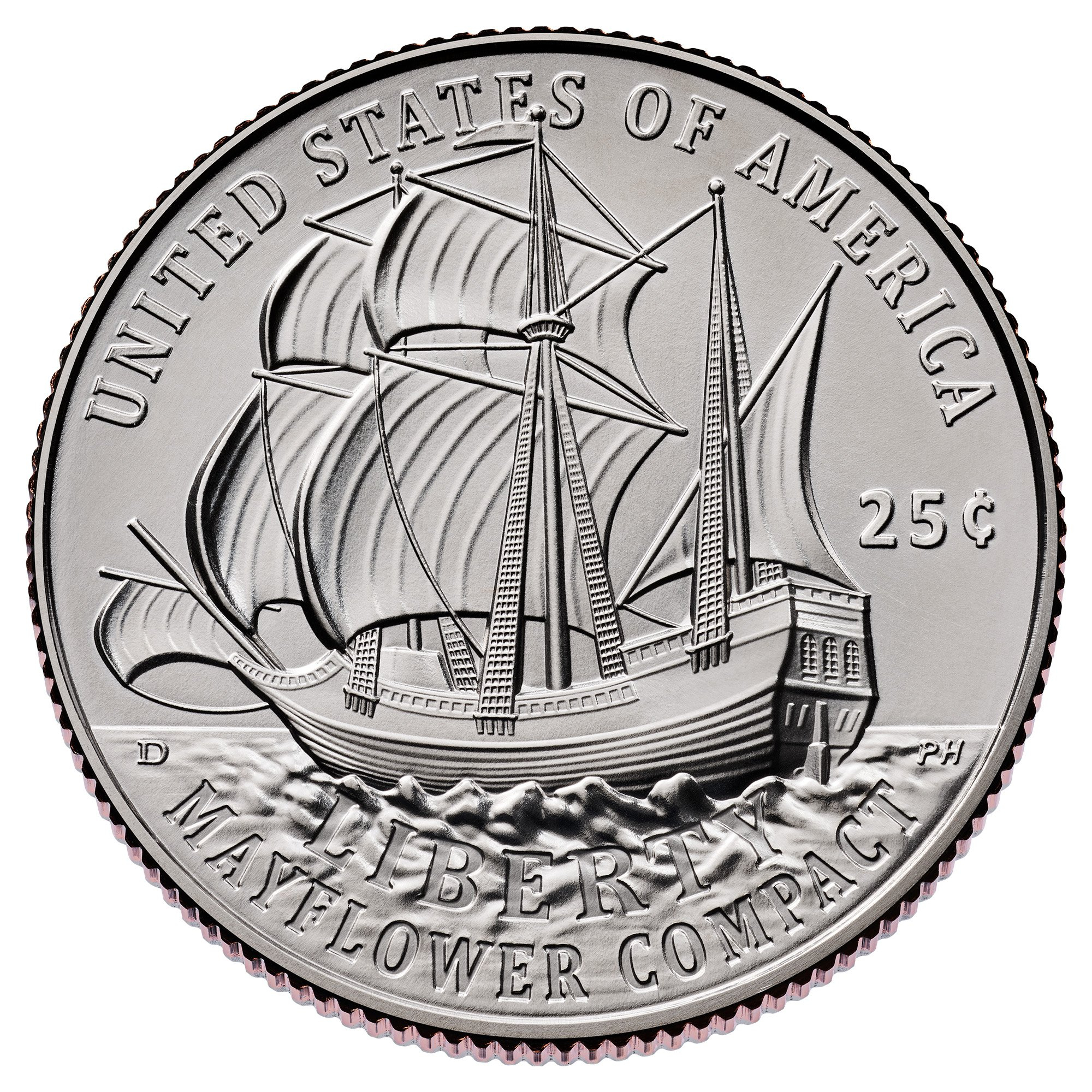
It's on the reverse, between the ship and "Mayflower Compact"
A little disappointed that original art wasn’t used in many cases. Saving money or lacking imagination?
I almost think that originally we were going to get a lot of CCAC's activist designs and they got nixed at the last minute, so they had to recycle designs to stay on schedule.
Thx. I think I see it now. I had looked there thinking they might have tucked it in the waves but I just couldn't see it.
I am pleasantly shocked that we dodged that scenario. I'm still not sure how we managed to avoid it.
It's also nice that the Pilgrims/Mayflower made it into a circulating coin after they were snubbed for a 400th anniversary commemorative coin program in 2020. (The Treasury did issue a gold bullion coin and silver medal, which did not require Congressional approval).
As for recycling designs, it's mostly coin collectors who will notice. Most "civilians" haven't seen those designs before, including ones recycled from the Presidential Dollar series since those didn't really circulate much, if at all.
These are a dramatic improvement over what was offered by the proposed designs.
Disappointment all around. I was looking forward to some of the CCAC designs, and the quarter obverses are just ugly. The dime is the best of the lot but so much verbiage looks like an overly-sponsored NASCAR jacket.
This doesn't excuse laziness. If they wanted to use presidential portraits, they should have started from scratch and executed some designs that had some homogeneity to them such that they looked like they belonged together and weren't a collection of afterthoughts.
Keeper of the VAM Catalog • Professional Coin Imaging • Prime Number Set • World Coins in Early America • British Trade Dollars • Variety Attribution
Reminds me of the opening credits of It's a Wonderful Life.
Here's some of the designs they had to choose from.
This one was a missed opportunity.
Larger images.................................
1776 ~ 2026 Penny
1776 ~ 2026 Nickel
Emerging Liberty Dime
Mayflower Compact Quarter
Revolutionary War Quarter
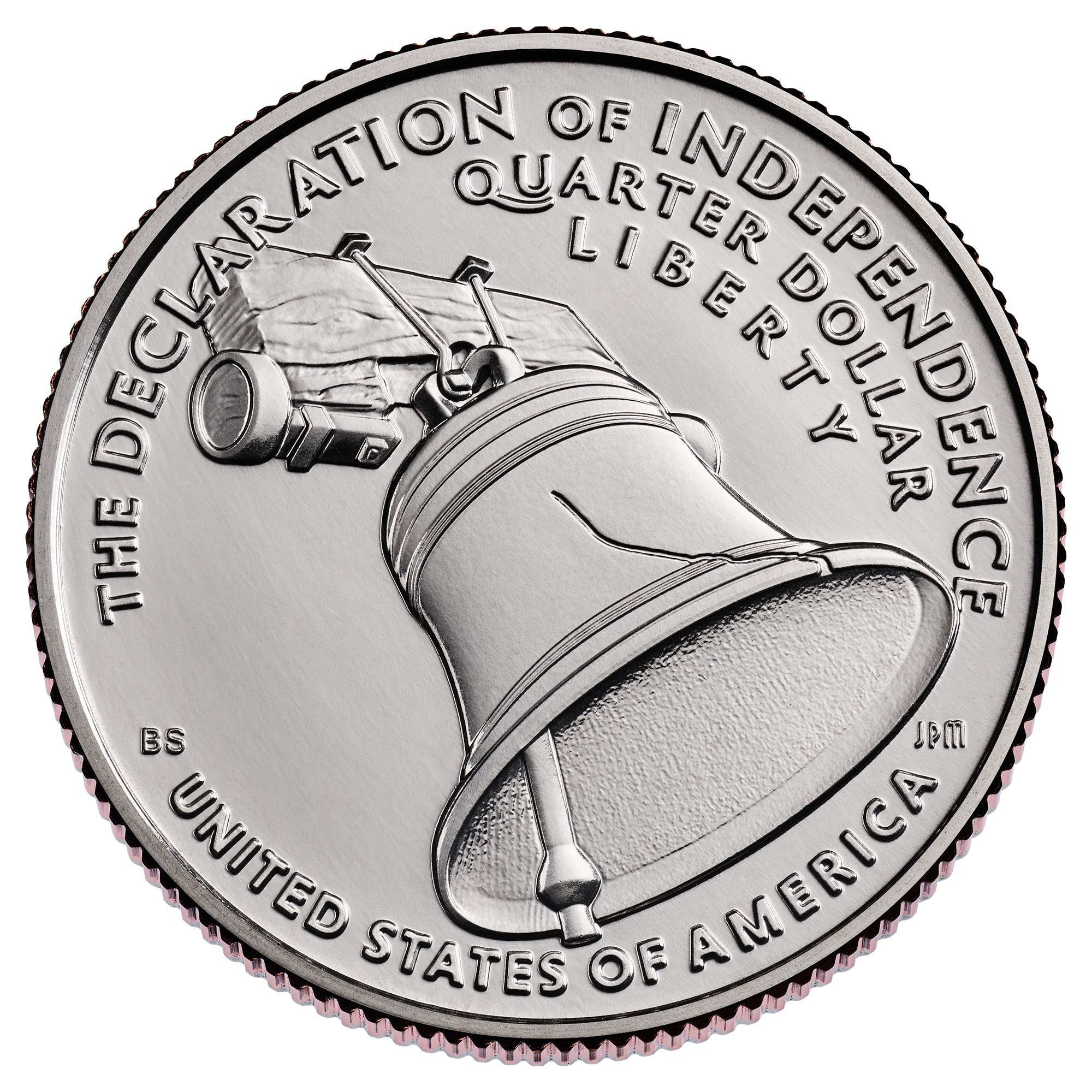
Declaration of Independence Quarter
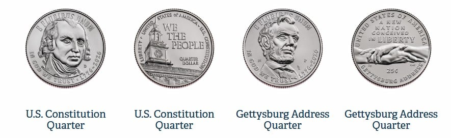
U.S. Constitution Quarter
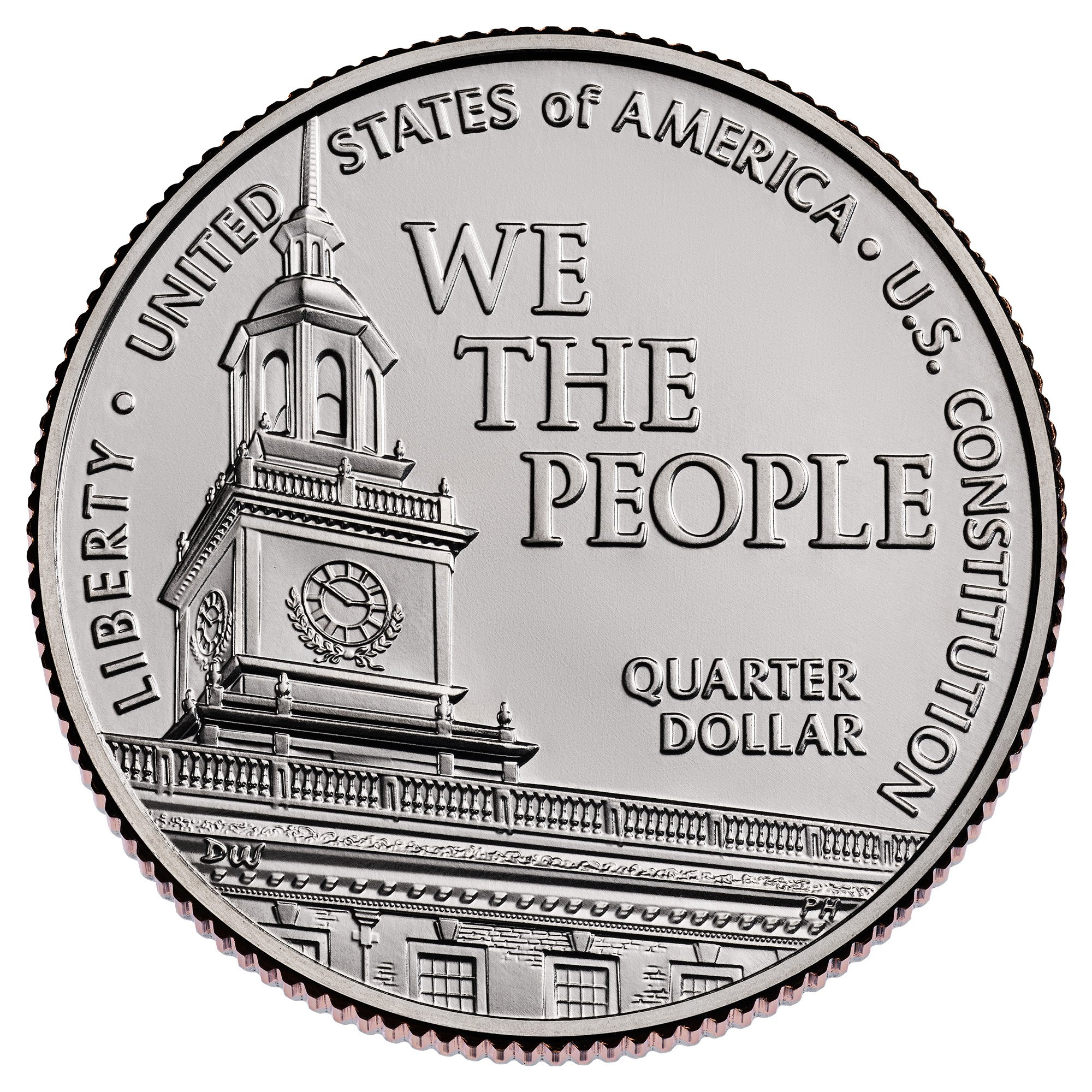
Gettysburg Address Quarter
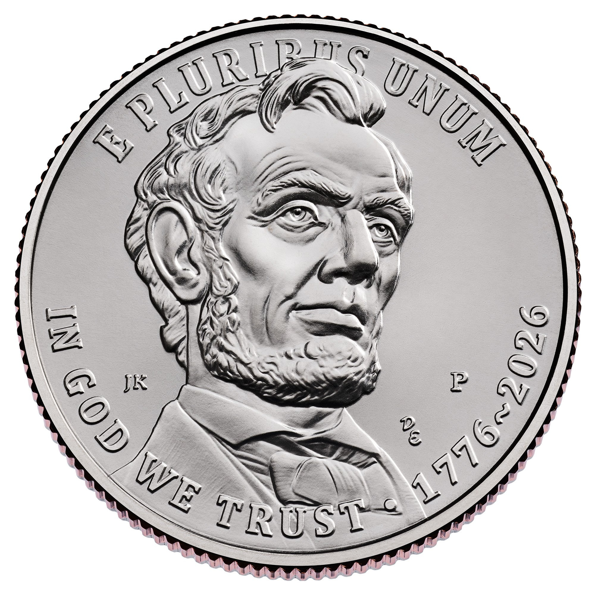
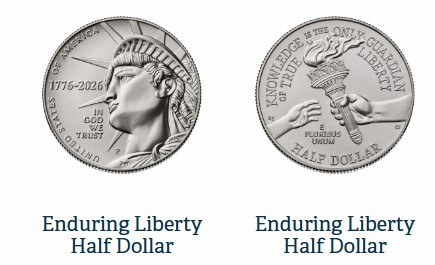
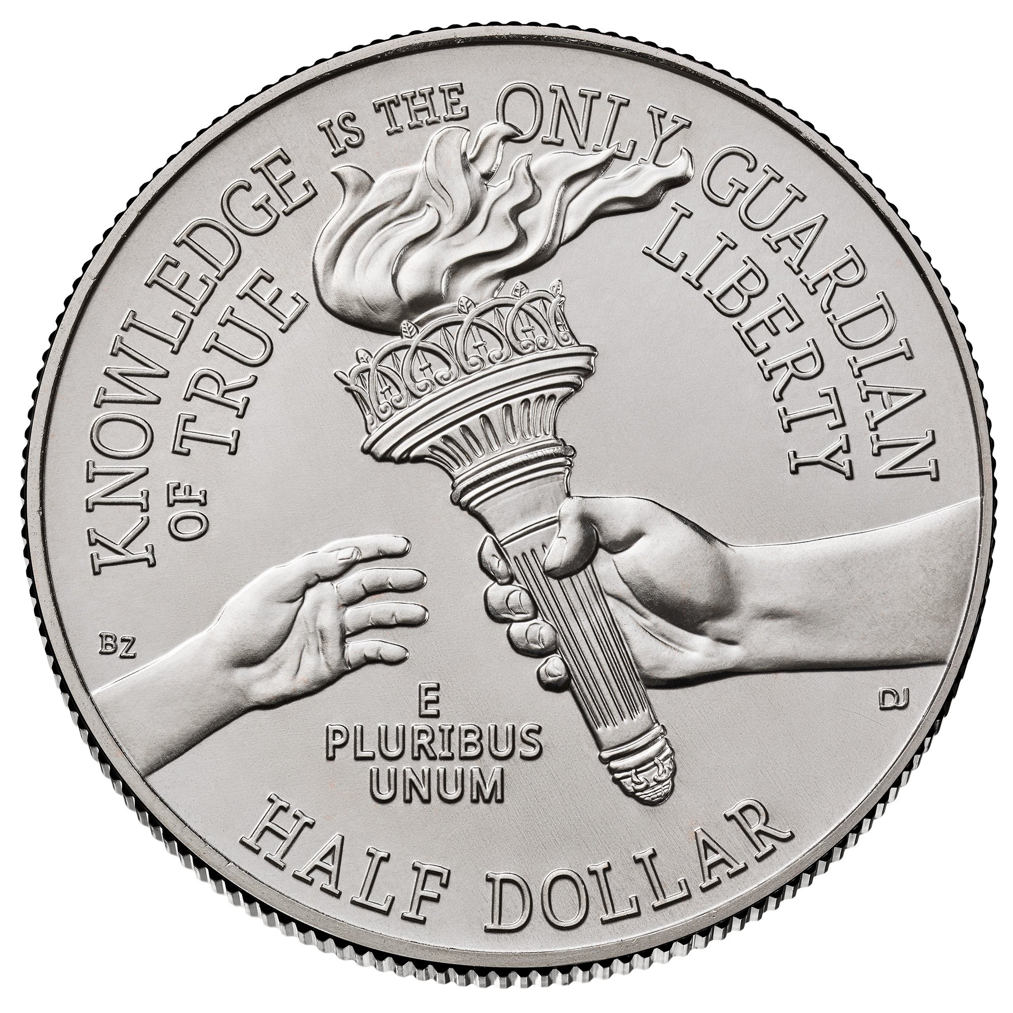
Enduring Liberty Half Dollar
I fixed the dime obverse. Larger portrait, smaller and somewhat more unified typefaces, less busy.
Keeper of the VAM Catalog • Professional Coin Imaging • Prime Number Set • World Coins in Early America • British Trade Dollars • Variety Attribution
I like the Mayflower Compact and Revolutionary War Quarter. The rest not so much.
Love the Emerging Liberty Dime and the Mayflower Compact Quarter. The rest poor artwork, JMO.
Jim
When a man who is honestly mistaken hears the truth, he will either quit being mistaken or cease to be honest....Abraham Lincoln
Patriotism is supporting your country all the time, and your government when it deserves it.....Mark Twain
As a Mayflower descendant, I was disappointed that Congress did not recognize the 400th anniversary of the Mayflower—I guess they thought coinage to mark the Basketball Hall of Fame was more nationally significant that year! Anyway, was glad the mint stepped up that year with gold coinage to mark the event.
Like you, I was pleased there will be a circulating Mayflower issue and the reverse looks nice. However, the obverse could be better—the hat brim looks ridiculously large and the guy looks blind by lacking defined irises in his eyes compared to the better defined eyes of the female pilgrim.
The hat struck me as a little odd, as well.
I think the failure of the 400th anniversary commemorative coin program proposal was due to politics - too many opportunities to offend someone.
The USPS thankfully issued a stamp, and a very nice one, at that. Still, the people pushing the coin and stamp issues had much higher hopes, such as a series of stamps commemorating a range of related subjects. I was involved in the letter-writing campaign and obviously the result was disappointing.
And then this quarter pops up out of nowhere! 🎉
Nice Dime.
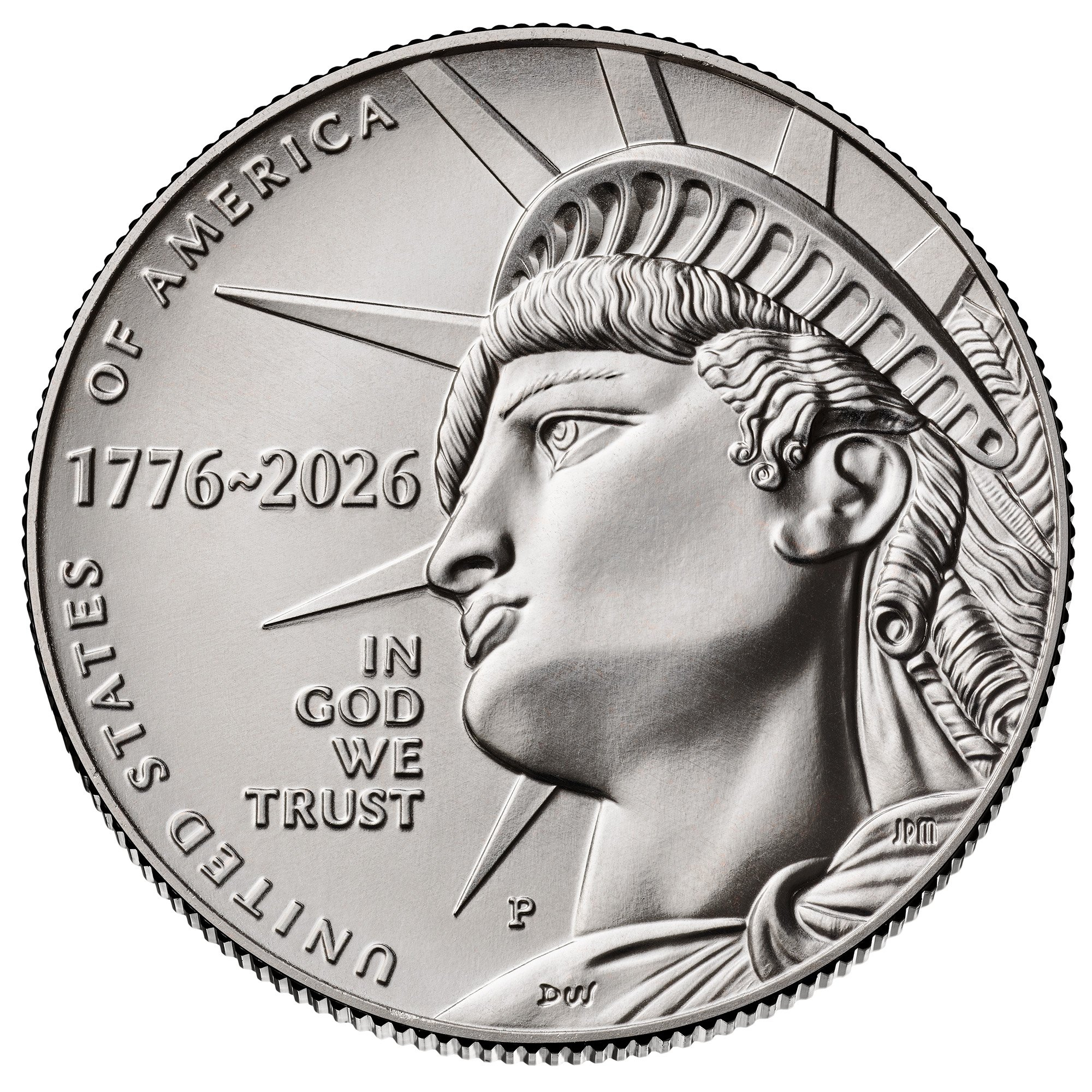
My first impression looking on the phone was that the Statue of Liberty looked like Pinocchio.
Buffalo Nickel Digital Album
Toned Buffalo Date SetDigital Album
https://pcgs.com/setregistry/mysetregistry/album/411385 7070 Registry<
Yeah, nice stamp.
This one as well. If I collected topical stamps, sailing ships would be it.
I believe in 2020 there was a joint us-uk mayflower release. 2 quarter ounce gold at even steeper premiums than usual
The dime looks great, but otherwise, these suck.")
The U.S. mint needs a spank.
God bless all who believe in him. Do unto others what you expect to be done to you. Dubbed a "Committee Secret Agent" by @mr1931S on 7/23/24. Founding member of CU Anti-Troll League since 9/24/24.
I see a lot of hoarding of these coins like in 1976. Can you imagine the enormous amount of new listings on eBay when these new designs are found in change! People will be asking money moon for the first listings!
Perfect time to bring back the 20¢ 🙃
Nothing is as expensive as free money.