1976-D Type 1 and Type 2 Eisenhowers for the Dansco
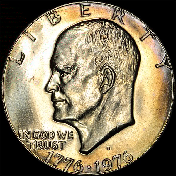
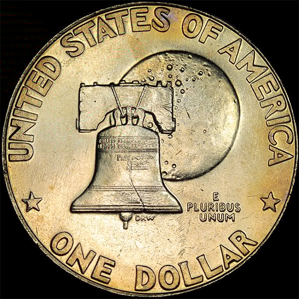
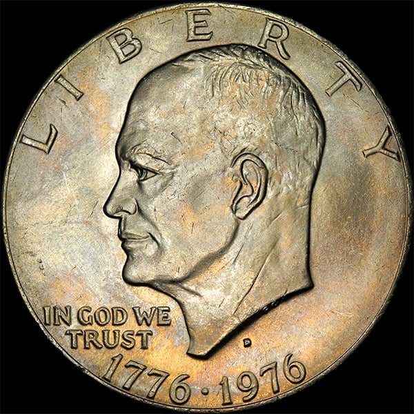
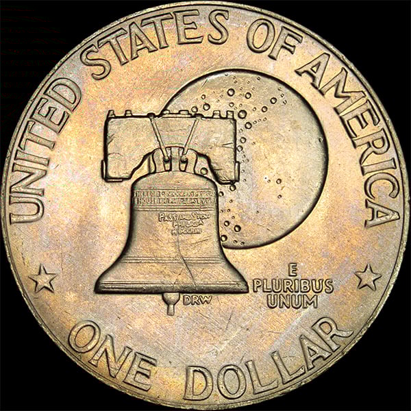
Here are a 1976-D Type 1 and Type 2 Eisenhowers for my Dansco. Notice the size of the lettering on the reverse. The images are by Bob Campbell, and I think he did an excellent job.
4
Here are a 1976-D Type 1 and Type 2 Eisenhowers for my Dansco. Notice the size of the lettering on the reverse. The images are by Bob Campbell, and I think he did an excellent job.
Comments
Nice pictures. The font is what distinguishes from the Type 1 and Type 2.
More useless Bicentennial Ike trivia:
Type 1
Type 2
I always wished the Mint could have pulled off both a high relief obverse and reverse bicentennial coin. Probably would have led to stacking issues.
Nice toners, I like
The type 1 reverse is one of my favorite US coin designs.")
Loved it when they came out, still love it!
How about a P Type 1? That is a hard coin to find in nice condition.
jom
Not an Ike fan ( ) but those look really nice.
"When they can't find anything wrong with you, they create it!"
The alignment of the first "U" in "PLURIBUS" and the first "U" in "UNUM" is another quick check to see if you got a T1 or T2.
Those are great pictures (nice work Bob Campbell).... and thanks to all for giving the PUP's for type 1 and 2... Cheers, RickO