Bought a Long-Term Want! Double-Denomination 11-Center with Laureate Lincoln & Pacman FDR
 airplanenut
Posts: 22,520 ✭✭✭✭✭
airplanenut
Posts: 22,520 ✭✭✭✭✭
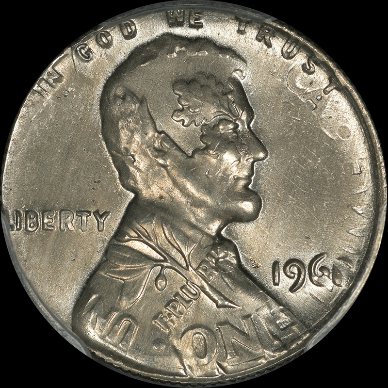
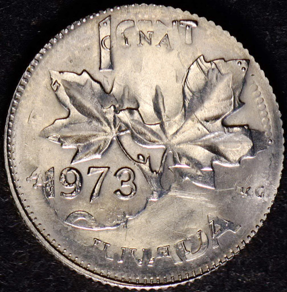
I'm by no means an error collector. I do think many of the more dramatic ones are neat, and I have a handful of inexpensive pieces acquired long ago, but for the most part, errors are out of my purview. Except for one. For years I've wanted a double-denomination error. They're not particularly difficult to find--I could surely point you to a dozen available right now if you give me a few minutes--but some are more dramatic than others, and I wanted the right one.
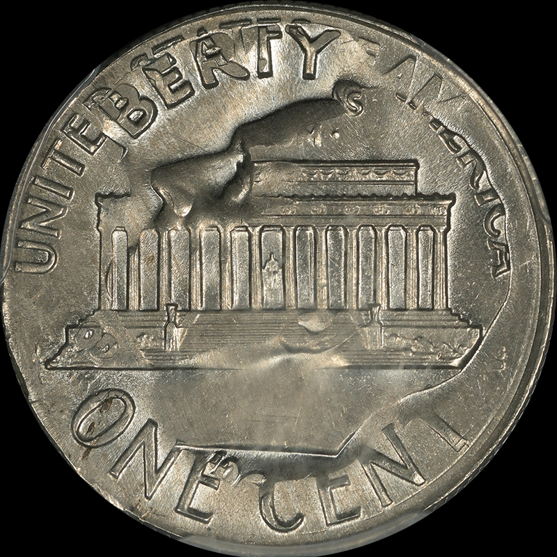
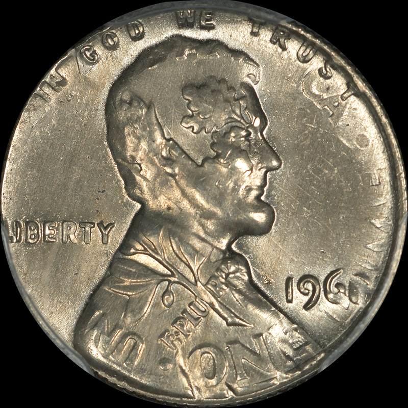
On Monday I took a look through a dealer's new inventory page and found this one. I've seen lots of Lincoln/Roosie examples before, but the ones struck in the 1980s and on tend to have a nearly obliterated undertype, and at best you get an outline of some of the design. Not to mention, I've never been a fan of the more recent Zincoln bust with its lower relief than the copper years. So when I was scrolling, this coin really caught my eye. I hadn't seen a date this early before, and between the higher relief of the coins in general, and I'm guessing lower striking pressure, both busts are very strong, and many details from both coins are strong. I'm amused by Lincoln's wreath (granted it's oak, and the olive branch is on his shoulder, but I digress), and yet more thrilled by Pacman FDR eating the Lincoln Memorial like a sub sandwich. The coin was a bit more than I thought I'd pay for a generic example, but I liked it way more than what I've seen before (which set my price expectations) and for a long-term acquisition, have no problem with ponying up a bit. The only thing the coin is missing is a full date; it has 196X on both sides, but the last digit is missing in both places. I'm hoping I may be able to find a ghost of a digit if I look hard enough under a loupe, or perhaps there's a die marker that can identify the date (one of the aforementioned errors I got nearly 20 years ago is a dateless Lincoln which ANACS graded with a date after someone helped me definitively identify the date with visible die markers), but if not, no big deal. What I like about the coin far outweighs the missing digit.
The lustre on the piece is a bit difficult to photograph since the metal flow from two strikes is funky, but under a light it is a very lustrous coin. I'd say guess the grade, but heck, I have no idea how errors get graded, so the emphasis would really have to be on guess. It's a PCGS MS64.
If you're wondering how they're made, my understanding is it's pretty simple: the undertype gets struck normally, and then the coin somehow doesn't make it out of the hopper. The hopper then gets used for blanks for a different coin, and the full struck coin of one denomination goes through the press of the second denomination. The result can be more or less dramatic based on the orientation of the coin during the second strike, which determines how the two designs play against each other.
Comments
I love it and think the Laureate Lincoln name is genius!
In honor of the memory of Cpl. Michael E. Thompson
Wow, nice fine! It’s always satisfying to wait to find just the right coin. (advise I don’t always follow). Enjoy!
Cool looking coin and a great write up!
Mark Feld* of Heritage Auctions*Unless otherwise noted, my posts here represent my personal opinions.
Nice.
On first glance the cent looked to me like 1968.
If it's not silver that limits the options, and it doesn't look like a 5, 7 or 9.
Looks 1968 to me, too.
Congrats on a nice error!
Dead Cat Waltz Exonumia
"Coin collecting for outcasts..."
Great example, amazing how random events can turn out. The Lincoln bust side would make a great image to hang on the wall.
I'd take a guess at a 1968, looking at the dimes digit in the "C". Absolutely worth a bit more in price.
That is a really nice error coin and great description. It does look like an 8 to me when studying both sides... Cool name you have given it also. I can understand why you purchased this one. Cheers, RickO
That's a spectacular piece!
Great transactions with oih82w8, JasonGaming, Moose1913.
Very cool - much easier to appreciate the details from the photo than in hand. If you come back to the show today, bring it by!
That is a Really neat piece I can see why you wanted it! Great Pick-up.
Very cool coin. Looks like a 1968 for both strikes.
-Paul
I think there's a pretty strong consensus for 1968. If it's labeled as undated I'd try to make the case with PCGS for a correction.
@airplanenut For a still closeted error collector that's a neat pick-up!")
I picked up this Canadian 11 cent some years ago for $20. Little did I know there was going to be an interesting history in the making.
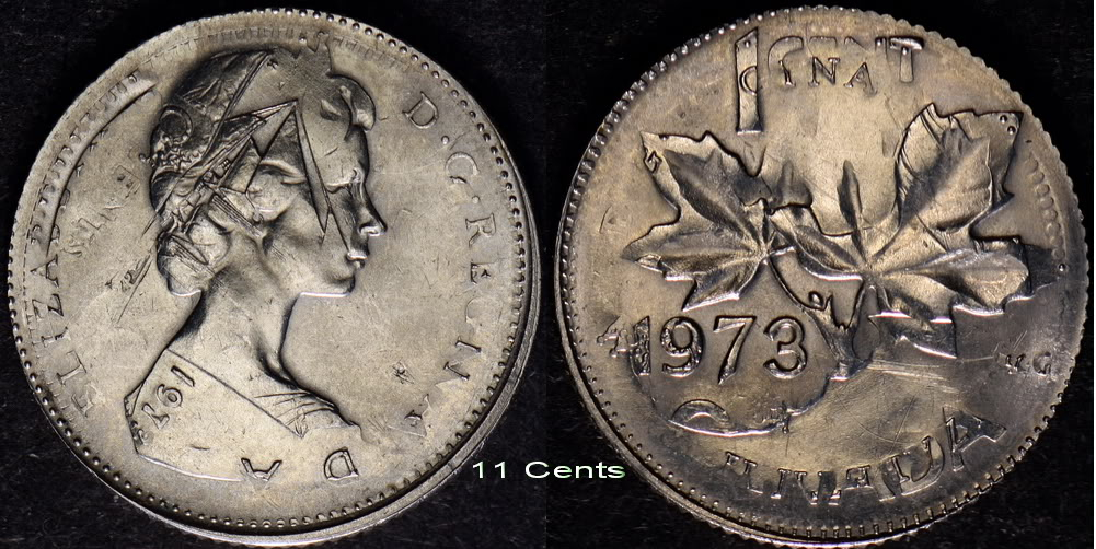
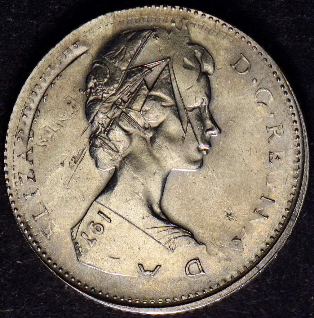
I asked the fellow who runs the error section in a Canadian publication for an explanation of how this could become an 11 cent coin. He did not even send a courtesy response, despite a reminder 4 weeks later. About a year later (at the time I did subscribe to the publication) my pictures were published and created a bit of attention together with the article that went with it. "only 3/4 of a page".
However, the error man did not have my permission any longer to publish my pictures for profit.. Instead, he lifted them from this site here.
Yes, from our hosts Forum, as I had also posted the images here to show. Our host confirmed that they could not and did not give permission for this fellow to copy and use my images. The error man simply stole them and used these for-profit (plagiarism). Subsequently, we settled just on "the courthouse steps".
So here is the subject 11 cent Canadian dime+1 cent with a history.
Very nice example indeed.
That is the coolest one I've ever seen. It's kinda confusing, so it was a dime first obviously because of the planchet type. Then struck as a Cent? It almost looks the other way around...
Great example - I really like that!!!!!!!!
"When they can't find anything wrong with you, they create it!"
Yep--this piece was fully struck as a dime, then struck like a cent blank. The design gets confusing because the fields of the cent dies nearly obliterate the dime's features in those areas, but where the cent has relief, the cent design isn't completely struck up, leaving the dime's design elements much stronger. If you look at a more recent example (lower relief designs, higher striking pressure) you'll see that much more of the dime's design gets obliterated. That it didn't happen here was a huge draw to me.
Wild!
A fun and distinctive coin to be in one’s collection. 👍👍
"She comes out of the sun in a silk dress,
running like a water color in the rain...."
Great looking coin! Blowing up the date on my phone, it doesn’t appear to be a discernable 8 or any other numeral for that matter.
Congrats on your purchase. Very nice example of the 11 cents.
It's not just what you can see, it's what you can't see. If you run down the other potential numbers, none seem possible.
Nice one! My guess is also 1968.
If someone who is good at doing overlays were to do them for 1965 through 1969, I am pretty sure 1968 is the only match.
I took a quick look just now to refresh my memory and none of those other dates seem like a possibility.
In theory, since 1964 dimes were struck into the clad era it could be an offmetal 1964, but that date doesn't match, either.
All I'm left with is 1968.
Looking more carefully and seeing the replies, I'm thinking along similar lines. Once I get a moment I'm hoping to make a few overlays to see what lines up.
I took a closer look here. I didn't see it at first (before your comment), but I definitely agree what looks like part of an 8 is a ghost in there.
Judging by the way the obverse lettering butts against the rim, I'd say that 1968 is a real solid bet.
Pete