1921 Peace Dollar "antique" toning
 Peace_dollar88
Posts: 1,233 ✭✭✭✭✭
Peace_dollar88
Posts: 1,233 ✭✭✭✭✭
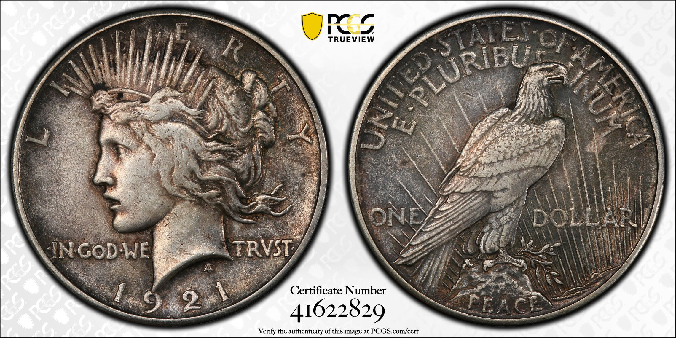
I know i overpaid for this one. I couldnt help myself with the antique toning. Who else likes this look?
37
Comments
I really like it, and I’m a sucker for 1921s.")
Yes, I like the Circam® look! The definition it gives to the eagle feathers is great.
Nice coin!
Cool look!!
Has a pewter hue to it...
"Bongo hurtles along the rain soaked highway of life on underinflated bald retread tires."
~Wayne
I like that look
How much?!
I generally like toning that highlights a coin's design, and that does. Very nice!
I like the look, I do not think it one I would "overpay" for.
My Collection of Old Holders
Never a slave to one plastic brand will I ever be.
For me that is the best look
Al
Booming luster brings big premium.
I give away money. I collect money.
I don’t love money . I do love the Lord God.
Nice...I like the look also! I had a really nice Peace dollar (I think it was a 22 or 23) with nice cameo like yours and I sold it a while ago...sort of wish I had not 'cause the detail was really accentuated by the toning. Thanks for posting!
K
Exactly my feelings.
Sometimes, it’s better to be LUCKY than good. 🍀 🍺👍
My Full Walker Registry Set (1916-1947):
https://www.ngccoin.com/registry/competitive-sets/16292/
I love CirCam!
USAF (Ret) 1974 - 1994 - The inherent vice of capitalism is the unequal sharing of blessings; the inherent virtue of socialism is the equal sharing of miseries. Remembering RickO, a brother in arms.
Stunning "peace", love it.
This is how I like all my circ material to look.
Nice one!
All she needs is a quick dip to be beautiful. Hope you stole it because of the nasty. Congrats!
The whole worlds off its rocker, buy Gold™.
BOOMIN!™
Wooooha! Did someone just say it's officially "TACO™" Tuesday????
Great looking Peace $.")
Nice detail on that Peace dollar, looks solid for the grade. Cheers, RickO
Definitely I like that look! Without disclosing the amount you paid for it I have no opinion on whether you overpaid or not. If you feel like you've overpaid then you have the best idea of that. Either way it seems to be very attractive to lots of us.")
I might be the only one, but I don't find this coin attractive. The spotting/stains on the reverse are bothersome and the lack of any discernible patina on the highpoints of the coin make me think it was previously "improved". I realize I am a jerk with this opinion, but you wanted feedback so I thought it might be okay to write.
In honor of the memory of Cpl. Michael E. Thompson
I likey
nice!
It is nice, not really my cup of tea but I can certainly see the appeal.
If this coin were dipped it would be a dull unnaturally white AUXF(I would have guessed AU). The character it has would be stripped away.
Collector, occasional seller
I think this is a nice coin-- the natural circ appearance gives a sense of authenticity and adds to the appeal IMO.
Idk, there may be ugly hiding under the toning. I've found that if I submerge a toner in acetone and shine a light on it, i can see what's under the toning. If it's ugly i leave it be, if it's beautiful i consider a dip.
I'll buy it from you...
That look is most appealing to me! I like it!
My OmniCoin Collection
My BankNoteBank Collection
Tom, formerly in Albuquerque, NM.
id be happy with that in my collection as well
That's a great look.