Options
Can we have a lesson on AT vs NT vs QT?
 yspsales
Posts: 2,670 ✭✭✭✭✭
yspsales
Posts: 2,670 ✭✭✭✭✭
So I am trying to learn the basics of Natural vs artificial vs questionable toning.
I tend to look from the rim to inside at the pattern of color... Then look closer inside the denticles and devices vs on the raised letters and date.
My limited knowledge makes me think it is NT.
Obviously NGC thought it was okay.
Would love opinions on the toning of the coin and be specific on how your process of determining AT vs NT
Please post images of coins so we can all benefit.


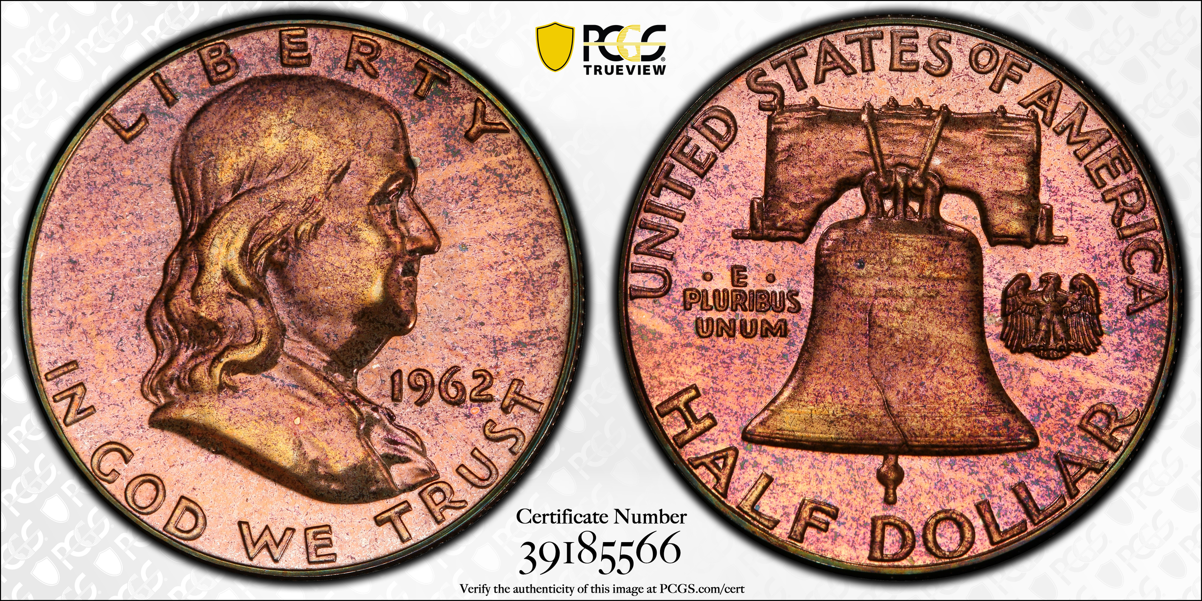
Some examples below of raw coins I saved from proof sets or albums... but would make me question AT (Franklin and Jeff)

![]()
BST: KindaNewish (3/21/21), WQuarterFreddie (3/30/21), Meltdown (4/6/21), DBSTrader2 (5/5/21) AKA- unclemonkey on Blow Out
0
Comments
A lot of those canada sets are naturally artificially toned. Canada mint used polymers that toned coins that way. It's one of the reasons I think AT vs NT is a very artificial line. That quarter doesn't tone that way if the Canada mint used archival materials in their packaging
All comments reflect the opinion of the author, even when irrefutably accurate.
All your examples look artificial to me. Looks like some got more Taco Bell sauce than others. RGDS!
The whole worlds off its rocker, buy Gold™.
BOOMIN!™
Wooooha! Did someone just say it's officially "TACO™" Tuesday????
Retiring at 55, what day is today?
I stay away from toned coins completely. Not only do you have to decide whether toning is artificial but then you have to determine the totally arbitrary premium you need to attach to it. I guess there's money to be made on them but also money to lose.
I'm always suspicious of strong purple on business strike coins.
AT can be subdivided into 2 categories:
Intentional AT and Unintentional AT
We consider most unintentional AT to be MA and most intentional AT to be a details grade.
Unintentional AT can be from approved storage methods such as album, envelope or even bag toning. Hence the confusion when a nice coin that was stored in an envelope or in a coin drawer can sometimes be called NT and sometimes AT. Depends on so many factors. Maybe where the envelope was stored.... in a sock drawer or if the coin drawer was in the basement for years.
It is ultimately a judgement depending on how the toning looks not as much on how it got there.
It helps to see other, unslabbed coins and how they're stored. I've bought a few Whitman albums of silver Roosevelts, so I know that coin is consistent with their appearance, and even that the 1954D in particular has a lot of examples toned that way.
Naturally I love the Canadian quarter, but I was questioning the small untoned circular spots interrupting the toning. For one, they suppress eye appeal, and I also wonder if they're an indication of some foul play. What @jmlanzaf said is a good place for me to look closer. Good topic.
I think better terms are market acceptable or not.
It is impossible to tell if market acceptable toning is intentional or not.
I can "make" coins that look like all of your examples given time.
It is easy to spot most coins that were toned overnight.
If someone wants to spend years doing it that is a different story.
I could post a hundred examples from Ebay right now that could be "NT" or intentionally toned, in top tier holders.
Red and blue is pretty easily done.
Green is a lot harder.
Experimenting on your own will give you insight as well as spending time here.
When I bought this coin raw 40 years ago it was blast white. I lost it and found it 5 years ago stuffed away in an old college notebook. It looks artificially toned but the toning was unintentional.
That might have been artificially frosted before you bought it, which protected part of it from toning.
Keeper of the VAM Catalog • Professional Coin Imaging • Prime Number Set • World Coins in Early America • British Trade Dollars • Variety Attribution
Or he could have eaten french fries before sticking it in the notebook.
Whatever happened to that neon toned ASE that was in PCGS plastic that was posted here years ago?
This bagged the first time I submitted it to PCGS for QT. It straight graded the second time.


Here’s my amateur AT experiment results from when I was first learning how to tell AT from NT back in about 2005 or so. I always just copy and paste the following when the subject comes up:
Here’s some artificially toned ones I made several years ago. I used to make “how to detect artificial toning” displays with them when I was in the Charlotte Coin Club. The second one is where I took a picture of the same coin every few seconds as it went through the artificial toning process. As the oxidation toning layer gets thicker it goes through that particular progression of color if the toning is done with just heat and no chemicals. That coin was heated evenly and that’s why it is uniformly toned. If the heating was done unevenly you’d end up with bands of the different colors, but it would still be the same progression. That purplish-red color in one of them is usually the give-away that it is artificial and that heat was used. That purplish-red is less common on naturally toned coins, but very common on artificial ones done quickly. The other pictures involve combinations of heat and chemicals, the first one is where I was going after green, which is usually not on artificially toned coins, but rarely it is. On all of these, the biggest giveaway is that the color layer goes right up and over the letters and other raised designs on the coins without any interruption. On coins that naturally tone slowly over time, there is usually a small un-toned outline around the raised letters and designs where the microscopic metal flow lines around these prevents the toning from happening.
Mr_Spud
Keeper of the VAM Catalog • Professional Coin Imaging • Prime Number Set • World Coins in Early America • British Trade Dollars • Variety Attribution
Very interesting! I found the outline around the lettering in this blue toned Indian to be very distinct. Would that indicate to you that this coin toned naturally?
The toning doesn’t go right up and over the letters, which is a good sign. That’s not really what I was describing though. Sometimes the letters are colored similar to the surrounding coin with just a break in toning right around the letter. Some call it “pull away effect”. That’s what I meant, but just as good if the letters aren’t toned like the fields around them. Fast toning goes right up and over the letters without changing much.
Mr_Spud
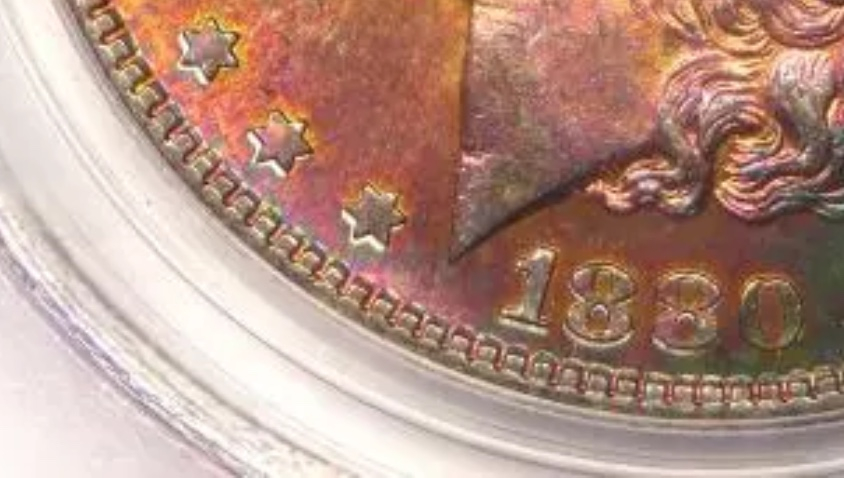
Here is an example of that “pull away” effect off of a random picture I just found on eBay. The untoned area around the bottom of the stars stars and bottom of date are a sign the toning probably happened slowly over time and this can help tell NT from AT sometimes
Mr_Spud
The Jefferson nickles in Proof from the early 60's many times have colorful toning. PCGS normally sees this as natural. I believe they toned that way due to the packaging from the mint
Pull away toning on my 1829 Bust Half
I tend to think a little like JRocco. for me, purple, red purple or almost all blue doesn't sit right with me. an important thing in figuring out the AT/NT debate just comes from experience, and one of the biggest experience factors is in knowing what "look" certain storage methods or mediums impart on coins and different alloys.
canvas bags have a distinctive look that they gave Morgan Dollars. paper rolls tone coins a certain way. the cardboard/mylar staple together flips tone coins a certain way. Capital Plastic holders tone coins a certain way. the late 1950's-early 1960's Mint Proof packaging cause some of the coins to tone a certain way. some of the coins from the Canadian Mint were stored in those felt lined boxes that tone coins a certain way. Blue Whitman, Littleton, Wayte Raymond, Dansco, etc. all made albums that tone coins in specific, identifiable ways.
there is more, but you should get the idea. it isn't easy to figure out and it is easy to make mistakes. color progression has a recognized pattern but that's hard to figure out all the time. all this is why the people doing AT are able to succeed. the only way not to make a mistake is to morph into RickO and go brilliant!!! the thing is, then the "dipping" discussion gets started.
To the OP: a lot of 1961 and 1962 proof Jeffersons have that look. As I recall, PCGS wouldn't slab them for a few years, but eventually decided the toning was a byproduct of the mint packaging and went back to straight grading them.
Someone can correct me if I'm wrong about that.
I did a lot of experimentation 18-20 years ago. Because of those experiments, I learned that tarnish, being a natural process (surface degradation due to chemical reactions), can also be artificially induced - both accidentally and purposely. @keets has a great summary above about the myriad of possibilities. I avoid tarnished coins completely... not because I am worried about AT/NT...but because I like the as minted look without the environmental damage. Cheers, RickO