At any rate, here’s one I bought when I was dealer. The dealer who sold it to me sent it in twice to get a higher grade. It flunked both times and came back as an MS-64. The Greysheet has these down to well under $200 which really too cheap.
Retired dealer and avid collector of U.S. type coins, 19th century presidential campaign medalets and selected medals. In recent years I have been working on a set of British coins - at least one coin from each king or queen who issued pieces that are collectible. I am also collecting at least one coin for each Roman emperor from Julius Caesar to ... ?
Yes, the term "Eye Appealing Monroe" is comparable to "Jumbo Shrimp" and "Fun Run".
Those are better than average Monroes, because the average is so horrible. But let's raise the bar to "average MS65 Oregon" and see if we can meet it, or at least come close
This is a tough issue to find eye-appealing....I bought this from TomB or his partner many years ago at Parsippany
This one is light lavender, not as dark as the photo
Personally I think the obverse design is "mehhh" AT BEST. I REALLY like the reverse design. Needless to say, it is redolent of the US viewpoint of South America in the 1920's.
It just makes me wonder if the chemistry of the coins keeps them from toning attractively. Although it is clear that the unpopularity of the coin contributed to the plethora of used and abused Monroe half dollars out there!
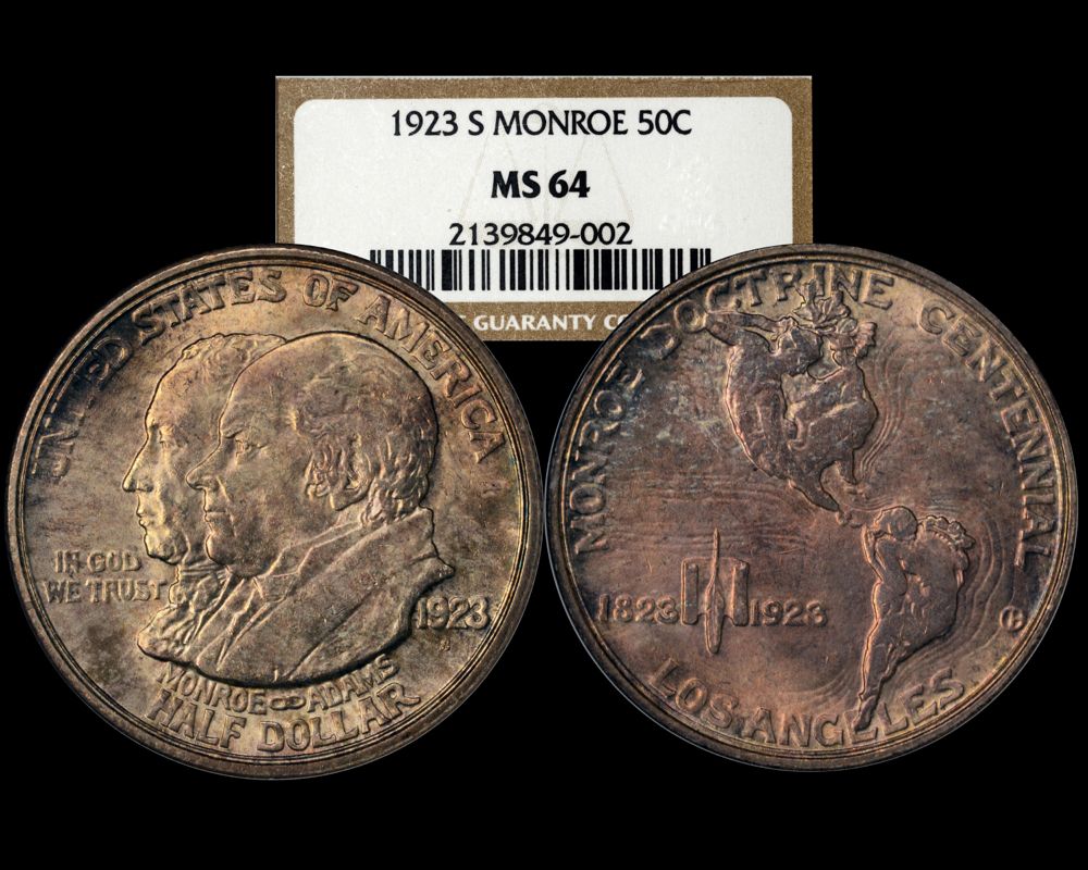
Ok, just got this one back from the slab factory, PCGS MS64 - probably the best one I have "made". While I would like to call this one "eye appealing", I think "not ugly" is the best I can do
OK, for the large but silent group that prefers untoned, lustrous coins for their 20th Century silver coins, here’s mine. Yes, I understand it was dipped, but apparently gently enough that CAC gave it their sticker. I bought it as a 65, and thought it was nice enough that I sent it back to PCGS for Reconsideration. It got upgraded with a “+”, and since the cert number remained unchanged, CAC automatically reapplied their sticker for $3. https://images.pcgs.com/TrueView/37107845_Medium.jpg
A day without fine wine and working on your coin collection is like a day without sunshine!!!
Nice one - I suspect the dip improved the eye appeal of the coin without destroying the luster - kind of like what happened with the 1921 Walker in the PCGS Restoration video.
@winesteven said:
OK, for the large but silent group that prefers untoned, lustrous coins for their 20th Century silver coins, here’s mine. Yes, I understand it was dipped, but apparently gently enough that CAC gave it their sticker. I bought it as a 65, and thought it was nice enough that I sent it back to PCGS for Reconsideration. It got upgraded with a “+”, and since the cert number remained unchanged, CAC automatically reapplied their sticker for $3. https://images.pcgs.com/TrueView/37107845_Medium.jpg
I would keep an eye on it as the reverse streaking seems like it's dip residue that's turning as it wasn't properly neutralized afterwards.
The light golden beige on the obverse in the field under IGWT also looks like mild dip residue not toning.
To Err Is Human.... To Collect Err's Is Just Too Much Darn Tootin Fun!
Bump for those who are buying into the "Decline in Classic Commems" thread. It is quality issues like this one that clearly de-bunk the myths surrounding these coins.
 Connecticoin
Posts: 12,570 ✭✭✭✭✭
Connecticoin
Posts: 12,570 ✭✭✭✭✭
Comments
65 CAC in a rattler.
An eye appealing Monroe commemorative?
Some people would call that an Oxymoron.
At any rate, here’s one I bought when I was dealer. The dealer who sold it to me sent it in twice to get a higher grade. It flunked both times and came back as an MS-64. The Greysheet has these down to well under $200 which really too cheap.
Yes, the term "Eye Appealing Monroe" is comparable to "Jumbo Shrimp" and "Fun Run".
Those are better than average Monroes, because the average is so horrible. But let's raise the bar to "average MS65 Oregon" and see if we can meet it, or at least come close
This used to be mine. Sold it off with the rest of my first early commem set. One of the nicer MS63's I have come across.
This is a tough issue to find eye-appealing....I bought this from TomB or his partner many years ago at Parsippany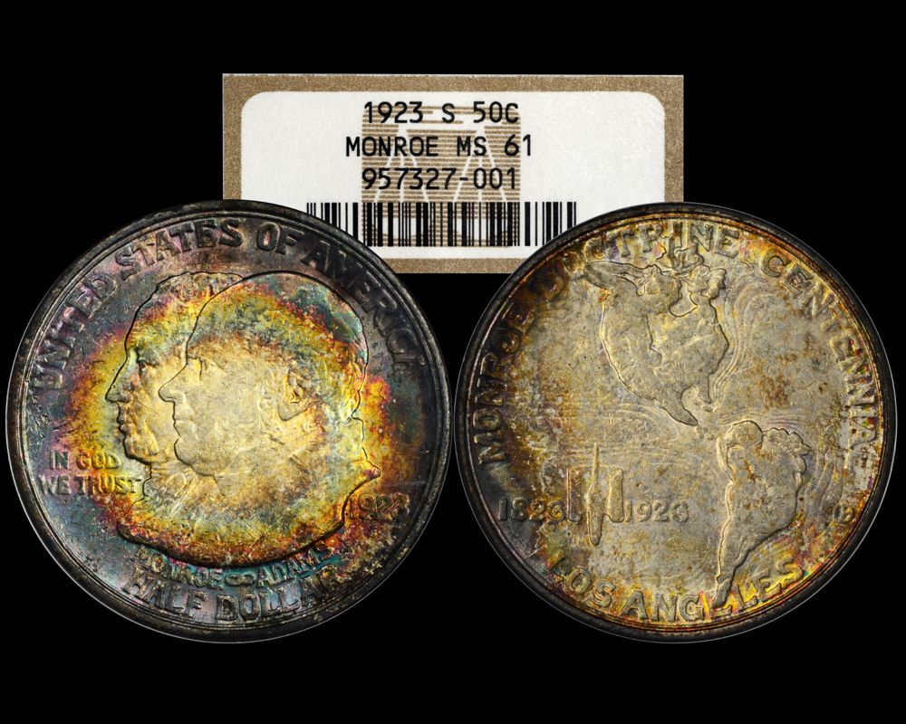
This one is light lavender, not as dark as the photo
Commems and Early Type
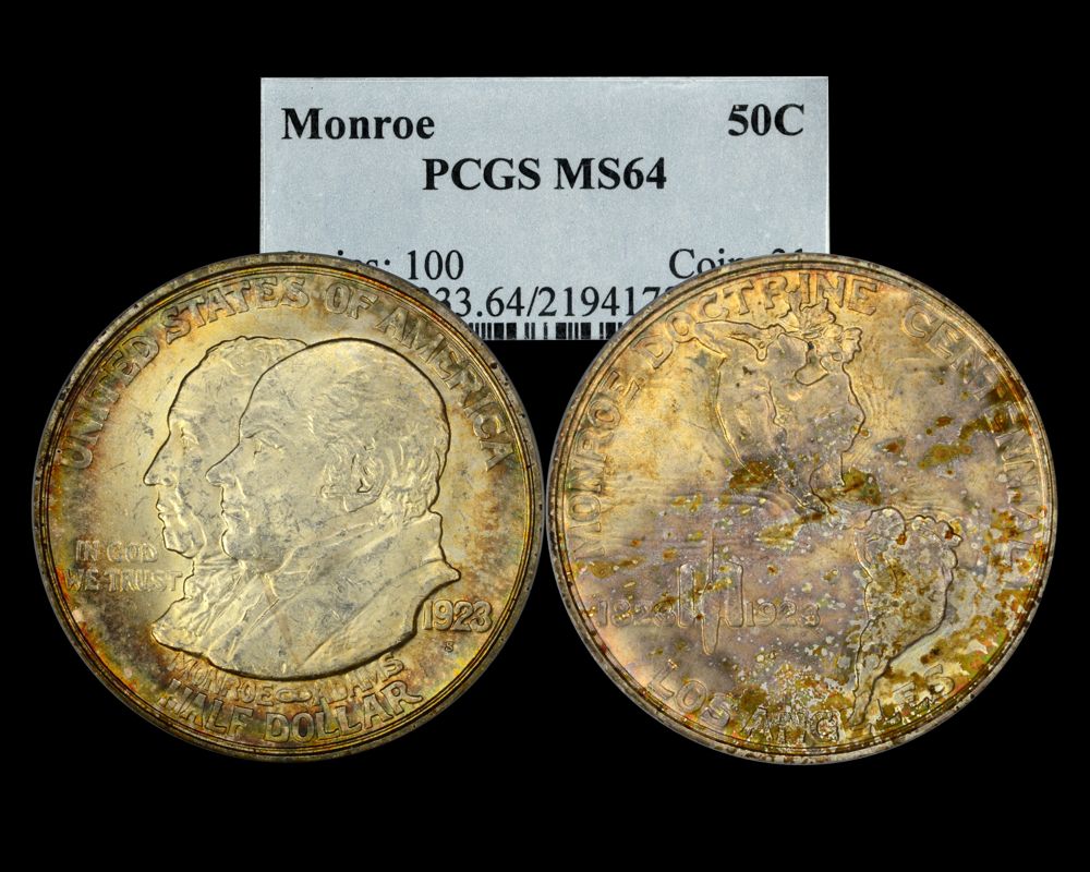
The purple reverse 64 is the best one so far!
P65 CAC
Joseph J. Singleton - First Superintendent of the U.S. Branch Mint in Dahlonega Georgia
Findley Ridge Collection
About Findley Ridge
That one isn't bad.
OGH PCGS 63

The Bowers Book on commems says you won't find an eye appealing one... so just buy one and move on!
My current "Box of 20"
No such thing, as it's an unattractive design. I'll play, though. PCGS 63.
Keeper of the VAM Catalog • Professional Coin Imaging • Prime Number Set • World Coins in Early America • British Trade Dollars
Most Monroes are usually been dipped or beat up. This is one is a most appealing piece.
Overland Trail Collection Showcase
Dahlonega Type Set-2008 PCGS Best Exhibited Set
Nice one, mrcommem. Probably one in a thousand on the eye appeal scale for a Monroe!
I actually made a decent looking PCGS 64 Monroe a while back but sold it thinking I would find a better one. Boy was I wrong!

OT except the “Monroe”.")

https://en.numista.com/catalogue/pieces38936.html
Great looking halves folks!
Successful transactions with-Boosibri,lkeigwin,TomB,Broadstruck,coinsarefun,Type2,jom,ProfLiz, UltraHighRelief,Barndog,EXOJUNKIE,ldhair,fivecents,paesan,Crusty...
Personally I think the obverse design is "mehhh" AT BEST. I REALLY like the reverse design. Needless to say, it is redolent of the US viewpoint of South America in the 1920's.
U.S. Type Set
It just makes me wonder if the chemistry of the coins keeps them from toning attractively. Although it is clear that the unpopularity of the coin contributed to the plethora of used and abused Monroe half dollars out there!
That is one attractive MS63!
Ok, here is the Holy Grail coin, the lone PCGS MS67+, none graded higher. I will concede that this coin IS eye-appealing
Nice find. This is currently in the J&L Registry Set, a very nice set with lots of top pops:
Outstanding set - consistently more eye-appealing than any of the #1 sets. For the 12% not there, is the owner working on crossing his NGC set?
Ok, just got this one back from the slab factory, PCGS MS64 - probably the best one I have "made". While I would like to call this one "eye appealing", I think "not ugly" is the best I can do
It's hard to beat for a toned Monroe as I held that in hand at a show years ago when it was one of the very few top pop MS66's.
That is one pretty coin!
OK, for the large but silent group that prefers untoned, lustrous coins for their 20th Century silver coins, here’s mine. Yes, I understand it was dipped, but apparently gently enough that CAC gave it their sticker. I bought it as a 65, and thought it was nice enough that I sent it back to PCGS for Reconsideration. It got upgraded with a “+”, and since the cert number remained unchanged, CAC automatically reapplied their sticker for $3.
https://images.pcgs.com/TrueView/37107845_Medium.jpg
My collecting “Pride & Joy” is my PCGS Registry Dansco 7070 Set:
https://www.pcgs.com/setregistry/type-sets/design-type-sets/complete-dansco-7070-modified-type-set-1796-date/publishedset/213996
Nice one - I suspect the dip improved the eye appeal of the coin without destroying the luster - kind of like what happened with the 1921 Walker in the PCGS Restoration video.
I would keep an eye on it as the reverse streaking seems like it's dip residue that's turning as it wasn't properly neutralized afterwards.
The light golden beige on the obverse in the field under IGWT also looks like mild dip residue not toning.
i like the Monroe but it needs to be fully struck. Most coins posted here are not. I think the 63 posted by Messy Desk was the best of the lot
Not as nice as many posted here, but here's mine.
Oh my, that one is fugly, even for a Monroe
Here is a lowball Monroe (FR02) - it actually looks better than the typical molested BU Monroe!
AU58, ex LeeG, CRO


Nice one Kaz! You should send it in for a "+" review!
An updated image of my PCGS 64 -- still not eye-appealing, but I think I can still say it is "not ugly"
Bump for those who are buying into the "Decline in Classic Commems" thread. It is quality issues like this one that clearly de-bunk the myths surrounding these coins.")
Appealing to a few.
Something a little different.

.
.
.
CoinsAreFun Toned Silver Eagle Proof Album
.
Gallery Mint Museum, Ron Landis& Joe Rust, The beginnings of the Golden Dollar
.
More CoinsAreFun Pictorials NGC