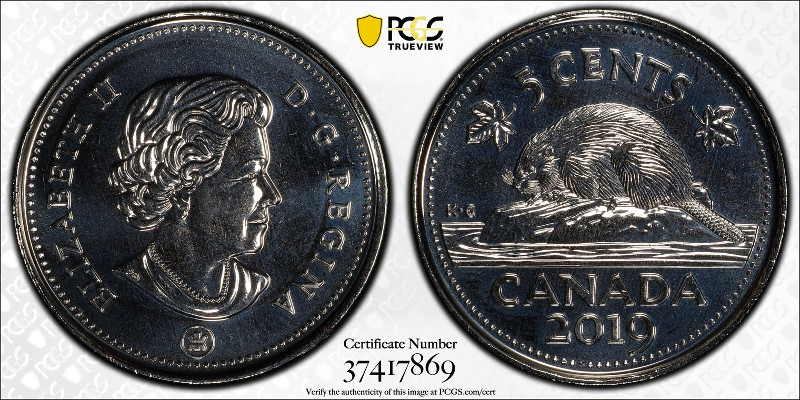
Which TrueView do you like more?
 dbldie55
Posts: 7,743 ✭✭✭✭✭
dbldie55
Posts: 7,743 ✭✭✭✭✭
This was taken last year when I submitted a group of Canadian nickels.
This one posted yesterday.
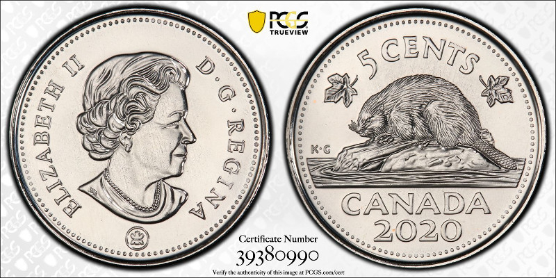
In hand, both of these look the same, somewhere between the two images (and have the same grade).
Collector and Researcher of Liberty Head Nickels. ANA LM-6053
1
Comments
2
The details are much more visible.
Great transactions with oih82w8, JasonGaming, Moose1913.
2
Paper money eventually returns to its intrinsic value. Zero. Voltaire. Ebay coinbowlllc
I'm betting #1 looks more like the coin when in hand. So I'm saying#1.
DPOTD-3
'Emancipate yourselves from mental slavery'
CU #3245 B.N.A. #428
Don
2
When a man who is honestly mistaken hears the truth, he will either quit being mistaken or cease to be honest....Abraham Lincoln
Patriotism is supporting your country all the time, and your government when it deserves it.....Mark Twain
Without regard to which might be more accurate, it's #2 in a landslide for me.
two")
Successful transactions with : MICHAELDIXON, Manorcourtman, Bochiman, bolivarshagnasty, AUandAG, onlyroosies, chumley, Weiss, jdimmick, BAJJERFAN, gene1978, TJM965, Smittys, GRANDAM, JTHawaii, mainejoe, softparade, derryb, Ricko
Bad transactions with : nobody to date
I think they both look like the coin in hand. It's all about the lighting. You can tilt it in-hand and see it both ways.
Great transactions with oih82w8, JasonGaming, Moose1913.
2
2
Collector
91 Positive BST transactions buying and selling with 56 members and counting!
instagram.com/klnumismatics
2
2
2
Definitely 2
My YouTube Channel
2 is definitely aesthetically better for that type of brilliant surface. Surprised they would ever do #1.
I'd prefer the one with the 2020 nickel on it since I can actually see something of the coin instead of a dark, mirrored disk.
In honor of the memory of Cpl. Michael E. Thompson
I prefer 2. No-relief, highly reflective coins like this one typically aren't very photogenic, as there's little you can do with the lighting that doesn't produce either photo 1 or photo 2.
Keeper of the VAM Catalog • Professional Coin Imaging • Prime Number Set • World Coins in Early America • British Trade Dollars • Variety Attribution
Photo #2 makes it much easier to see the coin. My take on #1 is a little different than some others. I hate this kind of coin (I'm looking at you, Canada and UK) because of how the surfaces lend themselves to photographing. They drive me nuts every time as I face the same question you're asking, and I've found it's just easier to dislike the strike type entirely")
I'd rather see the contrast or lack there of between the fields and devices. Picture 1 is more how the coin will look in hand (at that angle) whereas picture 2 is how every single proof of the type that isn't toned will look when imaged that way there's almost no reason to have that image it does nothing for me.
Just my opinion, I'm at the point where I wouldn't buy a proof unless it was in person. It's just too hard to get a feel for it through images.
I prefer the 1st picture because it more accurately shows what the coin looks like.
These are both graded MS67. They are not proofs.
I dunno... I am not able to get past the cartoonish appearance of the coins. Not sure if the second image we see captures the coin or creates this look because of the bold contrast
Experience the World through Numismatics...it's more than you can imagine.
The reflextion of #2 makes the Queen's face look doubled.
Last fall, I had a great opportunity to see PCGS photography experts at work. I had a nice chat with one of them and he was able to show me some new techniques that they were using. The work they are doing today is much better than just a year ago. I think some of the new techniques are really revealed on photo #2. I know of one collector that had most of his coins reimagined.
My 20th Century Gold Major Design Type Set ---started : 11/17/1997 ---- completed : 1/21/2004
I'm gonna send some stuff I have for trueviews soon. I guess it's good that I waited.
Number 1 looks like a coin. Number 2 looks like a drawing.
Lance.
I say #2.
Strange images.......Number 1 if you want realism. Number 2 if you want a cartoon.
I guess I like #2, as it is cleaner and more precise.
But does it really look like that? That is the question.........
Sometimes, it’s better to be LUCKY than good. 🍀 🍺👍
My Full Walker Registry Set (1916-1947):
https://www.ngccoin.com/registry/competitive-sets/16292/
Number one is too dark IMO.
I see, well then everything I said above but remove the part about proofs. #2 still does absolutely nothing for me it may as well be a stock photo from the mint for the type.
2 Definitely
Number two for me.... The details on number one are hidden in darkness....Cheers, RickO
I would have to see the coin. I always want the pic to look as close to the coin in hand as possible.
It's worth repeating- Both pictures are accurate. If you have the coin in hand you can rotate it or cant it so the light gives both results in person. They are both accurate representations under different lighting angles.
Great transactions with oih82w8, JasonGaming, Moose1913.
Number 1 looks like a coin. Number 2 looks like a drawing.
this is what I was thinking but couldn't describe.
The only reason I got the 2020 imaged is I had a 1942 to get graded as well so I had to use economy instead of the modern service, and with world coins, economy has to use the gold shield service. I really like they way it looks (I actually submitted 2 of the 2020's)
I really like TrueView images. My mint state Liberty Nickel set has images of all coins, and when I upgrade a coin, I will send the new one back in for a re-holder/image. In fact, if Heritage ever sends me the coin I paid for 2 weeks ago, even though it has a PCGS picture it will go back in for re-imaging. I was told it was imaged back in 2012 in Hong Kong, so I do want an updated image. When I do re-holder submissions, I usually try to include some of my other coins to go in as well for imaging. I suspect I will eventually get all of my AU58 coins in my everyman set imaged.
...but their both from Canada?")
2