Options
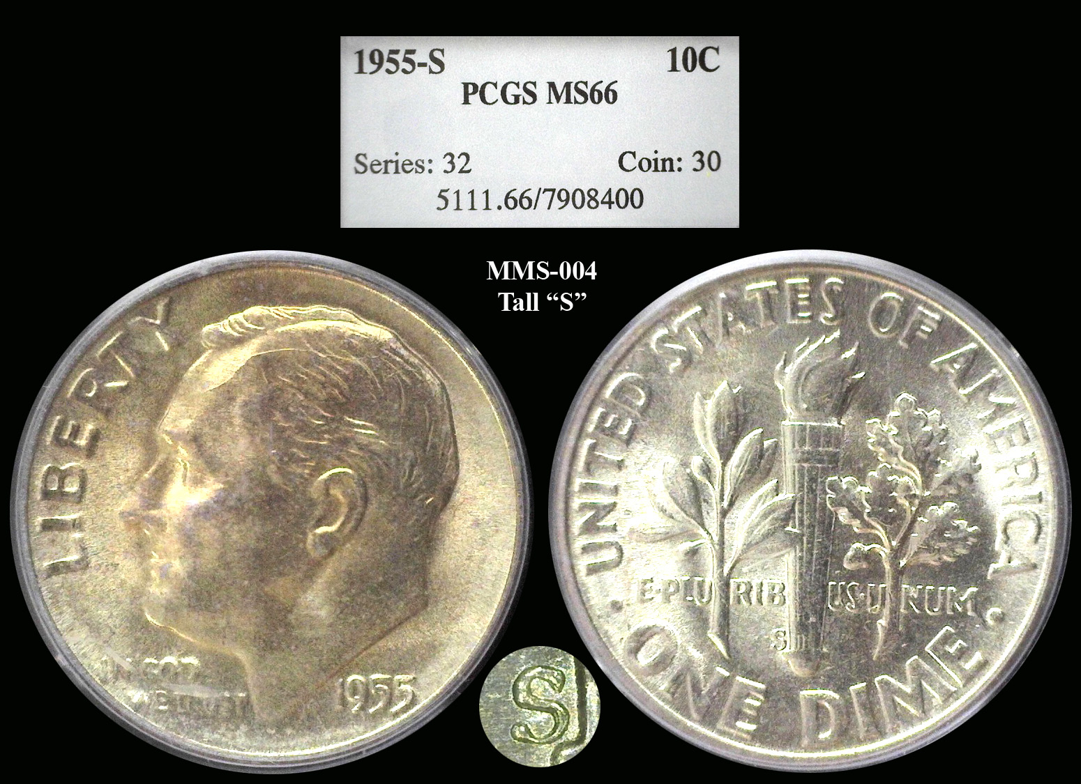
I just added this new Roosie Dime variety to my Variety Showcase.
 DIMEMAN
Posts: 22,403 ✭✭✭✭✭
This is a 1955-S with the CONECA MMS-004 Tall "S". This Mint Mark Size is larger than any other size in the Roosevelt series. This Mint Mark Size was used only in the years 1952 - 1955. Thanks for looking and comments welcome. 
4
Comments
Nice coin! ... I didn't know about this variety.
Nice coin. I think the 54-S from my Registry set also exhibits this mint mark, which I find rather cool and distinctive.
Another beautiful piece from, Jon. I’m another guy that didn’t know about this variety. Very cool and pretty to look at.
👌
Yes, this 54-S is the tall S. Nice one too!
Nice dime Jon... that reverse fairly 'blooms'....Does that S look upside down? I am used to fonts having the heavier portion at the bottom of the letter....Just wondering....Cheers, RickO
No, that is the orientation shown on the CONECA site.
Thanks Jon.... Your excellent picture inspired the question..... Cheers, RickO
The bottom half of the 'S' is wider than the top half. Turning my laptop screen over makes the 'S' appear top-heavy. The thinness of the base may be to accentuate the "bulb" (not sure of its correct technical name) on the end.
Another nice one.
Neat.
Successful transactions with: JimTyler, Morgan13, ChangeInHistory, LukeMarshall, Old_Collector, basets , MICHAELDIXON, Waverlycoins, dsessom, privatecoin, SurfinxHI, ZoidMeister, giorgioll, Lakesammman, Twobitcollector, Cazkaboom, Dscoin, Shrub68, CoinHunter4, Cladiator, coinbuf, Elkevvo, ChrisH82, WindyCity, Kccoin, NumisOxide, Meltdown, blaircountycoin, blue62vette, greencopper, Kliao, Downtown1974, BankerBob56, coinlieutenant, cucamongacoin, FranklinFactory, scooter25, erwindoc, bigjpst, and others.
Beautiful! I too wasn't aware of this variety. Nice addition. '55 is an interesting year for coins. I have a roll of '55 Cents placed in an unusual frame. It was the last San Francisco Minted Lincolns in the Wheatie era. Low Mintage too!
"Jesus died for you and for me, Thank you,Jesus"!!!
--- If it should happen I die and leave this world and you want to remember me. Please only remember my opening Sig Line.