Options
Coin confessions, the Unattractive disks, and the ugly duckling.
 Aspie_Rocco
Posts: 3,872 ✭✭✭✭✭
Aspie_Rocco
Posts: 3,872 ✭✭✭✭✭
There are many threads regarding one’s favorite design or denomination, so I wanted to make a thread about your LEAST favorite design. Not to be a negative topic, but to explore the designs that are not beautiful to you.
For US Coins, I have to say the most unappealing for me is the $20 St Gaudens. This design, while detailed, is very boring and does not wear well, in my opinion.
The modern Carr alterations to this design do a lot to improve the appearance from my perspective.
So which coin do you consider an ugly duckling?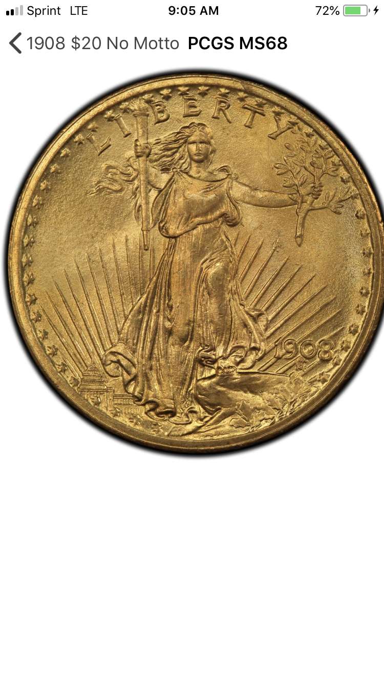
1
Comments
I’ve never been a fan of barber halves and the smaller denominations that carry the design. They are so plain and don’t evoke any feelings from me.
Frankly I am a fan of Saints and Barber Halves. However I find the 3 cent silvers too small and ugly. Ditto for shield nickels.
I prefer coins (silver) half dollar sized and larger. Gold prefer say Swiss 20 Franc and larger. Not a fan of copper coins / hate Lincoln Cents and mod circulating issues.
Barber coinage, when worn heavily is unattractive, UNC however is a different story.
My YouTube Channel
Not a fan of 1943 steel cents. In anything other than gem unc they are pretty crummy looking.
Collector, occasional seller
Shield Nickels... design does nothing for me.
Roosevelt Dimes... looks like Harry Truman
BST: KindaNewish (3/21/21), WQuarterFreddie (3/30/21), Meltdown (4/6/21), DBSTrader2 (5/5/21) AKA- unclemonkey on Blow Out
In general I prefer US coins with representations of liberty or native americans instead of presidents heads.
Instagram
Susan B Anthony Dollar
Morgan Dollars, once got 5 coins away from a set when I realized I couldn't stand them (although I do think getting back the CC's).
The new cent reverse.
The newest nickels and the actual ugly duckling on the 1792 half disme.
Edited to add “half”
I am not into the new portrait Jefferson Nickels either. They look like zombies when heavily circulated.
https://www.autismforums.com/media/albums/acrylic-colors-by-rocco.291/
This.
Ikes and Susan B's. Just awful!
St Gaudens may be my 2nd favorite, right after the Standing Liberty quarter design.
Dave
SBA's, Prezzie and hag dollars, and the modern quarters... the quarters are pure commercialism and lack an redeeming art values,.... Cheers, RickO
This has to be the UGLYEST coin ever. The Ike is next worse followed closely by the Sac Dollar. And of course all of the Prez dollars and their wives coins.
I like the idea of the reverse on the Ike, but the front...dang!
Susan B, Saca, and all of the coins that have presidents on them. Uninspiring...
Give me Lady Liberty and any Eagle!
Bst transactions with: dimeman, oih82w8, mercurydimeguy, dunerlaw, Lakesammman, 2ltdjorn, MattTheRiley, dpvilla, drddm, CommemKing, Relaxn, Yorkshireman, Cucamongacoin, jtlee321, greencopper, coin22lover, coinfolio, lindedad, spummybum, Leeroybrown, flackthat, BryceM, Surfinxhi, VanHalen, astrorat, robkool, Wingsrule, PennyGuy, al410, Ilikecolor, Southcounty, Namvet69, Commemdude, oreville, Leebone, Rob41281, clarkbar04, cactusjack55, Collectorcoins, sniocsu, coin finder
Most of the modern silver commems have flat cartoonish uninspired designs;
I think a 1917 mint set represents the single most beautiful year for US coins.
Commems and Early Type
Barber coins and most everything after 1933 with the exception of Wheat pennies and Merc’s. (Well except for the recent Apollo coins).
Not a big fan of dead presidents I think it was a bad decision.
https://www.pcgs.com/setregistry/quarters/washington-quarters-major-sets/washington-quarters-date-set-circulation-strikes-1932-present/publishedset/209923
https://www.pcgs.com/setregistry/quarters/washington-quarters-major-sets/washington-quarters-date-set-circulation-strikes-1932-present/album/209923
The sad thing is that it seems most agree yet the Mint/Congress will do nothing.
The effigy mounds are pretty bad. In their defense, I don't know how much better they could make them look.
IG: DeCourcyCoinsEbay: neilrobertson
"Numismatic categorizations, if left unconstrained, will increase spontaneously over time." -me