Home› U.S. Coin Forum
Options

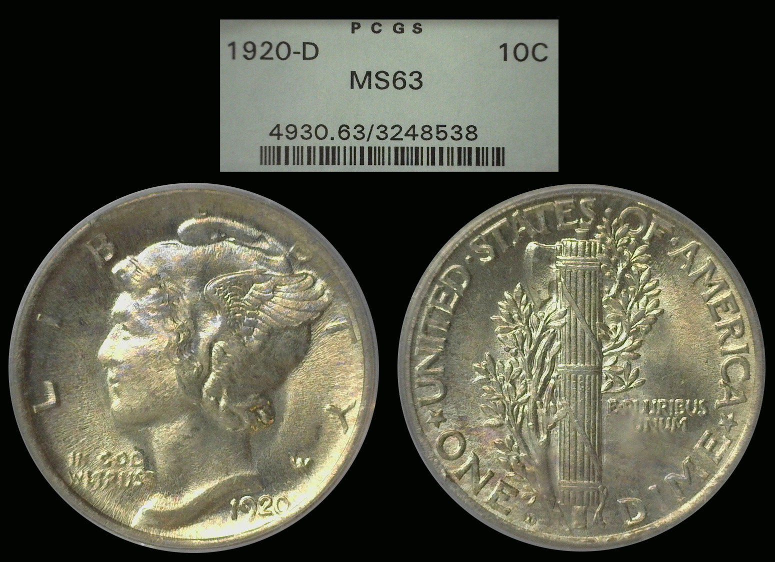
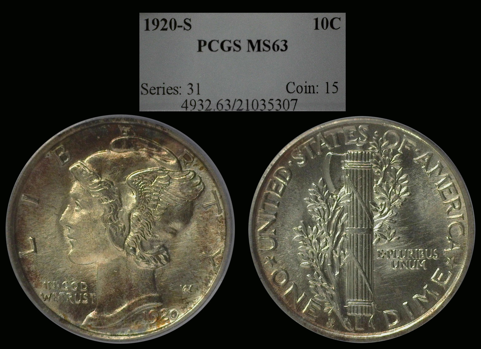
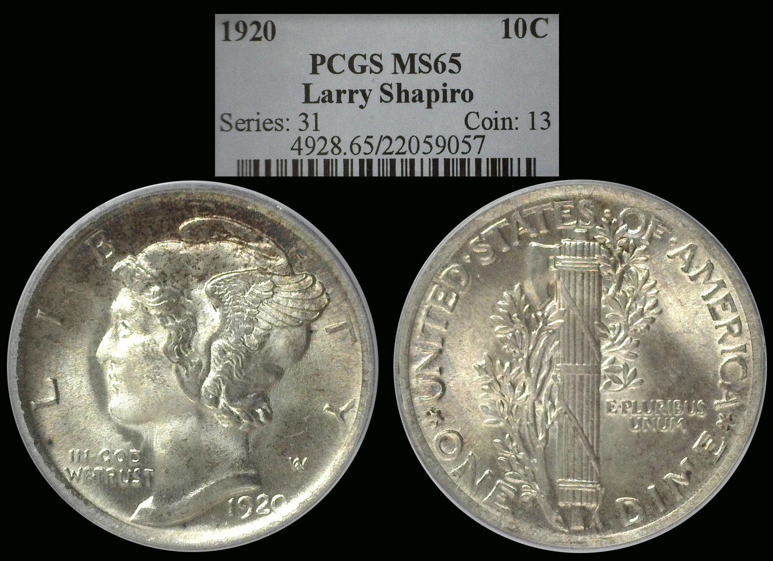
I just re-imaged my 1920 Mercuery Dimes....

DIMEMANDIMEMAN Posts: 22,403 ✭✭✭✭✭

What do you think?


Comments

  • Options
    BustHalfBrianBustHalfBrian Posts: 4,200 ✭✭✭✭
    edited March 7, 2019 1:20PM

    I think you need to increase the exposure slightly. I'm not a fan of the shadows in the fields. How many light sources are you using? The detail looks good, though.

  • Options
    CaptHenwayCaptHenway Posts: 34,227 ✭✭✭✭✭

    More nice stuff!

    Professional Numismatist, Retired. 55 year member ANA. Former ANA Senior Authenticator. Winner of four ANA Heath Literary Awards; three Wayte and Olga Raymond Literary Awards; Numismatist of the Year Award 2009, and ANA Lifetime Achievement Award 2020. Winner of the PNG's 2026 Robert Friedberg Award for "The Enigmatic Lincoln Cents of 1922," Available now from Whitman or Amazon.
  • Options
    FairlanemanFairlaneman Posts: 10,429 ✭✭✭✭✭

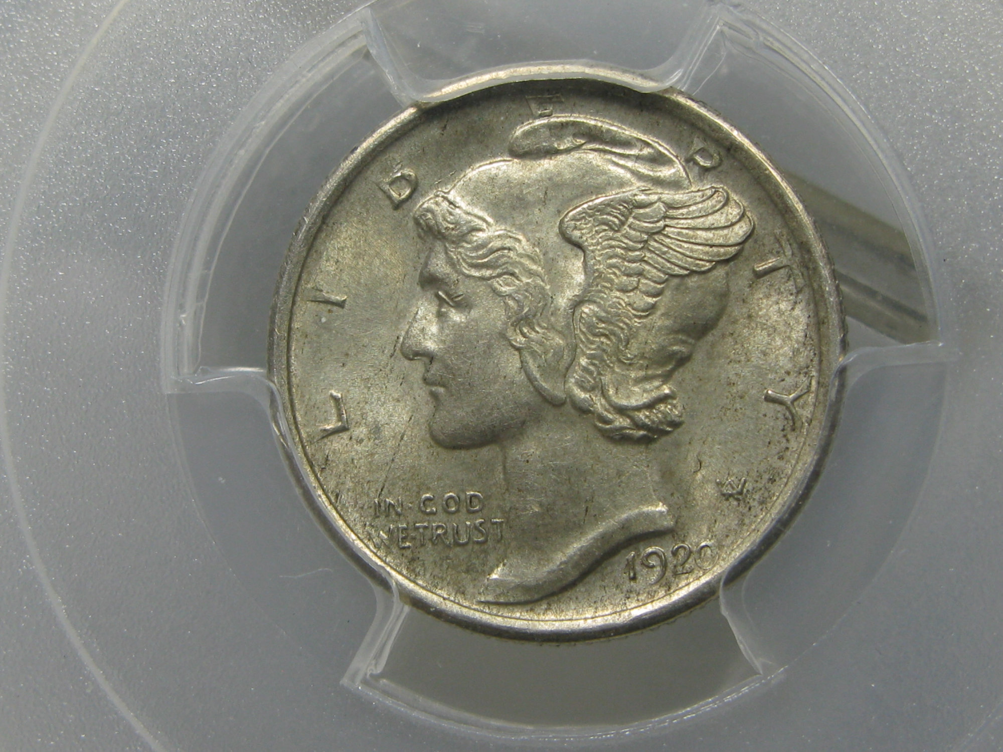
    Jon if you could get them all to look like the picture you took of the 20S everything would be good. Central Details are showing up nicely but then going toward the rims they seem a little mushy. Maybe a hair more light?

    Noticed the same thing on your 19's.

    Ken

  • Options
    FairlanemanFairlaneman Posts: 10,429 ✭✭✭✭✭
  • Options
    DIMEMANDIMEMAN Posts: 22,403 ✭✭✭✭✭

    @BustHalfBrian said:
    I think you need to increase the exposure slightly. I'm not a fan of the shadows in the fields. How many light sources are you using? The detail looks good, though.

    I use mostly sunlight. I have 4 Kia lights that I mix in to get the best matching image I can. My camera is a Dini-Lite.....so my pics will not look like Todd's or John's (messydesk) or TV's. I am just trying to get the best I can from what I have to work with.

  • Options
    Timbuk3Timbuk3 Posts: 11,658 ✭✭✭✭✭

    Nice !!! :)

    Timbuk3
  • Options
    fcfc Posts: 12,805 ✭✭✭

    First 2 pics are not very good. Look at the nose on the obv.
    The 3rd is ok.

  • Options
    rickoricko Posts: 98,724 ✭✭✭✭✭

    Beautiful Mercs Jon... no photographic criticism.... ;) ... Cheers, RickO

  • Options
    Sandman70gtSandman70gt Posts: 1,040 ✭✭✭✭✭

    They are improving, better than your previous work-- the color of your lighting makes them look a bit on the yellow side.
    But way better than my phone pics!

    Bst transactions with: dimeman, oih82w8, mercurydimeguy, dunerlaw, Lakesammman, 2ltdjorn, MattTheRiley, dpvilla, drddm, CommemKing, Relaxn, Yorkshireman, Cucamongacoin, jtlee321, greencopper, coin22lover, coinfolio, lindedad, spummybum, Leeroybrown, flackthat, BryceM, Surfinxhi, VanHalen, astrorat, robkool, Wingsrule, PennyGuy, al410, Ilikecolor, Southcounty, Namvet69, Commemdude, oreville, Leebone, Rob41281, clarkbar04, cactusjack55, Collectorcoins, sniocsu, coin finder

Leave a Comment

BoldItalicStrikethroughOrdered listUnordered list
Emoji
Image
Align leftAlign centerAlign rightToggle HTML viewToggle full pageToggle lights
Drop image/file