1891 Barber Half Dollar Patterns & an Early Model?
 StrikeOutXXX
Posts: 3,354 ✭✭✭✭✭
StrikeOutXXX
Posts: 3,354 ✭✭✭✭✭
With Roger posting about the 1891 coin redesign competition, we've been digging left and right trying to find info on the competition, the participants, and the entries themselves - we found some details in text of the designs submitted, but no pictures yet. Digging through old newspaper articles, we stumbled across a picture of a Barber Half in the November 21st, 1891 Harpers Weekly and noticed it looked a bit odd. Digging through the timeline of events as noted in the Wiki here: https://en.wikipedia.org/wiki/Barber_coinage came up with this.
There are 5 known Barber Half Dollar patterns.
J1766/P1980 - His first design, rejected by Mint Director Leech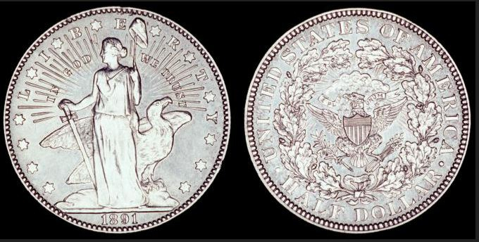
Leech rejected the design, and Barber submitted a revised obverse in mid-September with a head of liberty. I believe his next submission would be this one:
J1765/P1979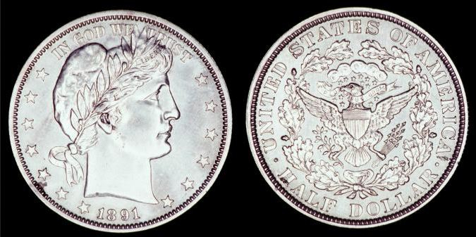
On September 28, Leech wrote Barber to prepare a reverse without the wreath. Barber Complained October 2nd, but produced 3 dies with clouds which Leech approved one of them on October 31st and ordered working dies be prepared. I believe 2 of the 3 submitted to Leech were below (Not sure about the 3rd)
J1762/P1976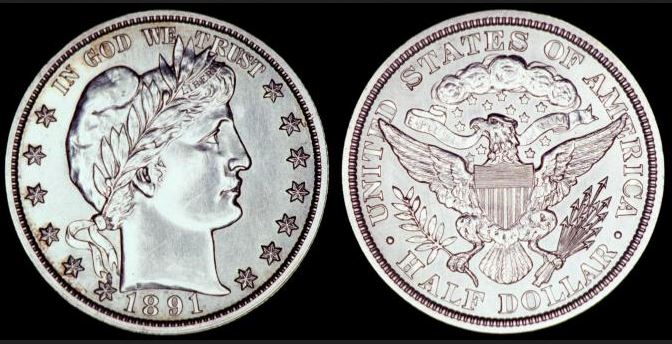
J1764/P1977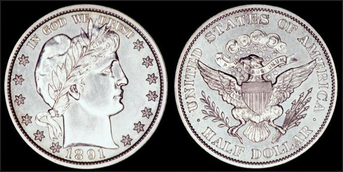
Then of course, Leech questioned the clouds on the reverse and ordered 2 more versions prepared. Those 2 versions were considered on November 6 by President Harrison. One was selected, and the next day Nov 7th Leech ordered working dies prepared. I believe the 2 considered was one pattern, and of course what became the production coin.
J1763/P1978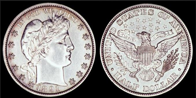
And a production picture (1893 picture, but to show the production version)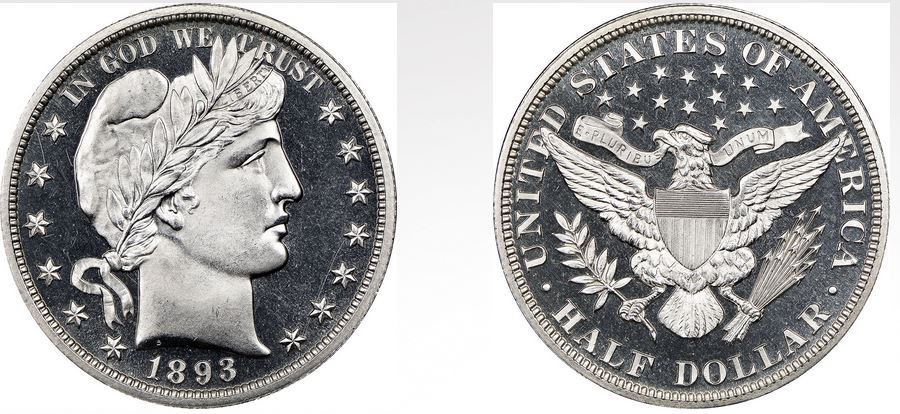
Now... It says Leech released the new designs to the press about November 10th. Harpers Weekly published them November 21st, but.. the pictures do not represent a match to any of the patterns or production coin: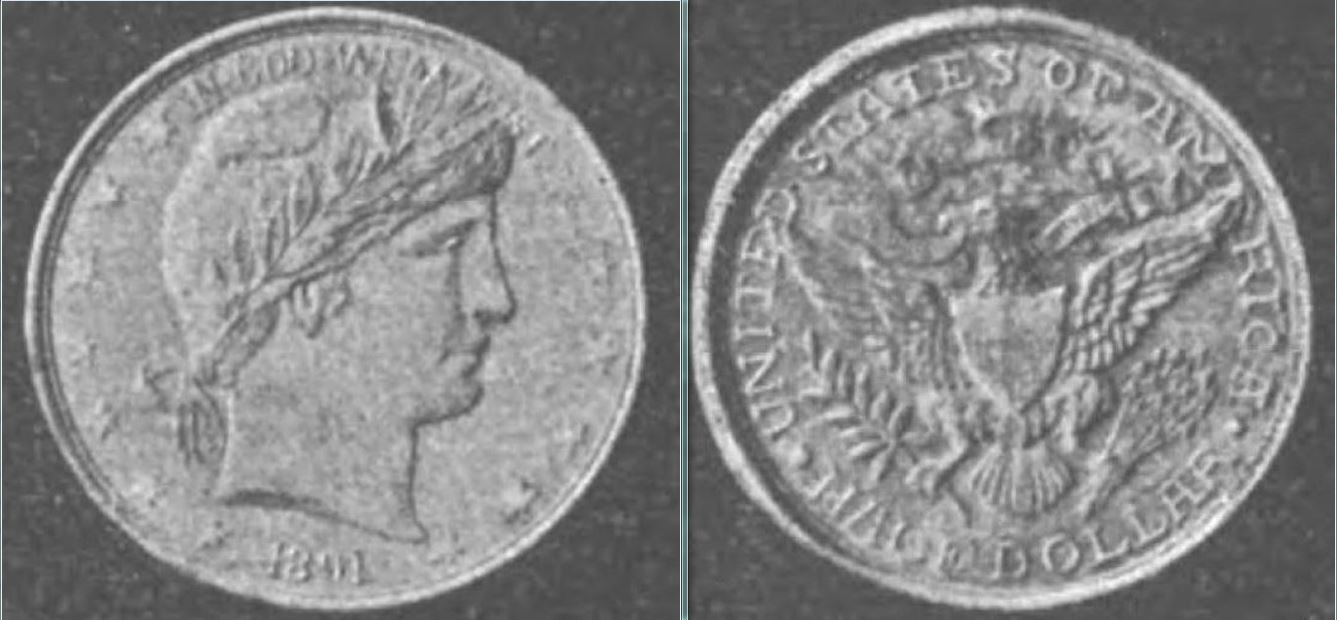
The obverse is closest to the 1st pattern (J1765) with the head in relation to the spacing of the neck to the 1st star to the date, or what I call "Raised" image - it is shifted very high into the legend. It is obvious when Leech asked for a reverse without the wreath, subsequent obverses came back with the head lowered.
The reverse still has clouds, the arrows are all bunched up, versus elongated/spread out like all the patterns, used the single branch versus the 2nd outcropping version, appears to have a different angle to the eagle's head, as well as rudimentary lettering. It does have the wider ribbon.
Based on all of this, I would put this (model?) publicized in Harpers Weekly as being made in the rough time period between October 2nd and October 31st after the request to remove the wreath. Seeing as the obverse saw the head lowered in this period, I would venture to guess that the model would be in the earlier part of October, perhaps his first rough model of the new reverse, before the redesign of the obverse, moving the head lower and not overlapping the motto as much.
Just thought it was interesting to see another step in the design process. The public opinion of this coin's unveiling was quite negative to say the least. I find it funny that any images of this brand new coin put out for public consumption was of an early - unrefined model. Granted, we're talking about 1891 here, and it took much longer to get information released and in print, but using a finished image of this new design might have helped public opinion a little bit.
"You Suck Award" - February, 2015
Discoverer of 1919 Mercury Dime DDO - FS-101
Comments
Thank you for sharing!
BST transactions: dbldie55, jayPem, 78saen, UltraHighRelief, nibanny, liefgold, FallGuy, lkeigwin, mbogoman, Sandman70gt, keets, joeykoins, ianrussell (@GC), EagleEye, ThePennyLady, GRANDAM, Ilikecolor, Gluggo, okiedude, Voyageur, LJenkins11, fastfreddie, ms70, pursuitofliberty, ZoidMeister,Coin Finder, GotTheBug, edwardjulio, Coinnmore, Nickpatton, Namvet69,...
What was the quality in general of illustrations in the magazine? Could this just be an artist's copy of a design from the Mint, for the purpose of creating a printing plate for the magazine?
Capt - here is the link to Harpers Weekly. Although it is heavy into illustrations of most publications of the time, there are quality photographs scattered through it (Yale team a few pages below this article for example).
https://books.google.com/books?id=zkJaAAAAYAAJ&pg=PA505&lpg=PA505&source=bl&ots=mzPnNGdy7u&sig=Fx7MyrEvaZnHdUbSN9OdH8Ok6MY&hl=en&sa=X&ved=0ahUKEwjyw8XC-arXAhXIQyYKHVvhCboQ6AEIXTAN#v=onepage&q=Director Leech&f=false
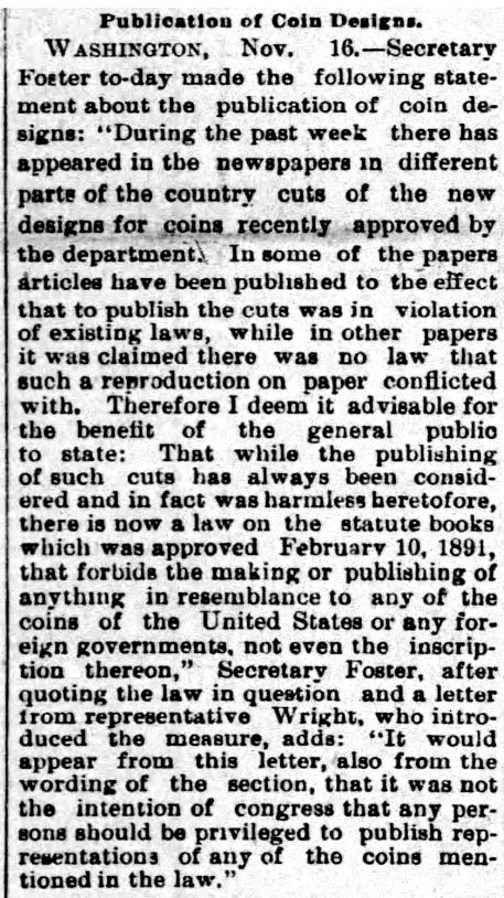
Here is an article Roger found regarding publishing photos of the coin. Believe what was published was photos of a model by Barber.
"You Suck Award" - February, 2015
Discoverer of 1919 Mercury Dime DDO - FS-101
Really nice detective work StrikeOutXXX!
Great research and it provides a real insight to the complications of design selection during that period. Cheers, RickO
Fascinating. I do believe that the coin illustration is a sketch of two models, which would explain the stilted lettering and date. But you are quite right that the obverse is of the first bust type obverse with the head high and the 1st and 13th stars close to the bust.
Perhaps Harper's sent an artist to Philadelphia to sketch the coin, and Barber or one of his flunkies just handed him one random head and one random reverse to copy from.
Do you mean, good Capt., that Barber might have 'lost his head' over this?