Home U.S. Coin Forum
Options

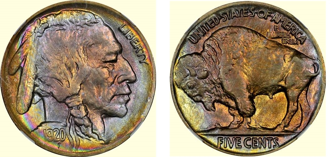
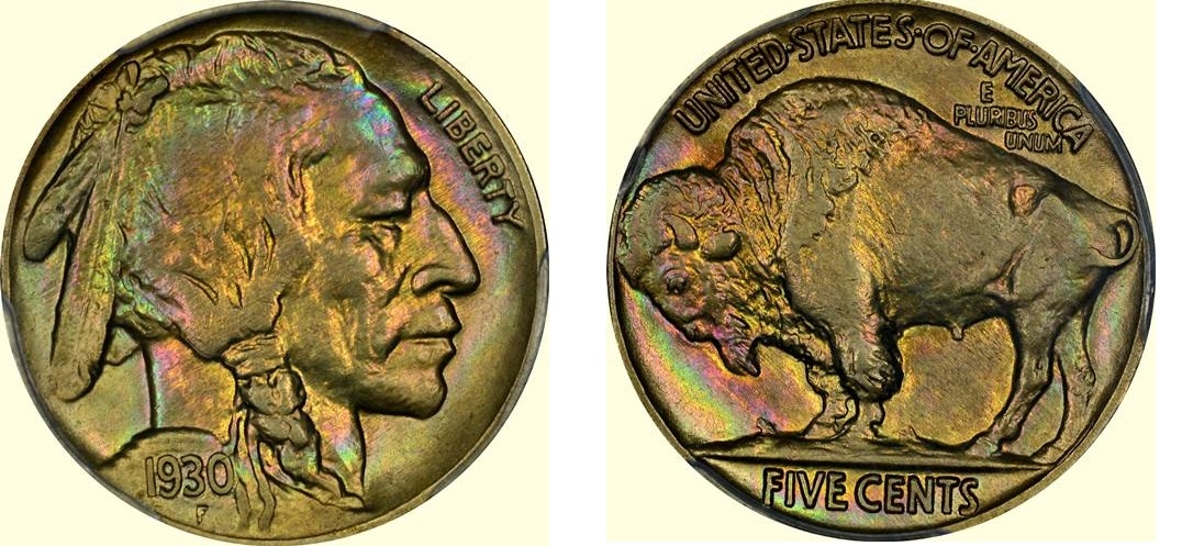
New toned 1920 and 1930 buffs for the set

clarkbar04clarkbar04 Posts: 5,018 ✭✭✭✭✭

Photos by crazyhounddog, who did a great job.

The 1930 is in a pcgs 64 holder, and I think is right. The 1920 is in an ngc 63 holder which seems a bit silly.
MS66 taste on an MS63 budget.

Comments

  • Options
    KyleKyle Posts: 1,822 ✭✭✭✭✭

    Great colour on both of them. A 63 does seem a little low on the '20 from the pics.

    Successful BST Transactions With: tonedase, streg2, airplanenut, coindeuce, vibr0nic, natetrook, Shrub68, golden, Lakesammman, drddm, Ilikecolor, CoinJunkie, wondercoin, lablover
  • Options
    CameonutCameonut Posts: 7,434 ✭✭✭✭✭

    Nice! I like both of them regardless of what the holder says.

    “In matters of style, swim with the current; in matters of principle, stand like a rock." - Thomas Jefferson

    My digital cameo album 1950-64 Cameos - take a look!

  • Options
    BuffaloIronTailBuffaloIronTail Posts: 7,754 ✭✭✭✭✭

    The 1920 Buff is a perfect example of why it is so difficult to grade coins online. We know it is uncirculated, but look at the flank area at the point wear first appears.

    It looks flat. I've been fooled by pictures before. This is an example why.

    Yes, 63 seems a bit conservative on the 1920. Note that both coins are not fully struck up. Both have incomplete top feathers, and that in turn makes the horn area a little weak. On both examples, the hump area is slightly weak in the center.

    I believe that the 1930 is graded properly, and is a real nice example for the date.

    The 1920 seems better than a choice grade, I would have thought the toning would have "kicked" it a notch. The fields on both coins looks clean without any serious dings or marks.

    My humble opinion.

    Pete

    "I tell them there's no problems.....only solutions" - John Lennon
  • Options
    clarkbar04clarkbar04 Posts: 5,018 ✭✭✭✭✭
    edited June 5, 2017 3:06PM

    @BuffaloIronTail Seems to me that buffalo nickels don't get "rewarded" by color the way silver coins do.

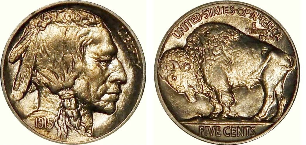
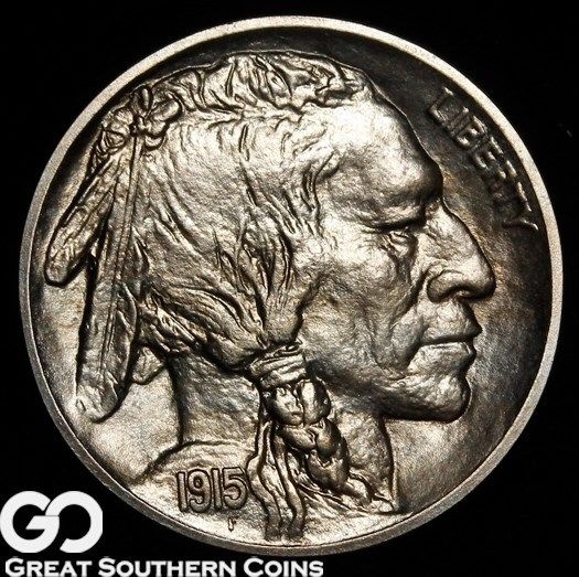
    BTW, here is a raw one I recently bought that seems to have no shortage of strike. Realizing of course 1915 is known for quality but still..
    MS66 taste on an MS63 budget.
  • Options
    BuffaloIronTailBuffaloIronTail Posts: 7,754 ✭✭✭✭✭
    edited June 5, 2017 3:12PM

    Are you sure that 1915 is not a proof? Looks like sharp inner and outer rims to me, but remember.......it's a picture. I can only comment on what I see.

    Also, when it comes to proofs..........I'm nowhere near qualified as to diagnostics.

    What a beautiful specimen, though.

    Pete

    "I tell them there's no problems.....only solutions" - John Lennon
  • Options
    koynekwestkoynekwest Posts: 10,048 ✭✭✭✭✭

    Those are gorgeous!!

  • Options
    clarkbar04clarkbar04 Posts: 5,018 ✭✭✭✭✭

    @BuffaloIronTail said:
    Are you sure that 1915 is not a proof? Looks like sharp inner and outer rims to me, but remember.......it's a picture. I can only comment on what I see.

    Also, when it comes to proofs..........I'm nowhere near qualified as to diagnostics.

    What a beautiful specimen, though.

    Pete

    It appears to have been struck from proof dies, the edge is not fully squared off or polished as a proof should be. Parts of the edges are beveled off a bit.

    MS66 taste on an MS63 budget.
  • Options
    erwindocerwindoc Posts: 5,438 ✭✭✭✭✭

    Superb coins!

  • Options
    crazyhounddogcrazyhounddog Posts: 14,234 ✭✭✭✭✭

    @BuffaloIronTail said:
    The 1920 Buff is a perfect example of why it is so difficult to grade coins online. We know it is uncirculated, but look at the flank area at the point wear first appears.

    It looks flat. I've been fooled by pictures before. This is an example why.

    Yes, 63 seems a bit conservative on the 1920. Note that both coins are not fully struck up. Both have incomplete top feathers, and that in turn makes the horn area a little weak. On both examples, the hump area is slightly weak in the center.

    I believe that the 1930 is graded properly, and is a real nice example for the date.

    The 1920 seems better than a choice grade, I would have thought the toning would have "kicked" it a notch. The fields on both coins looks clean without any serious dings or marks.

    My humble opinion.

    Pete

    Your humble opinion is spot on with mine. Well done my coin brother

    The bitterness of "Poor Quality" is remembered long after the sweetness of low price is forgotten.
  • Options
    HobosapianHobosapian Posts: 72 ✭✭✭

    Man! I collect rainbow toned Buffalo nickels and my jealousy meter is code red! Awesome coins. You should be proud.

    Chris Dempsey
    Dempsey & Baxter Rare Coins
    6032 Peach Street
    Erie, PA 16509
  • Options
    BUFFNIXXBUFFNIXX Posts: 2,759 ✭✭✭✭✭

    Yes that 1915 looks like a monster business strike to me. Hard to tell the MS from the PR for the 1915 as the business strikes are so darn impressive and well-made.

    Collector of Buffalo Nickels and other 20th century United States Coinage
    a.k.a "The BUFFINATOR"
  • Options
    BUFFNIXXBUFFNIXX Posts: 2,759 ✭✭✭✭✭

    here are photos of a 1915 matte proof buff to compare to the 1915 pictured above.
    Collector of Buffalo Nickels and other 20th century United States Coinage
    a.k.a "The BUFFINATOR"
  • Options
    BuffaloIronTailBuffaloIronTail Posts: 7,754 ✭✭✭✭✭

    On second thought, Clarkbar, your 1915 is one of those beautiful business strikes, and not a proof. The reason being that it is a little too shiny (not subdued) lusterwise in the field area.

    I think Ron Pope would agree.

    Pete

    "I tell them there's no problems.....only solutions" - John Lennon
  • Options
    rickoricko Posts: 98,724 ✭✭✭✭✭

    @clarkbar04 .... Wow... that is one beautiful 1915Buff....
    And I think the 1920 should be a 64.... Cheers, RickO

Leave a Comment

BoldItalicStrikethroughOrdered listUnordered list
Emoji
Image
Align leftAlign centerAlign rightToggle HTML viewToggle full pageToggle lights
Drop image/file