Home U.S. Coin Forum
Options

It's after 10...the kids are in bed...snow is coming down in buckets...and I am playing with a photo

CircOnlyCircOnly Posts: 2,215 ✭✭✭✭
I would like opinions on how to display my pictures on my registry set. I don't like labels, or any extra text. I like it to be as sleek as possible.


My current set pictures are just cropped images sized to 800x800 with the background in tact.
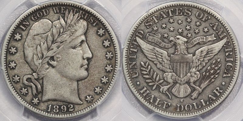


image


Here is a round crop with a black background and border.
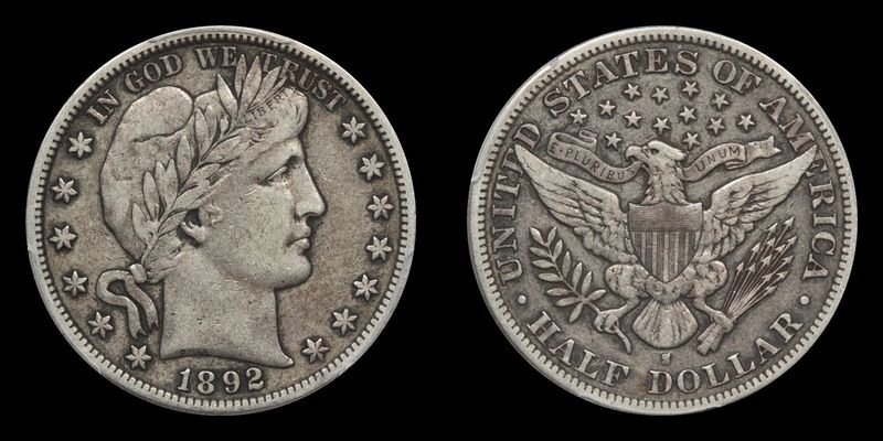


image


Here is the same only a white background.
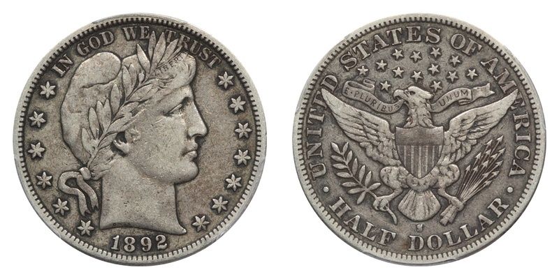


image

Comments

  • Options
    bolivarshagnastybolivarshagnasty Posts: 7,359 ✭✭✭✭✭
    Coins? I was thinking you were going to show pics of the better half in a white teddy. You need

    to get your priorities straight. image
  • Options
    TommyTypeTommyType Posts: 4,586 ✭✭✭✭✭
    I like the black teddy....er, I mean background. image

    Easily distracted Type Collector
  • Options
    david3142david3142 Posts: 3,691 ✭✭✭✭✭
    I tend to go with option 3. I don't like having the plastic in the picture, particularly because I have a mix of PCGS and NGC coins. i actually don't use any background so it comes out the same as the third set on the registry pages and when I post to the boards. I'd also like to add that your coin is an extremely pleasing circulated example!
  • Options
    BroadstruckBroadstruck Posts: 30,497 ✭✭✭✭✭
    I like her without the teddy...


    Seriously on your template crops your center spacing between the obverse reverse shots is too great.


    Try doing the center space at 1/2 that of the border and you'll see what I mean.


    Right now it's double the border width and takes away from the photo.
    To Err Is Human.... To Collect Err's Is Just Too Much Darn Tootin Fun!
  • Options
    TopographicOceansTopographicOceans Posts: 6,535 ✭✭✭✭
    I'd vote black for gold and white for silver
  • Options
    CircOnlyCircOnly Posts: 2,215 ✭✭✭✭
    Sorry, but the lady of the household is acting like she's freezing to death. The teddy pics are on hold....


    Originally posted by: Broadstruck

    I like her without the teddy...


    Seriously on your template crops your center spacing between the obverse reverse shots is too great.


    Try doing the center space at 1/2 that of the border and you'll see what I mean.


    Right now it's double the border width and takes away from the photo.


    I have only managed to figure out how to add a uniform border. I'll have to dig a little deeper to see if my program can do what you say.
  • Options
    AUandAGAUandAG Posts: 25,038 ✭✭✭✭✭
    What the heck, how's your roof. Buckets can't be easy on it!


    Black background for sure....


    bobimage
    Registry: CC lowballs (boblindstrom), bobinvegas1989@yahoo.com
  • Options
    davewesendavewesen Posts: 6,956 ✭✭✭✭✭
    I think a yellow or golden rod would look cool for most compositions of coins.
  • Options
    Jinx86Jinx86 Posts: 3,729 ✭✭✭✭✭
    Im a fan of the black background. Which editor are you using?
  • Options
    coinhackcoinhack Posts: 1,225 ✭✭✭✭✭
    I like the black the best.


    What photo editor are you using?
  • Options
    oih82w8oih82w8 Posts: 13,136 ✭✭✭✭✭
    For that particular Barber I like the Black background.
    oih82w8 = Oh I Hate To Wait _defectus patientia_aka...Dr. Defecto - Curator of RMO's

    BST transactions: dbldie55, jayPem, 78saen, UltraHighRelief, nibanny, liefgold, FallGuy, lkeigwin, mbogoman, Sandman70gt, keets, joeykoins, ianrussell (@GC), EagleEye, ThePennyLady, GRANDAM, Ilikecolor, Gluggo, okiedude, Voyageur, LJenkins11, fastfreddie, ms70, pursuitofliberty, ZoidMeister,Coin Finder, GotTheBug, edwardjulio, Coinnmore, Nickpatton, Namvet69,...
  • Options
    LakesammmanLakesammman Posts: 17,683 ✭✭✭✭✭
    I prefer the black as well and like it for all coins.
  • Options
    barberkeysbarberkeys Posts: 4,164 ✭✭✭✭✭
    I think the coin looks more like it does in hand with the slab background.
    Vern
    l
    It's not having what you want, it's wanting what you've got.
  • Options
    TwoSides2aCoinTwoSides2aCoin Posts: 45,123 ✭✭✭✭✭
    I like the coin with a brown background such as a Dansco page image So if you're in the mood for selling instead of shoveling snow , I'd be in the mood for cracking that baby out and putting it in my album, while you build a snowman with the kids.


    That reminds me…. What one snowman said to the other snowman : " Do you smell carrots ? "
  • Options
    sparky64sparky64 Posts: 7,063 ✭✭✭✭✭
    That's a nice pic.


    Always preferred the black background.


    Same thing with the Air-tite holders. Prefer the black ring over the white.


    Nice work.

    "If I say something in the woods and my wife isn't there to hear it.....am I still wrong?"

    My Washington Quarter Registry set...in progress

  • Options
    CircOnlyCircOnly Posts: 2,215 ✭✭✭✭
    Pic credit goes to JeffMTampa


    I am using Photoscape.
  • Options
    Walkerguy21DWalkerguy21D Posts: 12,143 ✭✭✭✭✭
    Well, they all exceed my skills....but I like the black background best, and the first one with the background slab

    image is a close second.


    Hunker down and stay safe, Log!


    Successful BST transactions with 177 members. breakdown, scotty1419, mattniss, bigjpst, onlyroosies, Manorcourtman, guitarwes, Ebeneezer, Tonedeaf, Shane6596, Piano1, Ikenefic, RG, PCGSPhoto, stman, Don'tTelltheWife, Boosibri, Ron1968, snowequities, VTchaser, jrt103, SurfinxHI, 78saen, bp777, FHC, RYK, JTHawaii, Opportunity, Kliao, bigtime36, skanderbeg, split37, thebigeng, acloco, Toninginthblood, OKCC, braddick, Coinflip, robcool, fastfreddie, tightbudget, DBSTrader2, nickelsciolist, relaxn, Eagle eye, soldi, silverman68, ElKevvo, sawyerjosh, Schmitz7, talkingwalnut2, konsole, sharkman987, sniocsu, comma, jesbroken, David1234, biosolar, Sullykerry, Moldnut, erwindoc, MichaelDixon, GotTheBug
  • Options
    cuda123cuda123 Posts: 12 ✭✭
    They all look good loggy but I'm with Vern, I like the slab look.

    Stay warm and dry.
  • Options
    ms70ms70 Posts: 13,958 ✭✭✭✭✭
    Black, definitely. Looks good.
  • Options
    rickoricko Posts: 98,724 ✭✭✭✭✭
    I prefer the black background... no other comments since I am photographically incompetent..

    Cheers, RickO
  • Options
    coindeucecoindeuce Posts: 13,515 ✭✭✭✭✭
    Adding the solid black or solid white background after photographing doesn't really change the way the coin looks, it just changes the way that the human eye focuses on the coin. It if were a raw coin shot over a black background or white background, the difference in the appearance of the coin would be noticeable.

    "Everything is on its way to somewhere. Everything." - George Malley, Phenomenon
    http://www.american-legacy-coins.com

  • Options
    goldengolden Posts: 10,513 ✭✭✭✭✭
    #2.
  • Options
    BaleyBaley Posts: 22,663 ✭✭✭✭✭
    I find both black and white to be too "stark" and the slab prongs distracting


    You know what I think would look good? A shade of blue similar to the blue color on PCGS slab labels (without the stippling, just that solid sky blue.

    Liberty: Parent of Science & Industry

  • Options
    LanceNewmanOCCLanceNewmanOCC Posts: 19,999 ✭✭✭✭✭
    .

    the un-cropped shots aren't bad but the obv/rev should for sure be next to each other imo.


    nice job whatever you choose.

    .

    <--- look what's behind the mask! - cool link 1/NO ~ 2/NNP ~ 3/NNC ~ 4/CF ~ 5/PG ~ 6/Cert ~ 7/NGC 7a/NGC pop~ 8/NGCF ~ 9/HA archives ~ 10/PM ~ 11/NM ~ 12/ANACS cert ~ 13/ANACS pop - report fakes 1/ACEF ~ report fakes/thefts 1/NCIS - Numi-Classes SS ~ Bass ~ Transcribed Docs NNP - clashed coins - error training - V V mm styles -

  • Options
    BackroadJunkieBackroadJunkie Posts: 3,745 ✭✭✭✭✭
    Personally, I think the coin dictates the background, unless your desire is uniformity. Gold will look better on black, proofs on white (depending on the lighting.)


    All your images look a little soft. A bit of unsharp mask would be appropriate. (And this is true anytime you resize an image.) Take it easy on how much sharpening you do. You can end up making the coin look much better than it does in hand. image


    JMHO...
  • Options
    CircOnlyCircOnly Posts: 2,215 ✭✭✭✭
    Well, I decided they are best the way they are. I really like JeffMTampa's pics and the more I thought about it, the added backgrounds really took away from the original picture.


    http://www.pcgs.com/setregistr...ishedset.aspx?s=136091

Leave a Comment

BoldItalicStrikethroughOrdered listUnordered list
Emoji
Image
Align leftAlign centerAlign rightToggle HTML viewToggle full pageToggle lights
Drop image/file