Home U.S. Coin Forum
Options

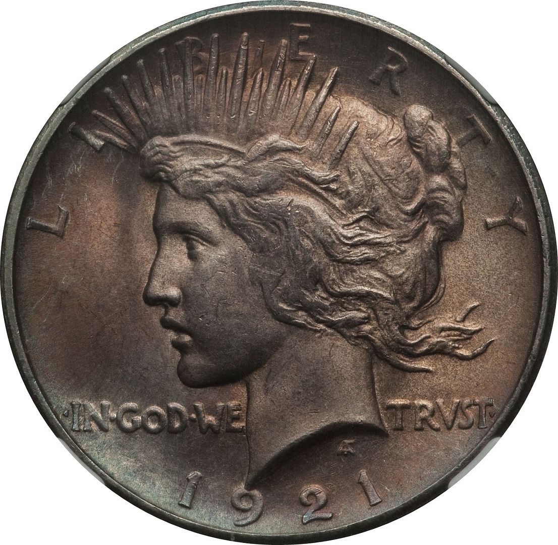
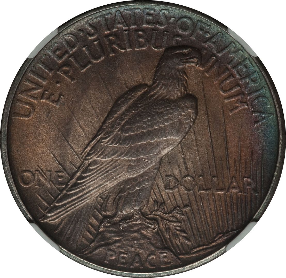
1921 Toned Peace Dollar

StuartStuart Posts: 9,831 ✭✭✭✭✭

1921 Toned Peace Dollar
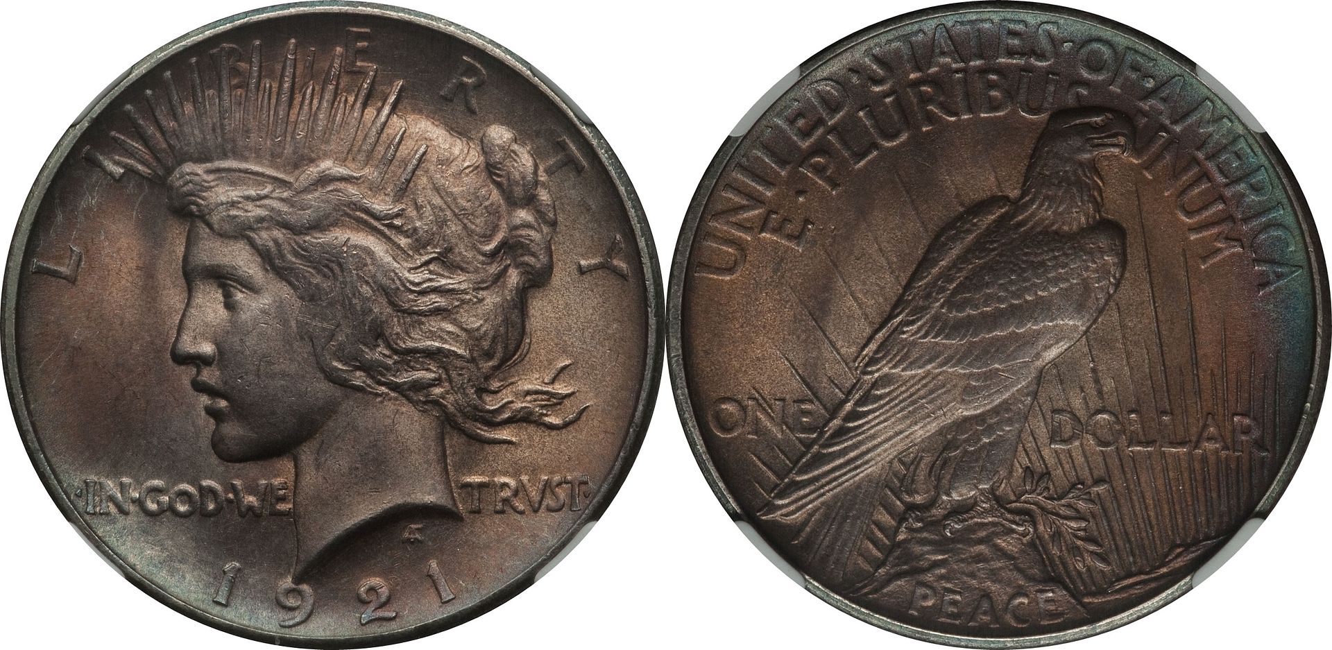

image


imageimage

Stuart

Collect 18th & 19th Century US Type Coins, Silver Dollars, $20 Gold Double Eagles and World Crowns & Talers with High Eye Appeal

"Luck is what happens when Preparation meets Opportunity"

Comments

  • Options
    epcjimi1epcjimi1 Posts: 3,489 ✭✭✭
    Dark pics, weak hair @ the ear, MHO.
  • This content has been removed.
  • Options
    Very clear in focus image and nice Peace $ I like it very much. It could use a little more light though.
  • Options
    jerseycat101jerseycat101 Posts: 1,361 ✭✭✭✭✭
    Color looks unnatural to me.
  • Options
    StuartStuart Posts: 9,831 ✭✭✭✭✭
    Christos: In reply to your post, do you prefer the following improved brightened images that depict more of the coin's details?


    1921 Toned Peace Dollar

    image


    imageimage

    Stuart

    Collect 18th & 19th Century US Type Coins, Silver Dollars, $20 Gold Double Eagles and World Crowns & Talers with High Eye Appeal

    "Luck is what happens when Preparation meets Opportunity"
  • This content has been removed.
  • Options
    TonerGuyTonerGuy Posts: 590 ✭✭✭
    Very nice !
  • Options
    epcjimi1epcjimi1 Posts: 3,489 ✭✭✭
    Originally posted by: Stuart
    Christos: In reply to your post, do you prefer the following improved brightened images that depict more of the coin's details?


    There ya go, that's the thing - "do you prefer the following improved brightened images that depict more of the coin's details?"

    Crazy.

    The details get worse.

    Nice reverse though, obverse, not so much.
  • Options
    HydrantHydrant Posts: 7,773 ✭✭✭✭✭
    Strange how the toning is so similar on both obverse and reverse. Is that common? I'm a newbie when it comes to toning. I do like it, but brown toning seems kind of dull and lifeless. Do people pay extra for brown coins? The blue and purple and green toning is prettier. That's just my opinion. Which is better?
  • Options
    lordmarcovanlordmarcovan Posts: 45,153 ✭✭✭✭✭
    That's a great looker. I love the peripheral sea green arc on the reverse rims.


    Originally posted by: Hydrant

    Strange how the toning is so similar on both obverse and reverse. Is that common? I'm a newbie when it comes to toning. I do like it, but brown toning seems kind of dull and lifeless. Do people pay extra for brown coins? The blue and purple and green toning is prettier. That's just my opinion. Which is better?


    Generally I agree with you on the brown toning, but it is common on 1921 Peace dollars. Many are streaky brown, looking like they got dunked into someone's coffee cup. While I'm no good judge of NT versus AT, I do think the toning here is quite attractive for a '21 Peace.

    Collector since 1976. On the CU forums here since 2001.

  • Options
    rickoricko Posts: 98,724 ✭✭✭✭✭
    Very similar to the one Stef posted earlier today..... Cheers, Rick
  • Options
    StuartStuart Posts: 9,831 ✭✭✭✭✭
    The following images do a better job of depicting the coin's mint luster than those previously posted.


    1921 Toned Peace Dollar

    imageimage

    Stuart

    Collect 18th & 19th Century US Type Coins, Silver Dollars, $20 Gold Double Eagles and World Crowns & Talers with High Eye Appeal

    "Luck is what happens when Preparation meets Opportunity"
  • Options
    keetskeets Posts: 25,351 ✭✭✭✭✭
    I think it looks like a nice 64 with some old Wayte Raymond album tone, pretty clean.
  • Options
    epcjimi1epcjimi1 Posts: 3,489 ✭✭✭
    Weak obverse strike. Look at the tiara band. Reverse looks good.


    Tone not in my wheelhouse.


    Reminds me of a '68 tobacco sunburst fender strat. Jimi, yes. 1921 peace, no.


    MHO.
  • Options
    epcjimi1epcjimi1 Posts: 3,489 ✭✭✭
    Watch the tiara band decay with the pics...


    image

    [qimage
    image


  • Options
    MidLifeCrisisMidLifeCrisis Posts: 10,614 ✭✭✭✭✭
    I like it. image
  • Options
    nankrautnankraut Posts: 4,565 ✭✭✭
    Originally posted by: jerseycat101
    Color looks unnatural to me.

    +1

    I'm the Proud recipient of a genuine "you suck" award dated 1/24/05. I was accepted into the "Circle of Trust" on 3/9/09.
  • Options
    BryceMBryceM Posts: 11,937 ✭✭✭✭✭
    The 1921 is a fantastic coin. This example is of average or perhaps a bit better than average strike. Unfortunately that means it still isn't really struck well at all. The brown toning is a bit dark for my taste, but fine. The blue around the reverse upper rim is a little odd to my eye.

Leave a Comment

BoldItalicStrikethroughOrdered listUnordered list
Emoji
Image
Align leftAlign centerAlign rightToggle HTML viewToggle full pageToggle lights
Drop image/file