Poll/Vote - Which Rainbow Top Pop 55S Lincoln Is The Best Looking??
 Coppercolor
Posts: 1,475 ✭✭✭
Coppercolor
Posts: 1,475 ✭✭✭
I'll put the favorite of the board into my showcase registry
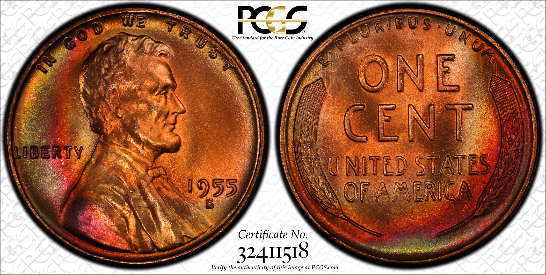
Lincoln 1:
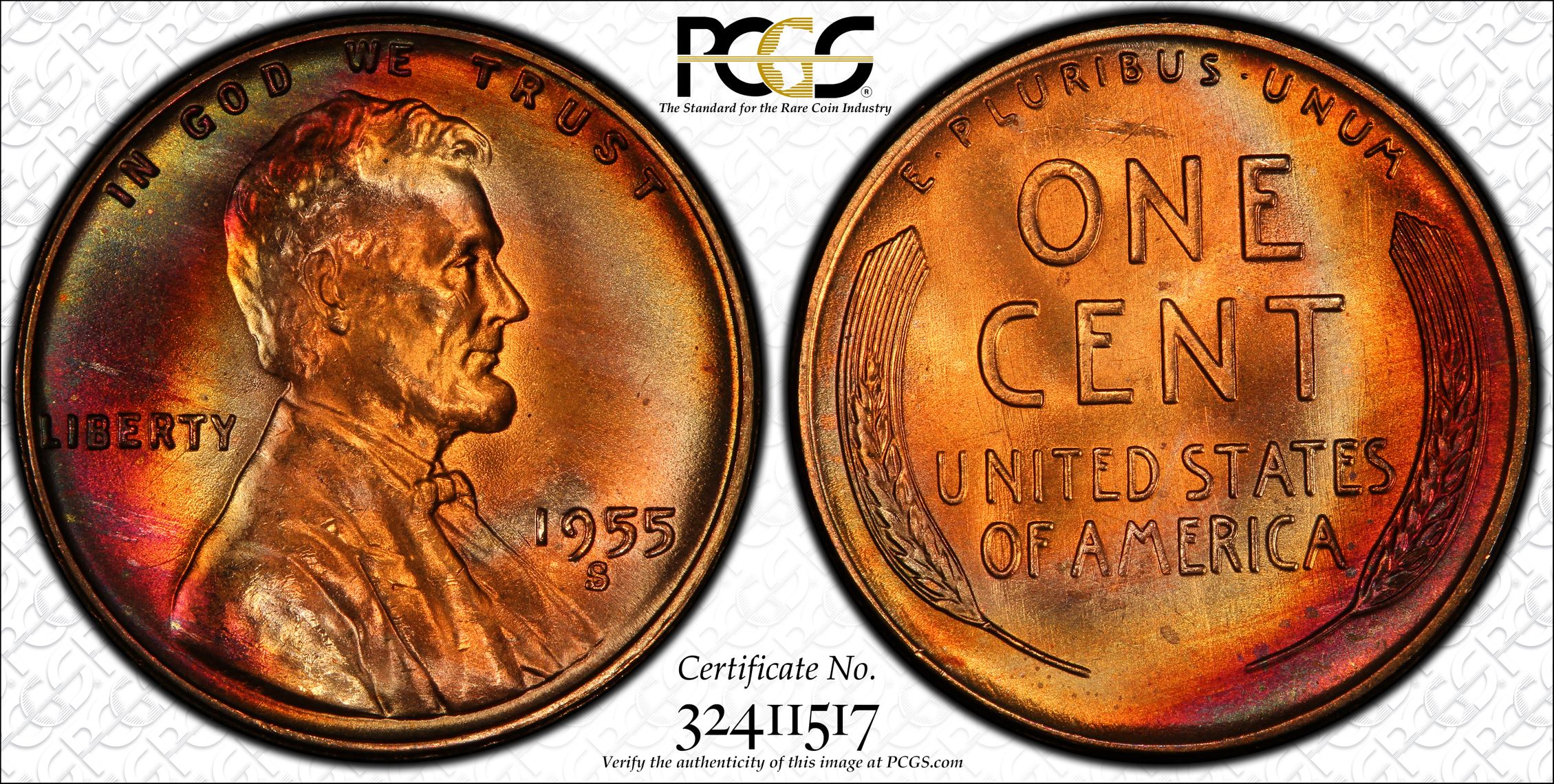
Lincoln 2:
Lincoln 3:
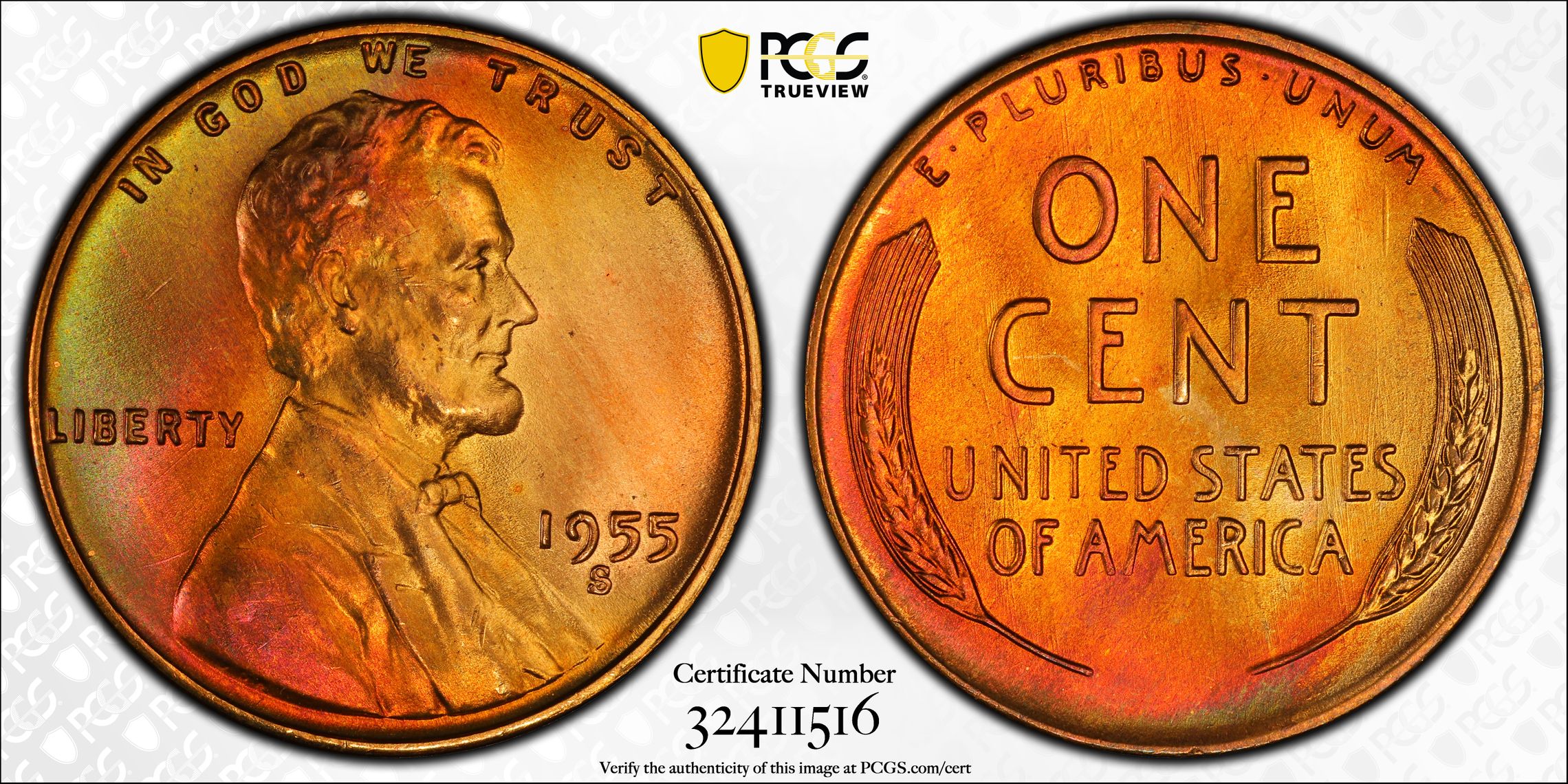
The first one and last one I felt had a shot at 67+RB or 68RB. Monster surfaces. But I don't mean to influence, I'm asking about eye appeal.
Edited to Add: Sorry about the amateur poll, I don't know how to set one up!
Lincoln 1:
Lincoln 2:
Lincoln 3:
The first one and last one I felt had a shot at 67+RB or 68RB. Monster surfaces. But I don't mean to influence, I'm asking about eye appeal.
Edited to Add: Sorry about the amateur poll, I don't know how to set one up!
I'd like my copper well done please!
0
Comments
Ah, never mind, I'll just vote for #2.
bob
David
That leaves a very nice #1 and #3 with the nod going to #3
So I agree with CoinJunkie.
Not really looking for much these days but if I were, it might be a toner.
<< <i>#1 for me. I like the reverse more than #3.
David >>
This David agrees exactly.
http://macrocoins.com
it just looks smoothest on my eyes to look at
little distractions grab my eyes on the other 2
In honor of the memory of Cpl. Michael E. Thompson
#1 does it for me though. Real even toning on both sides well matched.
#2 very vibrant but the color transitions a little harsh. Not a problem if it wasn't in this group and viewed in its own company.
#3 seems the same as coin #1 but has the minor hit in left upper field, so the first coin is superior in that minuscule way,
Just my taste, all super cool man.
1 is best
2 a tad dull compered to 1
3 don't like the cut left obv field.
Ike Specialist
Finest Toned Ike I've Ever Seen, been looking since 1986
#3 also nice color, but mark in field and possibly on Lincoln hair.
#2 color is not as balanced, and spots and distractions
http://macrocoins.com
"A dog breaks your heart only one time and that is when they pass on". Unknown
10-4,
My Instagram picturesErik
My registry sets
U.S. Type Set
Andrew Blinkiewicz-Heritage
For that reason, I chose #3.
<< <i>Ahhhhh, so you are the one making more! I submit mine, which was the first 67-RB for the 1955-S, all in good fun of course. None of your 3 below are slouches, but I lean towards #1.
Well, Erik, you must remember I tried to buy your 55S about five or six years ago, unsuccessfully. So I've been on a tear. Remember the fire red one I had graded 67RB about four years ago? Then this group (plus three more) came my way. BTW the others graded 65RD and 66RB.
For the record I still like yours the best because I like crazy color. Have you changed your mind about selling/trading????????????????????????????
Here is why it was hard to choose, "I used to be indecisive, now I'm just not sure......"
If #3 did not have he mark in the upper left obverse field it would be the winner over #1 because is has a better strike. In hand I expect that the mark on #3 is not as noticeable as the weak reverse strike on #1. If so, then #3 is the winner.
Sometimes, it’s better to be LUCKY than good. 🍀 🍺👍
My Full Walker Registry Set (1916-1947):
https://www.ngccoin.com/registry/competitive-sets/16292/
If I had it my way, stupidity would be painful!