Lady Liberty Designs - Is Beauty Found in Ugliness?
 Catbert
Posts: 7,665 ✭✭✭✭✭
Catbert
Posts: 7,665 ✭✭✭✭✭
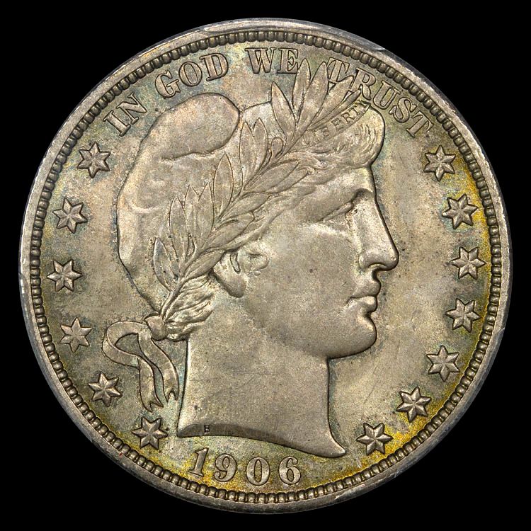
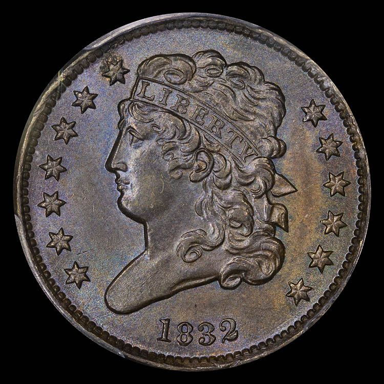
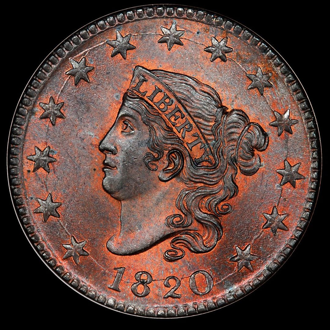
This thread is intended to discover how you react to the classic coin designs of Lady Liberty. However, I'm not addressing what all will regard as beautiful depictions such as the draped bust, walking liberty, or the st. gaudens double eagle. I am thinking about some really ugly versions such as the Liberty V Nickel, Matron Cent, and the Barber half as examples.
When one focuses on the design itself, how do you react as a collector? Do you still find beauty in large necks and ugly faces?
I came across a blog post from an architect who was writing about asymmetry here. She had an interesting analysis of Marilyn Monroe, stating:
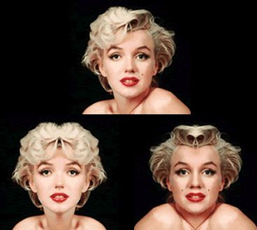
Marilyn Monroe’s iconic and memorable face (top center) is admired. By mirroring just the left side (lower left), and comparing that to a mirroring of only the right side (lower right), we can see that it is far from symmetrical in structure and detail. Her facial imbalance gives her vulnerability and compelling beauty. She even darkened her beauty mark to enhance the irregular composition.
I've told my kids, who don't really have any interest in my collection, that I enjoy the beautiful designs on the more popular coins but am also attracted to the bizarrely ugly versions of lady Liberty, despite their huge mannish necks and faces.
So, do you too appreciate these unheralded designs?
(Edited to remove distracting steelers reference)
When one focuses on the design itself, how do you react as a collector? Do you still find beauty in large necks and ugly faces?
I came across a blog post from an architect who was writing about asymmetry here. She had an interesting analysis of Marilyn Monroe, stating:
Marilyn Monroe’s iconic and memorable face (top center) is admired. By mirroring just the left side (lower left), and comparing that to a mirroring of only the right side (lower right), we can see that it is far from symmetrical in structure and detail. Her facial imbalance gives her vulnerability and compelling beauty. She even darkened her beauty mark to enhance the irregular composition.
I've told my kids, who don't really have any interest in my collection, that I enjoy the beautiful designs on the more popular coins but am also attracted to the bizarrely ugly versions of lady Liberty, despite their huge mannish necks and faces.
So, do you too appreciate these unheralded designs?
(Edited to remove distracting steelers reference)
Seated Half Society member #38
"Got a flaming heart, can't get my fill"
"Got a flaming heart, can't get my fill"
0
Comments
No comments?
"Got a flaming heart, can't get my fill"
PCGS Registries
Box of 20
SeaEagleCoins: 11/14/54-4/5/12. Miss you Larry!
<< <i>I always saw the barber design to be a man. That worked out pretty well. >>
That view seems to be fairly common.
so long as liberty is attached to them, they won't be ugly to me. coins lacking liberty are missing out; word or bust.
i am biased though as it is difficult for me the way i've been training my mind, to separate the design from all the history behind the design, denomination, politics, metals and their impact on social relevance & visa versa.
so trying to understand the beauty and significance behind the motif(s) usually supports any of the days i look at the design of a particular issue and go blah.
.
Instead, I'm looking at the details of the design. The engraving of the hair.....depth of design....how the design fills the surface....etc.
Based on that, I rather like the two Large Cent designs depicted in the OP. But I've never been much of a fan of the Barber coinage.
Crackout - I love college wrestling and now every time I watch the Gophers wrestle I will be reminded of a Morgan dollar. Looks like you had an up close and personal photo shoot with Kevin.
<< <i>I always saw the barber design to be a man. That worked out pretty well. >>
Funny, I've always thought the same of the Morgan. IMO the Morgan is one of the most unattractive coins in the USA pre-1945 coin portfolio.
-~-~-~-~-~-~-~-~-~-~-~-~-~-~-~-~-~-~-~-~-~-~-~-~-~-~-~-~-~-~-~-~-~-~-~-~-~-~-~-~-~-~-~-~-~-~-~-~-~-~-~-~-
My sets: [280+ horse coins] :: [France Sowers] :: [Colorful world copper] :: [Beautiful world coins]
-~-~-~-~-~-~-~-~-~-~-~-~-~-~-~-~-~-~-~-~-~-~-~-~-~-~-~-~-~-~-~-~-~-~-~-~-~-~-~-~-~-~-~-~-~-~-~-~-~-~-~-~-