Options
Unused designs....more added.
 RogerB
Posts: 8,852 ✭✭✭✭✭
RogerB
Posts: 8,852 ✭✭✭✭✭
Examples of unused coin and medal designs are well known to collectors although odd ones continue to pop up. These are a little different: unused designs for a coin book cover.
I licensed the color photo but later thought it was "too grim and foreboding." Enjoy. Questions welcome.
Abandoned Colorado mine and engine belt drive.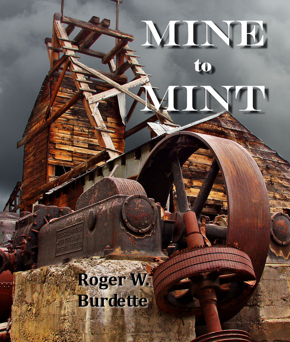
Mexican silver miners bring ore to the surface, and photo of press operator at work.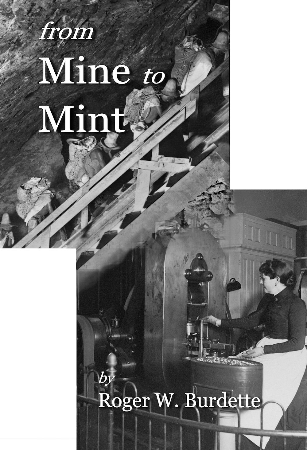
5
Comments
Considering the contents of the book and the drawing that was actually used on the book's cover, I like the actual photograph of the lady press operator by itself.
I considered the press operator photo, but there were a lot of black and dark tones that would have made the cover "block up." That's why I went with the idealized woodcut.
Damnation, I looked on that well known online retailer that is synonymous with a South American jungle and saw a $39.95 price in paperback.
I really like that first color picture.... It does not appear foreboding to me... Of course, people have told me I am weird before.... Cheers, RickO
The first picture is neat....but it suggests "abandonment" and old technology.
Unless that is the subject of the book, then I say "Zivili" (Croatian for hurray)
Pete
I like the first photo...to me it brings death back to life through technology, it makes it interesting.
The first photo was eventually tested for the cover for a CD containing daily production of all silver dollars made under the Pittman Act of 1918. But this one didn't work out, either. I like the dramatic angle and rich colors, but the image also demands specific, related content. Maybe a book on Colorado Mining would be appropriate?
Eventually the CD case used this image based on the "America's Tribute to Britain" WW-I poster. Here the interaction between Lion and Eagle supported the goal of the Pittman Act.
If there's interest, I'll look for some of the other rejected cover art.
Boy, that American eagle and British Lion thing strike me as a little disturbing.
America kinda did choose who would "wear the laurels" in aftermath of the First World War.
We probably did choose the "right" side. Peut-etre.
But that image is pretty blatant about it.
From my point of view the first picture is like a piece of fine art, it allows the mind to focus on what was.
The Lion and Eagle is ok but don't get my mind thinking. But if it works for you as the Editor, I guess that's all that matters. ( First and foremost remember I am not a writer and know nothing about Editing ). Either way your work is knowledgeable and passionate.
Understood. The color photo does not have a clear graphic focus that seemed to work with text -- or at least my text. It's always a subjective decision about how a cover design interacts with the text and book content.
This assay commission cover (4 DVDs) was straight forward with only small changes to the original Assay Commission medal. Details of the same medal were used in the DVD labels.
Should we judge your book by its cover??
Interesting point. Often, the first impression, and initial interest, comes from viewing the cover. It can attract attention and interest, or it can be off-putting. The title text and placement are also important and professional graphic artists know how to do this much better than I !
The first book published, Renaissance of American Coinage 1916-1921, got an unusual amount of interest from the cover design by artist Jane Waldron. While the content is key to everything, the first impression was uniformly positive. Several purchasers sent Ms. Waldron personal notes about the cover art. (She did covers for the other two books in that series, also.) Developing the design took months of work back-and-forth, testing, reviewing, and trying to produce a solid link between content and cover.
After the RAC books, I've done the covers myself. Some are good, some are OK, some are awkward -- all befitting my limited graphics skills. Personally, I like the WW-II Pattern cover even though it's more literal than the others.
Your good Roger real good!
I’m mostly kidding..... sort of. I tend to be a linear thinker and I do much better with numbers and facts than with artistry and fashion. Your points are well made. In your shoes, I would be greatly assisted by those with the appropriate talents, but my bull-headed self would be naturally inclined to go it alone. There’s so much more to writing a book than anyone imagines.
@BryceM
There’s so much more to writing a book than anyone imagines.
You got that right.
Yep. Coin collectors are more "linear thinkers" than some other hobbyists. [Darn spell check keeps trying to put in "Hobbits."] That is one of the reasons so many coin books have a "nak-d" coin on the cover -- just a flat image. It does seem to work so who am I to judge anything.
A personal goal has been to make the book covers at least interesting and maybe a little provocative while remaining accessible to coin collectors. Not sure if any of that has been accomplished - but maybe someone will read this thread at find pieces useful to them. If so, that will be enough reward.
A book is a complete product. If the author or publisher can afford to hire professional layout and graphics people, then the results are usually superior. Take special note to David W. Lange's books on coin albums and folders. The professional work really shows and enhances his copious research.
I tend to be more utilitarian. The advantage is I can make updates or wholesale changes at the last moment with out added delay or cost. But the penalty is somewhat bland or repetitive layout.
Here's an example of repetitive layout. It's OK as it is - the information is present and in a compact form, but from an author's perspective I'd like to have the skills to do better.
Left is from the variety table in a working draft of a long article on International Nickel Private Pattern pieces; right is part of the variety table from Pattern and Experimental Pieces of WW-II.