So it sounds like a partial print is possible w 2 ppl agreeing. For some reason the way it looks, being somewhat faded out, its not a distraction to me.
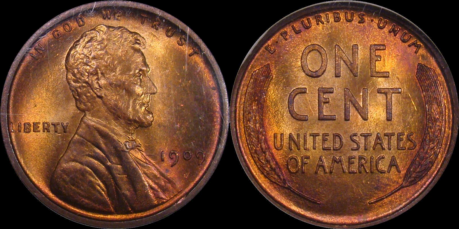
Well, it is the pop. 1 PCGS MS 66+ RB. The color is eye popping.
I am just glad to see a post where everyone seems to appreciate colorfully toned copper coins. No fake news about how they only tone red then brown, and anything else must be chemically altered.
Years ago collectors in general didn't really much appreciate color toning on silver coins. Tastes mature, spots and all.
Some refer to overgraded slabs as Coffins. I like to think of them as Happy Coins.
I like the coin as a 9 WL. You do have coins with better toning and the matte proofs toning will be be better, so 9 for MS coin. The color is very typical of the top colorless registry set coins. Color on this grade is much more than RD in this series, and thus much harder to find. Great Coin........don't sell it.
What I wish to know for the next time we play is this: The scale is "1 - 10." IMO, a "1" is a cull. A "10" is perfection. I should think that a "5" is an average, run of the mill coin. Nothing special. Agree? So when a coin hits the top of the scale for most of its attributes, a "7 - 9" should cover every informed opinion. Disagree?
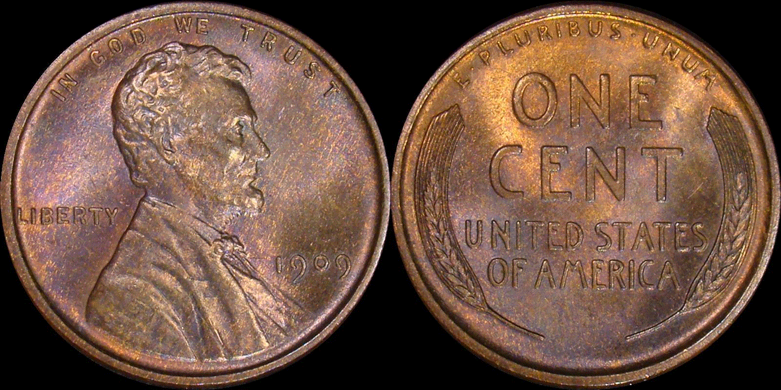
I thought we were talking about non-VDB coins. I agree with WL, gorgeous VDB examples are plentiful. The 1909 and '09-S non-VDB's are tough. Show us those.
Lance.
I went through (for fun of my own) and gave each coin my positive and negative opinion.
7 nice color, nice luster, ok strike/spots, weird color on chin or beard.
7.9 nice color, very nice strike/spots, muted luster.
6.5 nice luster, ok strike/spots, uneven color.
7.5 nice tone, nice strike, nice luster/color variation on obverse.
5 nice luster/details lost in brown camo color variations.
7 nice luster, nice even color, ok strike/spots on obverse.
7.9 nice luster, nice even color, ok strike/a few spots, color is dark.
5 ok luster/soft strike, uneven color.
4 ok details/splotchy uneven color, finger prints.
9 nice strike, nice color, nice luster/slight discoloration on jaw and cheek.
7 ok luster and strike/spots and uneven color.
"May the silver waves that bear you heavenward be filled with love’s whisperings"
"A dog breaks your heart only one time and that is when they pass on". Unknown
I definitely don't like medium size and big spots on bronze or copper coins. Small or tiny spots will pass with me if not too abundant.The OP coin is nice, i don't see much in the way of spots. I give it 8.
"A person who never made a mistake never tried anything new."
---Albert Einstein (b. 14Mar1879--d. 18Apr1955)
@Insider2, @lkeigwin, since there are only two coins, the one that is less original is also the one furthest from original in the set of coins, and is therefore also the least original.
Speaking of semantics, can you help me out with what that means? The "more" original one is MS66 RB CAC in an NGC holder. So I get it, two organizations have guaranteed that, in their opinion, it is "original". But the purple one, shown here, is a raw coin, and presumably has been wandering the world for 108 years doing who-knows-what.
I actually think this is better than the red one, which has a visible scratch to the right of T in CENT. Is it the purple toning that makes it less / least original? In hand the luster is a terrific purple cartwheel, so I would have difficulty believing this was cleaned and retoned.
I am reposting a new image to suppress some of the glare of the original, and to provide the full color spectrum available in a .jpeg. The apparent scratch on the nose is not visible except in the one photograph. In hand, there is no mark there at all.
@lkeigwin said:
I agree with Tom that it is likely a partial print. Fingerprint whorls or arches on a rounded fingertip can result in straight, parallel lines.
Still, it is minor and barely noticeable.
I agree, WL, that the 1909-S is a very tough coin. I settled on the below one which I'd replace if a nicer one came along.
Lance.
By the way, I want to point out the similarity in pale, almost yellow, coloration in both your 1909-S and this one.
@Insider2, @lkeigwin, since there are only two coins, the one that is less original is also the one furthest from original in the set of coins, and is therefore also the least original.
Speaking of semantics, can you help me out with what that means? The "more" original one is MS66 RB CAC in an NGC holder. So I get it, two organizations have guaranteed that, in their opinion, it is "original". But the purple one, shown here, is a raw coin, and presumably has been wandering the world for 108 years doing who-knows-what.
I actually think this is better than the red one, which has a visible scratch to the right of T in CENT. Is it the purple toning that makes it less / least original? In hand the luster is a terrific purple cartwheel, so I would have difficulty believing this was cleaned and retoned.
I am reposting a new image to suppress some of the glare of the original, and to provide the full color spectrum available in a .jpeg. The apparent scratch on the nose is not visible except in the one photograph. In hand, there is no mark there at all.
This is the one with the friction on its high points = less original to me than the other coin psted and I don't care what might be on the TPGS label.
@Insider2 said:
This is the one with the friction on its high points = less original to me than the other coin posted and I don't care what might be on the TPGS label.
The fault could be with my photos, too. They are still a bit overexposed, which makes it hard to tell whether that is friction or just too much light scattering off the high points. But at least I know what you mean by "less original" so my question has been answered. I will look at it again.
I think I was sorta agreeing with you about the label. The graded coin has a mark on the front that looks suspiciously like someone used a pencil to point at it and left a "<" shaped mark at the 3:00 position. And I mentioned the scratch on the back. And then we have a raw coin which gives it a good run for its money without any marks like those. (Leaving the friction aside for the moment!) Ya gotta rely on your own eyes.
Comments
I agree with Tom that it is likely a partial print. Fingerprint whorls or arches on a rounded fingertip can result in straight, parallel lines.
Still, it is minor and barely noticeable.
I agree, WL, that the 1909-S is a very tough coin. I settled on the below one which I'd replace if a nicer one came along.
Lance.
Beautiful coin, Lance, and gorgeous assembly of a group of 1909 Lincoln cents WL!
In honor of the memory of Cpl. Michael E. Thompson
i think 66 is a good grade for that one. very nice strike and luster with a few spots. lincoln has great detail!
So it sounds like a partial print is possible w 2 ppl agreeing. For some reason the way it looks, being somewhat faded out, its not a distraction to me.
My Coin Blog
My Toned Lincoln Registry Set
9 here. Nice coin!")
My YouTube Channel
Well, it is the pop. 1 PCGS MS 66+ RB. The color is eye popping.
I am just glad to see a post where everyone seems to appreciate colorfully toned copper coins. No fake news about how they only tone red then brown, and anything else must be chemically altered.
Years ago collectors in general didn't really much appreciate color toning on silver coins. Tastes mature, spots and all.
I like the coin as a 9 WL. You do have coins with better toning and the matte proofs toning will be be better, so 9 for MS coin. The color is very typical of the top colorless registry set coins. Color on this grade is much more than RD in this series, and thus much harder to find. Great Coin........don't sell it.
OINK
What I") wish to know for the next time we play is this: The scale is "1 - 10." IMO, a "1" is a cull. A "10" is perfection. I should think that a "5" is an average, run of the mill coin. Nothing special. Agree? So when a coin hits the top of the scale for most of its attributes, a "7 - 9" should cover every informed opinion. Disagree?
wish to know for the next time we play is this: The scale is "1 - 10." IMO, a "1" is a cull. A "10" is perfection. I should think that a "5" is an average, run of the mill coin. Nothing special. Agree? So when a coin hits the top of the scale for most of its attributes, a "7 - 9" should cover every informed opinion. Disagree?
This is the one I just sold to a happy collector. 67RB PCGS
Kind regards,
George
Looks like a great "8+" to me, spots and all. What about this one @? Higher than an average "5"?")
8.5-9
+1
POST NUBILA PHOEBUS / AFTER CLOUDS, SUN
Love for Music / Collector of Dreck
I thought we were talking about non-VDB coins. I agree with WL, gorgeous VDB examples are plentiful. The 1909 and '09-S non-VDB's are tough. Show us those.
Lance.
I went through (for fun of my own) and gave each coin my positive and negative opinion.
7 nice color, nice luster, ok strike/spots, weird color on chin or beard.
7.9 nice color, very nice strike/spots, muted luster.
6.5 nice luster, ok strike/spots, uneven color.
7.5 nice tone, nice strike, nice luster/color variation on obverse.
5 nice luster/details lost in brown camo color variations.
7 nice luster, nice even color, ok strike/spots on obverse.
7.9 nice luster, nice even color, ok strike/a few spots, color is dark.
5 ok luster/soft strike, uneven color.
4 ok details/splotchy uneven color, finger prints.
9 nice strike, nice color, nice luster/slight discoloration on jaw and cheek.
7 ok luster and strike/spots and uneven color.
"A dog breaks your heart only one time and that is when they pass on". Unknown
Good looking cent (penny?) in my book WL and I don't care what ricko says (he's out of his mind).
I like it a lot!
7 for me
Successful Trades: Swampboy,
I'd give it a 9.5 and consider this an incredible coin. The small spot below the date is poorly located and the only thing keeping it from a 10.
I just joined the forum to post these two images.
Welcome!
Nice graphics. And coins!
I definitely don't like medium size and big spots on bronze or copper coins. Small or tiny spots will pass with me if not too abundant.The OP coin is nice, i don't see much in the way of spots. I give it 8.
"A person who never made a mistake never tried anything new."
---Albert Einstein (b. 14Mar1879--d. 18Apr1955)
I like WL's 1909 as a 9+
- Bob -

MPL's - Lincolns of Color
Central Valley Roosevelts
@Ronsanderson said: "I just joined the forum to post these two images.
Welcome to CU. I wish everyone here could post amazing "light dynamic" (a J.P. Martin term) images of their coins as you have.
While both are very nice, IMO, this is the least original of your two coins.
I agree, Insider. Well, except that it is the less original of the two.
Lance.
What an entrance! Great coins.
Ronsanderson, welcome to the forum. Those photographs are very well done. Thank you for bringing something so positive with you!
"A dog breaks your heart only one time and that is when they pass on". Unknown
Lime green...gorgeous eye appeal..9+.
nice coin")
@Insider2, @lkeigwin, since there are only two coins, the one that is less original is also the one furthest from original in the set of coins, and is therefore also the least original.
Speaking of semantics, can you help me out with what that means? The "more" original one is MS66 RB CAC in an NGC holder. So I get it, two organizations have guaranteed that, in their opinion, it is "original". But the purple one, shown here, is a raw coin, and presumably has been wandering the world for 108 years doing who-knows-what.
I actually think this is better than the red one, which has a visible scratch to the right of T in CENT. Is it the purple toning that makes it less / least original? In hand the luster is a terrific purple cartwheel, so I would have difficulty believing this was cleaned and retoned.
I am reposting a new image to suppress some of the glare of the original, and to provide the full color spectrum available in a .jpeg. The apparent scratch on the nose is not visible except in the one photograph. In hand, there is no mark there at all.
By the way, I want to point out the similarity in pale, almost yellow, coloration in both your 1909-S and this one.
This is the one with the friction on its high points = less original to me than the other coin psted and I don't care what might be on the TPGS label.")
The fault could be with my photos, too. They are still a bit overexposed, which makes it hard to tell whether that is friction or just too much light scattering off the high points. But at least I know what you mean by "less original" so my question has been answered. I will look at it again.
I think I was sorta agreeing with you about the label. The graded coin has a mark on the front that looks suspiciously like someone used a pencil to point at it and left a "<" shaped mark at the 3:00 position. And I mentioned the scratch on the back. And then we have a raw coin which gives it a good run for its money without any marks like those. (Leaving the friction aside for the moment!) Ya gotta rely on your own eyes.